
Drawing a fire truck can be a thrilling experience, be it for firetruck enthusiasts, aspiring firefighters, or professionals in emergency services. This guide aims to walk you through the process with a step-by-step approach, helping you master the art of capturing the essence of a fire truck on paper. Each chapter delves deeper into the various elements, starting from the basic shapes and culminating with a polished final drawing featuring shading and detailing. As we progress, you will gain insights into proportions and essential fire truck elements, ensuring your artistic journey is both enjoyable and rewarding. Let’s embark on this creative adventure, transforming simple lines into a vibrant representation of a fire truck that exudes heroism and community service.
Foundations in Firefighting Illustration: Building a Fire Truck from Simple Shapes
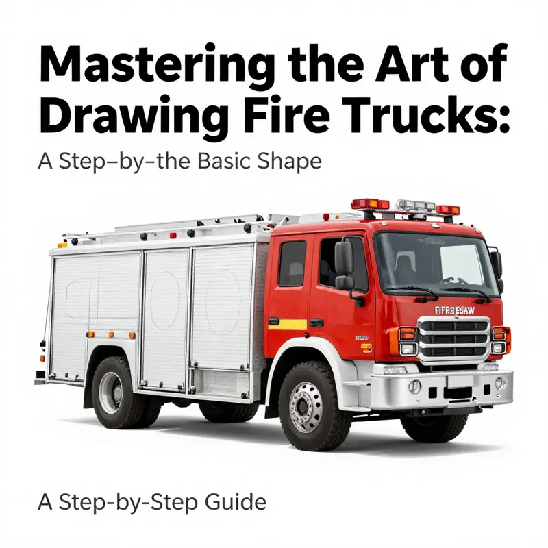
Drawing a fire truck starts with simple shapes and careful planning. Begin with a long box for the chassis, a slightly rounded cab, and then place four large wheels along the baseline. Add a roof rectangle for the cab area and a few angled lines to suggest perspective. Use light, sketchy lines in the early stage, then refine into a clean silhouette. Keep the ladder along the side as a linear lattice, with joints that imply extension and retraction. Add basic details like windows, grille, and compartments in simple forms. Consider light and shadow from a single light source to give volume, and avoid overworking lines too early. This foundational approach helps you render a confident, believable fire truck before adding color and texture in later passes.
Rolling Foundations: Adding the Wheels as Grounding Ground for a Fire Truck
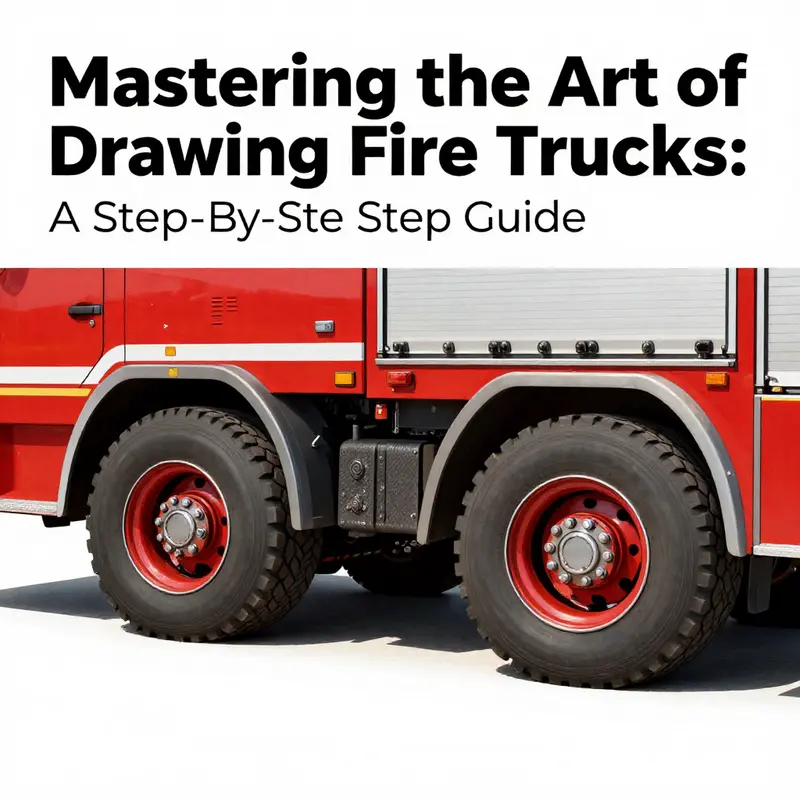
The wheels are more than just round shapes at the bottom of a vehicle; they are the ground on which a fire truck stands in space and time. When you begin a drawing, the body often starts as a clean silhouette or a blocky framework. The wheels, placed carefully, give that silhouette its confidence and its physics. They determine the truck’s attitude—the way the front leans slightly forward or the rear settles, how high the chassis sits above the ground, and how light travels across curved surfaces. In this chapter, you learn to translate a practical sense of contact with the road into a convincing, rounded form that can carry all the other details you will add later. The process begins with two circles, but the mind’s eye has to see beyond the circles: it must anticipate arches, wheel wells, fenders, and the subtle tension between sturdy metal and efficient rubber. As with any good drawing, it starts with light lines, adjustable as you refine proportions and stance. The wheels frame the vehicle’s rhythm; once they’re in place, every subsequent detail—be it the cab, the ladder, or the compartments—finds its place with greater ease.
Begin by outlining two large, circular forms near the bottom third of the truck’s length. The circles should be generous in size, occupying a fair portion of the lower body while leaving room for the fender lines to breathe. Place them so they’re evenly spaced, with a comfortable distance between the front and rear wheel. The goal is balance; the truck should feel sturdy and stable, not tentative. A good metric is to imagine the wheel diameter as a proportion of the body height. If the body rises a certain distance from the ground, the wheel should appear thick enough to support the mass without looking delicate. The exact measurements aren’t what matters as much as the sense that the wheels belong to the vehicle and not as an afterthought hung on its sides.
The next step is to make the wheels feel grounded by letting them interact with the truck’s bottom edge. Allow the circles to slightly overlap the sides of the vehicle. This overlap creates a natural contact point that helps the eye read the wheel as part of the whole, rather than a separate toy placed beneath it. If you draw the lower edge of the body first, the wheel placement can appear to tuck under the chassis in a way that mirrors the real world: tires tucked into wheel wells with a hint of the rim peeking through. You’ll notice that the edge of the wheel well often follows a gentle arc that mirrors the contour of the tire. Keeping this relationship organic is essential; it prevents the wheel from looking pasted on and instead makes it feel integrated.
For added realism, introduce the hubcaps inside each wheel. Draw a smaller circle within each main wheel to represent the central hub. The hubcap is not simply a circle; it can carry subtle design cues like a small circle at the center or delicate spokes that radiate outward. In a simple line drawing, a few light radial lines or spokes around the hub can suggest that the wheel is not just a flat disk but a component that may house brakes or a robust rim. The goal is crisp yet restrained detail—enough to convey a sense of machinery, but not so much that the wheel becomes the chapter’s dominant feature. If you want to see how professionals handle this balance, you can explore the idea further in the Fire Truck Blog, which offers practical tips and examples.
Symmetry is essential when you add wheels to a vehicle of any kind, but it is especially important for a fire truck, where a sense of purpose and reliability must come through in the drawing. Use light construction lines to align both wheels horizontally. A quick method is to draw a faint guideline across the length of the truck at a level that passes through the center of both hubcaps. This line helps ensure that the wheels stay on the same plane, which in turn stabilizes the entire profile. If you notice one wheel seeming smaller or higher than the other, adjust the circle’s size or the basis of the wheel well until both sides look evenly grounded. The eye often catches misalignment more quickly than the hand can correct, so step back frequently and evaluate the stance from a comfortable distance. A small adjustment made early saves you from major corrections later on and keeps the drawing cohesive.
As the wheels take their place, you begin to sense how they influence the rest of the vehicle. The wheel wells must accommodate the tires with a gentle curve, not a harsh angle, so that the lower body reveals a continuous line from front to back. If the wheel encroaches too close to the side panel, the silhouette can feel cramped or underdesigned. A careful curve around the wheel creates a sense of clearance that implies the thickness of the tire, the depth of the wheel well, and the way light reflects off the metal above it. You can fine-tune these transitions by letting your pencil glide along the area where the tire meets the body. A lighter hand here will preserve the sense that you are sketching a three-dimensional object rather than assembling flat shapes.
Once you’re satisfied with the wheels’ placement and the general interaction with the fenders, you can begin to refine the trucking’s ground plane. The ground line—the imaginary strip of surface on which the truck rests—should be straight and uninterrupted. It anchors the drawing and helps you develop the truck’s tilt and perspective. If you are working in a straightforward side view, this line is effectively the baseline from which all other features radiate. In more dynamic angles, you will adjust the line to reflect perspective, but even then, the wheels should appear to roll along it with consistent contact. The sense of weight comes not from exaggeration but from the careful, measured proportions of the wheel and the body around it. In practice, you may find that drawing the wheels first gives you a platform to test the height of the cab and the length of the equipment compartments, ensuring that each section cooperates with the others in a believable way.
With the wheels in place, the drawing gains a solidity that allows you to proceed to the next critical phase: shaping the cab, the flame-red body, and the storerooms for hoses and ladders. The wheels are the first real test of your proportion and line confidence. If you can render them cleanly—circles that feel round, hubcaps that read as metal, spokes that suggest mechanical complexity—then the rest of the vehicle will have a solid foothold on which to stand. This foundation also invites you to consider how light interacts with different materials. Rubber tires absorb and reflect differently from metal rims; you can use subtle shading to convey this difference. A light touch along the wheel edges and a slightly darker tone along the center of the tire create a sense of volume, as though the wheel is pushing outward toward you yet receding slightly into the wheel well. These tonal shifts are small details, but they carry a lot of weight in making a two-dimensional drawing feel three-dimensional.
As the chapter unfolds, you begin to appreciate how a seemingly simple step—adding wheels—exists at the intersection of proportion, perspective, and narrative. Each wheel anchors the vehicle’s stance and sets expectations about what comes next: the cab’s shape, the ladder’s angular forms, the compartments’ doors, and finally the emergency equipment that fills those spaces. The balance achieved here makes the later stages more intuitive. You’ll find that the cab’s height relative to the wheel diameter, the width of the wheelbase, and the curvature of the fenders all interact to determine how the entire fire truck reads on the page. A well-placed wheel does more than support the vehicle; it speaks to the truck’s purpose and the reason fire engines look the way they do—sturdy, efficient, and ready for action.
If you would like deeper context on the broader process of fire-truck drawing and related topics, you can explore more content at the Fire Truck Blog, which provides additional insights and exercises to refine your technique. Fire Truck Blog
Finally, as you move forward from wheeling the vehicle into its next forms—such as shaping the cab, the ladder apparatus, and the side compartments—keep returning to the feel of the wheels as your guide. They are the reference point for scale and for the vehicle’s physical presence. A consistent wheel treatment ensures that the entire drawing maintains unity of style, from the glossy metal of the body to the rough tread of the tires. When you look at the finished piece, the wheels should not draw attention for their own complexity but for how they quietly support the scene, lending credibility to the narrative of rescue, speed, and reliability that fire trucks symbolize. In that sense, wheels are not just a technical step; they echo the engine’s purpose and the story you are telling with pencil and paper.
For readers who want to study a structured, step-by-step demonstration alongside practical tips, a reputable starting point can be found in external tutorials that walk through the same sequence with visual guidance. You can explore a trusted beginner-friendly approach here: https://www.drawitwithjazza.com/draw-a-fire-truck. This resource reinforces the principle that careful construction, followed by deliberate refinement, yields confident, capable drawings that do justice to the subject’s form and function.
Shaping the Heart of the Fire Truck: Drawing the Cab and Roof
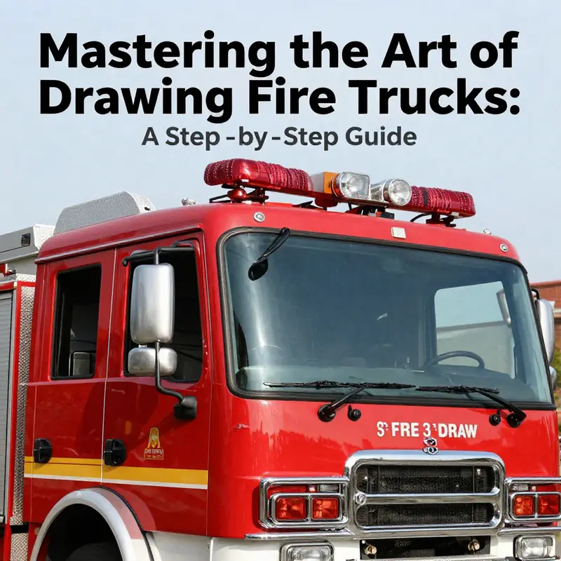
The cab and roof are the heart of the fire truck’s silhouette. They establish the vehicle’s stance, scale, and readiness, and they guide every subsequent addition—from the long chassis to the tool bays. As you approach this step, imagine the cab not as a box, but as a living space carved from metal that must endure the rigors of emergency response. Your pencil work should reflect that blend of practicality and purpose: clean lines that can survive a little shading, the occasional soft curve that communicates a robust, human-scale form, and just enough detail to tell a clear story without crowding the page. Begin with a simple rectangular block for the cab’s front section. This rectangle should feel slightly taller than it is wide, which helps convey the sense that the driver takes a commanding position and that gravity pulls the vehicle toward a practical, grounded center. Don’t worry about perfect symmetry at first; the beauty of this approach is that you can adjust on the fly as the rest of the drawing evolves. The cab’s basic volume acts as the anchor for every other element. Once the rectangle is in place, add a smaller, slanted rectangle on top to form the roof. Let the roof slope gently downward from the front toward the back. A slight tilt, not a sharp angle, gives the iconic aerodynamic profile of a fire engine—the visor-like line that keeps the cab feeling compact yet capable of withstanding a head-on stretch of street and wind. The windshield and windows come next as essential cues to realism. Draw a large, vertical rectangle in the center front of the cab to indicate the windshield. This central block should feel dominant, because it signifies the driver’s field of view and lays the foundation for the glass’s reflective quality. On either side, fit smaller rectangles or trapezoids that stand in for the side windows. The spacing should be even, and the vertical alignment of all window shapes should feel deliberate. If you’re unsure about spacing, lightly mark reference lines with your pencil and erase later. This is where the light sketching approach truly shines; it keeps you nimble as you adjust the geometry to look balanced rather than forced. The windows don’t need to be perfect mirrors of each other; a touch more width on the left can imply perspective or a slightly different door arrangement, which is common on real fire trucks. As you refine the roof, extend its sloping line toward the rear to create a convincing overhang. The overhang hints at the equipment compartments or storage behind the cab. In many designs, the roof line transitions smoothly into a rearward surface, a seam that suggests the presence of a ladder rack or an antenna. If you want to add these details, sketch them very lightly so you can revise without marring the main shape. The ladder rack is iconic in its silhouette, but the trick is to imply it with a gentle curvature or a shallow line along the roof rather than a heavy, blocky detail that competes with the cab’s face. Keep the rack proportional to the cab’s width: too tall or dense, and it will look crowded; too slender, and it will vanish against the roof’s longer sweep. The habit of using light lines remains the essential discipline here. The goal is a clean blueprint feel that can later be shaded for depth without losing clarity. Check your proportions by stepping back from the page or by using the pencil-measure method: hold the pencil at arm’s length and compare the cab’s height to its width, then compare the cab’s front edge to the windshield’s width. Make micro-adjustments to ensure the cab reads as a sturdy, upright unit rather than a flat projection. Your initial silhouettes should be simple enough to be read at a glance, yet refined enough to convince a viewer that the vehicle could actually serve as a dispatch and rescue unit. The window frames, roof edge, and front contour will receive their final refinement in the next pass, but already they begin to tell a story of function and form. The next layer involves connecting the cab to the rest of the truck. In a realistic assignment, you’d imagine the cab sitting atop a long chassis, with panels and compartments extending behind it. The alignment of the lower edge of the cab with the body behind is crucial; the transition should feel continuous, not abrupt. A gentle slope along the cab’s lower edge can suggest the connection to the undercarriage, while a faint line behind the door seam can hint at the beginning of the equipment bays. The eyes read the whole, not just the individual blocks, so keep the relationship between the cab and the rest of the vehicle in mind as you proceed. The wheels will come next, but even without them, the balance of weight between the cab and the body behind should look deliberate. If the cab seems to float or lean, you’ll need to slightly adjust the bottom line so that it rests naturally on the imagined ground and aligns with the wheels you plan to add. In the treatment of shading and depth, imagine light arriving from a specific direction—perhaps from the upper left. The cab’s left side will catch a brighter edge, while the right side recedes into soft shadow. The roof’s underside will hold a darker tone, reinforcing the sense of a three-dimensional form. Use a light hatch to suggest the curvature of the glass and the subtle recesses around the windows. Do not press too hard with your pencil in these areas; emphasis should be on gradual tonal variation rather than bold shadow blocks. This subtle shading is not just decorative; it communicates the rugged, practical character of emergency equipment, its resilience, and its readiness. The result should be a convincing interplay of light and material—glass, metal, and painted surfaces—that makes the cab feel like a real, usable cockpit rather than a flat graphic outline. Throughout this phase, the tension between geometry and grace remains the central challenge. Fire trucks are built from straight lines and sturdy angles, but they must still read as human-scale machines designed to respond quickly. Your lines can be crisper where the metal meets the air and softer where the glass or the curved edges of the cab appear. When you feel satisfied with the overall silhouette, run a final check for proportion against the anticipated length of the truck’s body behind. If you plan to place doors, hinges, and the start of the equipment compartments, ensure there is room for them in the transition from cab to body. The doors’ edge should sit in line with the windshield’s vertical edges, while the roof’s slope maintains its continuity across the top. The last thing you want is a jagged seam where the cab meets the rest of the vehicle, so refine the junction with careful, long strokes that taper away at the ends. If you prefer a quick reference for the CAD-like accuracy that helps beginners move toward realism, you can imagine the cab as three main volumes: the front face (the rectangle that holds the windshield), the cabin block (the taller rectangle), and the roof mass that reads as a slightly sloped cap. Each volume has its own subtle angle and proportion, but when combined, they form a coherent and credible face for the fire truck. The cab’s proportions should read consistently with the anticipated scale of the wheels and the length of the body behind. That consistency gives your drawing credibility, even before any detailed textures or logos appear. It’s a small victory, but it marks the difference between an earnest attempt and a confident rendering. By now, the process has moved beyond the initial sketching and into the realm of confident, accurate depiction. The cab and roof carry the most immediate information about the vehicle’s character—the upright stance, the forward-leaning windshield, and the gentle back-slope of the roof—all of which communicate readiness for action. When you look at your work, you should feel a sense of solidity and purpose, a feeling that the vehicle’s design is built to protect, rescue, and respond. This is the moment where method and imagination converge: a simple rectangular base, a sloped top, a few carefully placed windows, and a ladder rack that hints at the equipment stored within. The result is not just a pretty drawing but a visual narrative of a machine designed to move quickly and perform under pressure. For broader context and to see how these shapes function within a complete composition, you can refer to broader technical discussions and tutorials at firetruck.space/blog/. This internal link helps connect the drawing practice to a wider craft community and offers a space to explore how artists translate real-world machinery into expressive line work. When you’re ready to extend the drawing, focus on refining the wheels, length, and height, ensuring the cab remains the anchor while the rest of the truck’s body expands with proportionate confidence. Remember to keep your light lines in place until you’re fully confident of every angle and edge; you can erase or darken as needed, but never rush the essential balance between the cab and the roof. The method here is deliberate, not rushed, and that quiet, patient approach will serve you well as you append details such as doors, mirrors, and internal equipment later in the chapter sequence. External reference: https://www.youtube.com/watch?v=7WqX9LkG2uU
From Nose to Tail: Detailing the Front and Rear for a Realistic Fire Truck
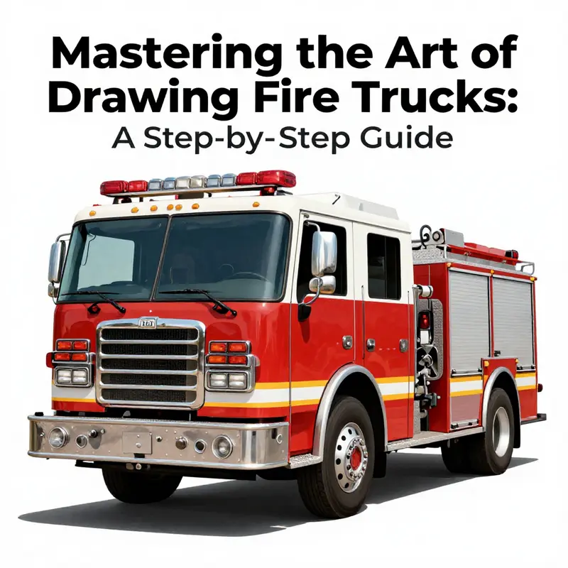
With the basic silhouette established, Step 4 invites you to sharpen the fire truck’s personality by detailing the front and rear ends. The goal is to balance accuracy with your own drawing style, so the truck reads as a cohesive machine rather than a jumble of parts. Start by reexamining proportions in relation to the wheelbase, cab height, and the flat planes that will carry your careful linework. The front and rear are where a viewer most readily recognizes the vehicle’s function, so let your lines carry the story of purpose: durability, efficiency, and readiness. You want the front to invite a closer look, while the rear should promise capacity and resilience. As you approach these zones, keep light sketching in mind. It remains your best ally for corrections as you test angles, align features, and refine shapes without committing too early to a single line. Throughout this phase, you will translate the imagined heft of a real fire engine into your drawing through careful contrasts, precise geometry, and subtle texture.
Moving to the front, the grille is the heart of the face. It anchors the truck in a recognizably industrial aesthetic, so sketch a large, dominant grille centered between the headlights. The pattern can vary—vertical bars for a traditional look or a mesh that hints at a modern, high-efficiency design. Either way, ensure there is a clear break between the grille and the surrounding fenders, creating that recessed feel that makes the front look solid and three-dimensional. The headlights sit flanking the grille and can be rendered with rounded or angular shapes depending on the year and style you want to evoke. Modern silhouettes tend toward sleeker, perhaps LED-inspired lines, while older models lean toward more pronounced bezels and reflective surfaces. The headlamps don’t exist in isolation; they anchor the geometry of the front’s face, so keep their positions symmetrical and their scale consistent with the width of the grille.
Beneath the grille, the bumper acts as a protective, grounding element. It should sit just below the main body, slightly lower than the hood line, and offer a finite slab of mass in your composition. You can enrich the bumper with small but telling details, such as air intake vents or a central emblem near the grille’s midpoint. Remember that a fire truck is built to endure, and the bumper’s lines should convey this robustness. As you refine, consider how light will strike these features. Subtle shadows along the lower edge will give the bumper depth, while a small highlight along its upper edge can suggest a polished metal surface catching a stray beam of light. The windshield then rises behind the grille and bumper, forming a clean, slightly curved plane that sweeps from the hood into the cab. Add the windshield wipers in a resting position at the base of the glass, and place tiny nozzles or washer jets near the base to convey a sense of functional realism. If you’re aiming for a more technical look, you might include faint reflections across the glass and a line indicating the separation between the glass and the frame. These small touches unite the glass with the truck’s metal form and help the drawing read as a single, purposeful unit.
When you’re drawing a ladder truck, the area behind the cab holds one of the most iconic features: the turntable and the rotating ladder assembly. This element communicates the vehicle’s core function—reach and rescue. In a simplified but convincing form, sketch the turntable as a circular plate aligned with the cab, then extend the ladder assembly as its angular, segmented arm. The ladder can be drawn in a retracted position or shown mid-rotation, but either way it should sit with confidence atop the chassis. The joints and treads of the ladder are rendered as crisp line segments, with even spacing and consistent angles to emphasize mechanical reliability. Don’t let the ladder overshadow the cab; the goal is harmony, where the equipment reads as an integrated system rather than a cluster of parts.
Turning to the rear, you’ll discover a different but equally important narrative. The back of a fire truck is a storage and support hub. It houses hoses, ladders, fittings, and often the bulk of the vehicle’s emergency gear. Detail the large storage compartments with emphasis on the doors. These aren’t merely flat panels; they are layered elements that hinge open to reveal racks and bins. Your lines should suggest the depth of each compartment, with a double line for door edges, a small seam at the hinge, and a subtle bevel along the door’s face to imply thickness. The doors themselves typically run the length of the rear and are divided into multiple sections to reflect how real compartments open. When you add the handles, keep them proportional and aligned with the door edges. This alignment makes the rear appear organized and functional, reinforcing the impression that the truck is ready for rapid deployment.
Beside the compartments, side-mounted water tanks or foam tanks are often visible. Shape these with gentle convex curves that flow along the side shell of the chassis, ensuring they don’t crowd the storage doors. The tanks’ contours should mimic the vehicle’s overall curvature, helping to knit together the front’s angular geometry with the rear’s volume. The rear bumper is another anchor point for the eye. It should look sturdy and reinforced, a clear signal of safety and resilience. If you choose to add reflective strips, place them along the bumper in a way that catches implied light without overpowering the linework. Mounting brackets for emergency lighting near the bumper’s edges can give additional visual cues about the truck’s utilitarian purpose. The tail lights deserve careful attention as well. They should be positioned in a way that feels natural to the truck’s silhouette and should balance with the vehicle’s overall width. Include a license plate area that harmonizes with the tail light assembly. Even small decisions—like the angle of a light housing or the spacing between the bumper’s bolts—count toward a convincing, compact, working vehicle.
Textures are the quiet workers in the drawing. The front and rear are excellent places to apply subtle rivet lines along the side panels, hinting at the modular construction of the chassis. Tires deserve careful treatment; their treads should show a repeating pattern that suggests rugged use while maintaining a clean outer wall. The metal finishes on the chassis can be suggested with quick, controlled hatch marks or a light cross-hatching that implies brushed steel or chrome in reflected light. Use your shading to imply depth, but avoid heavy outlines that flatten the forms. Instead, let soft edges and gradual transitions create the sense of rounded corners and sturdy planes. Remember that the goal is to convey realism without becoming a xerox of a photograph. Your drawing should feel tactile, like a model that has been painted with care and attention to its mechanical integrity.
As you weave all these front and rear details together, keep checking for visual rhythm. The truck reads best when its parts coordinate with one another—the grille’s height, the headlight alignment, the bumper’s width, and the rear doors’ proportions should feel like they belong to the same vehicle. It helps to occasionally step back and view the drawing from a distance; detail-heavy zones can overwhelm the composition if not balanced by simpler planes that serve as visual rest points. Your light sketching habit remains crucial: continuously evaluate the relationships between the cab, the ladder apparatus, the storage bays, and the tail structure. A well-drawn fire truck balances precision with a sense of mass, as if every line has a reason and every shape has a purpose.
If you’re seeking a quick reference to refine scale and stance during this stage, exploring examples of fire trucks for sale can provide helpful real-world cues. The scale and proportions observed in reference images can inform how you render the front’s grille and headlights in relation to the cab, or how the storage compartments align with the truck’s rear silhouette. For further context on how these elements come together in a complete design, you can consult external resources that discuss structural details and equipment configurations, which supplement your hands-on practice with broader perspective. For deeper reading on related apparatus and structural considerations, you may consult a broader reference on steel apparatus designs and their typical forms across departments and regions. External resources offer a wider lens on how designers balance efficiency, safety, and maintenance in the field while you apply those principles to your own drawing practice.
For additional context on equipment configurations and technical details, refer to this external resource: https://firetruck.space/steel-fire-apparatus/.
Polishing the Fiery Frame: Finishing a Step-by-Step Fire Truck Drawing with Depth and Detail
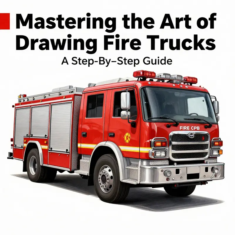
After you’ve laid down the basic silhouette and established the proportions, the real artistry begins. This is the moment when a clean, confident line turns into a vehicle that feels tangible on the page. The goal is not to overwhelm the viewer with ornament but to deliver the essential traits that make a fire truck instantly recognizable: the broad cab, the sturdy chassis, the sense of mass, and a careful balance of utility and energy. Begin by solidifying your main outlines. You want the body, the cab, and the chassis to convey their three-dimensional presence with a crisp boundary. Use a slightly firmer pressure along the outer edges to create a confident contour, while keeping the interior lines lighter so the form still breathes. The color choice you’re aiming for—red in the classic sense—acts as a unifying thread across the panel lines, the glass, and the chrome-like highlights. If you’ve kept your initial sketch light, this is where the correction phase becomes a painting-like process: you refine without erasing the life from your drawing, you sculpt the shape rather than simply trace it. The depth comes from understanding how light interacts with the metal surfaces. Shadows should not be a flat blockade but a staggered map that follows the truck’s planes. A slightly darker wash along the undercarriage and beneath the wheel wells helps the vehicle sit firmly on the ground, anchoring it in space. You’ll notice the truck’s silhouette gains immediacy as the outlines deepen, yet the interior details remain legible. That balance between bold edges and refined interiors is what prevents the drawing from looking like a two-dimensional symbol and instead gives it the feel of a real, working vehicle under a sunlit sky.
The cab and the chassis deserve particular attention because they are the anchor points of the whole drawing. The cab, with its generous front grille and tall windshield, communicates the engine’s heart and the crew’s command center. Darken the grille slightly more than the surrounding body panels to draw the eye toward the face of the truck, where function meets character. The front bumper can be given a touch of highlight along its upper edge to suggest a polished surface catching the light. The wheels must read as robust and grounded, so emphasize the mass of the tires and the subtle curvature of the rims. You can render the treads with short, slightly angled strokes that imply texture without crowding the linework.
Beyond the core hull, the recognizable equipment is what tells the story of a fire truck’s purpose. The ladder, when present, should appear as if it’s part of the truck’s backbone, extending from the back or side with a measured, almost cautious angle. Depict the ladder with evenly spaced rungs and a gentle perspective that hints at its length without flattening the composition. If you choose to show a water tank, place it along the side or rear with a quiet, rounded bulk that aligns with the truck’s cadence. The hatch or valve can be a small, precise rectangle or circle, depending on the model you’re visualizing, but the key is accuracy in scale so the tank reads as functional storage rather than a decorative protrusion. Hose reels add rhythm to the midsection of the truck; their circular forms break the rigidity of the long panels and provide focal points where light bounces off metal fittings. Finally, the emergency lighting and beacons along the cab’s roof and the front’s edges should sparkle with intentional highlights to convey that sense of readiness and urgency. These elements must align with the truck’s geometry: a misaligned beacon or an exaggerated hose reel can spoil the illusion of a believable machine. Consider the angle and distance from which you’re imagining the vehicle; a slight tilt can give the entire drawing a dynamic quality without compromising the sense of stability that a real-fire apparatus exudes.
Clarity comes not only from the components themselves but from how you handle the transitions between panels, glass, and chrome. Windows deserve careful treatment: the driver’s cabin windows should reflect the cockpit’s geometry, with subtle lines marking frames and mitered corners. Side and rear windows can be shown with a gentle gradient to imply transparency and depth. The trick is to keep glass boundaries crisp, but avoid over-darkening to preserve the reflective nature of the surface. The windshields and side panes should catch a touch of light on the upper edges, which communicates curvature and space. When you map reflections, remember that glass often holds a cooler, crisper highlight than metal, so a thin, bright edge at the top of a pane can read as glass while the surrounding metal maintains a warmer, red-toned persona. All other metallic surfaces, from chassis rails to tool compartments, should hum with a careful balance of midtones and sharp highlights. The goal is a sense of material variety—red-painted panels, chrome-like fittings, dark rubber tires, and glass that catches the light—while preserving unity in color and form.
As you approach the final phase, the focus shifts from constructing the form to refining the narrative the drawing tells. This is where the cleanup process truly matters. Erase any stray construction lines that still peek through the final layer; you want a clean surface that allows the shapes to breathe without the distraction of preliminary marks. The erasure should be precise and deliberate, preserving the integrity of the linework you intend to keep. When you go over the drawing again, use a lighter touch to refine line weight: exterior edges can remain a little thicker to anchor the shape, while interior details like window dividers, hatch edges, and hose reel rings should be a touch thinner to appear secondary yet legible. The final linework should feel cohesive and confident, not tentative. A well-balanced stroke communicates a sense of mechanical reliability and the pride of a well-maintained machine.
With the structural and surface work complete, the drawing gains depth through shading and highlights. Light typically comes from a single direction, so plan your shading to read that source consistently across the truck. Cast shadows should fall naturally along the wheel wells and beneath the chassis, providing a clear anchor to the ground that adds gravity to the scene. Where the light strikes metal, you can push a bright edge along raised panels or along the top edges of doors and hatches, producing glints that imply a polished or lacquered surface. Glass surfaces deserve a subtle, darker interior tone with a reflective strip or two that hints at the environment around the truck. If you’re feeling confident, you can add a touch of color variation—slight cooler tones in the glass, warmer reds on the painted panels, and a few gray marks on the hydraulic components—to broaden the range of values without sacrificing unity. The purpose of shading here is not to complicate the image but to articulate its three-dimensional form and emphasize the functional nature of the vehicle. A thoughtfully placed shadow beneath the truck will ground it, while lighter touches along the top surfaces will create a sense of mass and weight.
As you read these details and start to finalize them, remember that the act of drawing itself is a dialogue between your intentions and your marks on the page. If a line feels uncertain, redraw a segment with a lighter guideline to scan a more precise contour, then re-ink with increased confidence. This iterative approach—sketch, refine, erase faint traces, then reassert lines with controlled pressure—forms the backbone of a convincing render. You may choose to add a touch of shading or highlight to simulate reflections and to enhance depth, but keep it restrained. A well-executed final piece honors the idea of a practical, life-sized vehicle rather than a stylized caricature. Let the viewer sense the truck’s purpose through its balance of form and detail—the cab’s breadth, the ladder’s reach, the water tank’s heft, and the orderly arrangement of equipment all contributing to a cohesive, believable machine in a moment of readiness.
If you’re building a practice routine around this exercise, consider revisiting the foundational steps in light of what you’ve learned about finalizing details. The steps you’ve followed thus far—establishing proportions, mapping essential elements, and staging the vehicle within a simple environment—are designed to train your eye to value accuracy and rhythm in line work. You can explore related ideas and variations in the growing library of resources that accompany this subject. For continuing practice and fresh perspectives, visit the Fire Truck blog at firetruck.space/blog/. There you’ll find discussions and demonstrations that can reinforce what you’ve just completed and inspire new experiments with angles, lighting, and composition. The beauty of a step-by-step approach is that each pass through the process sharpens your instincts and your technique, enabling you to tackle more complex scenes with confidence.
For readers seeking broader context on how these vehicles are designed and manufactured in the real world—and how those principles influence the way we depict them on paper—an external reference offers a comprehensive overview of van types, standards, and manufacturing practices. This resource complements the practical drawing steps by linking form to function, showing how a fire truck’s architecture translates into performance in the field. https://www.fireengineering.com/fire-truck-van-types-standards-manufacturing/
Final thoughts
Mastering how to draw a fire truck is not just about artistic skill; it’s about capturing the spirit of community service that fire trucks symbolize. You’ve learned to start with basic shapes, add functional elements, and fine-tune the details that breathe life into your drawing. Whether you’re a seasoned artist or an aspiring firefighter, this guide equips you with the tools to create a striking representation of one of society’s most beloved vehicles. Continue practicing, exploring new techniques, and let your imagination lead the way. Your creative journey doesn’t stop here; there’s a whole world of artistry waiting for you!