
The sight of bright yellow fire trucks racing down the roads of Hawaii is more than just a striking appearance; it signifies a smart choice grounded in safety. Especially in a state known for its unpredictable tropical weather conditions, the color yellow plays a pivotal role in ensuring these emergency vehicles are highly visible. In this deep dive, we’ll uncover the essential factors behind the choice of yellow for fire trucks in Hawaii. Each chapter will explore critical aspects of visibility, safety standards, and environmental influences, ultimately revealing why this choice makes such a significant difference in emergency response operations.
Bright Frontlines: The Science of Visibility Behind Hawaii’s Yellow Fire Trucks
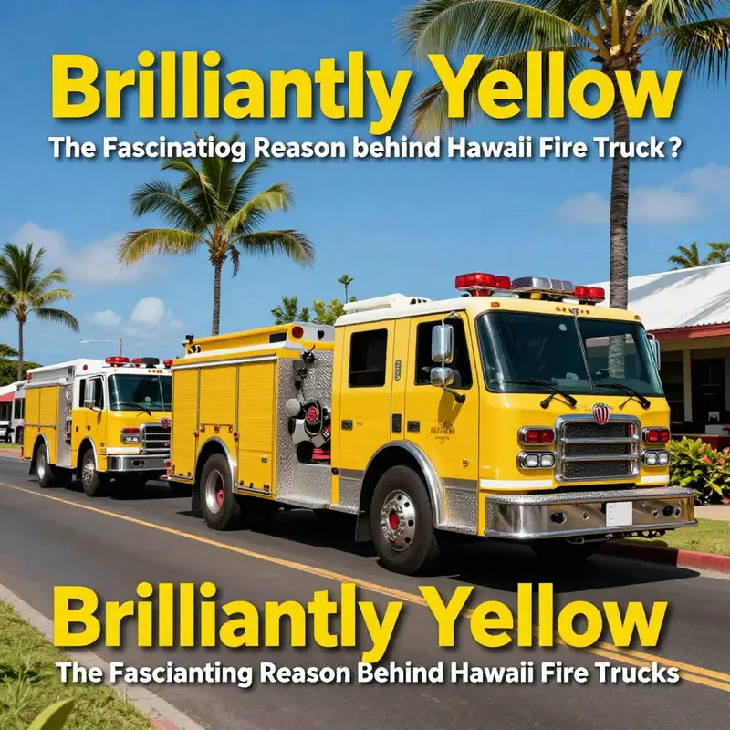
In the warmth of a Hawaiian morning, a fire truck slices through the hum of traffic with a brightness that seems almost intentional, almost audacious. The color of emergency vehicles does more than decorate a chassis; it signals a call to attention that can mean the difference between a close pass and a dangerous lapse in judgment. In Hawaii, that signal comes in the form of a bright lime or fluorescent yellow, a choice grounded in a long arc of safety research, perceptual science, and practical, street-level experience. To walk through this topic is to travel from color theory to real-world outcomes, from the psychology of perception to the lived rhythms of the islands where weather and landscape conspire to demand extra vigilance from everyone on the road. The result is not simply a preference but a carefully calibrated decision that shapes how quickly a responder is noticed, how reliably a driver can react, and how pedestrians interpret the approaching roar of an emergency vehicle across a fogged highway or a sunlit coastal road.
The eye’s capacity to distinguish colors is not uniform across hues. The human visual system is particularly sensitive to yellow and yellow-green wavelengths. When we say yellow, we often mean a spectrum that sits at the edge of green and toward the high end of brightness. In practical terms, this means yellow surfaces tend to produce a higher luminance contrast against many natural backdrops—greens of forests, browns of hills, even the blue of the sea and sky—than red or blue vehicles might in the same setting. The Hawaii landscape rarely serves up a monotonous backdrop; it is a mosaic of lush vegetation, saturated skies, and the variable glare of sunlight reflecting off rain-slicked surfaces. In such a tapestry, yellow can punch through more effectively than deeper reds or blues, capturing attention earlier in the sightline and providing more time for a driver to respond as the siren grows louder and lights begin to slice through the air. The science behind this choice rests on how visibility works in moving scenes: color, brightness, contrast, and motion all play a role, and yellow consistently scores higher on the perceptual quickness scale than many alternative hues when the goal is rapid recognition under the imperfect conditions that emergency vehicles frequently encounter.
Hawaii’s tropical climate compounds the visibility equation. Thunderstorms and passing showers are common, and fog can drift in from the ocean or inland valleys with little warning. In drenched or rain-slicked conditions, the reflective properties of the surface remain crucial, but so does the initial color cue that catches the eye before the brain can process the rest of the scene. The yellow hue, especially in a bright canary or lime tone, tends to stand out against the greens of the island’s forests and the earthy tones of rural roads. It is less likely to blend into a landscape when viewed from a distance, and more likely to be discerned quickly by drivers who must decide whether to yield, slow, or pull aside. In the traffic mix that characterizes much of Hawaii—narrow highways, winding coastal byways, and vehicles parked on shoulders near scenic overlooks—the ability to recognize an approaching engine without ambiguity reduces the cognitive load on drivers and helps prevent the kind of split-second misjudgments that can escalate into accidents.
This is not mere conjecture or a trend borrowed from elsewhere. The choice of high-visibility yellow for emergency apparatus aligns with broader safety standards that increasingly emphasize conspicuity. Modern safety thinking recognizes that an emergency vehicle’s purpose is not only to move swiftly but to announce its presence unmistakably. The color is complemented by design elements such as reflective chevrons and bold lettering that reverse-contrast well in low light. Yet color remains the anchor, because even a moment’s delay in recognition can cascade into lost seconds when every second counts. In a coastal state where vehicles bustle along by beaches and through neighborhoods that blend with the natural environment, the color is a constant reminder that safety is the product of multiple layers working together: color, light, shape, signage, and the predictable choreography of emergency response.
One might wonder why red—historically a dominant color for fire apparatus—didn’t persist as the universal symbol of urgency in Hawaii. The answer lies in a convergence of practical experience and evolving research. While red remains a strong color in many contexts, it can blend into the broader traffic environment in some of Hawaii’s settings. The more pronounced issue is not that red is unreadable, but that yellow provides a more immediate, pre-attentive cue. Pre-attentive processing is the brain’s ability to pick out basic features—like color—without deliberate focus. In a dynamic scene where a vehicle is shifting across lanes, starting from a parked position, or maneuvering around a curve, the pre-attentive detection of yellow can shave precious milliseconds from response times. Those milliseconds accumulate across thousands of daily encounters and can have meaningful safety implications for both the public and the responders. In this sense, Hawaii’s yellow fleet is less a rejection of tradition than an adaptation to empirical safety needs revealed by observation, testing, and the collective experience of a state that measures safety against the realities of its geography.
The argument for visibility is also deeply practical. Yellow is equipment that can be recognized at a wide range of angles and distances, and it maintains legibility even as light conditions shift. The shifting glare caused by sun and sea can complicate the clarity of other colors, particularly when a driver is momentarily distracted or when the weather grows hazy. The bright yellow hue acts as a constant beacon, a nonverbal cue that something urgent lies ahead and that other road users should yield or proceed with caution. This is not a theoretical preference but a repeated pattern observed by officers and drivers alike: a vehicle painted in a high-visibility tone is more likely to be noticed early, to be recognized as an imminent hazard rather than a billboard on the side of the road, and to prompt a smoother, safer response from those sharing the space.
The emphasis on visibility extends beyond color to how the color interacts with the vehicle’s other safety features. In Hawaii, and in modern emergency fleets more broadly, yellow is part of a holistic approach that includes lighting, signage, and retroreflectivity. The lights—often white or amber, flashing in sync with sirens—are most effective when the viewer’s gaze is already drawn to the vehicle by color. Reflective materials on the sides and rear of the truck further enhance conspicuity once the vehicle is within a closer range, such that a driver turning onto a road or a pedestrian stepping from a curb has multiple cues to guide their actions. Taken together, these elements cultivate a perceptual envelope around the vehicle that makes its presence unambiguous even when other drivers are momentarily less attentive. In environments where people may be distracted by scenery or by the inherent bustle of daily life, this multi-layered approach helps shift the probability of safe interaction in a favorable direction.
To appreciate how color and perception translate into everyday outcomes, imagine the sequence of a typical emergency response on a Hawaii road. A siren begins with a rising caution that compels nearby drivers to move aside. The color of the vehicle, bright and unmistakable, first captures attention in the periphery of the eye as the color field signals urgency. Then the lights flare, and the eyes lock onto the shape and the motion of the truck with greater speed. Finally the driver’s cognitive system processes the message: move to the shoulder, yield, or slow to a safer speed. With yellow serving as the initial trigger, the chain of recognition becomes faster, smoother, and more predictable. In short, the color works as a real-world accelerant for safety, reducing the distance between hazard perception and protective action.
The choice of yellow also intersects with public safety culture in Hawaii. The color becomes a shared signal among the communities that ring the islands: a visual shorthand that communicates, without words, that a vehicle in danger is approaching and that people should give way. This social contract matters. It requires not only the vehicles themselves but the surrounding behavior of drivers, pedestrians, and cyclists who learn to anticipate the telltale flash of yellow and to respond accordingly. It is a practice that extends beyond the road and into the daily rhythm of life on the islands: school buses with heightened visibility during school hours, processions along coastal roads, or temporary relief vehicles during a state-wide emergency. In environments where everyone shares a responsibility to maintain safety, color becomes part of a broader educational message that reinforces predictable, courteous, and safer road use.
This broader perspective is reflected in the way safety conversations are conducted among emergency services. Training emphasizes visibility as a core competency, not merely a decorative feature of a vehicle. Firefighters and support crews rehearse the choreography of approaching traffic, positioning the apparatus, and communicating with other responders, all with visibility as a constant consideration. The color then becomes a silent partner—an element that, while simple in concept, exerts an outsized influence on how quickly and safely operations can be carried out. It aligns with a philosophy of proactive risk management: anticipate what could go wrong in the moment of an emergency and alter the design of the response to minimize those risks before they materialize. In Hawaii, the yellow hue is a tangible expression of that philosophy, a constant reminder that safety is practical, not ornamental.
To situate this discussion in a broader discourse, one can consult a more expansive treatment of color choice and safety strategy. For readers seeking a deeper dive into the historical and practical reasons behind Hawaii’s yellow fire trucks, a detailed article exploring the history and rationale behind the color can be found online. This broader narrative provides context for how decisions about fleet appearance evolve in response to new research, changing standards, and the lived experience of communities that rely on rapid, reliable emergency response.
Beyond color, the conversation about Hawaii’s yellow fire trucks invites reflection on how communities balance tradition with evidence in public safety decisions. Color is just one variable among many that influence a driver’s perception and a responder’s effectiveness. The interplay between color, light, signage, vehicle geometry, training, and policy creates a safety ecosystem in which each piece reinforces the others. When one piece shifts—say, a new lighting configuration or a revised protocol for approaching intersections—the color still anchors the system by providing a stable cue that people recognize and respond to instinctively. In Hawaii, this stability is especially valuable given the state’s dynamic traffic patterns, diverse topographies, and the weather-driven variability that marks daily travel. In that sense, yellow becomes less about branding and more about a shared commitment to reducing risk on the road and ensuring that emergency operations can unfold with clarity and speed.
For readers curious about how such color choices fit into a larger pattern of safety culture, a quick detour through related reflections can be enlightening. The Fire Truck Space blog offers a space where practitioners and enthusiasts discuss how color choices intersect with broader safety practices, vehicle design, and field deployments. The conversation there often reaches toward questions about how fleets adapt to different regions, climates, and traffic ecosystems, illustrating that color is one piece of a complex, evolving safety tapestry. In Hawaii, the result is a fleet color that embodies a principle: visibility is not simply about being seen; it is about being recognized quickly enough to prompt protective action, and in a place where the landscape and weather can complicate recognition, that quick recognition matters more than almost anything.
Ultimately, the yellow paint on Hawaii’s fire trucks stands as a practical solution born of science, experience, and the urgent need to safeguard life and property. It is a reminder that public safety is an ongoing negotiation among perception, environment, and behavior. The color helps shorten the gap between a driver’s first glance and a deliberate, safety-focused response. It helps pedestrians identify an approaching emergency vehicle even at the far edge of their awareness. It helps responders move efficiently, with fewer hesitations and more predictable movements. It embodies a cautious optimism: a belief that the simplest choices—like choosing a color with maximal perceptual advantage—can yield measurable gains in safety when combined with training, technology, and disciplined practice. And as Hawaii’s roads, weather, and landscapes continue to present their particular challenges, that color remains a steady cue—a bright beacon that signals not just urgency but preparedness, collaboration, and a shared commitment to protecting lives along the shorelines, in the hills, and through the towns that knit the islands together.
For those who want to explore a broader window into how color decisions converse with safety outcomes in emergency services, consider visiting the Fire Truck Space blog. It offers perspectives on how fleets around the world think about visibility, color coding, and fleet design in ways that illuminate why Hawaii’s yellow trucks feel both intuitive and scientifically grounded. Fire Truck Space blog. And for readers seeking a wider historical lens on Hawaii’s color choices and their rationale, a detailed external account provides additional context, tracing the thread from early practice to modern safety standards and highlighting how perceptions of color, safety, and response times have evolved in parallel with changes in vehicle design and road use. External reference: Why Hawaii Fire Trucks Are Yellow: Reasons & History.
Bright Signaling on the Islands: The Science, Safety, and Culture Behind Hawaii’s Yellow Fire Trucks
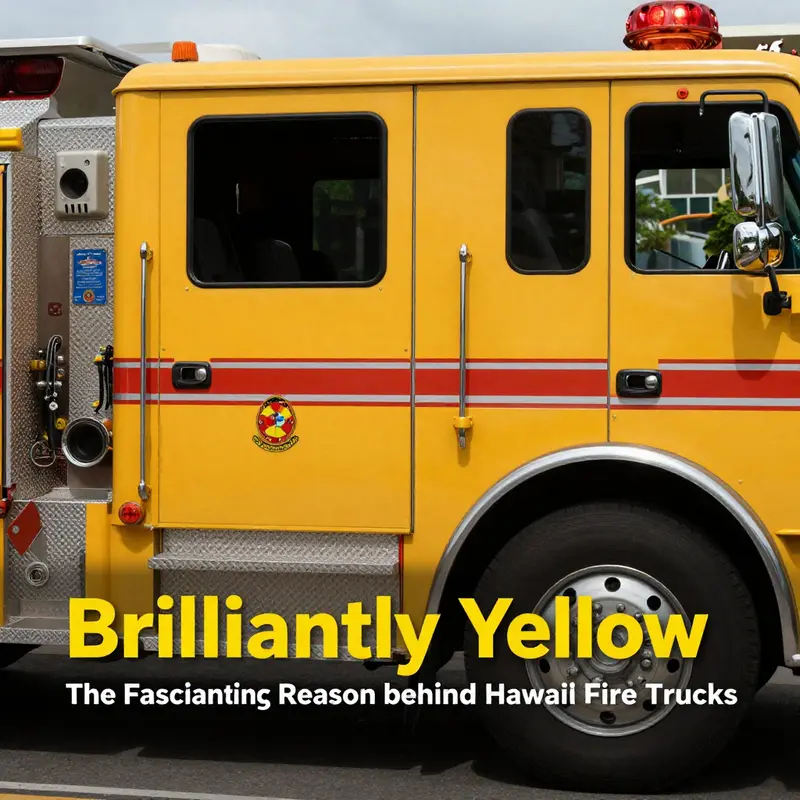
On the warm air of Hawaii, where trade winds ripple through palm fronds and the sun climbs steadily above the Pacific, emergency responders must rely on more than courage and training. They rely on visibility—of people, of paths, and of the vehicles that rush to scenes of emergency. In this environment, a color choice for fire apparatus becomes more than a design preference; it is a critical safety decision with measurable effects on how quickly help arrives and how safely it moves through crowded streets, coastal towns, and rain-slicked byways. Hawaii’s fire departments have long favored yellow, specifically lime-yellow or fluorescent yellow, for their fleet. The reasoning is straightforward in its logic and profound in consequence: a high-visibility color makes emergency vehicles easier to spot, and that easier spotting translates into faster recognition by other drivers and pedestrians, faster reaction times, and reduced risk for responders and the public alike. This is not merely a matter of aesthetics or tradition. It is a study in applied perception, weathered by decades of field usage and reinforced by contemporary safety standards that emphasize conspicuity as a foundational principle of emergency response. The islands’ distinctive climate—humid air that can blur edges, frequent downpours that lend a white veil to the horizon, and bright midday sun that can wash out less luminous tones—acts as a constant reminder that color is not cosmetic, but a tool. Yellow, in its lime and fluorescent forms, sits at the intersection of human visual sensitivity, practical maintenance, and public safety. It is a color that can glow in a spectrum where the human eye is most vigilant, and it does so in ways that matter when seconds separate danger from relief. The choice is thus an alignment of science, safety culture, and regional context, all converging on a single objective: making fire trucks easier to see so crews can reach those in peril more quickly and with fewer risks along the way. In telling this story, it is helpful to trace how color perception works, how environmental conditions shift what the eye notices, and how emergency services translate those insights into real-world practice without compromising other priorities such as durability, cost, and brand identity. The science of visibility rests on how the eye interprets light and contrast. Our eyes are built to pick out high-contrast signals against complex backdrops. In daytime, bright colors with strong chromatic contrast against asphalt, green vegetation, and blue water can register quickly even at distance. Under overcast skies, fog, or rain, the same chromatic qualities can fade unless the color sits within a band of wavelengths to which the human retina responds most readily. Lime-yellow, with its vivid hue that borders on green, tends to lie squarely within that band. It is not merely bright in the sense of intensity; it is bright in the perceptual sense, bridging the gap between raw luminance and perceptual salience. When you combine that chromatic advantage with modern reflective materials and strategic placement of retroreflective tape, the effect compounds. The result is a vehicle that doesn’t merely look conspicuous in broad daylight but remains recognizable at the edge of vision during dusk, under street lighting, and in the spray of a tropical downpour. The practical implications are not hypothetical. They show up in how a driver on a coastal road detects an oncoming apparatus earlier, how a pedestrian steps aside sooner, and how a responding crew is allowed to deploy with fewer near-misses on crowded highways and busy urban corridors alike. For the people of Hawaii, this translates into a tangible standard of safety that extends beyond the truck itself. It is about the public’s quick recognition of danger and the crew’s ability to maneuver with clarity in congested settings that include multi-lane highways, narrow residential streets, and the sometimes unpredictable maneuvers of vacation traffic in peak tourist seasons. The Hawaii context adds another layer to the story. The islands’ road networks traverse rugged coastlines, volcanic ridges, and dense neighborhoods where visibility is a moving target. In these settings, a color that stands out against a mosaic of blues, greens, and browns can reduce the cognitive load required to locate a vehicle in hours of daylight and in the dimmest moments of dawn or twilight. Yellow’s advantage does not erase the need for good lighting, reflective striping, or careful driving practices, but it does complement them. It offers a first, fast cue, a visual hook that cuts through the clutter of a busy, humid environment where other colors may blend into the backdrop of tropical scenery, weather, and urban color palettes. The choice in Hawaii also reflects a broader alignment with evolving safety standards that prioritize conspicuity in emergency response fleets. Across many jurisdictions, including those facing similar environmental challenges, experts advocate for colors and materials that maximize detection distances and reduce reaction times. Yellow occupies a central place in these guidelines because it reliably arrests attention under diverse conditions—from bright sun to rain-washed air, from fog to plume-like spray off the ocean. While no single regulation may specify an exact shade down to the nanometer, practitioners and safety officers increasingly converge on lime-yellow and fluorescent yellow as the most practical, evidence-based choice for emergency vehicles. The Hawaii story, then, is not simply about color preference; it is about implementing a scientifically grounded approach to public safety that recognizes how perception, weather, and human behavior interact on the road. This approach also reflects a pragmatic calibration of costs and benefits. Painting a fleet in a high-visibility color involves more than choosing a hue; it requires durable coatings that retain their chromatic integrity under ultraviolet exposure, humidity, and the wear and tear of frequent deployments. It demands consideration of how color interacts with equipment, matching tones with reflective materials, and balancing visibility with the need to maintain professional appearance and departmental identity. In tropical climates, the repaint cycle can be influenced by moisture ingress, salt air, and the abrasive effects of road debris. Yellow pigments must be paired with reliable topcoats and sealants that resist chalking and fading. In Hawaii, where the landscape can be lush and the scenery dramatic, the appearance of an emergency vehicle is part of a broader social script. The color signals not only urgency but a sense of approachability and safety. People often notice yellow trucks from a distance and respond with a reflex that is both rapid and calm. This is not just about fear response; it is about recognition and trust. A yellow vehicle is less likely to be mistaken for a non-emergency object in a cluttered travel lane or a residential street where parked cars, bikes, and pedestrians are common. That recognition supports smoother traffic flow and reduces the chances of misjudgments as an apparatus moves toward an incident that demands rapid action. The practical, on-the-ground benefits of yellow extend into the cadence of a typical Hawaiian response. When a call comes in, dispatchers rely on the clarity of the road environment to guide responders. A vehicle that is instantly identifiable helps other drivers to yield, creates a larger window for safe lane changes, and gives crews a higher margin for error when navigating unfamiliar neighborhoods or roads with limited street lighting. In a place where tourism adds a diverse mix of vehicles and pedestrians to the daily traffic, rapid recognition can be a matter of life and death. The yellow fleet thus becomes part of the public safety ecology, a visible commitment to reducing time to scene and minimizing exposure to danger. The choice is reinforced by demonstrations, field studies, and practical feedback from operators who train in varied tropical conditions. Operators note that lime-yellow remains conspicuous even as daylight shifts to the warm tones of late afternoon or recedes into the blue-gray palette of twilight. They observe that the color’s edge is not eroded by humidity in the same way as some cooler tones, which tend to lose their initial pop in a damp air mass. The color’s performance, then, is not merely a theoretical claim; it is a lived experience of crews who operate in the real world where perception, weather, and motion intersect. The narrative around Hawaii’s yellow fleets also touches on the broader culture of emergency response, where visibility integrates with training, command, and community relations. The color becomes a talking point in public information campaigns, a tangible example that safety standards can be translated into everyday practice. When residents and visitors pass a yellow fire truck on the highway, they gain a moment of awareness—an implicit reminder to slow down, share the road, and observe safety rules. In this light, the yellow choice supports not only the responders who rely on speed and precision but the public who must share the road with powerful, fast-moving emergency vehicles. It reinforces a culture of safety that begins with sight and extends into every decision that guides emergency response—from deployment planning to vehicle maintenance and incident command. For those who want to trace the practical research behind these conclusions, the case for yellow is supported by studies that examine detection distances, reaction times, and perceptual salience in varied lighting and weather conditions. These findings point to a robust pattern: brightness and color position in the spectrum that aligns with the eye’s peak sensitivity in the conditions most frequently encountered in Hawaii. The result is a fleet that remains legible, legible enough to prompt quick action and careful navigation from other road users, and legible enough to stay visible as it travels through the islands’ diverse landscapes—from the urban core of Honolulu to the rural byways winding along lava-strewn coastlines. The science and the practice converge on a single proposition: yellow is not a cosmetic ornament but a functional tool—one that is calibrated to the realities of the islands and to the universal demands of emergency response. For readers curious to explore further, a deeper dive into the research behind this decision is available in authoritative safety literature. You can consult a detailed exploration here: https://www.fireengineering.com/why-hawaii-fire-trucks-are-yellow/. To those who want to explore more about how such safety considerations are discussed and applied in day-to-day operations or to read related discussions and case studies, a broader perspective can be found in the Fire Truck Blog for ongoing insights and practical context, including topics on fleet management and visibility: firetruck.space/blog/. This chapter has traced a line from perceptual science to street-level practice, showing how a color can shape the tempo of an emergency response and, in doing so, reinforce the trust that communities place in their responders. The arc from light wavelengths to actual traffic behavior is not abstract; it is a concrete, everyday effect—one that helps Hawaii’s fire crews reach people in need more quickly and with a level of safety that reflects the islands’ unique blend of weather, terrain, and human activity.
null
null
Final thoughts
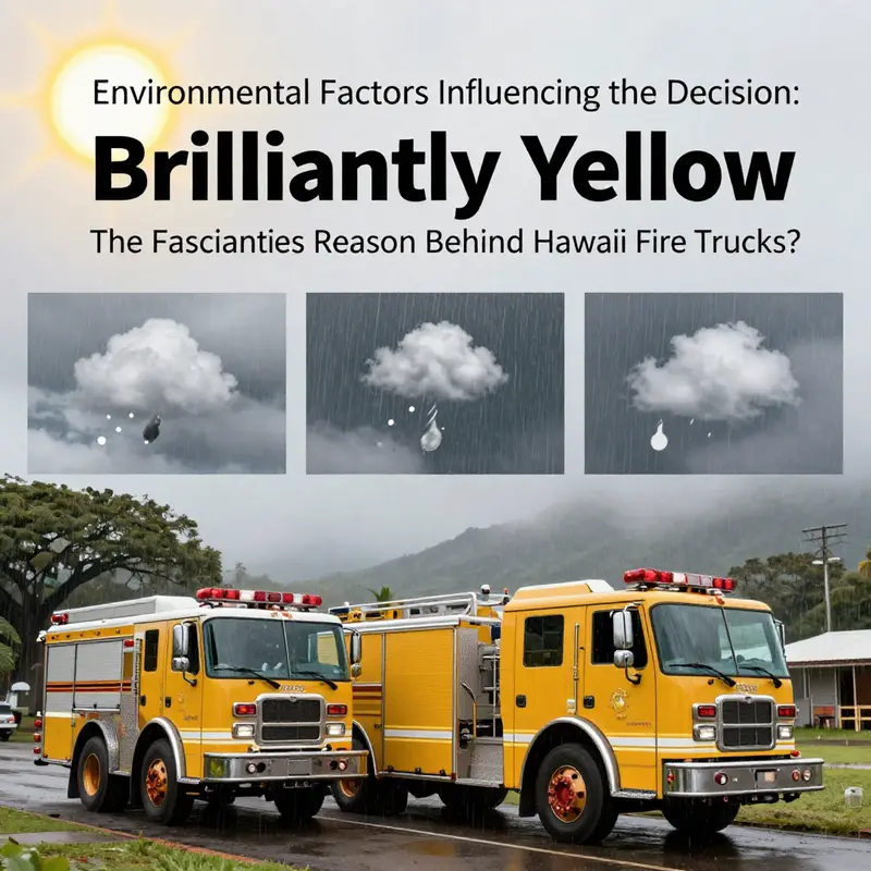
The choice of yellow for Hawaii fire trucks is much more than an aesthetic preference; it’s a calculated decision that bolsters visibility, enhances safety, and complies with stringent regulations tailored to the unique Hawaiian environment. As we’ve explored, visibility is not just a preference but a necessity in a locale subject to rain and fog, further reinforcing the critical role that color plays in emergency response. The dedication to public safety is evident in every bright yellow vehicle that ensures the community is safeguarded in emergencies. With its brilliant hue, Hawaii’s fire trucks continue to exemplify both function and commitment to safety.