
Fire trucks have long been synonymous with heroism and urgency, and their striking red hue instantly captures attention. But why are fire trucks predominantly red? Understanding this choice involves diving deep into a blend of history, practicality, and psychology. In our journey, we’ll uncover the historical perspectives that influenced this tradition, examine the practical considerations driving the choice of color, and dissect the psychological associations that red entails. Each chapter illuminates different facets of what has ultimately become a powerful symbol of firefighting and emergency response, solidifying the legacy of red fire trucks across the globe.
Why Fire Trucks Stay Red: A Rich Tapestry of History, Habit, and Public Perception
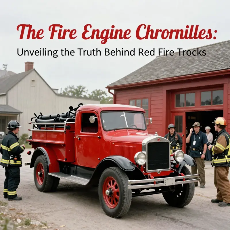
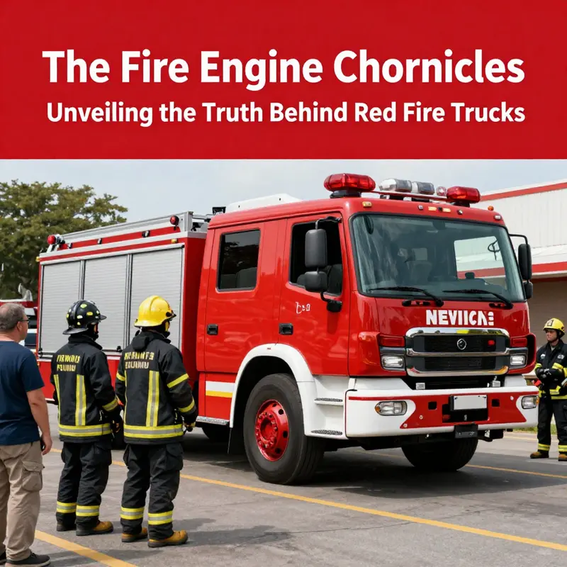
Color is never just a visual detail; it is a language fire departments use to speak to the streets, to reassure a frightened public, and to mark authority in a crowded urban landscape. The bright red that adorns fire apparatus is layered with meaning. It is a color that has traveled from shop floors to parade routes, from quiet town halls to the siren-lit hours of an emergency. The question of why these vehicles are red invites more than a single answer. It asks us to trace the lines where practicality, tradition, and social dynamics intersect. In that convergence lies a story that is less about optics and more about identity—how a color becomes a signal, how a signal becomes a symbol, and how a symbol helps a community respond to danger with speed, trust, and a shared sense of purpose. The red of fire trucks came to symbolize urgency not merely because red evokes alarm in the brain, but because communities year after year chose it, painted it, and carried it into the future through parades, blazingly visible during drills, and on the edges of real emergencies where visibility and reassurance mingle.\n\nLong before modern color science hardened the case for lime-yellow or fluorescent orange as the easiest color to notice under certain lighting, the early 20th century homeland of many fire departments saw a different logic at work. In that era, the streets were becoming a gallery of rapid change. A prevailing belief took hold that if a vehicle could stand out against a sea of moving metal—against a landscape that was increasingly filled with chrome, glass, and black paint—a bright hue would catch the eye more readily than a muted one. This was not primarily a study in experimental visibility; it was a practical, almost anthropological choice. The roads of the era contained many black automobiles that had become the standard due to production efficiency and the drying time of paint. Into this environment, many fire departments decided to paint their apparatus in a color that would punch through the visual clutter. Red, with its high contrast against greys and silvers of chrome and stone, offered a stark, unmistakable silhouette. In this way, a folklore-like narrative began to take shape—one that would be repeated, reshaped, and retold for generations: the red fire truck is not just easier to spot, it is a declaration that help is on the way. Yet historians today remind us to treat that tale with nuance. The line between folklore and fact is not always clean, and the most robust explanations are often those grounded in material reality rather than popular myth.\n\nA more substantiated, if less dramatic, thread runs through the material constraints of the era. In the 1920s and 1930s, red paint emerged as a practical choice because it offered a durable coating for metal surfaces at a time when paint technology and supply chains were still developing. Fire apparatus built on chassis supplied by a range of manufacturers could be finished quickly with red pigments that were affordable and reliably available. The economics of the palette mattered as much as the psychology of perception. Departments had to consider not only the initial purchase price but the longevity of the coating through exposure to road grime, weather, and the rough life of firefighting work. Red paint, for many towns and volunteer brigades, answered those demands with a straightforward efficiency. What began as a practical decision in a handful of departments gradually spread by example and visibility. As neighboring towns looked on and saw their peers with red rigs, the color became a standard by tacit consensus, a shared language of readiness that did not require explicit directions to be followed.\n\nThat shared language took on social textures as well. In the United States and beyond, volunteer fire companies often competed for prestige and public recognition. A bright red apparatus could symbolize strength, readiness, and pride during parades, drills, and public demonstrations. Communities watched and learned, and the color red came to be associated with the very idea of municipal service and emergency response. As these communities extended across regional lines, the practice hardened into convention. It is not an accident that Cincinnati’s early professional fire brigade is frequently cited as a milestone in red adoption; that city’s commitment to a bold color helped set a precedent that rippled outward to neighboring towns and across the nation. The symbolism grew robust enough to outlive the practicalities of early paint chemistry, turning red into a cultural marker that signaled authority and accountability.\n\nYet the story does not end with tradition alone. Modern research in visibility and recognition has complicated the once-unquestioned assumption that red is the easiest color to spot. Studies across safety organizations have suggested that colors lying in the yellow-green range, including lime-yellow and fluorescent orange, can be detected more quickly under a range of conditions. The advantage tends to be most pronounced in fog, at dawn or dusk, and along busy, cluttered streets where the human eye must parse rapidly changing scenes. The difference can be substantial, with some findings indicating that these hues are spotted up to roughly a third faster than red under certain circumstances. This is not to indict red as a failure; rather, it reveals a tension between empirical visibility and enduring tradition. Fire departments are not simply adjusting their palettes to chase the newest scientific insight; they balance a constellation of priorities: the maintenance of an identity that communities recognize and trust, the practicalities of equipment procurement and upkeep, and the shifting realities of road design, urban density, and pedestrian behavior.\n\nThe tension between evidence and emblem is perhaps most visible in daily operations, where color is one of many cues a first responder uses to navigate a chaotic scene. Red continues to convey urgency and danger, a signal the public has grown to associate with imminent action. It also carries a level of cultural resonance that transcends the mechanics of visibility. When a fire engine arrives in red, a familiar script unfolds in the mind of a bystander: someone in need is about to receive help, and the team is ready to act. That script, built through repeated exposure to red apparatus in drills, emergencies, and television narratives, reinforces the social contract between responders and communities. The color becomes part of the language of trust, a visual shorthand that translates into faster bystander cooperation, clearer lane positioning when vehicles are in motion, and an instinctive sense of safety born of a shared, recognizable sign.\n\nEven as science has opened the door to alternative palettes, the persistence of red is reinforced by institutional memory and brand identity. Fire departments vary widely in their purchasing practices, maintenance budgets, and public-facing communications. For many, the color red has become a brand signal—a shorthand for durability, reliability, and the long arc of service. It is a color that signals to residents and visitors alike that the people who arrive are prepared, trained, and ready to do difficult work. The symbolism extends into the cultural ritual of firefighting, where anniversaries, memorials, and community open houses often foreground the red-painted apparatus as protagonists in stories of courage and resilience. In this way, red endures not only because of its material durability or its ability to capture attention in a broad daylight context but because it carries a repository of communal meanings.\n\nThere is also the practical dimension of maintenance and logistics that reinforces the status quo. Fire engines travel far and wide, crossing jurisdictions and climates. The process of repainting, inspecting, and maintaining a fleet demands a color that can withstand harsh weather, road spray, and repeated washing without fading or peeling in visible ways. Red has, for many fleets, proven to be a robust choice in this regard, a hard-wearing shade that holds steady under the strain of daily use and long-term exposure. The story of the color thus intersects with the story of the people who keep the fire service running—the mechanics, the paramedics, the field supervisors, and the municipal procurement officers who must balance aesthetics with function. Each of them understands that color is not merely paint; it is a thread that ties equipment to readiness, to public perception, and to the memory of those who depend on the service.\n\nIn an era when digital dashboards, advanced lighting, and radio communications shape response strategies, the role of color remains both practical and symbolic. Some departments experiment with small, strategic variations—keeping a predominantly red fleet but incorporating white roof panels for improved daytime reflectivity or adding lime accents on particular models for enhanced nighttime visibility. These adjustments illustrate a broader principle: change is possible, even when tradition remains strong. The conversation around color is ultimately a conversation about balance—between old wisdom and new evidence, between the comfort of a familiar signal and the demands of a changing, more technically complex urban environment. It is a conversation that continues to unfold in firehouses, town halls, garages, and on the pages of historical discourse about public safety.\n\nFor readers who are curious about how this history translates into today’s market, the current marketplace for fire apparatus demonstrates the ongoing tension between heritage and practicality. The market features a spectrum of choices, with some buyers leaning into the time-tested red and others exploring options that optimize detectability in modern traffic ecosystems. If you are exploring these dynamics in more concrete terms, you can browse the broader market for current equipment at fire-trucks-for-sale, where you will encounter an assortment of configurations and color schemes that reflect both tradition and adaptation. This juxtaposition—heritage on one side, evidence-informed practice on the other—shows how deeply rooted color can be in the identity of firefighting while still leaving room for evidence-led refinements. The color story of fire trucks, then, is not a simple tale of optics; it is a narrative about how communities tell themselves who they are and how they respond when danger arrives.\n\nAs this chapter weaves together the threads of history, materiality, and perception, it becomes clear that the popularity of red in fire apparatus is less a solitary scientific inevitability than a layered social achievement. It is a color that has traveled from the workshop to the street, from the parade ground to the emergency scene, and from local pride to a national myth about readiness and rescue. The enduring question—why red rather than some other high-visibility alternative—remains a composite answer: tradition, practicality, and the social contract combine to keep red in service. The story does not diminish the importance of modern visibility research; rather, it situates that research within a broader social enterprise that values trust, community identity, and the reassurance that the public expects when the first responders appear in red. In that sense, red has become more than a color. It is a cultural instrument that helps a city, a town, or a neighborhood feel protected, connected, and confident that help is on the way.\n\nFor readers seeking further context on how this topic has been framed in contemporary scholarship and journalism, a well-researched overview traces the evolution of fire truck color from practical beginnings to cultural symbol, highlighting the complexity of the issue and the ways in which color intersects with visibility, psychology, and public perception. The Guardian’s exploration offers a nuanced account of the real-world dynamics behind the red tradition and how modern findings fit within that historical tapestry. External reading: https://www.theguardian.com/world/2026/jan/21/why-are-fire-trucks-red-the-real-answer
null
null
Red, Ready, and Readable: The Psychology, History, and Visibility of Fire Apparatus
Color is not merely a coat of paint on a fire engine; it is a language that travels faster than the siren and through the memory of a city. The question of why fire trucks are red has often been tied to tradition, practicality, and urgency. To understand why red endures, we trace how color is perceived in moments of action and how institutions translate danger into a recognizable silhouette on busy streets. The narrative begins with practical choices that made sense in crowded urban environments, where durability, cost, and visibility mattered as much as legends about heroic color. It continues through a cultural arc in which red becomes a badge of authority and a signal that an emergency is present. In modern cities, visibility has become more nuanced with lights and reflective materials, changing how quickly drivers yield or move aside. The color remains a centerpiece because it carries expectations about urgency, safety, and service.
The first thread in this tapestry is psychology. Red has long been associated with arousal and attention across many species, including humans. In moments of danger or social peak, red seems to intensify perception, focusing the gaze and quickening decision times in the brain. This is not about a single study or a single theory; it is a recurring pattern across research in color perception and emotion. Red can act like a prompt, a visual shortcut that says, pay attention now, which matters when a vehicle is racing toward a crosswalk or through a congested intersection. In color psychology, red carries a sense of dominance and immediacy. When a driver sees a red vehicle bearing down, the instinctual brain lights up with a cue that action is required, and quickly. That sense of urgency travels in tandem with social signals—red is a mark of authority, a flag that something important is happening and that those involved should respond with alertness and respect.
This psychological frame sits alongside a historical pattern in which red took hold as a standard color for emergency service vehicles. City fire departments in the United States began painting their apparatus in red as a symbol of their distinctive role in urban life. The public learns institutions by their colors as much as by their badges and helmets. Over time, red became synonymous with fire response, a cultural shorthand that signals both identity and urgency. This cultural resonance matters because it reinforces trust and recognition. People come to expect a certain hue when danger is near, and that expectation can translate into faster responses from bystanders and motorists alike. The gravity of red is not merely about perception but about how that perception informs behavior in moments when milliseconds count.
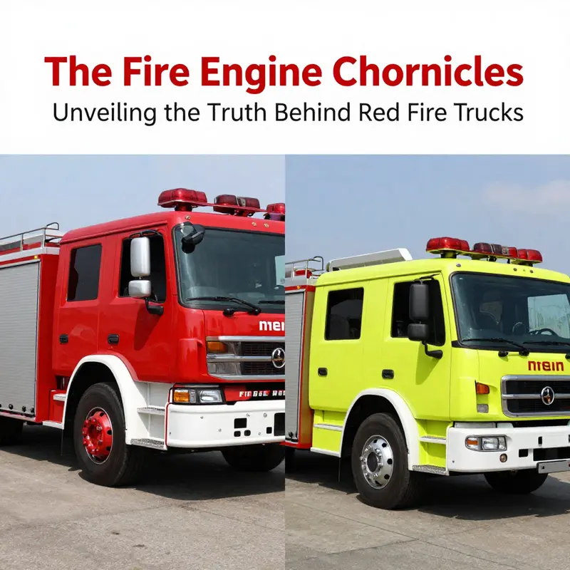
Of course, perception is not purely static. The visual system has limits, especially under challenging lighting conditions. In broad daylight, red can command attention on many backgrounds, but it is not always the most conspicuous color. The eye is most sensitive around 555 nanometers, in the yellow-green part of the spectrum, where visibility can be higher in fog, at dawn, or at dusk. In those conditions, lime-yellow or fluorescent orange can be spotted more readily than red. This is not a theoretical footnote but a practical design consideration. Some fire departments have incorporated brighter lime-yellow accents or reflective materials to improve conspicuity while preserving the traditional red identity.
Yet the persistence of red in the public imagination is powerful. It is reinforced by historical precedent and brand recognition. When a city’s streets light up at night and the red silhouette of a fire truck glides into view, there is a ceremonial recognition: this is an entity prepared to help. This symbolism matters for road safety as much as night safety. People slow down, yield, and make space, not merely because red is visually conspicuous but because it is a familiar cue tied to trained responses. In that sense, red has become a social contract, a durable signal that has weathered changes in vehicle technology, urban design, and public perception.
Where does modernization fit in? Red remains a dominant color not because it is the single most visible hue in every scenario but because it carries a bundle of advantages that extend beyond the purely physical. In daily life, a red fire engine signals authority and purpose without needing to broadcast every detail of its mission. The language of color is economical: it reduces ambiguity in high-stress moments, enabling people to respond quickly, predictably, and with less cognitive load. That is a practical advantage in a world where drivers may be distracted and weather can complicate perception.
The broader story connects color to lighting systems, reflective materials, and the predictable rhythm of an emergency vehicle’s approach. Sirens and lights have become almost as important as paint for grabbing attention. The public learns to interpret these cues in a layered way: color signals intent, lights convey urgency, and the overall presence signals the proximity of assistance. To understand why red endures, see it as part of a broader design philosophy—one where simplicity, tradition, and empirical testing converge in the street, where people make split-second choices about safety and space. The red fire engine stands as a case study in how culture negotiates risk and response through a single, striking color that travels through time and urban growth.
Final thoughts
The vivid color of fire trucks serves not only as a visual marker but embodies a rich tradition forged through history, practical choices, and psychological perceptions. Red may not be the most visible color in the light spectrum, yet it remains the emblematic choice for fire services, symbolizing authority, urgency, and readiness. This enduring legacy speaks to the heart of firefighting culture, uniting generations of fire professionals, enthusiasts, and the public’s expectations about what it means to respond to emergencies. As we continue to honor this tradition, it’s vital to balance historical context with modern advances in visibility and safety, ensuring our heroes in red remain effective on the front lines.