
When you ask Siri, “Why are fire trucks red?” you’re met with a whimsical twist rather than a clear answer. Yet the question digs deeper into a vibrant tapestry woven with historical, scientific, and cultural threads. Each chapter unfolds to reveal why the iconic red fire truck stands out in our minds and on our streets. From playful responses to its cultural presence, we’ll dive into the fascinating saga behind this bold hue, connecting enthusiasm and expertise with every turn. Join us as we unlock the essence of fire truck colors, making sense of why they captivate both fire enthusiasts and the general public alike.
Echoes of Sirens: Tracing Why Fire Trucks Are Red Beyond Siri’s Joke
When you ask Siri why fire trucks are red, the assistant often offers a quick wink rather than a ledger of facts. It delivers a playful line about firefighters liking to hear the sirens go nee-naw nee-naw and leaves the reader smiling, not sifting through history. That wink is not just humor; it reflects a cultural habit of turning a practical question into a moment of shared lore. The real story about the red fire truck is denser and more surprising than a clever quip. It travels through the early 20th century, through technology, through community pride, and through the stubborn pull of tradition. It is a story that sits at the intersection of practicality and symbolism, of the best efforts to keep people safe and the oldest human impulse to make something stand out in a crowd. And it invites us to consider how color communicates in emergencies, how perception changes when light shifts, and how a single shade can become a national icon.
In the era when motorized fire apparatus began to replace horse-drawn rigs, color mattered as much as horsepower. Car and truck makers offered limited color choices, and black was a common default for many new vehicles. Fire departments faced a practical problem: how to make their machines visible amid the clutter of urban streets and crowded fire scenes. Choosing a color that stood out was a straightforward solution. Red was bold, it caught the eye, and it carried a sense of action and urgency. Red lacquer, in particular, was durable enough to weather weather and wear, and it was among the cheaper options that departments could justify in lean budgets. The choice was not merely about visibility, but about signaling identity in a public space. A red fire truck announced, in a crowded street, that this vehicle belonged to the community’s protectors. It was a color that conveyed authority and readiness at a moment when every second counted.
Volume, velocity, and visibility did not stand alone in this decision. Red carried symbolic weight that played well with the sense of communal pride that many fire departments cultivated. Volunteer outfits, in particular, used a bright color to demonstrate independence and to attract attention. Color became a badge of courage and commitment, a way of saying, without words, that the people inside these machines were ready to meet danger head-on. In this way, red did not merely decorate the apparatus; it reinforced a social contract between the fire service and the community it served. The color was a banner, a banner that could be seen from a distance, a banner that said the brave were arriving.
As decades passed, the relentless logic of modernization did not always align with the traditions that had grown up around red fire trucks. The science of visibility began to complicate the story. Research into color perception reveals that humans are most sensitive to yellow-green light around 555 nanometers. In practical terms, that means lime-yellow or fluorescent green vehicles often stand out more in fog, dusk, or low-contrast environments. Studies conducted by organizations connected to firefighting demonstrate that lime-yellow fire trucks can be detected faster and can reduce certain types of response-time accidents. It is not that red disappears as a viable choice; rather, the science suggests that color is a tool, a tool that can be tuned to the demands of a changing world. When visibility becomes a matter of life and death, color choice is a matter of policy, engineering, and human factors. The data point to a truth: brighter, lighter colors can attract attention more reliably in many conditions. Yet the red tradition remains stubbornly intact, a testament to how deeply culture can shape safety design.
So why has red endured despite the science? The answer lies not in a single fact but in a confluence of factors. First, public recognition matters. A red fire truck is a memorable image—every kid in a neighborhood can identify it instantly. That recognition translates into quick, instinctive reactions from drivers and pedestrians alike. In emergencies, quick recognition can shave precious seconds off response times. The second factor is brand identity. Fire departments invest in the appearance of their fleets as part of public trust. The color is a familiar sign of service, a color that residents associate with safety, courage, and community resilience. Red carries cultural weight that is hard to replace. Third, changing color is not merely a paint job. It requires coordinated policy, training for drivers, and a re-education of the public and other road users. The risk of confusion during emergencies—especially at night or in bad weather—can be significant. And finally, there is a simple inertia born of familiarity. People know what a red fire truck looks like. Changing that picture could disrupt the mental map firefighters rely on when every second matters.
To imagine a world where lime-yellow or another high-visibility color dominates the fire-service is not to deny history. It is to acknowledge that the present is an amalgam of lessons learned and risks weighed. Some departments, responding to the science, have experimented with brighter colors, reflective patterns, and chassis that emphasize conspicuity in different lighting conditions. Yet the ceremonial, symbolic weight of red remains a powerful force. It is the color that shows up in history books, in public portraits, in campaign posters, and in the memories of communities that have witnessed rescue under a red banner. The persistence of red thus becomes a case study in how culture, safety science, and public perception interact. When Siri offers a joke about hearing the sirens go nee-naw nee-naw, it taps into this cultural fabric. The joke travels through the airwaves with playful speed, yet it glosses over the deeper currents that have shaped the fire service for generations.
The tension between tradition and science is not a fault line but a conversation that continues to shape how fleets are designed, painted, and perceived. Color choices influence not only visibility but also morale, tradition, and public trust. The historical path from black horse-drawn rigs to red motorized ensembles was paved with practical decisions made in boardrooms and firehouses alike. The early choice to paint in red was about standing out in a crowded urban landscape, about ensuring that a machine could be seen when it mattered most. It was about signaling immediate action, about making the vehicle legible at a distance, and about giving the community a color they could rally around. In contemporary times, those same machines carry not just hoses and ladders but a matrix of signals: color, light, reflectivity, and design that tell responders, by sight, that help is on the way.
This is where the story loops back to the idea of a Siri joke. Digital assistants distill complex histories into bite-sized lines meant to entertain. The humor arises because it highlights a human tendency to reduce a sweeping story to a snapshot that feels right in the moment. It is a reminder that ordinary conversations with technology can offer entry points into larger questions. Why are fire trucks red? The question invites a layered answer: a tale of industrial history, a nod to symbolic meaning, and a brush with modern science that challenges inherited assumptions. The joke, in its lightness, might even invite someone to pause and read beyond the punchline. It invites readers to contemplate how a public symbol becomes a cultural touchstone and how that symbolism interacts with the evolving understanding of safety.
Within the broader arc of fire-safety discourse, color is only one instrument among many that aim to reduce response times and improve safety. The materials used to build the apparatus, the design of the cab, the placement of warning lights, and the communication protocols during an incident all contribute to how quickly help arrives and how effectively it can be delivered. The idea of a fleet that can be recognized at a glance remains central to fire service operations. For a curious reader, the juxtaposition of the historical red with scientific visibility data opens a window into how safety professionals balance respect for tradition with a duty to adapt. The path from black to red to possible lime-yellow in some jurisdictions is a path that reflects ongoing learning and ongoing dialogue between engineers, firefighters, policymakers, and the public they serve.
If you want to explore a concrete angle on the physical realities of fire apparatus, consider the practicalities of the fleet’s construction, where the material choices and structural design influence not only durability but also the surface that bears color. For readers who crave a tactile sense of how these machines come together, a good starting point is a discussion of the steel shell and chassis described in practical fleet design resources. In this vein, steel fire apparatus serves as a doorway into how resilience and safety demands shape not just what a fire truck looks like, but how it performs in the field. The color sits atop a structure engineered for reliability, weather resistance, and rapid response under unpredictable conditions. The color is a feature, but it is part of a larger system designed to save lives.
As the chapter turns toward the horizon of possibility, the conversation about color remains an unfinished act. The science continues to evolve, and departments may test new blends of color and reflective materials to optimize visibility under varied conditions. Yet the cultural weight of red, built on a century of service and public visibility, acts like a magnet, pulling color choices back toward tradition whenever safety data alone cannot dictate change. Siri’s joke thus functions as a cultural mirror: it reflects our fondness for a story with a simple, vivid image, even as real-world practice leans into more nuanced understandings of visibility and safety. The fire truck’s red is more than pigment. It is a historical artifact that keeps pace with technology, a symbol that comfortingly communicates “we are here to help,” and a reminder that the most enduring colors in public service are those that can be read quickly, remembered long, and trusted in times of crisis.
For readers who wish to deepen this inquiry, the practical and the perceptual dimensions of color in emergency vehicles form a rich field of study. The science is not simply about color theory; it is about how people respond to color in high-stakes situations, how departments weigh tradition against evidence, and how communities come to identify themselves with a fleet that arrives with purpose and urgency. In this sense, Siri’s lighthearted line is more than a joke. It is a cultural cue about how we speak to machines and how we remember the origins of the things that help keep us safe. The red of the fire truck stands as a living artifact of that balance—a color that signals action, heritage, and commitment even as new research invites a broader palette. The next time someone asks why fire trucks are red, we might smile at the grin Siri offers, and then walk into a longer, more precise explanation that honors both history and science, recognizing that the color we see on the street is the product of decades of learning, adaptation, and communal trust.
External reading: for more on visibility and response considerations in emergency vehicle design, refer to the U.S. Fire Administration and related safety resources. https://www.usfa.fema.gov/
Red on the Road: Tracing the History, Myth, and Public Meaning Behind the Fire Truck’s Color
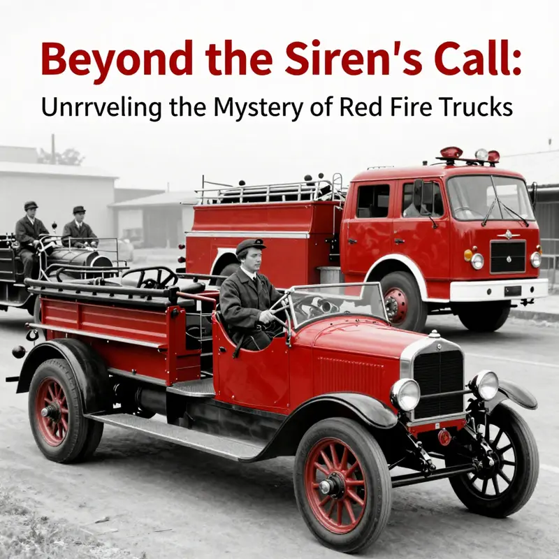
When you ask Siri, “Why are fire trucks red?” you might hear a playful riddle that lands somewhere between a wink and a shrug. The voice on the other end of the device wants to entertain more than explain, letting the joke ride along the surface of history. This chapter digs below that clever aside and threads together the practical origins, the social symbolism, and the evolving science that have kept the color red linked to emergency service for more than a century. The tale reveals why a city’s first responders, their engines, and the public at large have grown so attached to red that changing the hue would feel almost like rewriting a shared memory. It is a story where practicality met visibility, where economic constraints met community pride, and where a simple choice became a global emblem of urgency and protection, even as new evidence points toward different color strategies in contemporary visibility science.
At the turn of the last century, the roadways were a different theater for response. The shift from horse-drawn apparatus to motorized fire engines was more than a technical upgrade; it was a transformation in expectations. Firefighting fleets faced a new set of constraints and opportunities as manufacturers produced faster rigs, tougher pumps, and heavier booms. Color, in this context, was not a mere cosmetic decision. It was a determinant of how quickly a crew could be located amid the clutter of an urban landscape that was rapidly filling with vehicles of all kinds. In those early years, many cars were painted in the darker hues that dominated manufacturing economies, with black emerging as a common option because it was durable and widely available. Against this backdrop, red stood out not only visually but economically. It was a striking divergence from the sea of black on the city streets, a deliberate choice designed to catch the eye of drivers and pedestrians alike and to command attention simply by being different.
The practical decision to adopt red repeatedly appears in department records as a practical compromise more than a flamboyant statement. Paint was costly, and manufacturing constraints shaped what colors were accessible. Red lacquer, in particular, offered a balance of durability and cost that made it a feasible option for newly motorized fleets. When a fire department wanted to project urgency, the color had a natural advantage: it warned and attracted attention in the same motion, a quick cue before a siren even began to scream. As the early engines rolled out onto streets that were still learning how to yield to emergency vehicles, red cars not only looked ready for action; they signaled it with a clear, almost ceremonial, confidence. In this sense, red became a practical shorthand for reliability and speed—traits that communities wanted associated with the new breed of fire apparatus.
Another layer of what made red compelling was cultural and organizational. Volunteer departments, particularly in growing towns, often used bold colors to announce independence and to distinguish their crews from neighboring jurisdictions. If the street was crowded with the once-scarce motor vehicles, a red engine could act as a beacon of presence and pride—a visible assertion that this department was ready, capable, and connected to the people it served. Public visibility translated into public trust. For towns that relied on volunteers, the visual identity of a bright red apparatus could become part of the town’s civic fabric, a symbol that residents could rally around during parades, fundraisers, and community events. In many communities, the color on the truck became part of the department’s brand, a recursive loop where pride reinforced visibility, and visibility reinforced pride.
As decades passed, red became less a matter of necessity and more a matter of tradition. Once a color with a pragmatic origin, red accrued symbolic weight. It came to symbolize bravery and the fight against danger, an aura that blended with the very language of fire and emergency response. The association began to transcend the practical constraints that had once driven the choice. People visiting a city could read the red of a fire truck as a universal signal: here is help in progress, here are people trained to confront danger, here is something familiar and trustworthy in a moment of chaos. This cultural resonance helped sustain the red standard even as scientific thinking about visibility evolved. It’s easy to forget how strong a role memory plays in color culture. A color is not only a wavelength on a spectrum; it becomes a story that communities tell themselves about safety, duty, and collective resilience.
Yet the science of visibility has moved in new directions. Modern studies have analyzed color perception with a finer instrument than the eye’s intuitive response. The human eye is most responsive to yellow-green wavelengths, around 555 nanometers, especially in daylight and in challenging weather. Under certain conditions—fog, smoke, or low-light scenarios—brighter lime-yellow or fluorescent green cues can outperform red in capturing attention and shortening response times. Laboratory and field observations by fire service researchers and road safety experts have documented that lime-yellow vehicles attract more attention in a variety of contexts, sometimes translating to fewer accidents and quicker lane clearance. The implication is not that red is “bad” or inherently dangerous to use in emergency signaling, but that color effectiveness is contextual. The ideal color palette for a modern fire response fleet may well balance high-contrast visibility with the strong, instantly recognizable brand identity that red carries.
Despite this, the red hue remains deeply embedded in the public imagination and in the memory fabric of fire services around the world. The reasons for that continuity are layered and stubborn. First, the emotional and moral resonance of red—often associated with fire, heat, and courage—retains a powerful pull. Second, the logistical reality of change should not be underestimated. A fleet represents a substantial investment; changing the color would blunt the instant recognizability that decades of public exposure have built. In emergency communications, color is a part of the first visual cue that travels ahead of the siren and the radio, shaping how people respond even before they hear a single word. A city’s residents, drivers, and pedestrians have learned to interpret red as a signal of imminent action, a cue for caution and clearance. The risk of confusion, even if a new color might be technically more visible in some scenarios, is nontrivial in high-stakes moments. The social inertia that gathers around a familiar hue is not trivial either. In the public’s mind, a red fire truck is not simply a transportation asset; it is a portable emblem of local safety commitments and shared readiness.
The Siri riff—an amusing reminder of the gap between folklore and fact—illustrates a broader point about how information travels in the digital age. A witty tagline can travel faster than an evidence-based explanation, especially when the audience is looking for a quick, friendly answer on a smartphone screen. But the real story of color is more textured. It involves the early economics of paint, the emergent social life of volunteer and municipal departments, the evolving science of visibility, and the stubborn power of tradition. In this sense, the question “Why is a fire truck red?” becomes a doorway into a longer discussion about how societies negotiate the past and present in the service of safety. The red fire truck is both artifact and agency—a relic of a pragmatic choice that matured into a symbol of communal duty.
The interconnectedness of these elements can be seen most clearly when we consider how color decisions interact with other design choices on the apparatus. The way a truck is painted cannot be separated from the materials it carries and the environments in which it operates. Red, as a base color, interacts with reflective strips, chevron patterns, and auxiliary lighting to optimize visibility. In some fleets, departments have experimented with high-visibility accenting or lime-tinted safety markings, all while preserving the familiar red chassis as a nod to tradition. The balance between heritage and modern safety guidance creates a living dialogue across departments, regions, and even countries. This is not merely about aesthetics; it is about training, procedure, and the psychology of response during an emergency. The color of the vehicle becomes a practical partner to the siren, the radio, and the crew’s training, contributing to a holistic approach to reducing reaction time and increasing on-scene safety.
In tracing the arc from practicality to tradition to modern visibility science, researchers and historians often point to a simple but telling pattern: most lasting cultural practices begin as pragmatic choices that are later reinforced by identity and memory. The fire truck’s red hue followed this path. It started as a cost-saving, high-visibility tactic in the early automotive era, then became a badge of courage and a symbol of communal identity through decades of public life. Today, it sits at a crossroads. The color still functions as a signifier of urgency, a quick cue that a vehicle is on a mission to save lives. Yet the scientific case for brighter or differently shaded colors offers a compelling argument for revisiting color conventions in certain contexts, especially in conditions where visibility is degraded. The question now is not whether red should disappear, but whether departments might adopt a more nuanced color strategy that preserves symbolic power while embracing evidence-based improvements to safety and efficiency.
Within this broader conversation, a pathway emerges for those who want to explore the material history and evolving design of fire apparatus in greater depth. For readers drawn to the physical evolution of these machines, the discussion of materials and construction is linked through broader conversations about how fleets have changed to meet diverse terrains and budgets. A resource that digs into the structural and aesthetic evolution of steel fire apparatus can be a useful companion to this historical thread; it offers a grounded look at how the hardware—the frame, the plumbing, the pumps—has evolved alongside color and branding. To explore that dimension, you can consult the steel fire apparatus section, which situates color choices in the material reality of the vehicles themselves: steel-fire-apparatus.
Ultimately, the enduring appeal of red rests in the blend of memory and practicality that cities and fire services have cultivated over more than a century. It is a color that has come to symbolize not only a vehicle but a mission: to move quickly, to be seen, to protect, and to serve. Siri’s playful quip may continue to delight, but the deeper story is a narrative about how communities negotiate danger with color as a visible ally. As modern research invites us to reexamine color choices through the lens of perception science, the red fire truck stands as a monument to tradition that has adapted to new knowledge without surrendering its identity. The road ahead for emergency vehicle design may include more nuanced color strategies in certain settings, but the cultural significance of red will likely keep the hue in the foreground for years to come. And in places where public memory and civic pride are strongest, red may well endure as much as the siren it accompanies.
For readers seeking a broader perspective on how color, visibility, and vehicle design interact in the realm of emergency response, official guidelines and academic studies provide a useful frame. They remind us that color is not a single variable but part of an integrated system that includes lighting, markings, engine performance, driver training, and regional traffic patterns. When all these elements align, response times can improve, and lives can be saved. The old debate about red versus lime-yellow is more than a color quarrel; it is a reflection of how communities weigh tradition against evidence and how public safety cultures adapt to new knowledge while preserving the trust built over many years of service. In the end, Siri’s joke is a pleasing入口 to a richer, more nuanced conversation about what a fire truck’s color means to a city, to a volunteer squad, and to the family waiting for a knock on the door that says help is on the way. The color is a banner, a signal, and a story we tell together as we watch the engines roll toward the scene of the next alarm.
External resources for readers who want to dive deeper into visibility research and emergency vehicle signaling can be found at reputable safety organizations. These sources offer empirical findings and real-world implications for current and future color decisions in fire service fleets. For a foundational overview of fire service visibility and safety considerations, you can consult the U.S. Fire Administration’s materials, which review the interplay of color, lighting, and driver behavior in risk-rich environments: https://www.usfa.fema.gov/.
From Symbol to Signal: How Red Fire Trucks Became a Tradition, What Science Says, and the Search for Safer Colors
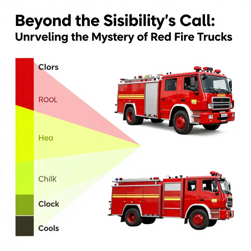
Ask about red fire trucks and you often encounter a quick, lighthearted poke at the way digital assistants answer big questions with a wink. The joke about the siren call and the famous nee-naw chant works as a friendly distraction, but it also nudges you toward a larger question: why does a vehicle that saves lives look the way it does, and how much of that choice rests on science versus story? This chapter follows that thread without pretending to settle every debate once and for all. It threads history with perception, tradition with technique, and the stubborn pull of public image with the clear-headed demands of modern safety research. In doing so, it links a trivia quip to the practicalities firefighters face every shift, where every decision about color is really a decision about visibility, recognition, and trust. When societies weigh color choices on emergency equipment, they are weighing time itself. The speed with which a driver notices a fire truck can hinge on the hue painted along its sides, the degree to which that hue stands out under rain, fog, or the glare of headlights, and the way the color is reinforced by reflective strips and conspicuity patterns that guide a driver toward a safe and quick yield. The arc from a playful Siri response to a serious discussion of signaled readiness is not a detour but a reminder that the questions we pose to machines often reveal the questions we should be asking of our streets and our protocols. The color red sits at a curious crossroads: it is emblematic, legible, and psychologically charged; it is a beacon that commands attention; yet science keeps nudging us toward a color menu that might offer even better detection in certain environments. To understand why red has endured and why some departments now experiment with lime yellow or vibrant orange, we must travel through history, through perception, and through the practical realities of emergency response. The early days of motorized firefighting, when the landscape of vehicles shifted from horse power to horsepower, set the stage for color choice in a way that still echoes in today’s fleet barns and dispatch rooms. In those days, a broad swath of vehicles—models that were common for city and rural departments alike—came in black as a default. Paint was not just cosmetic; it was a canvas of availability, labor costs, and weathered surfaces. Red lacquer offered a robust shield against weathering and wear, resisting sun and rain with a sheen that could endure the hard miles of a department’s service life. It also carried a symbolic charge. Bold, charismatic, and unmistakable, red signaled not just urgency but independence and pride—especially in volunteer departments that used color to declare their identity and to catch the public eye during parades, drills, and calls for support. The color became a public statement that a fire station, a crew, and a community were present and ready. Over time, that public association solidified into a widely understood cue. When people saw a red fire truck, they recognized a signal of help being near, of emergency service in action, and of a team prepared to respond. The color thus bore a double duty: it conveyed practical readiness in a crowded street and reinforced a shared narrative about bravery, service, and community cohesion. The science of visibility would later complicate that narrative, but the emotional and historical resonance remains powerful. Yet as the decades passed and research methods matured, researchers began to parse how color performs in real driving conditions. The human eye does not perceive all colors with the same acuity. Our retinas are most sensitive to yellow-green wavelengths around 555 nanometers, a fact that emerges from the anatomy of rods and cones and the way light is scattered in the atmosphere. In practice, that means lime-yellow and fluorescent greens can register more quickly in many settings than red. When drivers encounter these hues in fog, rain, or the low-contrast combination of dusk and city lighting, the difference can translate into critical milliseconds that accumulate across a response interval. The U.S. Fire Administration and other research bodies have documented that lime-yellow fire apparatus can be detected faster and, in some analyses, suffer fewer response-time incidents than red equipment. The statistics are not a single universal verdict, but a pattern that has prompted many departments to experiment with high-visibility colors as a deliberate safety measure. Those results push a conversation beyond aesthetics and toward a policy stance: color is a tool in the broader apparatus of conspicuity, sequencing of warning lights, reflective markings, and the strategic placement of emergency vehicles. The modern color debate thus sits at the intersection of science and tradition. Even as lime-yellow and high-visibility orange appear on more fleets, red endures as a cultural landmark. It has become a brand in its own right, a color that instantly communicates a story of firefighting as a public service and a call to action that fits the dramatic moments of an urban landscape. This persistence presents a set of real-world constraints. Repainting entire fleets is not a trivial decision. It carries cost, logistics, and the risk of inconsistent visibility across mutual aid networks where different departments join up for large incidents. The color of a vehicle can affect how quickly it is recognized by drivers from neighboring towns, by pedestrians, and by the very communities that rely on it. In practice, agencies weigh these factors against the comfort of continuity: the certainty that a red vehicle will be understood in a familiar way, that it aligns with tradition and merchandising norms, and that it remains a consistent visual cue when first responders arrive on a scene. The tension is not merely an aesthetic preference but a strategic trade-off between optimized detection in some conditions and stable recognition across diverse settings. In this light, the shift toward brighter, more conspicuous options emerges as a cautious evolution rather than a wholesale replacement of an old standard. It is a gradual balancing act: keep the recognizable power of red where it serves well while admitting that certain environments—dense traffic corridors, fog-prone regions, or areas with heavy chrome and reflective surfaces—might benefit from the sharp contrast of lime-yellow or orange. Some departments now implement hybrid strategies where the core body of the apparatus is lime-yellow or orange with red accents or insignia to preserve a recognizable brand while enhancing conspicuity where it matters most. Others opt for lime-yellow entirely for new builds, pairing that hull color with reflective chevrons and high-contrast labeling to maximize visibility in low light. In all cases, the decision is made with an eye toward reducing response time and improving safety for every participant in an emergency, from the first responders to the drivers who share the road with them. Still, public perception plays a substantial role. A red fire truck is a familiar image in the collective memory, and changing that image requires careful rollout, public education, and coordinated dispatch practice. Communities need time to adapt to a new cue and to rebuild the mental map that helps people yield and move aside. That social dimension of color—how a city or region perceives and accepts a new standard—complicates the science even when the physics and perception are clear. It is not merely a matter of what is fastest to notice, but what pattern of color will be most quickly interpreted as belonging to emergency service in a given locale. The result is a layered approach to high-visibility that respects both evidence and experience. For readers who want a practical, evidence-based sense of what these changes look like in policy terms, the literature on vehicle conspicuity offers a rich set of findings and recommendations. It is not a bland list of color swatches but a synthesis of how light, weather, urban design, driver behavior, and training interact with color to shape outcomes on the road. The conversation moves beyond the surface gloss of a single hue into the architecture of how cities organize response and how professionals train their eyes to spot danger, even when the hue is familiar. In this light, the chapter also gestures toward a broader point: color is one instrument in a broader orchestra of safety. Lighting configurations, reflective materials, chevron patterns on the rear, and the strategic placement of warning devices all work in concert with paint to catch attention quickly. When these elements align, arrival times shorten and a driver can intuit where to yield with minimal distraction. The historical weight of red remains part of that orchestra, even as the science suggests that other colors can perform the same function more efficiently under certain conditions. The result is not a triumph of one color over another but a nuanced, evidence-informed negotiation about context, resources, and community expectations. The deeper purpose of this chapter is to show that the vivid, sometimes humorous curiosity that a digital assistant sparks about color can lead to meaningful reflection on how departments decide what to drive and how they present themselves during emergencies. To connect this back to the public dialogue, consider how the same instinct that makes a red fire truck a powerful symbol can, in other settings, be tuned to optimize safety. A curious observer might visit the Fire Truck Blog to explore how practitioners weigh color alongside other design choices in fleet deployment. blog The broader takeaway is that color matters, but it matters within a framework of practical constraints, scientific insight, and social trust. A color that feels iconic may still prove less effective in certain weather or lighting, prompting responsible agencies to test and adopt brighter options where the data supports it. However, the emotional and cultural resonance of red keeps it in play as a standard—not as a criminal to reform, but as a baseline that can harmonize with newer, high-visibility measures. And so, as Siri continues to entertain with clever answers to playful questions, the real work behind color on fire apparatus remains a sober and ongoing collaboration among engineers, firefighters, policymakers, and the communities they serve. This is a story about how tradition and science can coexist, how public perception can guide safe innovations without erasing a shared heritage, and how a red vehicle can still be as effective a signal as the bright alternatives now proving their worth on modern roads. External resource: https://www.usfa.fema.gov/downloads/pdf/publications/vehicle_conspicuity.pdf
Red Reverence: The Cultural Echo of Fire Trucks, Siri, and the Enduring Color of Emergency
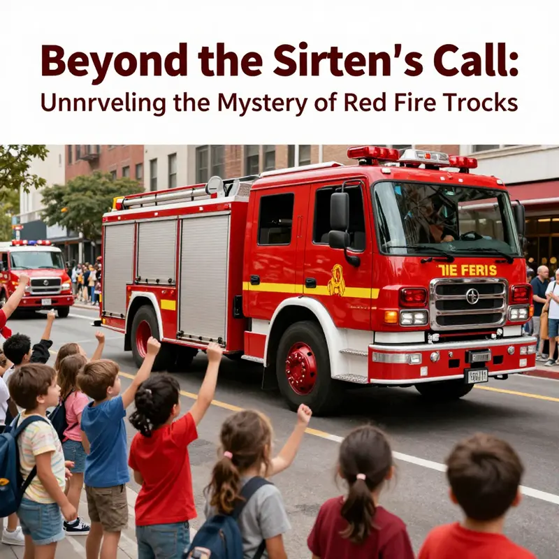
When you ask Siri, “Why are fire trucks red?” you often get a wink in the form of a riddle. The digital assistant answers with a playful line about firefighters liking to hear the sirens go “nee-naw nee-naw,” a response meant to delight more than to instruct. But the cleverness of that quip arcs away from the truth being requested. It is a distraction that exposes a deeper truth about public perception: color is not merely a utility, it is a symbol. The color red, in particular, sits at the intersection of practicality, tradition, and emotion, and in the context of fire engines, it has become a cultural shorthand for urgency, protection, and sacrifice. The chapter that follows treats this color not as a mere aesthetic choice, but as a loaded sign that shapes behavior, memory, and identity. The story of why a fire truck is red begins with a practical decision in a shifting era and matures into a social legend that resists easy revision, even as science quietly offers a sharper lens on visibility and safety.
In the early days of motorized fire suppression, departments faced a landscape that looked nothing like today’s orderly fleet rosters. Horse-drawn rigs, with their glossy paint and leather harnesses, were a familiar sight. When the switch to motorized apparatus accelerated in the early 20th century, most vehicles were painted in the fashion of the era—black, simple, and economical. The choice to repaint some of these rigs in red was both strategic and symbolic. Red stood out against the street hues of the time, a visual beacon that could be spotted quickly in a cityscape of moving horses, wagons, and early automobiles. It wasn’t merely about catching the eye of drivers in the crowded lanes; red’s visibility translated into a loud, public statement about readiness and authority. The choice was reinforced by cost dynamics as well. Red lacquer and enamel, durable enough to withstand weather and wear, offered a practical advantage at a moment when color choices were limited by production realities and budget constraints. In many communities, especially those with volunteer brigades eager to demonstrate vigor and independence, a boldly colored engine became a banner of public service and civic pride. The red scene was a sign of legitimacy, a public pledge that the station was ready to respond, not just to light fires but to light a sense of communal duty.
As time moved forward, the color red outpaced other hues in becoming a global shorthand for emergency response. It is a visual cue that transcends language and local dialects. Red is a color that has long carried the weight of warning. Traffic signals rely on it to signal stop, danger, and the need to pause. Signs and warnings frequently lean on red to draw attention. This cultural conditioning helps explain why a red fire truck feels intuitively appropriate. It taps into a primal layer of perception that has evolved with roadways, regulations, and public expectations. Yet, the scientific lens offers a different, more nuanced assessment of visibility. Modern studies from traffic safety researchers and fire service organizations point to a different truth: human vision is most sensitive to yellow-green wavelengths, around 555 nanometers. On that basis, lime-yellow or fluorescent-green vehicles can be seen faster in many conditions—fog, rain, dusk—than red vehicles. Some laboratories and field experiments even report fewer recognition errors and quicker responses when lime-yellow fire trucks share the road. This doesn’t erase red’s historical role, but it does complicate the question of optimal color from a purely perceptual standpoint.
Despite the science, the red fire truck persists, and it persists for reasons that go beyond optics. Cultural memory plays a powerful role in public perception. Red has become a universal emblem of escort and emergency. It signals danger and protection at once. When people glimpse a red engine, they instinctively know a response is imminent, a signal that cannot be easily mistaken for a delivery van or a tourist bus. The color’s emotional resonance amplifies the trust that communities place in their firefighters. Courage, resilience, and a readiness to act—these are not only professional attributes but cultural associations that red conveys with particular clarity. The symbolic weight of red has grown with the profession’s own narrative of heroism and sacrifice. In many towns, the color is woven into school parades, civic ceremonies, and the collectivity of memory around emergency services. The color is not merely paint; it is a marker of identity that binds responders to the public they serve.
Yet the conversation around color is not a relic of nostalgia. It intersects with modern concerns about safety, efficiency, and fleet management. Contemporary visibility science does not ask departments to abandon tradition for the sake of novelty; it asks them to balance symbolic power with perceptual efficiency. Some fire services have experimented with alternative colors in certain contexts, favoring lime-yellow for its high visibility, particularly in roadside operations or high-traffic environments where the risk of missed recognition is acute. These experiments are not uniformly adopted, partly due to the inertia of established identity and partly due to concerns about public confusion. If a community becomes accustomed to red, a sudden shift could temper the immediate recognition that people rely on in emergencies. The psychological and behavioral implications of color changes extend beyond aesthetics; they touch on trust, response times, and the consistency of the emergency signal that the public expects to receive from the fire department.
The historical arc of red fire trucks also reflects the dynamics of volunteerism and municipal branding. In many rural and semi-urban regions, volunteer brigades forged an image of vitality and dedication, and color was a crucial part of that image. Bold hues—most notably red—helped volunteer firefighters distinguish themselves from other service vehicles in the street ecosystem. The color became part of a broader brand within the community—an audible and visible promise that men and women were ready to defend the town at a moment’s notice. As cities grew and professional departments expanded, the red emblem carried over, becoming a visual shorthand for the entire profession. This continuity is why red feels safer, more familiar, and more trustworthy than a design that might have been adopted purely on the basis of the latest safety data. Familiarity compounds safety: a driver who has learned to associate red with emergency can more quickly yield, slow, or pull over, even when visibility is blurred or when the encounter occurs at night.
The Siri moment—a lighthearted, almost mischievous explanation—plays with the public’s appetite for quick, digestible facts. It reveals a cultural preference for storytelling over detail when it comes to everyday technology. Siri’s riddle acknowledges the human desire for a neat answer that feels complete, even if that answer is more entertaining than informative. This dynamic is instructive for readers who study how knowledge travels. When a public question is asked in a bustling digital workflow, the reply often travels along the path of least resistance: a crisp, memorable line that resonates emotionally. The deeper, technical background—the historical paint choices, the color-safety debates, the economics of fleet maintenance—tends to recede into a longer arc that few will chase without a deliberate effort. In that sense, the public-facing story about red is a narrative that blends science with sentiment, history with habit, and action with symbolism. The result is a color that remains uniquely colored by public perception even as the science around it evolves.
As we contemplate the interplay between perception and practice, the question of public perception becomes a kind of mirror. It asks what kinds of signals we want emergency vehicles to project and how those signals affect behavior in moments of stress. The public’s unquestioned association of red with urgency is not merely a consequence of a historical decision; it is a living cultural ecology that shapes how road users respond to sirens, how pedestrians interpret the approach of a fleet, and how communities narrate the bravery of their responders. It is, in short, a color that carries a social memory as much as a physical one. The science of visibility may push toward brighter colors in certain contexts, but the cultural inertia of red anchors itself in people’s minds, ensuring that a red fire truck remains instantly recognizable, even when miles of distance or obscuring smoke threaten to blur the line between fear and reassurance.
In the end, the question “Why is a fire truck red?” is not simply about pigment or cost or even the simplest of safety calculations. It is about a society’s relationship with its guardians on the move. It is about the shared language of urgency that helps strangers become allies in a crisis. And it is about how a single color can carry a constellation of meanings—alarm, courage, tradition, and protection—across generations. If the color were chosen today from scratch, some departments might opt for lime-yellow or other high-visibility shades in the name of incremental safety. Yet the red that persists binds a public to its fire service through a familiar silhouette, a consistent cue in the daily theater of streets and shelters alike. It is not a refusal to adapt, but a decision to honor a history while still attending to future possibilities. The public’s response to a red fire engine—whether through a wave of headlights, a narrower lane, or a moment of collective breath in the pause before the siren—remains a shared ritual that confirms the city’s dependence on highly visible, readily recognizable guardians.
As this conversation moves from the personal to the social, the broader context becomes clear. The hue that clads many fire apparatus is more than pigment; it is a mnemonic device that compresses time, memory, and trust into a single, instantly legible image. The Siri question, with its playful provocation, invites us to examine why we crave quick answers and how those answers shape our perception of truth. The historical record provides material depth: a practical choice born of the conditions of early modern fleets, a cultural declaration that helped communities rally around their responders, and a psychological emblem that continues to convey strength and readiness. The scientific insight into visibility reframes the debate but does not erase the cultural function that red serves. The result is a nuanced synthesis in which color persists not because it is the only bright option, but because it has earned a place in the public imagination that is difficult to dislodge. The red fire truck thus stands as a symbol of a profession that blends courage with service, tradition with progress, and an urgent need to respond with both speed and assurance.
For readers who want to explore the wider conversation about fire-truck color, memory, and the cultural life of emergency services, the discussion at firetruck.space/blog offers a broader lens on how communities engage with these machines beyond the narrow confines of color. firetruck.space/blog provides context on how fleets are imagined, maintained, and deployed in ways that intersect with history, media representations, and everyday practice. As you step back from the color debate, you see a larger pattern: color is a doorway into how societies frame danger and defense, how they remember those who respond, and how they teach younger generations to recognize and trust a line of vehicles that appear when danger escalates.
To close this chapter, it is useful to acknowledge the evolving science that informs color choices while honoring the enduring aura that red carries. The public face of a fire truck—its color, its silhouette, its flashing lights—remains a carefully choreographed signal: a promise that help is on the way. The Siri quip may amuse, but the deeper narrative is grounded in a long arc of practicality, symbolism, and shared experience. Red endures because it has become a cultural artifact as much as a practical instrument. It is the shade that has helped communities look up, take note, and step aside so that brave responders can move with purpose and speed. And even as new colors emerge in pockets of the world—pockets that seek to optimize visibility in particular environments—the global image of the red fire truck endures as a touchstone of emergency readiness and public trust.
External resource: https://www.caranddriver.com/features/why-are-fire-trucks-red
Final thoughts
The vibrant shade of red on fire trucks encompasses a rich tapestry of historical, scientific, and cultural significance. From Siri’s cheeky riddle to the deep-rooted traditions and visibility studies, each element adds depth to the understanding of why fire trucks remain red in our collective psyche. Whether it’s for distinctive identification or cultural pride, the color red is not just a choice; it’s a legacy that generations have come to recognize and respect. In a world where innovation continually challenges the status quo, the story of red fire trucks reminds us of how tradition and practicality often blend seamlessly, creating symbols of hope and bravery.