
Fire trucks capture the imagination of enthusiasts, collectors, and aspiring firefighters alike, with their striking red color standing as an emblem of urgency and response. The question of why fire trucks are predominantly red invites us to delve into a unique blend of history, practicality, cultural symbolism, and modern science. In the chapters ahead, we will uncover the historical context that shaped the decision to paint fire trucks red, explore the practical reasons that initially influenced this choice, appreciate the cultural significance attached to the color, and examine scientific insights into visibility that challenge long-standing perceptions. Each chapter will illuminate how the fiery hue of fire trucks has not only endured through tradition but also continues to evoke respect, recognition, and action in the face of emergencies.
A Coat of Tradition: Why Fire Trucks Are Red
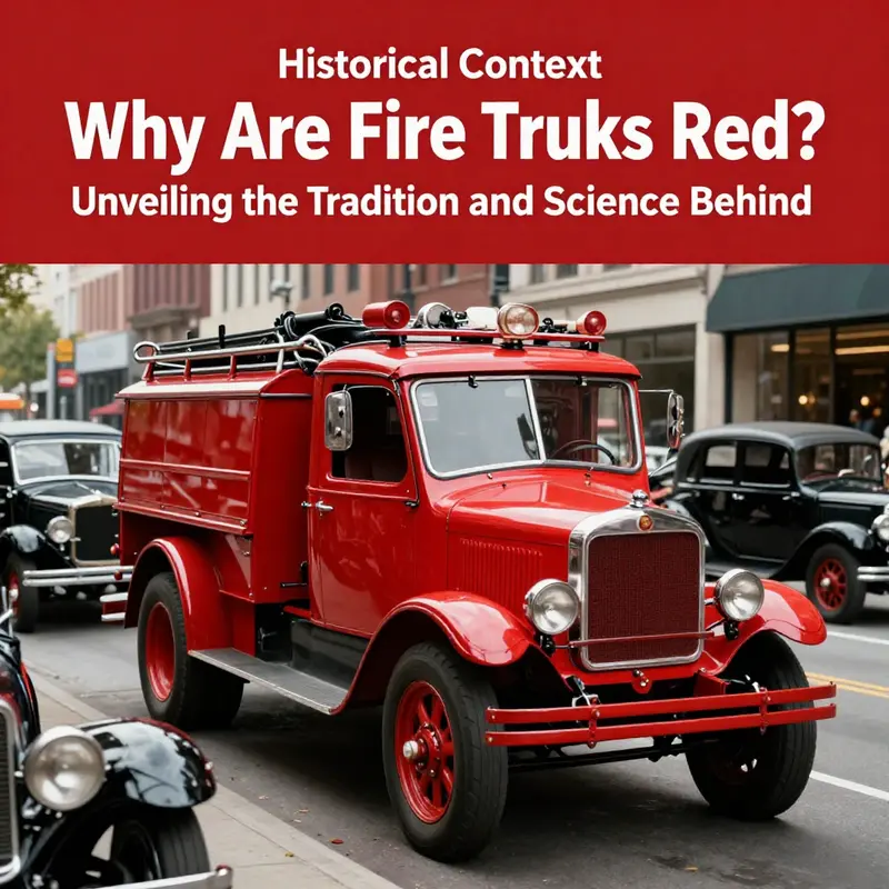
The color of a fire truck is more than a coat of paint. It is a history written across metal and public space, a signal that travels with crews through crowded streets and into the civic memory of a city. When people ask why fire apparatus are red, they glimpse a story that blends practicality, spectacle, and ritual. The result is a color that feels inevitable even when the science of visibility is not on its side. The early chapters of this story circle around three intertwined forces: a pragmatic choice shaped by material constraints of the era, a cultural impulse toward bold signaling in times of crisis, and the stubborn power of tradition that can outlive the original reasons for a decision. In reckoning with these forces, one sees why red persists, even as scholars point toward alternate hues that might perform better in certain conditions.
The practical case rests on the materials and maintenance realities of the day. In the early motor age, paint was a cost and a care item. Red pigments offered durability, visibility under sun and weather, and a predictable life cycle for fleets that stretched budgets and schedules. A red finish could endure exposure, road wear, and the rough handling of a heavy vehicle that spends long hours on call. It was not just taste but a financial calculation that kept fleets ready for the next run and kept repainting costs manageable. Over time this conservative choice hardened into a standard, anchored by procurement practices and the rhythm of municipal life.
A second thread concerns contrast and attention in busy urban streets. In a world of horse-drawn carriages, automobiles, and pedestrians, a bright color that stops people in their tracks proved helpful for public visibility. The notion that red would pop against the backdrop of everyday traffic provided a practical rationale, even as the historical record of the exact trigger remains debated. Folklore about red’s origin is part of the story, but the underlying logic is consistent: a vehicle meant to announce danger should demand notice, not blend into the crowd.
The third strand is symbolism and identity. Red became a badge of readiness, courage, and service. Through parades, drills, and public ceremonies, the color travels beyond the paint shop into the shared memory of a community. It signals presence, authority, and support at critical moments. In this sense red functions as a cultural marker as much as a practical cover for a working fleet.
Yet color choice in public safety is not static. Scientific studies of color perception remind us that red is not the most legible hue in every lighting condition. In bright daylight the eye is most sensitive to yellow-green, and lime-yellow tones can offer faster detection in some contexts. That does not erase tradition, but it invites a nuanced discussion about when and how color should adapt to new evidence. Departments may experiment with different shades for specialized fleets while preserving red as a core identity for standard apparatus.
In sum, the red fire truck story is a layered one: pragmatic maintenance considerations, a drive for visibility in complex urban space, and the durable power of symbol. The color endures because it works as a public signal and as a living badge of service and solidarity. The story continues as fleets evolve, color standards shift, and communities balance memory with evidence. Red thus remains a steadfast beacon on the street, a signal that help is arriving and that responders stand ready when trouble arrives.
Red at the Front Lines: The Practical Realities Behind Fire Truck Color
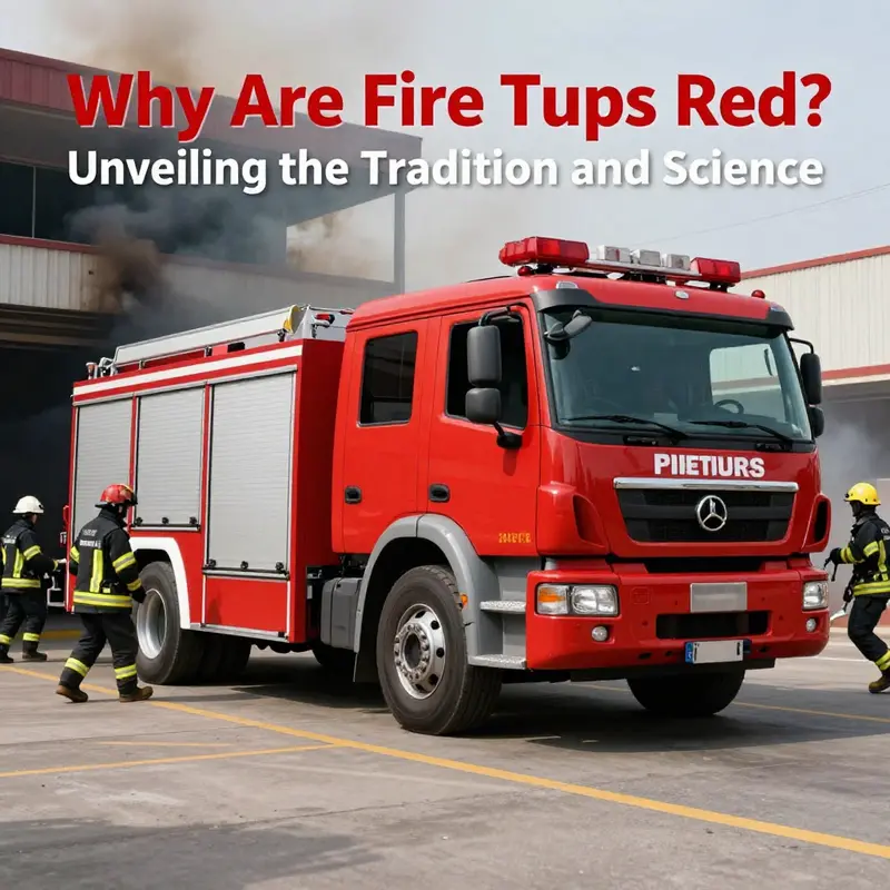
Color order and urgency have long been entwined in how communities perceive emergency services. When people ask why fire engines are painted red, they stumble into a tapestry of physics, perception, history, and culture. The simple answer—red is striking—contains layers that science and street experience have braided together over a century. The practical reasons behind the choice are not a single neat formula but a convergence of visibility in poor conditions, the psychological pull of danger, and the stubborn resilience of tradition. To understand this mix, it helps to move beyond folklore and into the way color interacts with light, how humans react to signals of urgency, and what departments learned through trial and error as roads filled with faster, brighter, less predictable traffic.
Visibility is the first pillar of the practical argument. Red light occupies the long end of the visible spectrum, with wavelengths roughly between 620 and 750 nanometers. In daylight, red can be seen from a distance and, in adverse weather, such as rain, fog, or dust, the longer wavelength light tends to scatter less than shorter blue or violet light. That means red can maintain some clarity when the air is thick or the air is full of particulates kicked up by wind and movement. The distance at which a driver or a pedestrian notices a fire rig is not just about how bright the color looks. It is also about how well the color remains recognizable against unpredictable backdrops—the gray hiss of a city street, the dark silhouettes of buildings, the glare of wet pavement, or the smoky shimmer at a scene. In practice, this translates into a kind of hedged performance: red can cut through some of the visual noise without demanding the high-contrast, high-illumination conditions that other colors require to stand out.
Beyond raw visibility, color signals are deeply wired into how people interpret risk. Red is one of the most universal cues of danger in many cultures. It triggers a quick cognitive ping—a sense of urgency, a cautionary note, a call to yield and to pay attention. This is not just about the color itself; it is about the historical association between red and fire, heat, and alarm. Fire, after all, is danger made visible, and red has become the color habitually linked to those moments of critical response. The effect ripples from the road to the living room. A passing driver, glancing in a side mirror, may instinctively start to slow when a red vehicle slides into frame, even before any siren or lights. That automatic reaction is a kind of visual shorthand that helps reduce reaction time in chaotic intersections and crowded urban corridors. The image of the red fire truck becomes a ready-made cue for urgency, a cue that drivers and pedestrians can recognize at a glance, in a moment when seconds matter.
These practical dynamics are not purely instinctive, though. They have a long historical arc that contributes to current practice. In the early 20th century, when fire departments were standardizing color schemes, red quickly emerged as a dominant choice for several overlapping reasons. Paint availability and durability played significant roles. Fire apparatus needed robust finishes that could withstand frequent exposure to weather, road grit, and the corrosive byproducts of firefighting. In many regions, red pigments offered a favorable balance of durability and cost, resisting fading in harsh conditions and remaining legible with relatively fewer coats of protective sealant. As fleets grew and maintenance budgets tightened, red became a dependable default. The symbolism—flame, courage, urgency—formed a feedback loop: communities started to recognize red equipment as a signal of readiness, which reinforced the color’s cultural association with emergency services. Over time, that symbolic weight became part of the brand identity for many departments, extending far beyond the practical considerations of paint chemistry.
Yet the modern picture is more nuanced. Scientific and operational reviews now suggest that lime-yellow or bright yellow variants can outperform red in certain daylight and visibility conditions. In controlled studies that look at color perception under a variety of lighting and weather scenarios, yellows have shown strong conspicuity, particularly in bright sun and across a broad range of backgrounds. The practical implication is not that red is obsolete, but that visibility depends on more than the hue alone. Size, shape, reflectivity, lighting, and movement all contribute to how quickly a passing vehicle or pedestrian recognizes an emergency apparatus. A red truck with highly reflective striping and dynamic lighting on a cluttered street can outperform a yellow unit with dull finishes on a clear day. In other words, color is a powerful tool, but it works best when paired with a comprehensive visibility strategy—lighting, signage, reflective materials, and predictable vehicle silhouettes all operating in concert.
This is where the tradition-turned-brand narrative intertwines with real-world practice. Fire departments are cautious custodians of public trust, and color traditions often symbolize steadiness, reliability, and a long service history. The red choice carries decades of association with brave front-line action, rescue, and immediate response. That cultural resonance matters in how communities engage with emergency services, how they educate the public about yielding and giving way in urgent moments, and how new recruits learn to recognize the fleet’s role in a city’s infrastructure. The identity embedded in red can help align a department’s communications, station house murals, and volunteer recognition with a consistent, unmistakable image. It also shapes how vehicles are perceived in media representations and public-facing materials, reinforcing familiarity and trust across generations of residents.
If one were to trace the evolution of color choices across time, one would notice a tension between scientific optimization and symbolic signaling. The research landscape acknowledges the advantages of yellow in certain contexts but also notes how other factors—vehicle size, warning lights, siren patterns, and the way a station or city designs its streets—can tip the scales. Red’s advantage is rarely a single, unassailable factor; it is the convergence of historical momentum, practical durability, and sensory psychology. The practical reasons are thus not simply about being the most visible color on a bright day; they are about how a color channeling urgency integrates with equipment design and public perception to produce a reliable, recognizable emergency asset.
To connect these threads with what readers can observe in the field, consider the everyday experience of approaching a scene at night. The human eye’s sensitivity peaks in the yellow-green region, around 555 nanometers, which means that under certain low-light conditions a lime-yellow vehicle may acquire a superior conspicuity. Fire departments that opt for non-red palettes often point to this kind of empirical observation as a reason to explore color alternatives. Still, red persists in many departments, in part because of the sheer inertia of tradition, and in part because a red silhouette against an urban horizon still reads as an emergency unit in a crowded environment. The difference between theory and practice is not a gulf but a corridor—and the corridor is lined with ongoing experiments, field reports, and real-world feedback from drivers, pedestrians, and other responders who navigate the shared roadways every day.
What does this mean for the broader question—why fire trucks are red? It means a layered answer: red works well enough in many practical situations; it carries deep cultural significance that strengthens public understanding of emergency services; and it remains the easiest identity cue to sustain across a city’s past, present, and future fleets. It is a case study in how a simple design choice can carry multiple consequential meanings. On one hand, the science suggests that color is not a perfect, one-size-fits-all solution. On the other hand, the social and historical dimensions of color choices shape how communities respond to emergencies. Taken together, they illuminate why red has endured as the emblem of readiness and protection, even as modern research widens the conversation about the optimal color under certain conditions.
For readers curious to explore more, the Fire Truck Blog offers accessible discussions that tie practical considerations to broader questions about equipment, safety, and public perception. You can learn more through the ongoing conversations at the Fire Truck Blog, which provides a space to connect field observations with evolving research and industry practices. Fire Truck Blog.
As this chapter threads through physics, psychology, and history, it’s worth underscoring a simple takeaway: color is a crucial, but not solitary, element in the safety equation. Red gives a signal—one that a city can recognize in a heartbeat. It is a signal shaped by decades of training, policy choices, and the messiness of real-world driving where demands are high and margins are tight. Yet the science behind visibility continues to push departments to consider complementary design choices. Reflective materials, high-contrast markings, and intelligent lighting all contribute to making any color function effectively in the service of public safety. In that sense, red remains less a verdict from physics than a negotiation among science, strategy, and shared community values. The color’s longevity is less about a single optimal wavelength and more about a durable synthesis that aligns with how people perceive danger, how agencies communicate readiness, and how cities structure their streets for dependable, predictable emergency response.
External reference for further reading that frames these nuanced conclusions is available from a professional safety organization, which offers a concise explainer on why fire trucks are red and how visibility considerations have evolved over time: NFPA explainer on fire trucks.
null
null
Red on the Front Lines: How Science, Tradition, and Practicality Keep Fire Trucks Red
The color of a fire truck is more than a coat of paint; it is a signal carried into every collision of noise, smoke, and fear. Red has earned a stubborn, almost ceremonial seat in the public imagination, and its persistence invites us to ask not just what is visible, but what is remembered. In exploring why red remains the color of choice for fire apparatus, we travel through layers of history, economics, perception, and culture. The narrative is not that simple. It is a story of practical beginnings that grew into symbolic meaning, entwined with the norms of public safety and the psychology of urgency. What appears at first glance as a settled convention emerges as a dynamic conversation between what works, what endures, and what people expect to see when danger arrives.
Historically, many departments acquired their first engines in a period when color options were limited and the road became a shared theater of emergency. A widely repeated origin story—though one debated by historians—claims that red was chosen to stand out against the sea of black automobiles that dominated streets in the early automotive era. The logic was straightforward: if most cars were black, a red vehicle would be instantly recognizable, a beacon in the chaos of a crisis. While this origin tale has taken on mythic status, the essential point remains: visible color in a crowded field mattered in those early days, when urban traffic was just beginning to scale and the nation was learning how to respond to speed and danger with organized public safety resources.
But the choice of color did not hinge on visibility alone. The 1920s brought a practical truth that often shapes long traditions: pigment availability and durability. Red paint happened to be affordable and long-lasting for coating heavy apparatus. Fire departments, working with tight budgets and harsh operating environments, found red to be a durable option that could withstand the wear and weather of daily service. The economics of paint are a quiet but powerful force in color history. Over time, the practical decision hardened into tradition. The color that began as a cost-effective solution became the badge of a department’s identity, a visual shorthand that signaled bravery, readiness, and rescue.
From the vantage point of modern science, the persistence of red invites careful scrutiny. The field of visibility research, including work cited by the National Highway Traffic Safety Administration, shows that color perception is nuanced. Red remains highly recognizable under a variety of lighting conditions, which helps it retain an edge in signaling urgency. In daytime, dusk, and even in low-light settings, red can capture attention and facilitate quick recognition. The psychological association between red and danger or immediacy reinforces this effect. People instinctively react to red as a cue to slow down, yield, or pay heightened attention. This push-pull between perception and emotion helps explain why red has endured even as new color theory and technology evolve.
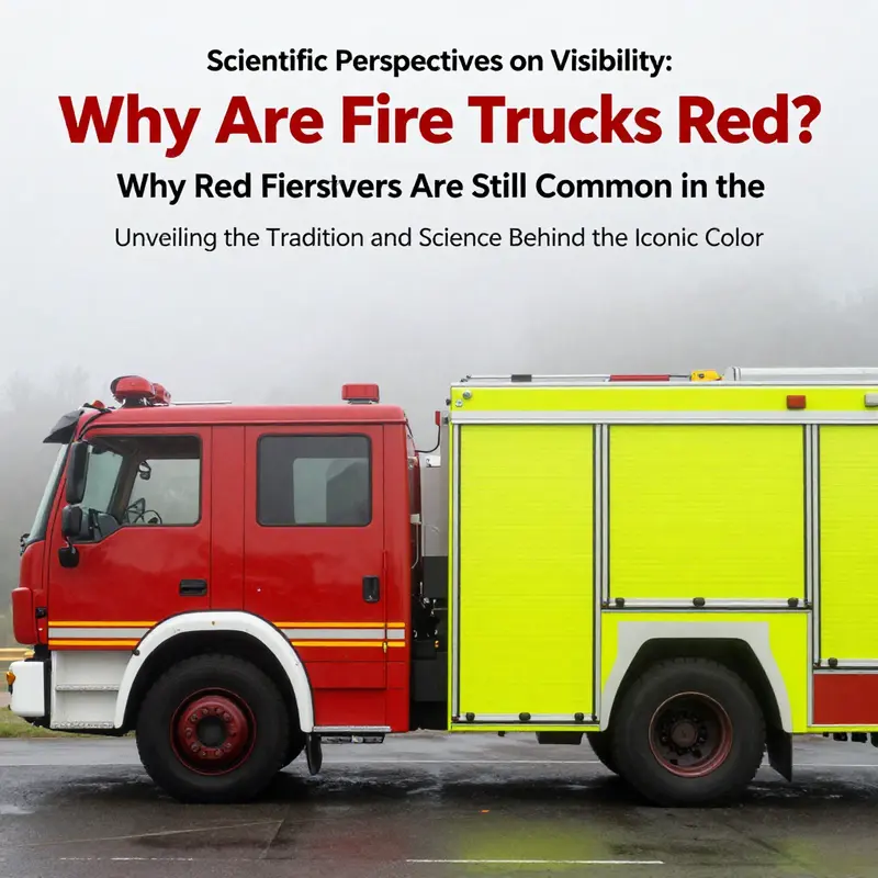
Yet science does not proclaim red as the indisputable king of visibility. In daylight, the human eye’s peak sensitivity sits in the yellow-green range, around 555 nanometers. Under certain environmental conditions—bright sunlight, fog, or murky air—colors at the high end of the spectrum can be more salient. In practice, this means that red is not the most visible color in all situations. Researchers have shown that lime-yellow or bright yellow schemes can sometimes outperform red in locating emergency vehicles, particularly when conditions reduce visibility or when the observer’s attention is divided by chaotic surroundings. This nuance has driven some agencies to experiment with color combinations that blend red with high-visibility yellows or to adopt two-tone schemes that exploit the strengths of both hues. The result is a mosaic of approaches aimed at balancing the strongest possible signal with the realities of diverse operating environments.
In many departments, the simple choice of red has continued to endure because it works within a larger system of signaling. The color is part of a broader safety ecology that includes reflective materials, appropriate lighting, and standardized markings. Red gains strength when paired with bright strobes, high-intensity LEDs, and reflective striping that catches the eye even before the sirens wail. The color is less a solitary beacon than a component of an integrated visual language that communicates urgency across conditions. This integrated approach helps explain why red remains common. The color carries not just visibility, but immediate recognition in a tradition-bound context where consistency and rapid identification matter as much as any single feature.
Public perception plays a substantial role too. Red has become a cultural symbol of emergency response, a visual shorthand that people across generations recognize instantly. The color has become part of the collective mental map of safety—so closely tied to rescue, mercy, and rapid intervention that it seems almost inevitable that it would persist. When a community sees a red vehicle roaring toward a scene, the association is reinforced by decades of imagery in media, parades, and public education. This cultural resonance is not merely nostalgia; it reinforces trust. People know what red signifies, which can translate into quicker compliance from other drivers and pedestrians positioning themselves to clear a path for the responders.
However, the practical realities of modern fleets push against a monochrome red myth. Some agencies actively consider or adopt alternate hues for specific contexts. In conditions where visibility is compromised by fog, drizzle, or high glare, colors closer to lime-yellow or orange have demonstrable advantages. In some cases, departments experiment with hybrid schemes that blend red with high-visibility accents. These approaches aim to preserve the brand recognition and traditional urgency associated with red while tapping into measurable improvements in immediate visibility under challenging conditions. The result is not a rejection of red but an acknowledgment that a color’s effectiveness depends on the environment in which it is observed, a reminder that public perception and scientific insight can inform one another rather than conflict.
The persistence of red also rests on the broader narrative of emergency services. Fire departments are organizations steeped in history, ritual, and identity. The color becomes part of a department’s story—the color you see painted on a responding apparatus, the emblem on the door, the banners at a station, the uniforms that accompany the vehicle to a scene. That symbolism matters. It influences recruitment, community trust, and the morale of crews who rely on public recognition as a practical advantage when laying out on a street or highway. In this sense, red is not simply a color; it is a declaration of presence. It communicates, without words, that a team is mobilized, prepared, and ready to respond. It fences off the unknown with a familiar line of color that belongs to the public’s mental schema of emergency response.
The chapter’s core tension is thus not whether red is the most visible hue in every scenario, but how a color can carry meaning and function simultaneously across different contexts. Fire trucks must do more than attract attention; they must harmonize with traffic patterns, urban and rural landscapes, and the rhythms of daily life. Red offers a robust baseline. It is a reliable, recognizable signal that works well in many common scenarios—an important factor in decision-making, maintenance cycles, and fleet branding. Yet the ongoing exploration of visibility does not end with red’s adequacy. The evidence supports a nuanced view: red remains common because it balances historical precedent, cost stability, public recognition, and reasonable perceptual effectiveness across a wide range of circumstances. The science provides a useful calibration rather than a verdict against tradition. It reminds us that color choice in emergency vehicles is a practical compromise, one that must accommodate everyday operations as well as dramatic moments of crisis.
As we consider the broader landscape of emergency vehicle color, a single lesson becomes clear: visibility is not a single measurement but a field of trade-offs. The eye’s sensitivity, the ambient environment, the vehicle’s other signaling features, and the social meaning attached to color all converge to produce a design choice that endures. Red’s longevity is a testament to the power of tradition to stabilize expectations while science offers a guide to improving performance where feasible. In places where research has indicated practical gains, departments have not discarded red but have enriched it with complementary strategies—reflective materials, optimized lighting, and, when appropriate, brighter accent colors that harmonize with the red base. The aim remains constant: to help responders reach people who need them quickly and safely, and to ensure clear, unambiguous signaling in the most stressful moments.
The conversation around red is also a reminder of how integral public education is to safety. Communities learn to recognize red as a cue to yield, to make space, and to trust that a crew is moving with purpose. This recognition translates into behavior that can save seconds in critical situations. The value of those seconds compounds as a drive to keep designing vehicles that respond to evolving conditions: brighter lights, more legible markings, and, when appropriate, color strategies that maximize visibility without sacrificing the enduring symbolism of red. In other words, the color is not simply a practical choice but a communication choice, a statement about how a city or a region wants to be seen when danger interrupts everyday life. The interplay of perception, culture, and practicality forms a complex ecosystem in which red remains a central, resonant actor.
To readers curious about where this leaves the future of fire truck color, the answer lies in flexibility under a shared framework. The field benefits from evidence that supports both the staying power of red and the tactical value of alternative hues in certain conditions. Departments that invest in color research, fleet branding, and visibility-enhancing technologies will continue to refine their approaches without abandoning the language of urgency that red conveys. The lesson is not a rejection of red, but an invitation to keep color an active, evidence-informed conversation within public safety. The public’s expectation of red remains a durable asset, one that helps maintain coherence in emergency response as communities grow, traffic grows more complex, and visibility challenges evolve with weather and urban design. In this sense, the color of a fire truck becomes a living artifact of safety—rooted in history, refined by science, and animated by the daily realities of rescue work.
For readers seeking further perspectives on how color choices intersect with public perception and safety engineering, a related resource offers a broader view of color and visibility outside of a single fire service context. the Fire Truck Blog provides ongoing discussions about color strategies, vehicle design, and regional variations in practice. This ongoing dialogue helps illuminate why red persists even as evidence points to nuanced advantages of alternative schemes in specific conditions.
External resources offer deeper empirical grounding for the ideas above. For a detailed overview of vehicle color and visibility research, consult the National Highway Traffic Safety Administration’s resources on how color affects recognition and reaction times across driving environments. The study of color perception in real-world settings reinforces the careful balance that fleet managers must strike when choosing a hue for emergency response vehicles. External resource: https://www.nhtsa.gov/vehicle-color-and-visibility
Final thoughts
Understanding why fire trucks are red starts from a complex tapestry woven from historical choices and societal values. While the initial motivations centered on visibility and cost-effectiveness, the lasting legacy of red extends into cultural significance and public perception, making it a color synonymous with heroism and emergency response. As we consider the science of visibility that suggests alternative colors might be more effective, it’s clear that tradition plays a crucial role in why red remains predominant. The vibrant hue fosters recognition and respect, embodying the bravery of firefighters and the urgent mission they undertake each day. Fire truck enthusiasts and aspiring firefighters alike should appreciate not just the striking color but the rich history and function it represents in our communities.