
Fire trucks have captured the imagination of many, becoming a quintessential symbol of bravery and emergency response. But why are these iconic vehicles painted red? This article unveils the compelling reasons behind their vivid color—from economic choices in history to visibility needs on the modern road, and the cultural significance that red has garnered over the decades. Each chapter delves into essential elements contributing to the legacy of fire trucks, appealing both to those with a keen interest in firefighting and aficionados alike.
Historical Factors Behind Why the Fire Truck is Red
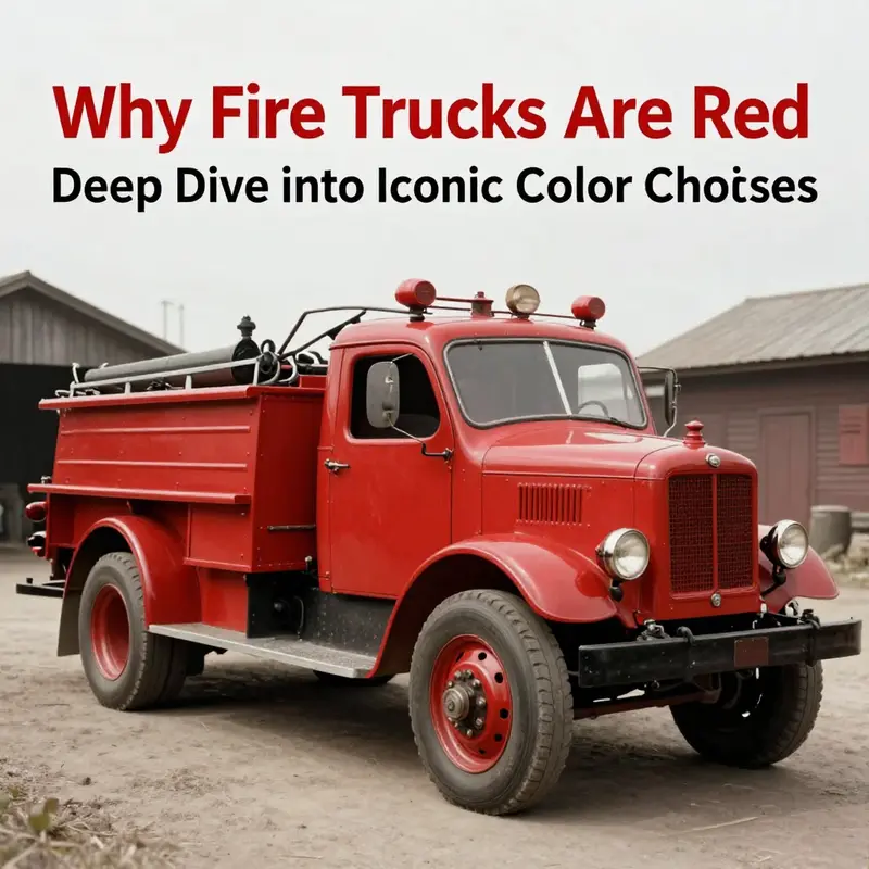
The color of the fire truck is often treated as a given, a cultural shorthand for urgency and protection. Yet the seemingly simple question, why is the fire truck red, sits atop a long layer cake of historical decisions, material constraints, and social meanings that coalesced over more than a century. To understand the red fire engine is to trace a chain of practical choices, economic realities, and symbolic signaling that repeatedly reinforced a single hue long after more modern options appeared on the horizon. The narrative begins in an era when fire apparatus were not machines of sleek aluminum and polished chrome, but wooden and iron contraptions shaped by horse, manpower, and the spare dollars of volunteer wards. In that world, color was not merely aesthetic; it was a ledger item, a logistical decision, and a badge of identity all at once. The first engines were painted red because red paint was the cheapest option available for metal and wood surfaces in the 19th century. This wasn’t a slogan or a marketing choice; it was a practical fact that would ripple outward. When departments faced tight budgets and the need to protect iron and timber from the elements, red emerged not by accident but by cost-benefit calculus. The claim that “the first fire engine was painted red because red paint was the cheapest” captures the economic logic of the era. It was a no-frills decision that, once made, etched itself into tradition. As those early vehicles rolled out of workshop bays onto soot-darkened streets, the red finish became a visible signal of durability against weather and wear, a quality that mattered to crews who measured every mile of line and every bucket of water as vital. The image of a red engine soon entered public imagination as a reliable, sturdy, and unmistakable machine, a characterization that echoed through firehouses, parades, and town hall meetings alike. This initial practical choice anchored a color code that would outlive many of the procedural changes in firefighting technology. It is tempting to view color as a mere matter of taste, yet in this case taste and utility walked hand in hand. The earliest apparatus were large, cumbersome, and expensive to replace. Departments learned quickly that the hue chosen for repainting could affect resale value, maintenance planning, and even the ease with which crews could inspect the apparatus after a hard night of service. Red’s association with durability was grounded in the paint’s properties as well as its availability. The economic rationale was not solely about the sticker price; it also involved the long view, the way a color could reduce annual maintenance costs by resisting weathering and hiding minor corrosion on a long cycle of service. Even in this context, the aesthetic dimension of red was not an afterthought. It carried a unifying message to the community: the department was solvent enough to invest in quality finishes; the color would endure as a symbol of reliability and readiness. The practical and symbolic threads began to intertwine in a way that would make red a durable choice beyond the economics of a single paint market. As the 19th century yielded to the 20th, another thread entered the tapestry: the rapid expansion of automobiles and the consequent need for distinctiveness on crowded streets. The rise of the Model T, with its famous black-only palette during its production years from 1908 to 1927, created a new urban visual landscape. Black cars crowded the avenues, silhouette after silhouette forming a uniform line against the backdrop of growing cities. Fire departments, ever mindful of safety and visibility, sought a color that would cut through the monotony of the street and catch the eye of drivers and pedestrians alike. Red provided a stark, high-contrast signal against the sea of black vehicles, soot-covered walls, and the gray dust of urban life. This strategic choice—using color to maximize contrast in a dynamic traffic environment—was not just about aesthetics. It was about a practical aim: to ensure that emergency vehicles could be recognized quickly, day or night, amid the choreography of sirens, pagers, and the bustle of city life. Visibility was not a mere variable; it was a core element of life-saving work. The decision to use red in this transitional period illustrates how practicality and perception could converge to harden a tradition. If we stand with the people in those early 20th-century firehouses, we see a moment when the color of a vehicle became a decision of social signaling as much as engineering. Red was chosen because it did not merely stand out; it stood for something a community could rally around: urgency, danger acknowledged, and a promise of prompt response. The psychological resonance of red—its association with danger and action—reinforced this message. A bright, warm hue can prime the nervous system to attend quickly; it can also evoke an emotional charge that reduces hesitation in the heat of traffic and the chaos of an evolving incident command. In the days when communications were still evolving—hand signals, bells, and the nascent use of electric sirens—the color red helped synchronize a broad urban audience to the arrival of help. The color carried a cultural load that made it more than a practical marker. Firefighters, volunteers, and citizens alike began to read red as a cue for bravery, sacrifice, and communal effort. A sense of identity sprang up around the red engine, and departments began to view their color as part of their public mission. In many towns, red became a badge of pride, a mark by which a department distinguished itself from neighbors and rival brigades. This tradition—red as emblem, not merely as paint—began to function as a social glue, a way to solidify the community’s shared commitment to protection and service. Over time, the red engine acquired a symbolic density that extended beyond the workshop and into the firehouse ritual. The badge of red carried with it expectations of readiness, uniform discipline, and a story that could be told aloud in parades and commemorations. The color came to symbolize what firefighters did and who they were: stewards of the public good, ready at a moment’s notice to answer the call. Yet the broader history also invites a sober note about evolution and science. Modern visibility studies—often cited in discussions about vehicle color and conspicuity—have suggested that other high-visibility hues, such as lime-yellow or certain bright yellows, may offer superior daytime visibility and even performance in certain lighting conditions. While these findings challenge the long-held assumption that red is the ultimate color for perception, they have not erased the cultural and historical significance of red. The reason is simple: once a color becomes embedded in tradition, it becomes part of a community’s memory and ritual. Public recognition contributes a weight that scientific metrics cannot easily dislodge. The red fire engine thus sits at an intersection of economy, convenience, and meaning. It is a practical compromise that turned into a cultural touchstone. The earliest cost-conscious decision to paint engines red created a standard that outlived the material constraints of 19th-century paint technology. As the decades passed, the color’s prestige grew, not only because it served a functional role but because it carried a shared narrative. The image of a red engine in a smoke-filled dawn or a rain-soaked parade is a powerful one, and that image became a shorthand for the idea that urgent help was on its way. The story adds a layer to our understanding of how colors travel through time. What began as a pragmatic response to price and availability became a symbol of identity and trust. In that sense, the color of the fire truck is not merely about optics; it is about community memory, professional integrity, and the enduring promise of service. This lineage—rooted in cost-effectiveness, reinforced by an urban driving environment, and transformed into a symbol of courage—offers a compact explanation for why red continues to define fire apparatus around the world. It is tempting to see a single answer, but the truth lies in the confluence of factors that made red the default. The economic landscape of the 19th century dictated the material feasibility of hardware finishes; the emergent urban traffic environment demanded rapid recognition; and the evolving culture of firefighting wove color into its rites, lore, and public trust. When we read historical accounts such as those that emphasize the cheapest red paint, we are not simply cataloging a paint choice; we are tracing a chain of practical decisions that became cultural magnets. The engines that rolled out of workshop doors carried with them more than engines and hoses. They carried a narrative about who protected towns, how protection was enacted, and how communities recognized the danger and responded. The chapter of red fire trucks, then, is less a simple case of preference than a layered account of scarcity, necessity, and meaning—an account that continues to color the way we think about emergency response, even as new materials, new design philosophies, and new research broaden our view of visibility and safety. The historical factors behind why the fire truck is red thus reveal a pattern: color, in this context, is history made visible. For those who study firefighting as a practice embedded in society, the color of the apparatus becomes a tangible artifact that encodes a long arc from economy to identity, from function to ritual. The practical choices of yesterday did more than set a price or a shade; they planted a symbol that endures in parades, in memory, and in the everyday acts of crews who arrive first to heed the call. If one looks closely at the evolution of the fleet, one can trace a line from a cost-driven decision to a public expectation. The red engine is not merely a vehicle; it is a public statement about what happens when a community chooses to invest in protection, speed, and visibility. It is a reminder that history does not always move in straight lines—from cheaper paint to standardized color, from customer preference to institutional habit. Sometimes it moves through the channels of need, identity, and shared purpose, until a single color becomes the easiest way to recognize bravery and readiness on the street. In the end, the question of why the fire truck is red yields a richer answer than a simple ledger entry. It reveals how a design choice can become a cultural symbol, how economic constraints can evolve into emblematic meaning, and how the visual language of emergency response communicates not just speed, but a promise: that help is near, and it will come in red to answer the call when time is most precious. As modern conversations begin to weigh color choices for new fleets, the historical lens reminds us of the layered life of color in public service. Red is not merely a shade; it is a repository of decisions, memories, and commitments that have, for more than a century, guided the way fire departments signal to the world that assistance has arrived. If the chapter ends with a sense of reverence for what red came to signify, it also points toward a practical understanding: the best color for a fire truck is the one that communicates immediacy, safety, and readiness—today, tomorrow, and for generations of responders who will one day tell the same story in a slightly altered streetscape. For readers who want to explore how these historical threads thread into modern equipment design, the lineage is visible in the continued use of high-contrast finishes that balance tradition with evolving standards of conspicuity. And for curious minds who wonder how far a color can travel in public perception, the answer lies in the way a color becomes a cultural shorthand that works in a crisis as surely as it worked in a workshop. To see the deeper, tactile link between past and present, consider the arc of steel fire apparatus—the subject of a dedicated article that traces how early color choices interacted with material realities and the advent of steel as a dominant chassis. This connection underscores that the red we associate with emergency response is not only about visibility but about the enduring human need to recognize, remember, and respond when danger arrives. See the discussion in the article on steel fire apparatus. For readers seeking broader historical context beyond color, a concise external resource on fire-engine history offers a complementary perspective on how technology, policy, and public expectation co-evolved around these essential machines: https://en.wikipedia.org/wiki/Fire_engine.
Seeing Red on the Rescue Road: How History, Visibility, and Tradition Shape the Fire Truck Color
The color of a fire truck has become a cultural symbol as much as a practical detail. When you imagine a fire engine roaring toward an emergency, the image that often comes to mind is a gleaming red form cutting through smoke and glare. Yet this image sits at the crossroads of history, perception, and evolving safety science. To understand why this color persists, we have to trace a thread that runs from crowded city streets in the industrial age to modern traffic-safety research, all while listening to the voices of firefighters who carry tradition as part of their daily work culture. The story is not merely about paint; it is about how communities recognize emergency presence, how departments crafted identities in highly competitive landscapes, and how science challenges inherited assumptions while still affirming the power of symbol. In this chapter, we will weave together these strands into a cohesive account that respects the complexity of the question, “why is the fire truck red?” without reducing it to a single factor. We will also consider how new technologies and new research might reframe color choices in the years ahead, while acknowledging the stubborn persistence of a color that has long stood for courage, urgency, and response.
Historically, the choice of red arises first from the material and economic realities of the late 19th and early 20th centuries. Fire brigades formed in dense urban cores where smokestacks and coal soot softened the skyline. Brass and bronze equipment, polished to gleam, needed a color that would resist the atmosphere of busy streets and industrial grime. Red, a bright hue produced by some of the most durable paints of the era, quickly became shorthand for authority and visibility. It was not merely that red looked striking; it was also practical. Red pigments and coatings offered a balance of durability, rust resistance, and availability that made the color economical for departments with limited budgets. In a period when cities expanded, fleets multiplied, and apparatus became more standardized, red achieved a consistency that other colors lacked. That historical footprint planted red deep in the professional imagination, and once a standard takes root, it tends to echo through generations of acquisition decisions and ceremonial traditions. The color did not change because it was perfect; it persisted because it carried meaning and a shared vocabulary for public safety.
As cities grew and the automotive landscape fractured the visual field of the road, a second practical logic entered the conversation: visibility against a changing backdrop. The rise of the automobile introduced a new class of road users who shared space with emergency responders. In many cases, departments sought a color that would set their vehicles apart from ordinary traffic, particularly in dense urban streets lined with soot-darkened façades. The idea that red provided contrast with a sea of black, gray, and dark vehicles offered a narrative that resonated with public perception. It was a vivid symbol that screamed urgency. The cultural memory of the era—where fire engines were seen as a dramatic, almost theatrical presence on the curb—made red a color associated with action and immediacy. This alignment of color with emergency response helped cement red as not just a practical choice but a cultural marker that signaled urgency even before the siren began to wail.
Another dimension of why red endured lies in tradition and identity. Firefighting has long operated as a brother-and-sisterhood of volunteers and professionals who carried rank, pride, and community allegiance into every call. Red became a badge of belonging, a visual cue that a crew was ready to respond. In some regions, volunteer companies used red to distinguish themselves from neighboring departments, a subtle signaling system that reinforced pride and competition in a field where solidarity and reputation mattered as much as water pressure and ladder length. As neighboring towns adopted similar colors, red coalesced into a recognizable national identity for emergency response. When a truck appears in red, it evokes a shared heritage of service, a tradition readers and citizens recognize instantly. That cultural resonance is not a trivial preference; it binds departments to a history that can be both comforting and motivational for those who risk their lives in the line of duty.
Closely linked to tradition is the psychological dimension of color. Red has long been associated with danger, warning, and alertness. Our perceptual systems respond strongly to high-saturation, warm hues, which can prompt quicker attention in chaotic environments. The psychology of red supports its use in emergency settings: it helps convey urgency, draws the eye, and primes bystanders to respond with caution or deference to the approaching vehicle. Yet psychology is nuanced. The modern understanding of visibility acknowledges that red is not universally superior in all lighting or weather conditions. In fog, rain, or dim dawn and dusk, the spectral advantage can shift toward colors that reflect more light or create higher luminance contrasts. The red of a late-model fire engine may appear more muted against a cloudy sky or in low-contrast urban canyons. Even so, the symbolic power of red, reinforced by decades of media representation and institutional ritual, keeps it in active use despite emerging data about alternative colors.
In more recent decades, discussions about color and visibility have become more nuanced. Researchers have explored how colors such as yellow, lime, or white—especially when augmented with reflective materials and high-intensity LEDs—perform under varied lighting and weather conditions. These studies do not invalidate the long-standing tradition of red; instead, they reveal a more complex picture of how a vehicle’s color and its lighting systems work together to achieve visibility. Red remains highly legible in daylight and against many urban backdrops, particularly when paired with modern lighting and reflective striping. Yet under certain conditions, other colors can offer improved conspicuity. These insights have spurred some departments to experiment with color palettes or to adopt hybrids—keeping red as a core identity while layering additional visibility strategies through lighting and reflective finishes. The practical takeaway is not a wholesale rejection of red but an acknowledgment that color is one tool among several that collectively ensure safety.
If we think of color in the context of a fleet, the choice becomes a balancing act between tradition, identity, and objective safety outcomes. Fire departments don’t evaluate color in isolation; they consider how color interacts with signage, lighting, and the behavior of drivers and pedestrians. A bright, reflective stripe might make a vehicle more visible in low light; a loud siren and rotating lights create temporal cues that capture attention regardless of base color. In this sense, color remains part of a broader safety ecosystem. The modern practice is to pair any color with high-reflectivity materials and robust LED lighting, so a red vehicle can still register clearly at a distance in fog or rain. In practice, departments that are experimenting with color often maintain red as the anchor color while enhancing the visibility profile through other design features. The aim is not a color overhaul but a safer, more legible presence in a busy street scene.
The cultural and practical threads converge in how communities perceive and respond to emergency vehicles. For the public, red fire engines reinforce recognition and the immediacy of danger. A child might instantly understand that a red truck signals time to clear the road, while an adult driver might interpret the same color as a cue to yield right of way. The social memory attached to red shapes expectations: it signals authority, safety, and urgency. In communities where firefighting is deeply embedded in local life, color becomes part of a shared ritual. Parades, open houses, and emergency demonstrations frequently present red apparatus as a familiar hero on wheels. This social script deepens the color’s staying power, making it more than a technical choice. It becomes part of the fabric of civic life, tying together memory, duty, and daily readiness.
Yet no single color exists in a vacuum. The modern push toward enhanced visibility invites a broader conversation about how colors perform across the spectrum of real-world conditions. Researchers and practitioners recognize that color, while powerful, is just one variable in a dynamic system of signals, sensors, and responses. The push toward higher visibility has also accelerated the adoption of standardized reflex helmets, reflective trim, and conspicuous lighting patterns that do not depend solely on the vehicle’s base color. In this sense, the color red can coexist with more diverse safety approaches, enabling fire departments to maintain a strong, recognizable identity while embracing evidence-based improvements in conspicuity. The synergy of color, lighting, and reflective materials creates a multi-layered message that is clearer to pedestrians and drivers alike, especially in chaotic moments when every second counts.
To connect these threads with the lived experience of firefighters, it helps to listen to stories from the front lines. In many departments, the color choice carries a legacy that new recruits learn to respect even as they recognize the scientific reasoning behind updated safety measures. The color becomes a bridge between generations, linking veteran crews who remember the days of hand-drawn hoses and brass fittings to younger teams who navigate digital dispatch boards, upgraded headlights, and smarter response protocols. The continuity across generations is part of what makes red so durable as a symbol of emergency service. It is a reminder that courage is not a new invention but a tradition carried forward in vehicles that move fast, light up the night, and remind the city that help is on the way.
From a practical standpoint, the discussion about color is never merely theoretical. Departments must consider their particular environment when making color decisions. A city with tall buildings and reflective glass may present different visibility challenges than a rural district with open farmland. Traffic density, weather patterns, and the local color palette all influence how well a color reads at a distance. In some climates or urban textures, a different color might offer incremental safety gains, but these gains must be weighed against cost, training, and the brand identity of the department. The reality is that color is intertwined with policy, funding cycles, and the governance of fleet maintenance. Decisions are seldom driven by a single study or a single feature. Instead, they emerge from ongoing assessment, field experience, and conversations with other departments that have faced similar trade-offs.
In connecting past, present, and potential futures, we must also acknowledge the information ecosystems that shape public understanding. Media representations often celebrate the iconic red fire truck, reinforcing a visual language that audiences already know. This ubiquity helps schools, reporters, and civic leaders communicate quickly about emergency events. A red vehicle is instantly legible in a crowded photograph or broadcast frame, a fact that aligns with how images travel in a media-saturated world. At the same time, scholars and practitioners argue for a broadened palette—one that respects tradition while incorporating evidence about visibility. The question, then, becomes not whether red is inherently superior but how best to deploy red alongside complementary visibility tools. The answer lies in a balanced approach: preserve the symbolic power of red while upgrading the technical means of conspicuity through materials, lighting, and adaptive signaling.
Among the many voices in this conversation, the idea of an aesthetically and technically integrated system stands out. A fire truck might be born red, but it lives in a world of reflective strips, high-intensity LEDs, and intelligent lighting patterns that respond to ambient conditions. The vehicle’s color becomes part of a broader constellation of signals that communicate urgency to every observer—drivers, pedestrians, and bystanders. In this sense, color remains a powerful anchor. It anchors identity, tradition, and public recognition. It also remains part of a living practice that updates with new science and changing urban realities. The best path forward is not a strict adherence to a single hue but a thoughtful, evidence-informed strategy that treats color as one instrument among many to ensure safe, rapid, and unambiguous responses to emergencies.
As we reflect on the full arc—from soot-darkened streets and brass fittings to LED-lit, high-visibility reflectivity—the central point emerges: red endures because it carries a durable blend of meaning, function, and adaptability. It is not a perfect or eternal solution, but it is a robust one that has proven effective enough to stay in use while being complemented by modern technologies. The color is a cultural beacon, a symbol of the time-honored covenant between a community and the people who answer its calls. To that extent, red remains a living tradition—one that harmonizes with a modern safety science that continues to refine how we detect, perceive, and respond to danger on the roads and in the streets where emergencies unfold.
For readers who want to explore ongoing discussions in the field or follow practical considerations from the broader firefighting community, there is value in engaging with contemporary voices and narratives. The narrative around color is not fixed in stone but evolves with new research, urban design changes, and the experiences of crews who work in diverse environments. If you are curious about how these conversations unfold in everyday practice, consider exploring the broader conversations that shape the culture of firefighting and how color figures into those conversations. The discourse is enriched by stories from the field, by safety researchers, and by communities that depend on timely, unambiguous responses to emergencies. In this way, the question of why fire trucks are red becomes a lens through which we examine how tradition meets science, how symbolism reinforces duty, and how careful attention to visibility can save lives while respecting the identity that communities have built around their rescue vehicles.
As part of this broader dialogue, readers might benefit from connecting with ongoing resources and communities that curate information about fire apparatus, safety practices, and the evolution of fleet design. For those seeking a starting point within a trusted information stream, a well-curated hub or blog can offer ongoing reflections, field reports, and practical considerations from practitioners on the front lines. These sources can illuminate how color choices fit into a wider safety framework and how departments negotiate the sentiment of tradition with the imperatives of modern proof and policy. If you want a concise portal to follow these conversations, consider visiting dedicated content hubs that include regular updates on fire apparatus and related topics. For those who want to dive deeper into the visibility landscape beyond the color question itself, the literature on emergency vehicle conspicuity provides a rigorous grounding for evaluating how color interacts with lighting and reflective materials in varied conditions.
In sum, the question of why the fire truck is red cannot be reduced to a single truth. It is a layered answer that respects history, honors tradition, acknowledges psychological impact, and embraces scientific insight into visibility. Red remains a compelling default because it carries a multidimensional payload: authority, courage, urgency, and a strong visual signal that speaks to people across generations. At the same time, the road ahead invites a nuanced approach that blends color with reflective technology and lighting design to meet the demands of an ever-changing traffic environment. The result is a color story that is living rather than fixed, resilient enough to endure the test of time while flexible enough to incorporate evidence-based improvements across weather, light, and distance. If the narrative of red is to be written anew, it will be by those who recognize that history can guide innovation and tradition can coexist with safety science. The fire truck will likely remain red for many communities, but the way it shines—its reflections, its LEDs, its luminous stripes—will continue to evolve as part of a dynamic, safety-first culture. In the end, the color is not merely about paint on metal; it is about a shared commitment to respond, to protect, and to return safely from every call.
Internal reference snippet: For readers who want to explore ongoing discussions within the firefighting community about color, visibility, and safety culture, the Fire Truck Blog offers a space for conversations that connect practice with perception. You can explore it here: Fire Truck Blog.
External resource for deeper study: For a detailed examination of visibility considerations for emergency vehicles, see the scholarly overview on this topic at the following external source: https://www.ncbi.nlm.nih.gov/pmc/articles/PMC1468027/.
The Red Emblem: Color, Culture, and Courage Behind the Fire Truck’s Iconic Hue
Color has a stubborn power to linger in the public imagination, especially when it is tied to an act of service that demands attention, respect, and quick action. The fire truck, with its glossy red finish, sits at the intersection of memory and function, a moving emblem that signals both danger and protection. This chapter explores how a single color became more than a practical choice; it grew into a cultural icon, a shorthand for courage, and a visual cue that dispatches a response even before the siren starts its wailing descent into a street. The conversation about why red endures is not a single-thread tale but a braided weave of history, psychology, tradition, and evolving technology. Understanding this color’s staying power helps illuminate how communities imagine emergency work, how volunteers and professionals alike claim identity, and how the visual landscape of urban life is read by drivers, pedestrians, and bystanders in moments of crisis.
Historically, the practical roots of red trace to a time when departments sought durability and cost efficiency in murky industrial cities. Red paint was, in many places, one of the more affordable options for sealing metal surfaces against rust and weathering. Budgets were tight, and a color with proven longevity helped stretch dollars while maintaining a vehicle’s legibility on the road. In those early decades, a department could repaint a fleet with a single choice and rely on that color to endure the wear and exposure that fire apparatus routinely faced. The economic logic is not glamorous, yet it is foundational. When a color works in the daily grind of maintenance, dispatch, and training, it earns a quiet legitimacy that later generations come to trust, defend, and celebrate. The red hue thus traveled from the shop floor into the heart of municipal pride, turning a utilitarian decision into a shared emblem of readiness.
The practical launchpad, however, sits side by side with the question of visibility. A widely cited line of reasoning connects the choice of red to a visual contrast with the growing prevalence of black automobiles and the soot-darkened urban canyons of the early automotive era. The Model T, famously available in black for a long stretch, became a cultural touchstone around which departments sought a color that would shout above the street clutter. Red, with its bright, warm tone, offered a strong counterpoint to a sea of dark, matte surfaces and smoky storefronts. In the right light, red fires a signal of urgency that can be read from a distance, guiding motorists and pedestrians toward a scene in need of help. Yet this reasoning, though compelling, sits alongside more nuanced observations about how color works in real-world driving conditions and how human perception responds to different wavelengths of light under varied weather and times of day.
As the decades progressed, a deeper layer of meaning settled into the public psyche: red as a symbol of urgency, danger, and action. The color’s reputation was reinforced by repeated cultural cues—cartoons that painted firefighters in red, toys that celebrated the brave image of a red engine, and the constant presence of red emergency lights in cinema and news footage. This cultural reinforcement matters because symbolism travels faster and farther than hardware specs. When a color becomes associated with a set of values—courage, promptness, protection—people begin to interpret a red fire truck as a trusted messenger before it even stops. Communities embraced red not only as a practical choice but as a narrative device: a vehicle that embodies rapid response and a promise of safety. The color’s story grew into a recognizable sign, a public vow that help is near, efficient, and willing to stand between danger and the vulnerable.
Tradition and community pride then layered additional meaning onto the red hue. In the era of volunteer fire companies, bright red paint often signified more than readiness; it expressed a department’s willingness to invest in itself and its neighbors. Painting a truck in bold red sent a message to townsfolk—this is a crew that is visible, ready, and united. The visual uniformity across neighboring towns helped knit regional identities into a broader firefighting culture, where red became a color that linked communities through shared practice and mutual aid. The symbolism extended beyond the mechanics of firefighting. The color became a banner in parades, a backdrop for fundraisers, and a familiar feature in training grounds where generations of recruits learned to respect the gravity of the work. The public rituals around fire service, from open houses to memorials, echoed the same red glow that drew families toward the station on a summer weekend and reminded children that bravery could be both near and approachable.
The psychological pull of red cannot be understated. Research into color psychology points to red’s ability to capture attention, heighten arousal, and communicate urgency. In a world saturated with stimuli, red stands out in the periphery and the center alike. It engages the visual system, triggering swift recognition. In emergency communication, seconds matter, and the color red has, for many, become a heuristic cue—a mental shortcut that alerts observers to the presence of danger or the imminent need for action. In practice, this translates into faster recognition and quicker crowd movement away from danger, a benefit in the chaotic moments at the scene. The psychology of red is not purely scientific, however; it is also cultural. The color’s associations with warnings, alarms, and bravery have been reinforced by decades of media portrayal, political posters, school safety campaigns, and the visual language of navigation aids. Taken together, these cultural and psychological layers make red a particularly potent color for emergency vehicles, crafting a public perception of the fire truck as a steadfast guardian rather than a mere machine on wheels.
But the conversation around red is not a straightforward endorsement of tradition without fault. Modern daylight visibility studies have raised questions about color choices beyond tradition. Brighter colors such as yellow or lime-green can offer improved conspicuity in certain conditions, including low sunlight or high soot environments where the red hue might blend into horizons or become less legible at a distance. This line of critique does not erase the cultural weight of red; it reframes the discussion to consider whether a blend of colors or updated paint technologies might maintain the symbolic authority of red while maximizing visibility. In many jurisdictions, departments have acknowledged this tension. They recognize that color is both a practical tool and a story we tell about ourselves when we respond to emergencies. The result is not a wholesale abandonment of red but a measured openness to new palettes, reflective markings, and higher-illumination lettering that preserves the emotional resonance of red while enhancing safety for responders and the public alike. The balancing act illustrates how a color can endure in popular memory while adapting to the demands of modern science and road safety.
This fusion of memory and modernization is where the thread of culture most clearly threads through the narrative of color. A red fire truck is not merely a vehicle with a pigment on its panels; it is a moving artifact of shared history and communal aspiration. It carries the weight of stories about late-night calls, of crews who trained through winters and summers, of neighborhoods pulling together in the face of catastrophe. The color thus becomes a storyteller, recounting the long minutes when a station’s doors opened to a siren’s call, and the seconds that followed when a team pressed the throttle and steered toward a cross street, their silhouettes cutting through the glow of streetlamps. In this sense, red endures because it has become a shorthand for response, for readiness, and for the quiet dignity of service. It signals to the public that help is present, that a crew has arrived with equipment, expertise, and a willingness to take action before the first question is even asked.
The cultural significance of red also travels through the channels of education and memory. Schools, neighborhoods, and families learn a compact version of emergency response culture through the visual language of red. Flyers, safety posters, and community drills often lean on the iconography of a red engine as a visual anchor. In this way, the color becomes a schoolyard tutor, teaching children that emergencies are real and that there are people who devote themselves to managing them. The symbolism invites a dose of reverence as well as trust: reverence for the risks that firefighters face, and trust that a red emergency vehicle will not pause before moving toward danger. This social teaching is not a passive inheritance; it is reinforced by community practice, by the annual rituals that honor first responders, and by the ongoing mentorship that sustains a firefighting culture across generations. The color thus evolves into a living language, spoken not just in the words of policy or the mechanics of gear, but in the everyday acts of helping neighbors and guiding them to safety.
In contemporary discourse, the red fire truck stands beside debates about color, visibility, and branding in a broader sense. It is impossible to separate the hue from the work’s identity—each informs the other in a feedback loop. When communities celebrate the courage of their responders with parades, with commemorations for fallen heroes, or with moments of public gratitude, the red vehicle becomes part of the ceremony. It sits in a line of honored objects that carry tangible memory forward: the chrome polish catching the summer sun, the emergency lights flashing in a rhythm that mimics a heartbeat, the silhouette of a crew stepping onto the curb with purpose. These images become the emotional map of safety for many people, especially children who will one day confront their own fears and rely on similar institutions. The red machine thus becomes more than a means to an urgent end; it becomes a symbol that helps communities frame themselves as resilient, resourceful, and communal in the face of danger.
In this complex weave, the myth of red persists not because it is the only color that could work, but because it carries a multi-layered fabric of meaning. It holds practical roots, acknowledges evolving visibility science, honors tradition, and channels the public’s longing for certainty in uncertain moments. It remains a living story, adaptable yet stubbornly consistent, a color that has learned to speak in different dialects of safety and service without losing its core message. When a seasoned firefighter glances at a red engine and a child watches from a sidewalk with awe, both are participating in the same narrative: that courage arrives with care, and that the color red is a cue, a banner, and a promise all at once.
The narrative of red also invites reflection on how color shapes policy and design in the emergency services. If the color can carry so much social weight, how might departments think about future changes that preserve cultural memory while embracing scientific improvements? The answer lies in a careful choreography of paint, lighting, reflective materials, and training that respects both the heart and the head of the matter. It is not a rejection of history but an invitation to broaden it—an invitation to blend symbolic power with measurable safety, to honor what red has meant while exploring new ways to keep responders and the public even more secure. In this sense, the color is a bridge between then and now, linking the first orders to rush to a blaze with the contemporary expectations of inclusion, accessibility, and effectiveness in urban life.
As we trace this thread from practical beginnings through cultural resonance to practical improvement, one point becomes clear: the red fire truck endures because it remains legible in memory and effective in action. Its color is a compact unit of social meaning that travels across time, across towns, and across the spectrum of everyday life where emergency work happens. It remains a shared image that can still invite a sense of awe and a sense of trust, a symbol of courage that speaks to universal values even as it adapts to new knowledge about visibility and road safety. And while the color itself is a physical property—the result of pigment, weather, and engineering—the meaning it carries is communal, produced through countless interactions: a driver’s quick recognition on a busy street, a child’s point at a passing vehicle, a volunteer’s salute at a station door, and the silent pledges uttered in the flicker of lights during a night response. The red emblem, then, is not merely a paint job. It is a living artifact of how communities choose to see themselves when danger arises and when help must arrive with speed, clarity, and heart.
For readers curious to see how these historical threads connect with contemporary practice, the topic invites a broader exploration into how color is used in emergency systems today and how communities balance tradition with the latest research in visibility and safety. If you’d like to reflect further on the broader cultural impact of public service symbols, consider engaging with related perspectives on gratitude and remembrance for first responders—the public rituals that reinforce the social contract that makes red feel both familiar and sacred. thanking-first-responders.
External resource: For a concise scholarly exploration of the origins and symbolism of red on fire apparatus, see The Atlantic’s overview of why fire trucks are red. https://www.theatlantic.com/technology/archive/2018/07/why-are-fire-trucks-red/565344/
Final thoughts
The color red in fire trucks is more than just a visual choice; it’s a melding of history, practicality, and cultural pride. From its beginnings in budget-conscious decisions to its role in enhancing visibility during emergencies, and finally to its deep-rooted significance in the community, red is an emblem of bravery and emergency response that resonates with all of us. The fondness for red fire trucks remains a powerful symbol that underscores the commitment of firefighters to protect and serve.