
Across the United States and beyond, an exciting transformation is unfolding in the world of firefighting vehicles. Gone are the days when red was the sole hue representing emergency response teams. Today, lime-yellow and fluorescent yellow fire trucks are taking center stage, thanks to their unmatched visibility in challenging conditions. This article delves deep into the reasons behind this vibrant shift, exploring the enhanced safety it offers through each chapter. From the scientific studies that underscore the color’s effectiveness to its historical roots and implications in regions like Hawaii, we will uncover how this color choice is revolutionizing fire service operations and saving lives. Join us as we explore the significance, history, safety studies, regional variations, and future trends that paint the modern fire truck in a bold new light.
Visible First Responders: How Lime-Yellow Saves Seconds and Lives

Visible First Responders: How Lime-Yellow Saves Seconds and Lives
Color is not merely an aesthetic choice for emergency vehicles; it is a safety measure with measurable consequences. The shift from traditional red to lime-yellow or fluorescent yellow on many modern fire trucks reflects a deliberate application of human vision science, international standards, and hard lessons learned on roads and in wild landscapes. This chapter examines why that bright yellow is increasingly preferred—how it improves detection, shortens reaction times, and reduces collisions during urgent responses.
At the heart of the change is visibility. The human eye is most sensitive to wavelengths in the yellow-green band under a broad range of lighting conditions. That sensitivity means a high-luminance yellow stands out at greater distances and against more backgrounds than many other colors, including classic red. In practice this translates into faster spotting of an approaching emergency vehicle by drivers, cyclists, and pedestrians. When every second counts, being seen sooner gives other road users more time to yield, clear intersections, and avoid last-second maneuvers that cause accidents.
Visibility matters most in the situations where emergency vehicles operate. Low light, heavy rain, fog, glare, and complex natural settings all degrade contrast and obscure shapes. A lime-yellow fire truck preserves contrast against foliage, dirt roads, and urban backdrops in ways a darker or less luminous color cannot. In coastal or tropical regions, for example, bright sunlight reflecting off water and wet pavement can create intense glare; after rain, diffused light and mist soften edges and blur colors. Yellow’s higher luminance and chromatic contrast make the truck’s silhouette more readily resolved by other drivers’ vision systems, even when road markings, reflective surfaces, or lighting create confusing cues.
Research supports these observations. Comparative studies and safety reviews show that high-visibility yellow vehicles are involved in fewer response-time accidents than vehicles painted traditional red. Those findings are not merely statistical quirks: they reflect the physics of light, human perception, and the real-world contexts in which emergency responses occur. When visibility improves, reaction windows widen; stopping distances and evasive maneuvers become safer; and the likelihood of multi-vehicle incidents falls.
The benefit is especially pronounced for specialized roles. Forest, wildland, and rescue apparatus often operate off-road or near dense vegetation. Against a backdrop of green and brown, a yellow vehicle creates stronger visual separation than red, which can blend with autumn leaves or sunset hues. Rescue vehicles working at night on highway shoulders also gain from lime-yellow paint, which works synergistically with reflective striping and warning lights to present a layered, highly conspicuous profile.
Psychology also plays a role. Yellow is an innate alert color in many cultures. It attracts attention without always carrying the emotional intensity of red. In noisy urban environments, where sirens can be diminished by traffic, construction, or ambient sound, visual cues assume greater importance. A color that draws the eye quickly reduces reliance on auditory signals alone and supports safer, faster yielding by road users.
International standards recognize these advantages. Some countries have formal guidance specifying medium or fluorescent yellow shades for rescue and emergency vehicles because of their superior recognition capabilities under diverse lighting and environmental conditions. Those standards reflect rigorous testing of luminance, chromaticity, and contrast, and they help harmonize vehicle appearance for clearer recognition across regions.
Adopting yellow does not eliminate other safety measures. Effective design bundles color with high-intensity flashing lights, retroreflective striping, and clear vehicle profiles. When flashing blue or amber lights are combined with lime-yellow paint, the overall warning system becomes more robust. Retroreflective materials amplify visibility at night when headlights shine on the vehicle, while the paint’s inherent luminance boosts daytime conspicuity. The combination yields a multi-modal signal—color, light, and reflective contrast—that is easier for drivers to process quickly.
Real-world deployment has reinforced theoretical advantages. Departments operating in wet, mist-prone, or coastal zones report fewer on-route incidents after switching to high-visibility colors. Those outcomes are most pronounced where poor weather or dense natural backgrounds previously masked emergency vehicles. Data-driven transitions, including pilot programs and comparative analyses, have helped departments justify repainting or acquiring lime-yellow apparatus as a targeted safety investment.
Despite the evidence, tradition and identity remain powerful. Red has been the iconic color of fire services for decades. That tradition connects communities to history, ceremony, and institutional identity. The push toward yellow often encounters cultural resistance, and the visible shift must be managed with community engagement and education. Presenting the change as a life-saving, evidence-based improvement, rather than merely aesthetic, eases that transition.
Operational considerations matter too. Fleet managers balance repainting costs, resale values, and interoperability with neighboring agencies. The most effective approach is often incremental: prioritize high-risk units, such as rescue trucks or wildland engines, for high-visibility colors while retaining traditional hues for others when appropriate. Training is important as well; drivers and officers should understand how color, lighting, and positioning interact during responses to maximize the vehicle’s visibility affordances.
Visibility upgrades are not limited to paint. Applied technologies like photoluminescent markings, adaptive lighting systems, and advanced reflective patterns further extend detection ranges. When combined with lime-yellow paint, these technologies strengthen visual cues in both day and night scenarios. The goal is the same: to create unmistakable visual priority that reduces ambiguity for other road users and protects crews and civilians.
For agencies in developing regions or varied terrain, color choice can be part of a broader strategy to tailor equipment to local risks and budgets. Practical, evidence-backed color selection complements vehicle configuration choices designed to meet diverse firefighting and rescue challenges. For departments exploring fleet modernization or customized apparatus, resources discussing tailored vehicle solutions can help frame color as one integral component among many. See the discussion on comprehensive customized firefighting vehicles for developing countries for context on adapting equipment to terrain and budgets: https://firetruck.space/comprehensive-customized-firefighting-vehicles-for-developing-countries-meeting-diverse-terrain-and-budget-constraints/.
Standards bodies continue to refine recommendations that guide procurement and design. For instance, national color standards specify medium or fluorescent yellow shades for emergency rescue vehicles to ensure consistent recognition in different lighting conditions; these standards are grounded in tests of luminance, contrast, and human factors. For technical details on one such national specification, refer to Standard GB/T 3181: https://std.samr.gov.cn/gb/search/gbDetailed?id=9C2F4B5A6D5A4E6A8B6F4A5E.
Choosing lime-yellow is more than a paint decision. It is a strategic, evidence-based choice that enhances detection, shortens reaction times, and reduces accidents. As departments weigh tradition against safety, the data increasingly favors high-visibility colors for the vehicles that must be seen first and fastest.
From Scarlet Tradition to Lime Visibility: The Historical Shift in Fire Truck Color
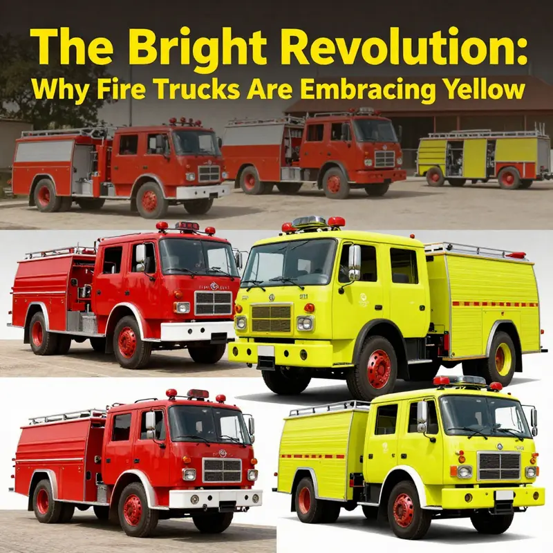
Why the color of a fire truck matters
Color is more than decoration for emergency vehicles. It signals urgency, marks authority, and guides split-second decisions on the road. For over a century, fire engines were almost universally red. That bold hue carried symbolic weight and practical reasons behind its adoption. Yet, in recent decades, safety science and real-world data have driven a gradual, pragmatic shift toward lime-yellow and fluorescent shades. This chapter traces that journey, showing how early choices, cultural identity, and emerging research combined to reshape what we expect an emergency vehicle to look like.
At the start of the motor era, most civilian cars were painted black. That trend was not accidental. Black finishes dried faster and cost less, making them a sensible commercial choice. When fire departments acquired motorized apparatus, they faced a visibility problem amid a growing sea of dark cars. A brighter color was easier to spot. Red served that purpose well. It contrasted against black vehicles, street surfaces, and the urban palette of the period. Paint availability and cost also mattered: red pigments were durable and affordable then. For volunteer companies, color became a form of identity. Bright red conveyed boldness and pride. It helped muster members, distinguish competing companies at parades, and communicate urgency when responding to alarms. Over time, red developed cultural resonance: when people thought of firefighting, they pictured red.
That symbolic power reinforced habit. Municipal procurement, public expectation, and imagery in newspapers all reinforced red as the norm. Traditions are sticky. Departments tend to preserve appearance across generations. Uniforms, insignia, and station décor often align with apparatus color. Changing a fleet’s hue can feel like altering civic memory. For many communities, a red engine is part of local identity as much as its siren.
But visibility is not only cultural; it is physiological and environmental. Human eyes detect different wavelengths with varying efficiency. Under certain lighting or weather, some colors stand out while others fade into the background. Research into crash statistics and human factors began to question whether red truly offered the best visibility in all conditions. The U.S. Fire Administration and researchers in traffic safety examined real-world incidents where emergency vehicles were involved in collisions during responses. They found a striking pattern: vehicles painted lime-yellow or fluorescent green were detected earlier by drivers and pedestrians, particularly in low light, fog, rain, or bright glare.
Lime-yellow occupies a sweet spot in the visible spectrum for human sensitivity. It reflects light in a way that the eye picks up more readily, increasing detection distance. In practical terms, detection distance matters. Even a few seconds saved in identifying an approaching fire truck can reduce the likelihood of an intersection collision or a delayed clearance of lanes. Departments that switched to high-visibility colors reported fewer response-time accidents. Those outcomes transformed the debate from one of tradition to one of safety.
Regional factors amplified the argument. In places with frequent downpours, sea mist, or intense sunlight reflecting off water and pavement, contrast can disappear quickly. Coastal regions and tropical locales, for instance, often present shifting glare and diffuse light that dull red hues. There, a lime-yellow surface cuts through haze and reflects differently, making an apparatus noticeable against varied backgrounds. Some departments in such climates adopted fluorescent schemes not as a fashion choice, but as a targeted mitigation against local hazards.
Adoption, however, has not been uniform. Many departments remain red, citing legacy, visibility of lights and reflective striping, and community preference. Others embraced a hybrid approach: red bodies with broad lime-yellow striping, or lime-yellow bodies with deep red accents. These compromises attempt to preserve traditional color cues while integrating modern visibility science. The debate often centers on trade-offs: identity and public recognition versus measurable safety gains. Budget also plays a role. Repainting a fleet is expensive. Departments frequently update colors only when ordering new apparatus. That natural replacement cycle makes change gradual, rather than immediate.
Psychology enters here as well. People associate red with danger, urgency, and authority. That emotional shorthand has value in commanding attention and compliance. But emotional salience does not override sensory physics. A vehicle that is highly visible before its lights are seen gives civilians and other drivers more time to respond. In mixed urban environments, milliseconds count. As evidence accumulated, more leaders framed color decisions as a public safety investment. When councils and chiefs review accident statistics, the argument for high-visibility colors carries weight.
The shift also influenced design beyond paint. Reflective striping, chevrons, and high-intensity lighting complement color choice. A lime-yellow surface with well-placed reflective elements maximizes detection across conditions. Departments learned to pair hues with layout and materials to achieve the best results. This systems approach treats color as one component in a broader visibility strategy.
Cultural reactions remain varied. Some communities welcome the change, valuing data-driven improvements. Others lament the loss of classic imagery. Media coverage sometimes frames the issue as tradition versus science, but it is more productive to see it as an evolving balance between identity and safety. Many departments find a middle ground that honors heritage while reducing risks. New apparatus may carry historical insignia, station colors, or red trim, while adopting modern base colors for safety.
Ultimately, the story of fire truck color reflects a shift in priorities. Early choices answered the needs of their time: cost, contrast against black cars, and civic pride. Modern choices respond to measured performance under real-world conditions. Where red once solved a visibility problem, lime-yellow and fluorescent tones now solve a different one. The move toward high-visibility paint is not a repudiation of tradition. It is a pragmatic evolution driven by data, local environment, and a commitment to protect both firefighters and the public they serve.
For departments and communities weighing the question, the evidence is plain: color influences detection, and detection influences safety. That realization has reframed procurement discussions, painting decisions, and public expectations. Tradition still matters, but when the goal is to save lives, visibility science has become a decisive factor. For readers who want the technical background and study findings that helped change minds, see the U.S. Fire Administration research on vehicle visibility: https://www.usfa.fema.gov/research/vehiclesafety/.
For ongoing discussions and examples from the field, including departments that have adopted high-visibility schemes, see the firetruck.space blog: firetruck.space/blog.
Bright Lines, Safe Streets: How Lime-Yellow Fire Trucks Translate Research into Quicker, Safer Emergency Responses
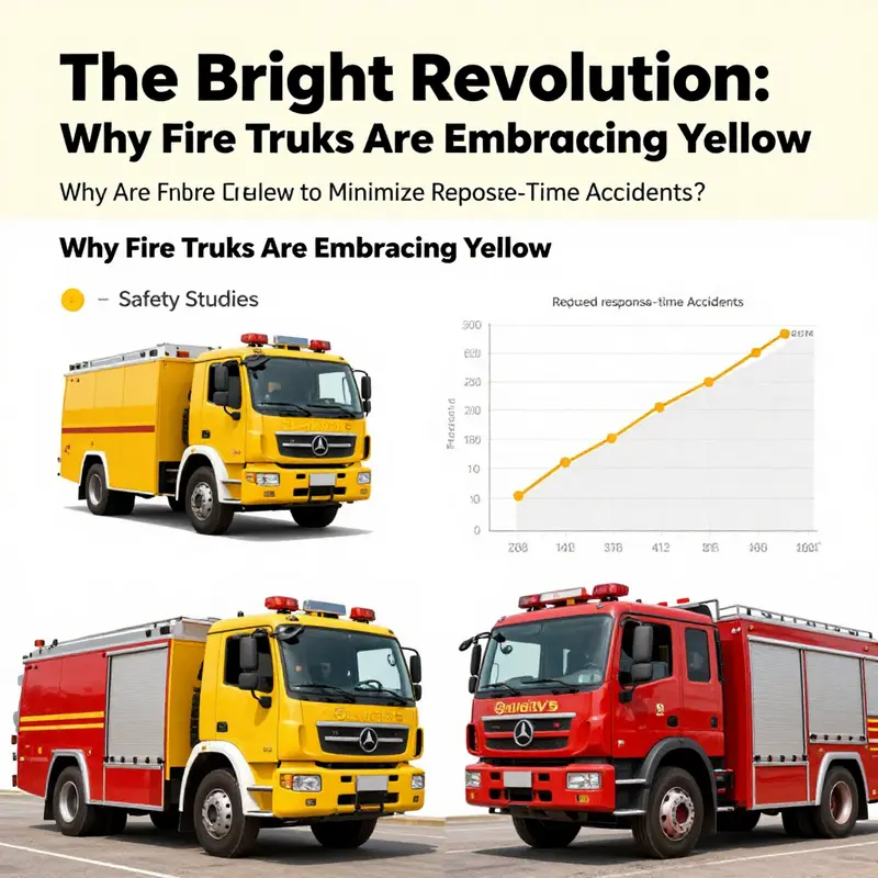
On the surface, the color of a fire truck might look like a matter of tradition or personality for a department. Yet the shift toward lime-yellow, or fluorescent yellow-green, marks a deliberate turn toward safety driven by science. This is not merely a cosmetic change; it is an applied classroom in which perception, physiology, and field practice intersect. When engines thunder toward an emergency, every fraction of a second counts. Color, as a design element, becomes part of the response system itself, shaping how quickly drivers notice a vehicle, how pedestrians interpret urgency, and how the entire scene is navigated under stress, glare, rain, or fog. In this sense, lime-yellow is a signal that aligns perceptual physics with life-saving action, turning a color choice into a measurable component of public safety.
The core of the argument rests on who sees what first and under which conditions. Human vision operates on a spectrum of sensitivity that peaks around wavelengths near 555 nanometers. That yellow-green region is where the eye is most efficient at detecting movement and contrast against a broad array of backgrounds—from gray asphalt to bright urban facades. In practical terms, lime-yellow stands out more quickly than red when you consider the clutter of a city street or the changing light of early dawn and late dusk. This enhanced detectability translates into faster recognition by other drivers and pedestrians, a faster assessment of risk, and ultimately quicker, safer maneuvering around an emergency scene. It is a counterintuitive truth for many until they see the numbers and the field stories that accompany them: color is not just a badge, it is a reliability feature that improves reaction time when every second matters.
Support for this view comes from focused, field-oriented research that treats emergency vehicles as moving visibility challenges rather than static objects. A landmark study conducted by a national research body found striking results: lime-yellow emergency vehicles experienced significantly fewer collisions than their red counterparts. The exact figures vary by study, but the most influential results point to a dramatic reduction in accidents during high-stakes responses. The mechanism is anchored in human perception—yellow-green light is detected earlier, and the brain processes it with a speed that reduces the chance of a collision in the critical seconds when a fire truck surges through intersections or lanes obstructed by other traffic. When people acknowledge an approaching emergency vehicle sooner, they react sooner, and that reaction time compounds across a whole chain of drivers and pedestrians who share the roadway.
These results are not abstract theory; they have spurred tangible policy and practice changes in communities that have long depended on rapid, reliable responses. In Hawaii, where weather patterns intensify visibility challenges—persistent downpours, sea mists, and bright sun reflecting off water and pavement—the switch to high-visibility yellow has proven particularly effective. The visual environments in such settings are messy and variable: glints off wet surfaces, white spray from surf, and the all-too-common glare from the sun low on the horizon. Lime-yellow’s edge lies in its ability to remain conspicuous across this spectrum of conditions, cutting through reflections and backscatter that often obscure other colors. The practical takeaway is simple: the right color reduces the chance of a near-miss during the run, thus protecting both crews and bystanders as they move through traffic to reach a scene.
Historical context matters here, too. Red fire trucks have a long and storied origin, tracing back to early modern fleets where affordability, contrast with black Model T bodies, and symbolic identity all intertwined to make red a default. Yet the safety science of visibility began to tilt the balance. When departments re-examined traditional conventions through the lens of collision data and international practices, lime-yellow emerged not as a fad but as a reasoned choice grounded in evidence. The Honolulu Fire Department, for instance, undertook a measured transition in the late 1980s after reviewing data and observing international norms. The goal was clear: reduce injuries, reduce vehicle-related incidents, and align with what other systems around the world had learned about visibility. This is a telling case where a city’s willingness to recalibrate tradition in light of evidence paid off in safer, more efficient emergency responses.
The broader significance lies in the mindset shift this entails. Fire departments are known for precision and discipline, yet they operate within the uncertainties of weather, traffic, and human behavior. A color choice—simple in concept—becomes a lever for reducing risk and accelerating response. The move toward lime-yellow embodies a larger trend in emergency services: decisions rooted in data, reproducible results, and practical field validation rather than inherited aesthetics or nostalgia. It is not that red disappears from the fleet entirely; rather, many departments incorporate lime-yellow as the primary hue or in high-visibility accents to maximize detection while preserving a recognizable identity. As the research landscape evolves, the color of emergency apparatus becomes one of many design variables tested and refined through actual incident data, pedestrian and driver behavior, and the evolving standard of care in rescue operations.
In discussing visibility, it is important to acknowledge the ongoing balance between detectability and other operational considerations. Colors interact with reflective materials, lighting systems on the apparatus, and the surrounding environment. Lime-yellow often pairs with reflective trimming and high-contrast markings to ensure that the vehicle remains conspicuous both during daylight and at night. This layering of safety features confirms that the color choice is not a single fix but part of an integrated approach to on-road safety. Departments must also weigh maintenance realities, such as color longevity, seduction by the palette across different climates, and the cost of rebranding a fleet. The science, however, remains persuasive: a color that is easier to detect translates into faster reactions, fewer close calls, and a smoother, safer route to the scene for everyone involved.
For readers who want to explore how these ideas move from laboratory tests to street-level changes, a deeper dive is available in discussions hosted by industry writers and researchers alike. As discussed in the Fire Truck Space Blog, the color debate illustrates a broader principle: evidence-based design can translate directly into public safety outcomes. The blog reflects on how departments test, implement, and evaluate such decisions, highlighting the practical, lived experience of crews who observe the difference in real-world runs. This coupling of science and practice reinforces the idea that color is a design tool with measurable consequences, not merely a house style or branding decision.
In sum, the move to lime-yellow is a deliberate, data-informed choice that aligns perception with action. It acknowledges how the eye processes color, how humans react under stress, and how urban and rural drivers respond to urgent signals on roads and highways. It recognizes that emergency response is a system—colored signals, lighting, traffic coordination, and the choreography of responders—where each element supports speed without compromising safety. The greenish-yellow hue, the reflective accents, and the disciplined deployment of these vehicles together form a line of defense as vehicles cut through traffic, lights ablaze and sirens singing a predictable, legible message to the road. When a community embraces this approach, the science that underpins it moves from the page to the pavement, where it can save minutes, and in turn, save lives.
Internal link: For a concise look at how practitioners connect research findings to street-level practice, see the discussion in the Fire Truck Space Blog. Fire Truck Space Blog.
External resource: Emergency Vehicle Visibility Study (National Research Council Canada) offers the foundational data behind these conclusions. https://www.nrc-cnrc.gc.ca/eng/solutions/transportation/roadsafety/emergencyvehicle_visibility.html
Hawaii, Myths, and the Real Color Game: Why Fire Trucks Aren’t Yellow Here—and What Colors Do Save Time
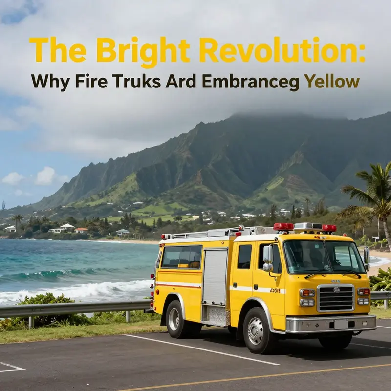
When people first hear the question of why fire trucks are yellow, they often picture a bright isle palette and a dramatic sunset behind a fleet of gleaming lime-yellow machines. But in Hawaii, the simple rule of color is not that straightforward. There is no official statewide mandate that all Hawaiian fire apparatus must be yellow, and in practice most departments still paint their engines red. Color decisions are driven by visibility research, local weather, road geometry, and administrative policy rather than by geography alone. In other words, color is decided department by department, not island by island. The myth of a universal Hawaiian yellow fleet is a story that travels easily in headlines and social media, but it does not hold up under official fleet records or the day-to-day choices of the crews who respond to calls across the islands. To understand why a color might be chosen, it helps to zoom out from the myth and consider what visibility science actually says, and how it plays out in a place with rain, mist, and bright coastal light as a daily backdrop.
The core idea behind shifting toward brighter hues is not simply aesthetic preference but safety science. Lime-yellow or fluorescent yellow has been shown to offer superior detectability in a range of challenging conditions. A landmark study conducted under the auspices of the U.S. Fire Administration found that lime-yellow fire vehicles could be detected more quickly and with fewer response-time accidents than red ones in certain contexts. The implication is straightforward: color can influence how fast a driver notices an approaching emergency vehicle, and how quickly a pedestrian or cyclist reacts when a siren enters the field of view. The practical takeaway for departments is that color is part of a safety toolkit—one element alongside lighting, signage, and reflective markings. In a compact urban corridor or a coastal road that twists through rain squalls, the difference between a split-second recognition and a near miss can be the difference between life and death for someone in danger and someone trying to reach help on time.
Hawaii’s weather and geography intensify the visibility challenge in ways that are easy to misinterpret from across the continental United States. The frequent downpours and sea mist, the bright glare off wet pavement, and the way light refracts off spray off the ocean all create scenes where background contrast can shift rapidly. In such environments, a highly visible color tends to stand out against the typical palette one sees along coastal roads and rural lanes: deep greens, ocean blues, and sun-bleached grays. Lime-yellow has a distinct edge in many of these conditions because it remains legible when glare is high and when objects are backlit by the sun. Yet red still performs well in many backgrounds, especially where the surrounding terrain is darker or where urban color cues dominate the scene. The best color, in short, is not universal; it is context-dependent, balancing detectability with other practical factors like durability, cost, and institutional branding.
The reality on the ground reflects a broader national pattern: color choices are policy-driven and contingent on each department’s fleet philosophy. In Hawaii, as elsewhere, the choice often comes down to prioritizing the most visible configuration given the local mix of roads, weather, and traffic. For example, the fleet information publicly available from a major city in the state confirms that red remains the dominant color for fire apparatus. This is not a universal declaration about the entire state, but a reflection of one department’s assessment of what works best for their streets and neighborhoods. Departments also deploy color strategically for certain vehicles. White, yellow, or other bright tones may appear on support units, training rigs, or reserve fleets, but these choices are typically part of a broader branding or labeling system rather than a statewide mandate. The essential point is that color variety exists because visibility science, cost considerations, and organizational identity all matter in real-world operations.
Confusion about Hawaii specifically being yellow often arises from cultural associations and media narratives that blend local imagery with color symbolism. Hawaii’s vibrant, sun-drenched visuals and luau aesthetics contribute to a perception that the islands prefer bright yellows in many contexts. That cultural cue, while charming, has little bearing on the formal color policies governing emergency vehicles. The truth is that the yellow notion travels in the same way urban legends travel: it persists in stories, even when official sources show a different picture. When people encounter a fleet page or a press release from a county department, they discover a more nuanced truth—color is part of a designed system that must perform under diverse conditions, not a postcard-ready color scheme tied to a single place.
The conversation about color is inseparable from the broader toolbox of visibility practices. Researchers emphasize a combination of strategies: high-contrast markings, reflective trim, and lighting that remains effective in rain, fog, and at night. A color itself can be improved by how it is used—whether it is paired with reflective tape, outlined with luminescent borders, or integrated into a fleet’s overall design language. In practice, many departments experiment with color as one piece of a larger vision for conspicuity. The aim is to reduce reaction times for both other drivers and pedestrians while maintaining the integrity of the fleet’s branding and the durability of the paint in coastal, corrosive environments. The evolving pattern across the country is toward enhanced visibility without sacrificing practicalities like maintenance costs and long-term durability.
As readers explore this topic, it becomes clear that debates about color are never about a single hue in isolation. They are about how color, light, and texture interact with human perception on busy streets, in variable weather, and along routes that carry responders through the most time-sensitive moments of a call. A department that adopts a lime-yellow scheme does so with the expectation that the color will be reliably detected in the most demanding conditions. A department that sticks with red does so with the confidence that the hue remains instantly recognizable across a broad spectrum of landscapes. And some fleets blend approaches, reserving certain colors for specific roles or types of vehicles while preserving red as a common baseline for the majority of apparatus. The outcome is a spectrum rather than a single rule, with each choice grounded in local data, field experience, and the specifics of the surrounding road network.
For readers who want a closer look at how these decisions are framed in practice, it can be instructive to explore discussions within industry spaces that bring fleet design and safety science into a common conversation. In this chapter, you’ll find a practical perspective rooted in the real-world experience of departments facing rain-soaked commutes and glare-filled mornings. If you’d like to dive deeper into the broader dialogue about emergency-vehicle visibility and design, a concise overview is available at the Fire Truck Blog, which offers accessible discussions that place color choice within the larger context of apparatus design and safety considerations. Fire Truck Blog.
Meanwhile, for readers seeking authoritative local context, official fleet information from Hawaii’s major departments underscores that red remains the standard color for emergency apparatus in many jurisdictions within the state, and any use of alternative hues tends to be selective and purpose-driven rather than statewide policy.
External resource: Honolulu Fleet Information provides a concrete example of how a city’s fleet color policy is implemented in practice, illustrating the balance of visibility science, environmental realities, and organizational identity that shapes these visual choices across Hawaii and beyond.
Beyond Red: How Lime-Yellow and High-Visibility Design Are Shaping the Future of Fire Trucks
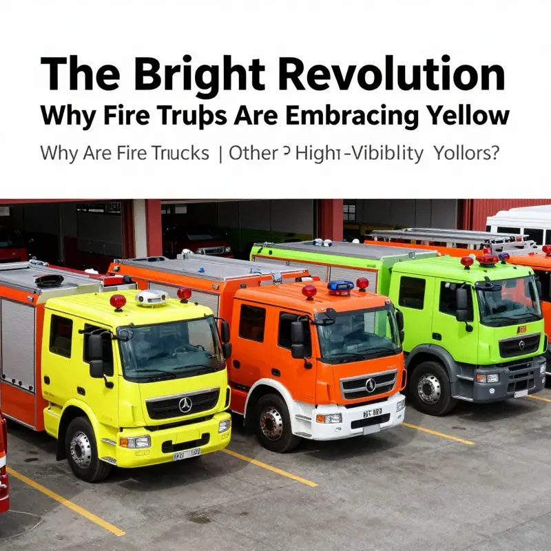
Visibility First: The Next Wave in Emergency Vehicle Design
The growing move from traditional red toward lime-yellow and other fluorescent hues marks a practical evolution in fire apparatus design. This change is no fad. It follows clear science about human vision, documented risk reductions, and a desire to improve safety during emergency responses. As departments evaluate color choices, they weigh the symbolic power of red against measurable gains in detectability. The result is a cautious but steady march toward colors and materials that help drivers, pedestrians, and other responders notice emergency vehicles earlier.
Human perception drives the trend. The eye detects wavelengths in the yellow-green range more readily, especially in low light, fog, and glare. That advantage translates into split seconds gained for motorists. Those seconds often reduce braking distance and evasive maneuvers, lowering collision risk. A landmark study by the U.S. Fire Administration showed lime-yellow vehicles experienced fewer response-time accidents than red ones. That empirical finding influences policy and procurement decisions for fire agencies across diverse climates.
Places with complex visibility challenges illustrate the benefit clearly. In coastal regions, sudden downpours and mist scatter light and obscure shapes. Sun glare reflecting off water and wet pavement can wash out red tones. Lime-yellow resists that camouflage. It stands out against both urban backdrops and natural scenery. Departments serving such areas often adopt high-visibility paint to reduce on-road risk during urgent runs.
Color is just one element in a larger visibility toolkit. Future fire apparatus will combine bright pigments with reflective striping, high-intensity LED arrays, and materials engineered to catch and redirect light. Retroreflective sheeting boosts nighttime conspicuity. Fluorescent pigments react to ultraviolet light, increasing daytime brightness. When designers marry these technologies, the vehicle becomes visible at greater distances and under tougher conditions. That layered approach produces consistent gains in recognition and reaction time.
Adoption faces real hurdles. Tradition and identity run deep. Red has long served as a visual shorthand for firefighting. Departments worry about losing heritage and public recognition. There are also procurement realities. Replacement cycles for apparatus span decades, and repainting fleets is costly. Fire agencies must justify color changes with safety data and budget plans. But as evidence accumulates, more departments see the long-term trade-off as worthwhile. New purchases often favor high-visibility schemes, while legacy vehicles may receive targeted upgrades in lighting and striping.
Standardization will likely follow adoption. Municipal and national agencies need consistent guidelines that balance visibility with identity. Specifications will address pigment reflectance, retroreflective stripe placement, and the integration of auxiliary lighting. Training materials will change too. Drivers and the public must learn to recognize a wider palette of emergency vehicles quickly. Public outreach campaigns can shorten the transition period by explaining why color choices matter for safety.
Beyond color, future trends stress human-centered design. Cockpit ergonomics, control layout, and communication systems all influence response safety. But exterior appearance plays a singular role: it determines whether other road users notice the vehicle in the first place. As engineers tweak aerodynamics, reduce blind spots, and add sensor systems, the exterior color remains a primary cue for eye-brain recognition. Brighter colors, combined with smarter lighting, will help systems and people work together to avoid collisions.
International cities offer useful lessons. Some countries have already standardized high-visibility liveries for a range of emergency services. Where adoption has been broad, crash statistics show improvements. These real-world examples provide models for training, procurement, and public messaging. They also reveal pitfalls. Poorly chosen contrasts or confusing liveries can undermine recognition. Clear, simple patterns, and consistent placement of reflective elements, produce the best outcomes.
Cost considerations are important but surmountable. The incremental price premium for fluorescent pigments and retroreflective sheeting is often offset by reduced accident costs and lower downtime. Insurers and municipal risk managers increasingly factor visibility into loss-prevention strategies. When a department can point to fewer collisions and faster clearances, the financial case for high-visibility paint strengthens. Grants and cooperative purchasing programs further ease the transition for smaller agencies.
Change will not be uniform. Some departments will cling to red for identity reasons. Others will adopt hybrid solutions, using red bases with lime-yellow panels or conspicuous striping. Hybrid liveries preserve tradition while improving detectability. These mixed approaches can deliver much of the safety benefit without a total break from historical color schemes.
The broader lesson is pragmatic: emergency vehicle color choices should prioritize human detection. Modern materials and lighting make that easier than ever. As studies continue to validate visibility advantages, logic favors those options that save lives and prevent injuries. Departments that adapt will likely see fewer roadway incidents during response and safer operations around scenes.
For professionals seeking deeper context and practical guidance, industry conversations and technical resources can help. Ongoing discussions on fleet design and visibility are available through community resources such as the firetruck.space blog. For the foundational research on color and emergency vehicle safety, see the U.S. Fire Administration analysis on emergency vehicle colors: https://www.fema.gov/emergency-vehicles-and-colors
Final thoughts
The shift from the traditional red fire truck to lime-yellow and other high-visibility colors signifies more than just a change in aesthetics; it embodies a renewed commitment to safety and effectiveness in emergency response. As the evidence mounts regarding the benefits of visibility in challenging conditions, fire departments worldwide are re-evaluating their color choices not just for tradition’s sake, but for what ultimately makes a difference when lives are on the line. The future holds exciting possibilities as we may see even broader adoption of bright colors in firefighting, enriching the legacy of emergency services with each bold new paint job. Together, we celebrate not only a change in color but a brighter outlook for safety in our communities.