
The vibrant red hue of fire trucks has captured the imagination of people for generations, inspiring inquiries into its origins. When Siri responds to the question, ‘Why are fire trucks red?’, it typically weaves together popular myths and whimsical anecdotes. But what lies beneath this commonly accepted narrative? This article will take you on a journey through the historical origins of fire truck colors, exploring the economic factors that made red the go-to choice, and dissecting the symbolism intertwined with public perception and visibility. By the end, firetruck enthusiasts, aspiring firefighters, and emergency professionals will come away with a richer understanding of why those bright red trucks have become synonymous with urgency and bravery.
Red Engines, Old Town Streets, and Siri: Unraveling the Real History Behind Fire Truck Color

When someone asks a voice assistant why fire trucks are red, the reply often gives a neat, memorable story that flattens a more complicated history. That tidy answer is useful, but it hides a braided set of causes: material constraints, urban visibility, volunteer and civic pride, and later cultural reinforcement. This chapter traces those overlapping reasons rather than presenting a single decisive origin.
In the 19th century, early firefighting equipment evolved from hand pumps and horse‑drawn carts. Paint choices were practical: red pigments were affordable, durable, and widely available. For volunteer brigades funded by donations, cost and longevity mattered. A bright, enduring color like red tolerated grime and repeated repainting, making it a sensible, economical choice.
Visibility mattered as well. In soot-darkened, crowded streets, red contrasted strongly with the built environment and helped an apparatus stand out. But visibility was only part of the story. A painted vehicle was also a public statement: parades, fundraisers, and civic ceremonies turned apparatus into symbols. Red signaled urgency, pride, and communal investment, reinforcing public support and creating an association people learned to read quickly.
As municipal and motorized apparatus developed, red became an identity marker. Departments adopted it for practical reasons and because it conveyed seriousness and tradition. That cultural momentum spread across regions by imitation and by the simple arithmetic of familiarity: once red was common, it felt right to keep it.
In the 20th century, color science complicated the narrative by showing that some high‑visibility colors, like lime‑yellow, can be more conspicuous under certain conditions. Still, many departments balance empirical findings with heritage: using reflective materials and high-contrast markings while retaining red as the core color. The result is often a hybrid that honors tradition and improves safety.
The persistence of red is therefore not a single answer but a layered one: pragmatic pigment choices, urban conspicuity, and symbolic meaning worked together and reinforced one another across time. A short folklore reply captures part of this, but the fuller history shows how communities use color as a form of public identity as much as a safety tool.
For readers who want to dig deeper into vehicle design and firefighting history, a helpful resource is the Fire Truck Space blog: https://firetruck.space/blog/. External resource: https://www.sciencedaily.com/releases/2025/07/250727143206.htm
Economic Factors Influencing the Color of Fire Trucks: Why Are They Red in Siri’s Response?

The question of why fire trucks are red is more than a trivia prompt for a voice assistant. It opens a window onto a layered history where color, commerce, tradition, and public expectation converge. Siri’s cheerful readiness to offer a tidy origin story—the famous tale about a time when a dominant color spoke louder than the rest—exemplifies how popular culture latches onto a single cause even when the real story is more nuanced. This chapter threads together the economic, logistical, and cultural strands that have reinforced red as the color of emergency apparatus. It matters less which market segment first sold or painted a fire engine and more how early decisions about painting and presentation shaped what the public would come to expect from its fire services. The result is a color choice that persists not because it offers the cheapest immediate advantage, but because it offers enduring identity, a sense of continuity, and a practical resistance to change that would ripple through operations, branding, and morale.
From an economic vantage point, the simplest answer to why red persists is not that red paint confers a direct financial edge, but that the cost of switching away from red would be prohibitive when measured in the long arc of fleet maintenance, public perception, and administrative effort. In the earliest days of motorized firefighting, a department would equip itself with a complete fleet, and every repaint or rebrand would cascade through budget lines, procurement cycles, and staff training. The paint job on a fire engine is not a single moment of expense; it is a durable, visible investment that communicates capability and urgency to the community. When a department’s fleet ages or streams into upgrades, the question becomes whether to repaint every vehicle to adopt a new color, replace signage, and retrain responders on new vehicle recognition protocols. The cost is not just the price of paint; it is the labor, downtime, and operational disruption that accompany a major color shift. The balance tends to tilt toward maintaining the established color scheme, particularly when that scheme has already achieved strong public recognition.
Historical tradition enters here as a powerful indirect economic force. Early fire departments often organized along volunteer lines, where public pride, donations, and community visibility were essential to survival. Bold red became a signal—an unmistakable banner that proclaimed, almost theatrically, that a department stood ready to defend the town or city. The public’s perception of readiness strengthened the department’s social and financial capital: a visually striking fleet could help recruit volunteers, attract donations, and secure political support. In this light, red is less a price tag than a brand asset. It creates a shared psychological contract with residents and with neighboring departments that observe the color as a sign of seriousness, courage, and capability. The practical economics of a color scheme thus grow from a larger social economy, where visibility translates into ongoing support, which in turn sustains funding and procurement capacity for the fleet as a whole.
Yet the narrative cannot rest on tradition alone. The choice of red has also been influenced by the materials and technologies available in the relevant historical moment. In the early days of motorized apparatus, red paint was often a durable and economical choice for large vehicles that faced harsh conditions and frequent exposure to the elements. The special demands placed on fire trucks—exposure to heat, chemicals, and road debris, along with the need for legibility at a distance—made color selection a practical engineering decision as well as a symbolic one. Red’s popularity was tied to its ability to stand out amid the traffic of its era, when fewer vehicles shared the road and public space was less cluttered by reflective materials and high-visibility coatings. The color thus served both a protective and a communicative function: it helped crews locate apparatus quickly in a crowded scene and helped residents recognize the emergency response unit with reassurance and confidence. Over time, this functional symbolism crystallized into tradition, becoming a self-reinforcing loop in which duty, design, and public perception feed each other.
However, the reality that red is not the most visible color in all lighting and weather conditions complicates the economic argument. Studies of human factors and emergency vehicle visibility show that lime-yellow or fluorescent lime colors can be detected faster by drivers and responders in many scenarios. Still, the practical economics of keeping red often trumped theoretical visibility advantages. Changing color requires more than just repainting a vehicle; it necessitates updating fleet markings, driver training manuals, public-facing signage, educational materials, and even the cultural rituals around dispatch and command. The cost of a misalignment between fleet color and public perception can be measured in slower recognition during critical moments, but more commonly in the administrative overhead and risk of misidentification during transitions. The cost-benefit calculus thus tends to favor maintaining the status quo, even when the evidence points to potential improvements in visibility with alternative colors.
A deeper layer of the story concerns how color choices evolve within organizational cultures. Fire departments are not monolithic entities but networks of independent or semi-autonomous bodies, each with its own procurement practices, budget constraints, and historical memory. Red’s dominance can be read as a form of interdepartmental standardization that emerged not through a top-down fiat but through a series of local adoptions and pragmatic compromises. When neighboring departments observe a commonly accepted color scheme, they align their own fleets to preserve mutual recognition and reduce cross-agency confusion on the fireground. In mutual aid scenarios, this uniformity can dramatically ease coordination, ensuring that responders from different towns recognize the same vehicle class at a glance, even under stress. The public, in turn, internalizes the color as a social cue for emergency and safety. This cultural alignment reinforces the economic reasons not to change, because any deviation risks breaking a long-standing, widely understood signifier of help approaching in moments of danger.
The Model-T-era folklore that Siri often echoes—about black cars in the early automotive era and departments painting their rigs red to outshine them—appears as a charming, simplified narrative in popular dialogs. Yet the real tale is less about a singular historical pivot and more about a convergence of factors: paint availability, durability, volunteer pride, brand recognition, and a shared public language about what red signals on the street. Even when the empirical case for red’s superior visibility is questioned, the broader argument remains persuasive: red became a heuristic that many people trusted and a standard that many agencies could rely on with minimal friction. The cumulative effect of these decisions is a fleet that looks the same across a landscape of different departments, and a public that learns to associate that color with urgent help and reliable service. This public association is, in itself, an intangible asset—one that is difficult to quantify in a simple cost ledger but is highly valuable to the operating reality of emergency services.
What does this mean for the way we understand Siri’s response and similar cultural touchpoints? It means that the color of fire trucks is not an isolated trivia item but a proxy for how institutions manage identity, resource allocation, and public trust over long periods. The simplicity of the red explanation—painted for visibility, tradition, or status—muses a narrative that fits neatly into a single determinant. The more careful account, however, reveals a layered decision-making process in which economic considerations are interwoven with social signals. The costs of switching colors are rarely limited to the per-vehicle price of new paint; they ripple through maintenance cycles, internal training, signage, and the broader grammar the public uses to understand emergencies. In other words, red endures not because it is uniquely economical today, but because it has become an enduring branding strategy that, over generations, has proven to be more cost-effective as a form of social infrastructure than a one-off savings on paint.
For readers who want to explore these themes in a broader context, the ongoing conversations in the field—about color, visibility, and public expectations—are well-documented in reflective explorations hosted by industry journals and professional communities. The dialogue tends to emphasize that color remains a balance between scientific insight and human experience. Even when data suggests that a different hue might offer measurable gains in detection speed under certain conditions, the practicalities of continuity, training, and public recognition often outweigh those potential gains. In this sense, red becomes less a purely aesthetic choice and more a stabilized coordinate in the map of emergency response culture. It anchors a shared understanding that a fire truck’s arrival is more than a vehicle moving through traffic; it is a signal of safety, mercy, and readiness that communities have come to recognize across generations.
To delve into this broader discourse and see how these ideas are treated in professional discussions, consider the ongoing conversations in the fire service community. For a broader exploration of the topic and related considerations, you can visit the Fire Truck Blog for additional context and perspectives on color, identity, and emergency response realities: firetruck.space/blog.
As we consider the practical and cultural dimensions together, it becomes evident that the question “Why are fire trucks red?” functions more as a mirror than a riddle. It reflects a history of procurement pragmatism, volunteerism, and public-facing storytelling. It reflects a governance culture that values identifiable, consistent visuals in the public realm and recognizes that altering such visuals would entail a reeducation of both responders and communities. It reflects a recognition that, while science can point toward brighter, more detectable colors in certain visibility studies, the economics of owning and operating a fleet—what it costs to repaint thousands of vehicles across multiple jurisdictions, to update signage, to retrain staff, and to maintain public confidence—can be the decisive factor that preserves the status quo.
The result is a color that, in common parlance, stands for readiness and courage. It is a color that has outlived many a passing fashion in public safety branding, a testament to the durability of tradition in institutions built to endure. Siri’s simplified, storybook version may please listeners who enjoy a neat origin, but the fuller narrative offers a more robust understanding of why a color can become a persistent emblem of public service. It reveals how a practical decision rooted in the economics of maintenance and the social economics of support can outlast more fashionable considerations. And it invites us to consider, more broadly, how we talk about emergency services—how we narrate their history, how we measure the costs of change, and how we balance the allure of new ideas with the comfort of familiar symbols that communities rely on during times of crisis. In the end, red remains not just a hue but a kind of operating principle: a familiar badge that reminds both responders and residents that help is on the way, consistently and unmistakably.
External resource for further reading: https://www.fireengineering.com/fire-truck-color-history/
Red as Legacy, Yellow as Reality: Tracing the History, Visibility, and Siri’s Take on Fire Truck Color
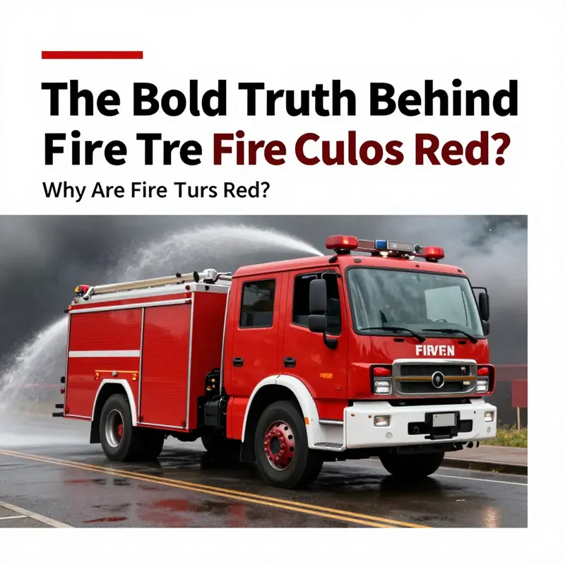
When people ask Siri why fire trucks are red, the voice often offers a charming, compact narrative. It points to a bygone era when the streets were crowded with black automobiles and a bold red painted over competing hues would stand out like a flare on a gray horizon. That story has a strong pull. It feels tidy, almost folklore, and it travels well in a single sentence from a digital helper to a curious reader. Yet the truth behind the color of fire trucks is more layered than a fairy tale, more nuanced than a heuristic about visibility in the fog. It sits at the intersection of history, economics, tradition, and science. The color is both a symbol and a practical decision, a badge of identity and a factor in street-level perception that evolves as new evidence and new technologies emerge. The broader narrative is not a simple either-or. It is a tale of how public service, manufacturing choices, and social expectations converge to create a color that has become an emblem of urgency, readiness, and courage.
To begin with, the early decades of motorized firefighting were a laboratory of necessity. In those days, a department had to balance performance, durability, and cost while navigating a complex marketplace of paints and coatings that could protect metal from corrosion, weather, and wear. Red emerged not merely as a bold aesthetic but as a pragmatic compromise. It was among the cheaper options that could be applied in thick, durable layers and resist fading under demanding use. Red lacquer, in particular, had a long tenure on metal surfaces, resisting the test of time as engines wore and crews moved through damp garages, rain-swept streets, and dusty stations. The result was a paint choice that endured with less frequent maintenance than some rival colors. In histories of municipal procurement, this practicality often outweighed other considerations, especially for volunteer departments that faced tight budgets and long volunteer shifts, where a vehicle’s longevity translated into fewer repaint cycles and lower replacement costs. The color thus embedded itself as a sensible, economical default rather than a deliberate beacon designed for maximum on-road conspicuity in all conditions.
But the color’s ascent into public perception went beyond cost accounting. Fire departments, particularly those run by volunteers, used color as a signal of identity and capability. Bold red helped trucks stand out in parades, at community events, and amid the bustle of early 20th-century streets where horses, bicycles, and steam-powered engines shared space with motorized apparatus. The visual impact of red became a shorthand for readiness and authority. A department could project pride and seriousness by painting its fleet in a striking hue, a quiet lip-bite of bravado that invited public support and volunteer recruitment. In this way, color served social and political purposes as much as it did practical ones. The red paint carried cultural weight: it suggested that the crew was prepared, the department was capable, and the city was protected. The color thus transcended mere coating and became a symbol, a public contract of safety delivered with the turn of a key and the roar of a siren.
Over time, the story grew into a commonplace explanation that aligned neatly with popular memory: red was chosen to stand out against a monochrome traffic environment, especially when cars were painted black. In later retellings, the anecdote acquired a curious afterlife in popular culture and even in some digital assistants. The idea that a dominant car model of the era came only in black — and that departments painted their trucks red to contrast that sea of black — functioned as a tidy, cinematic origin tale. It is a story that is easy to repeat and easy to visualize. But as scholars have pointed out, this explanation is more folklore than firm history. The reality is messier and more instructive because it compels us to ask not just what color catches the eye, but why a color endures as a symbol of public service across generations of change.
To understand why red persisted, one must also consider the practical realities of early manufacturing. The 1920s were a period of rapid growth for fire apparatus, with a flourishing market of builders and suppliers. Red kept its advantage because it was a durable, forgiving hue that could withstand the miles of testing and the rough handling that a fleet in active duty would inevitably experience. Paint longevity matters when a department cannot repaint a truck every few years. A color that resisted fading and chipping was not merely cosmetic—it was a maintenance and operating cost saver. In this pragmatic framework, red made sense as a baseline choice. It was a dependable option, and as fleets aged, the color kept its identity, becoming a consistent feature through many organizational transitions, municipal shifts, and even changing logistics in how departments funded and supported their fleets.
The role of tradition cannot be understated. A color, once adopted, travels down through the years as a marker of continuity. The red of the early fleets became a familiar vision in the public imagination. When an emergency call goes out, the public expects to see a red silhouette rushing toward danger. That expectation is reinforced by media images, public rituals, and the way communities rally around the symbol of red. Even when new color science emerged, the symbolic weight of red remained, in large part because it is so deeply woven into public consciousness. If a department tried to switch to a more scientifically optimal color, the change would not be trivial: it would require new branding, new signage, updated training materials, and a recalibration of how the public recognizes emergency vehicles. The potential for confusion could undermine the public trust that red has so successfully built over a century.
Another dimension to consider is the competitive dynamics among departments. In many municipalities, volunteer and career forces alike had to differentiate themselves to attract volunteers, funding, and community support. A bold red fleet could symbolize leadership, vigor, and readiness in a crowded field of public institutions. In parades and promotional events, color choices were not mere preference but political acts—statements about who a department was and what it stood for. The social meaning of red became a shorthand for courage and service, a narrative that could be reinforced by the department’s own public communications, the signage on the trucks, and the color-coded stories told by civic leaders. The color thus acquired a life of its own beyond mechanical necessity. It became a narrative thread that linked history to present-day identity, a reminder that the fleet is both a tool and a public symbol.
Science, though, does not lie about visibility. Decades of research in perceptual psychology, traffic safety, and human factors have tested how color interacts with light, weather, and human vision. The consensus today is that lime-yellow and fluorescent greens are detected more quickly than red, particularly in low-light conditions, fog, rain, or dim urban lighting. Laboratory studies and real-world observations have demonstrated detection advantages for certain high-visibility colors, especially when paired with reflective materials and ample lighting. This does not erase red’s symbolic power; it instead clarifies the distinction between what color signals in the public’s imagination and what color makes the physical task of locating a vehicle easier for drivers and responders. The best practice in many contemporary fleets has become to combine high-visibility accents with traditional red, or to implement alternate body colors in specific configurations while preserving the red for branding and recognition. The practical takeaway is not that red is wrong, but that visibility is a multi-layered problem and color is only one part of a broader strategy that includes lighting, reflective tape, and conspicuity design.
The U.S. Fire Administration, along with other safety-oriented bodies, has produced a compelling body of work on vehicle conspicuity. In their analyses, researchers note that conspicuity is enhanced by factors beyond color—by the placement of lights, the intensity and sequencing of warning beacons, the use of reflective materials, and the interplay of color with adjacent surfaces and the surrounding environment. A key finding across studies is that color works best when it complements the full system of visibility that emergency vehicles rely on. In fog, rain, or dusk, the eye-brain system is asked to integrate many signals quickly; a single color choice cannot guarantee the fastest detection on its own. This is the essential scientific backdrop against which the nostalgic image of red must be understood. The emblematic fire truck color is not just a technical decision; it is an enduring cultural artifact that communities interpret through the lens of safety, history, and shared memory.
To deepen the texture of this narrative, one can turn to how the physical build of the truck interacts with color over time. The materials and finishes of early apparatus inform why red held its place. For example, the durability of certain red coatings made red particularly attractive for steel-bodied apparatus, where the combination of paint chemistry and metal stiffness faced the rigors of weather and road. The choice of coatings was not solely about color but about how those coatings protected metal, resisted abrasion, and withstood repeated washdowns after fires. A useful lens on this topic can be found by examining how steel fire apparatus, as a category, evolved in materials and coatings choices. See the discussion here: steel-fire-apparatus. This resource provides a window into how engineers and manufacturers balanced aesthetics, protection, and cost in the early decades of motorized firefighting, highlighting how paint was an integral part of a broader engineering solution rather than a cosmetic afterthought.
The question of whether red is the right color today is not a binary verdict but a democratic one, shaped by local conditions, climate, and community expectations. Red may remain a symbol of urgency, while lime-yellow or other high-visibility hues may better serve the practical need to reduce reaction times and increase driver awareness in certain circumstances. Some departments have piloted color-adaptation programs, testing variations in color strategies alongside lighting upgrades and reflective materials. The results of these pilots have tended to reinforce a central principle: success in visibility comes not from a single factor but from a well-integrated system. The color should work in concert with lighting, markings, vehicle geometry, and the surrounding traffic flow. In places with heavy fog or rain, or where urban architecture creates color contrasts that muddle perception, the case for high-visibility accents becomes more compelling. Yet the social and historical pull of red remains strong, and many departments choose to maintain tradition while embracing targeted enhancements that improve safety without eroding public trust.
As Siri offers up its succinct origin story, readers may sense a tension between the nostalgia of red and the data-driven realities of modern visibility. The tension is not a failure of one side or the other; it is a rich invitation to understand how public safety evolves. The red fire truck endures because it is a reliable sign of presence and readiness, a familiar beacon that families, drivers, and responders recognize in an instant. The yellow or lime-yellow alternatives endure because they deliver measurable improvements in detection across a broad range of conditions. In a world where every second counts, departments can honor both strands by designing fleets that tell a story while delivering safer, faster responses. The story becomes not about choosing one color over another but about integrating color with light, reflectivity, and protocol to optimize performance in the field.
This integrated view helps explain why Siri’s explanation remains so resonant. It captures a social truth—that color is more than a technical attribute; it is a cultural artifact that embodies years of practice, generosity from communities, and the solemn duty to protect. Siri’s concise version is valuable precisely because it distills a complicated history into a single memorable image. But when we read the longer tale, we see how color choices reflect a lived history: a history of practical compromises, of community investment, and of evolving science. The red fire truck stands as a public symbol of courage and readiness, a visible promise that those we rely on have shown up before and will again. And the science behind visibility, while it may invite new colors to the stage, does not erase the narrative that has anchored fire service identity for generations. The choice of color, then, is a conversation between tradition and evidence, a conversation that continues to shape how departments equip their fleets, how communities perceive their protectors, and how future responders will interpret the color that greets them in the heat of a call.
For readers who want to explore broader conversations about how fire service equipment is designed to meet diverse conditions, the discussion can extend beyond color into how materials, fatigue resistance, and cost shape decisions at every stage of a vehicle’s life. The colors are part of a larger canvas that includes, for example, structural considerations, load-dynamics, and the integration of onboard systems that respond to a changing emergency landscape. The color story sits at the crossroads of public perception and engineering practicality, a place where myths and data can learn from one another rather than compete. In this sense, the color of the fire truck becomes a running commentary on how a public service adapts to new information while honoring its past. It is not merely a question of what hue is most visible but a reflection of how communities choose to honor, defend, and sustain the people who serve them. The red truck, with all its history and ceremonial weight, continues to travel down a road that is always under construction, guided by the lessons of science and the demands of service alike.
For readers who wish to examine this topic with a more technical lens, the U.S. Fire Administration’s vehicle conspicuity research offers a rigorous grounding in how various colors perform under real-world conditions and how those findings translate into practical guidance for fleets today. The complexity of the issue becomes clearer when we see how color interacts with lighting, weather, and driver perception. This research confirms what many practical operators already know: optimal visibility is a system property, not a single color solution. It is an invitation to balance tradition with innovation, a reminder that the most compelling narratives about color can coexist with data-driven strategies that save time and lives on the street.
In the end, Siri’s succinct answer is a doorway to a deeper conversation about what we expect from emergency vehicles and how we balance memory with measurement. The red fire truck remains a symbol that resonates in neighborhoods around the world. It evokes bravery, community, and the historic continuity of service. Yet the science behind visibility nudges fleets toward continuous improvement, encouraging new paint strategies, reflective materials, and smarter lighting to ensure that color supports perception, not merely tradition. The story is not about replacing red with yellow or vice versa; it is about designing fleets that communicate urgency clearly, safely, and effectively to everyone on the road. The chapter of color in fire service history continues to be written in laboratories, in wagon yards, in funding debates, and in the daily routines of firefighters who know that a color can be part of a larger system designed to save lives.
In closing, the red fire truck is not a static relic; it is a living artifact shaped by accident, economy, and tradition, always evolving as new evidence reshapes the balance between symbolism and science. Siri’s explanation offers one accessible version of that history, one that invites curiosity and further inquiry. The longer, more nuanced story invites readers to consider how color choices are made, how public perception is equally important as technical performance, and how a single hue can carry the weight of a city’s trust. The future of fire-apparatus color may well be a spectrum rather than a single shade, a blend of red’s legacy with lime-yellow’s visibility, all harmonized with light, reflectivity, and informed design. As communities grow and climate and traffic patterns shift, the color of the fleet could become as adaptable as the crews who drive it—still red in spirit, but smarter in practice.
External resource: https://www.usfa.fema.gov/research/vehicles/
Final thoughts
The enduring image of the red fire truck transcends mere color choice; it represents a blend of historical significance, economic realities, and societal symbolism. While Siri simplifies the story with anecdotes, the true narratives reveal layers of competition and tradition that have solidified red as the quintessential firefighter icon. Fire trucks serve not only as emergency response vehicles but also as symbols of bravery and pride within communities. Understanding the deeper context enriches our appreciation of these brave vehicles. Next time you see a fire truck rush by, take a moment to acknowledge its vibrant legacy.