
The vibrant hue of fire trucks has been a symbol of bravery and emergency response for generations. But why exactly are these iconic vehicles predominantly red? Is it merely tradition, or is there something deeper that ties this color to firefighting? In this exploration, we’ll delve into the rich tapestry of history that led to the adoption of red for fire trucks, examine the practical considerations and economic factors that influenced this choice, and analyze the psychological impact of color on both firefighters and the communities they serve. Each chapter will bring us closer to understanding why red is not just a color, but a powerful emblem of service and urgency in the firefighting world.
Red on the Road: How History, Economics, and Psychology Shaped Fire Trucks’ Iconic Hue
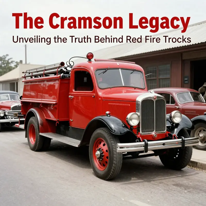
Fire trucks move through streets with a speed that makes them feel almost like living punctuation marks in the narrative of public safety. The color they bear is not merely an aesthetic choice but a layered signal that blends history, economics, and collective memory. To understand why fire engines are red, one must trace a path through a century of social practice, material constraints, and the evolving psychology of color as it relates to urgency and trust. The most familiar answer—red stands out, thus keeps people safe—contains a kernel of truth, but it is only a starting point. The full story reveals a tapestry of reasons that are seldom as simple as they first appear, a tapestry that still helps explain why the color endures even as science points toward other hues that can perform better under certain conditions.
The earliest strands of this history begin in the bustling era when municipal fleets began to motorize and cities needed a reliable way to locate and recognize their fire apparatus in traffic and in the might of smoke-filled streets. A widely recounted, though contested, tale ties the choice of red to the dawn of the automotive age when Henry Ford’s Model T popularized a sea of black cars. The story goes that fire departments, seeking to cut through the uniformity on the road, chose red precisely to stand out against the predominantly dark backdrop. It is a vivid image—an explicit decision to leverage color contrast to speed response. Yet historians tend to treat this version as folklore rather than a documented policy. There is no definitive archival lock that records an official decree anchoring red specifically to visual contrast in that moment of automotive upheaval. The absence of a clean paperwork trail does not make the story false; it simply places it in the realm of popular narrative. In that sense, the Ford-era folklore acts as a useful shorthand for a broader truth: that color choices in the early motor age were shaped by a mixture of visibility concerns, visual theater, and the social desire to create a public icon that was unmistakable in the heat of an emergency.
If the Ford anecdote occupies a cherished corner of the fire service mythos, a more substantiated logic sits in the practicalities that accompanied the growth of motorized fire apparatus. In the 1920s, fire departments faced the daunting task of coating and maintaining large metal vehicles with paint that could endure the demands of outdoor use, mechanical vibrations, and long service lives. Red paint, at that historical moment, often offered a favorable blend of affordability, coverage, and durability. Large-scale vehicles required coatings that could cover substantial areas with fewer coats and resist the drying and cracking that can accompany rough weather and heavy wear. Red, as a pigment family, was readily available and offered a balance of color fastness and resistance to the metal substrate. The economics of the time mattered: departments could stretch budgets further by choosing a color that required less maintenance over years of use. In a fleet-based world, where a single serviceable color could unify a municipal lineup and simplify procurement, red became not just a practical option but a sensible standard. The decision, once made, gained inertia. It produced a self-reinforcing cycle: departments chose red for financial and maintenance reasons; the public began to associate red with fire protection; and over time the color became a badge of identity that carried its own branding advantages. In that sense, the palette was less an isolated flip of the scientific switch and more a convergent outcome of resource management, operational logistics, and a growing sense of professional pride.
As color choices hardened into routine, red acquired a symbolic grammar that extended beyond the paint itself. Communities learned to identify fire apparatus by color as well as by shape, and this familiarity conferred a sense of safety through recognition. Red became a cultural shorthand for urgency and service—an emblem that could travel across neighborhoods and across generations. The symbolism of red—heat, fire, danger, courage—resonated with public perceptions of danger and rescue. It is easy to overlook how much a color can accumulate meaning as it travels through time. A fire truck’s red exterior is not merely a coat of pigment; it is a social cue that signals authority, readiness, and the obligation to intervene. That symbolic layer is an adhesive force that helps explain why red persisted even as other color options emerged and social attention shifted toward questions of safety performance and visibility.
Still, the scientific compass points toward a more nuanced view of visibility. Modern human factors research demonstrates that, in daylight and many common driving conditions, the human eye is most sensitive to wavelengths around 555 nanometers—the yellow-green region of the spectrum. In controlled experiments, lime-yellow or fluorescent yellow-green vehicles have shown the potential to be detected faster than red, particularly in low-light conditions, fog, or dusty air where contrast matters. The takeaway is not that red is inherently wrong or unsafe, but that its leading role in public signaling sits alongside evolving evidence about how color interacts with light, atmosphere, and human perception. The practical implications matter for fleet managers and city planners who must weigh the benefits and tradeoffs of color schemes in the context of their local climate, traffic patterns, and funding realities. In some environments, lime-yellow variants might offer measurable safety gains; in others, the historical strength of red’s visibility, combined with public recognition, still carries weight. The existence of this scientific nuance does not erase the cultural legitimacy of red; it rather reframes the conversation around color as a decision space where tradition and data coexist.
What are the concrete mechanics behind these color decisions? Larger vehicles—fire engines—demand coatings that can withstand weathering and abrasion without frequent restaining. In the early motor era, red pigments tended to be durable, and the associated paints could be applied in a way that delivered red coverage more reliably on large, heat-flushed metal bodies. The maintenance side matters, because a color that shows wear quickly can create the impression of neglect or failure, which is unacceptable for public-facing emergency vehicles. The long service life of many fleets means that the color seen today is the color that has proven itself reliable over decades. With red’s long track record, the perception of reliability becomes intertwined with the color itself. Communities come to expect red fire trucks, and this expectation feeds back into the confidence people have in their local fire departments during crises. The color thus becomes a social contract: you know what you’re getting when a red vehicle arrives, and so does everyone else in the vicinity.
Yet color is not a fixed global standard; it is a changing conversation that travels with policy shifts, budget cycles, and the evolving lexicon of safety design. Red’s staying power has much to do with branding and public familiarity. When people see a red truck, they do not just recognize a tool; they recognize the institution of firefighting—the discipline, the readiness, the civic duty. That recognition is a powerful form of nonverbal communication that enhances coordination during emergencies. It reduces cognitive load in high-stress moments when seconds matter. It can also forge a sense of shared identity within a city, a reminder that the people inside those machines are part of the same broader community that relies on their courage and skill. In this sense, red’s cultural capital becomes a practical asset: it shapes perceptions, affects civic trust, and helps spur community support for budgets and programs that strengthen emergency services.
The color story, though, does not pretend to be the only color story available. Across different cities and regions, color schemes have experimented with alternatives that promise visibility advantages in specific environments. Lime-yellow or lime-green variants have been adopted in some places as a way to optimize daytime visibility and improve conspicuity at pedestrian crossings, along arterial corridors, or in weathered urban landscapes where red’s contrast can be diminished by strong backlighting or reflective surfaces. The slow pace of change here reflects a balancing act between immediate safety gains and the inertia of tradition. Fire departments do not merely swap pigments; they undergo procurement cycles, re-educate dispatch personnel, and navigate public expectations that equate red with firefighting. The social dimension of color—how communities interpret and react to what they see on the street—often weighs more heavily than a purely perceptual calculation. The heart of the matter is that color is as much about trust and memory as it is about light and visibility.
In practice, many departments have prioritized a composite approach to color and visibility. They might maintain the traditional red for public recognition and ceremonial duty while incorporating brighter markings, reflective trim, or high-contrast signage that enhances conspicuity in challenging conditions. The balance is delicate: you want a fleet that looks unified and professional, yet also stands out in smoke or haze when response times are critical. The modern design ethos often embraces this balance by augmenting traditional red with bright yellows, white borders, or reflective striping, deliberately engineered to catch the eye in a range of contexts. This approach preserves the cultural heritage of red while acknowledging the empirical evidence that certain color combinations can improve detection in some scenarios. It is a pragmatic acknowledgment that the color story is not a single fixed rule but a spectrum of choices shaped by local needs, technological advances, and evolving standards in road safety.
To understand the resonance of red today, it can help to listen to the public’s relationship with emergency color cues. Red’s ubiquity in signaling danger, alarms, and urgent action has made it a shared visual language far beyond the fire station. When a red fire truck nears, drivers instinctively yield; pedestrians pause; a city’s sense of order crystallizes in that moment of approaching sirens. This cultural embedment matters. In an era of rapid urban growth and crowded roadways, a familiar color helps align the actions of hundreds of individual motorists with a common, time-critical objective: allow the emergency vehicle to reach its destination with minimal delay. The color, then, has an experiential dimension that is as real as any scientific measurement. It reduces ambiguity in the chaotic moments of queues and intersections and acts as a social heuristic that supports the coordination of diverse road users toward a single objective—protecting life and property when seconds can determine outcomes.
The story does not end with the past; it evolves with present-day practice and planning for the future. Fire departments operate at the interface of public safety, public perception, and economic reality. Decisions about color are not made in isolation; they ride on budgets, maintenance programs, and the political climate that shapes which tools a city can afford to procure and maintain. In some cases, adopting a nontraditional color might come with a longer-term safety payoff, but it also demands a communications plan that explains the change to residents, schoolchildren, and drivers who rely on consistent visual cues. The risk of a color change is not merely aesthetic; it is institutional memory, it is a reeducation effort, and it is a test of how effectively a city can adapt its public safety branding without eroding trust. Against this backdrop, red’s persistence feels less like stubborn nostalgia and more like a calculated choice that harmonizes history, practicality, and public confidence.
For readers who want to circle back to broader discussions of color, visibility, and branding in emergency services, the FireTruck.space blog offers related explorations of fleet history and design. the FireTruck.space blog
As a closing reflection, the red of fire trucks is not simply a pigment on a metal shell. It is a negotiated artifact—born of historical contingencies, economic pragmatism, and the deep-seated desire to reassure a community in peril. The color has become a multi-layered symbol that travels with the vehicles as they move from station doors to burning buildings, carrying with it the authority of the firefighters who defend neighborhoods and the collective hope that swift, decisive action can limit harm. Modern considerations of color science push us to recognize that no single hue holds a monopoly on visibility. But the endurance of red testifies to the power of tradition to cohere with function and meaning in the public eye. It is a story about how a single color can accumulate meaning, become a symbol, and still serve a practical role in the daily, high-stakes work of emergency response.
If you take away one point from this layered history, it is that color choices in emergency equipment are never merely about what a paint swatch can do in a laboratory. They are about what a community wants to trust when danger arrives—trust in not only the people who answer the call but also the machine that carries them toward it. In that sense, red remains not only a matter of pigment but a public pledge, a visible promise that when danger appears, help is already on its way. The hue, in this reading, is as much a social contract as it is a color specification, and that is what keeps the red fire truck moving through the modern city as it has moved through decades of change.
External reference for further reading: https://www.firerescue1.com/industry-features/article/22876432/why-are-fire-trucks-red-the-real-reasons-explained
Red, Revenue, and Visibility: The Practical Economics Behind Fire Truck Color
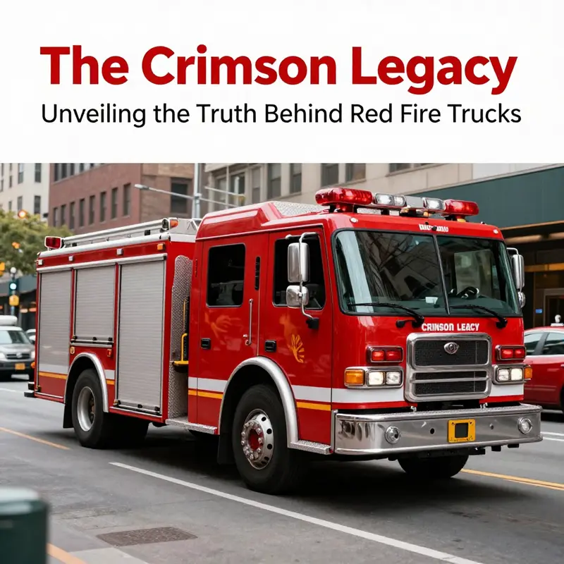
The question of why fire trucks are red, at first glance, seems anchored in a simple tradition. Yet the full answer sits at the intersection of practicality, economics, and public perception. This chapter follows that braid, tracing how a color choice embedded in history, material constraints, and collective identity evolves into a decision with real-world consequences for safety, operations, and budgets. To understand the present, it helps to listen to fleets in motion, not merely to legends about black Model Ts and dramatic road contrast. The practical considerations start with safety and visibility, a core concern for any emergency vehicle that must slip into traffic, navigate urban canyons, and appear unmistakable in fog, rain, or the glare of city lights. Visibility research has evolved in leaps since the era of red established itself as a normative standard. While red remains deeply associated with urgency and bravery in popular culture, the science of how we detect color under varied lighting conditions points toward a different calculus. Bright yellows and lime-yellow hues, especially when combined with high-contrast decals or reflective striping, often outperform red in daylight and under complex urban backdrops. In daylight, the peak sensitivity of the human eye lies in the yellow-green spectrum around 555 nanometers. That simple fact helps explain why some departments have experimented with warmer, lighter palettes that reduce the time drivers spend locating a fire engine at the edge of a crowded intersection or in a dense plume of smoke. Yet the practical decision is rarely a matter of pure optics alone. Rather, it unfolds within the broader lifecycle economics of a fire fleet, where cost, downtime, maintenance, and public recognition must all be weighed against incremental safety gains. The pull of tradition cannot be dismissed; it anchors a brand of trust and assurance that communities expect from their emergency services. A red fleet signals continuity with decades of service, a familiar silhouette that residents learn to recognize and respond to with instinctive urgency. That recognition matters, even if it is not the single most efficient color from a purely perceptual standpoint. The psychology of color plays a powerful role in how the public interacts with a fire department. Red communicates danger, speed, and action. It is a color that commands attention in a way that aligns with the adrenaline of an emergency response. In many communities, a red fire engine has become a symbol of readiness, a visual assurance that trained professionals are close at hand. This symbolic aura contributes to trust, cooperation, and community engagement—factors that in turn influence funding, volunteer recruitment, and public participation in prevention campaigns. But as departments consider modernizing fleets or replacing aging apparatus, the economics of color begin to weigh more heavily than ever. Repainting a fleet is not a cosmetic exercise; it is a complex logistical and financial operation. The upfront costs are only part of the picture. Paint, primer, and labor are a direct line item in capital budgets, but downtime matters as well. While a repaint is underway, a number of engines and ladders may be out of service, reducing the department’s surge capacity in a crisis or in peak demand seasons. Fleet managers must forecast maintenance windows, plan for stored inventories, and adjust deployment plans to absorb the temporary loss of vehicles. In some departments, even modest downtime translates into measurable risk, requiring careful scheduling and contingency arrangements. The economic calculus often favors smaller, incremental updates rather than sweeping color overhauls across an entire fleet. This is where the cost-benefit reasoning becomes practical rather than emotional. If a department can demonstrate that a color change reduces overall incidents, enhances response times, and lowers long-term repaint costs due to improved paint durability or lower maintenance needs, the case strengthens. In reality, the cost equation has multiple layers. First, there is the paint itself, a product whose price can vary with supply cycles and the availability of durable, UV-resistant formulations that can withstand the harsh conditions of engine bays and road exposure. Then comes labor—highly specialized, often coordinated with the manufacturers of the apparatus to avoid compromising warranties or compromising the integrity of critical components during long, manual repainting sessions. The downtime is not simply the time the vehicle is not in service; it is the time the fleet is not fully available for a critical mission, an implicit cost that some agencies quantify in terms of adjusted response times, risk exposure, and potential exposure to liability during emergencies. All of this happens within a public sector budget environment that rewards predictability and risk management. Fire departments plan through long cycles, where apparatus acquisitions are spaced out over years, and paint choices ride along with the procurement strategy for new engines or for refurbishments. When red has already been the default, departments may be reluctant to depart from that baseline unless there is persuasive evidence of material gains. Even when such evidence exists, it must be reconciled with the realities of legacy fleets, regional regulations, and the expectations of taxpayers who fund these services. One of the strongest practical arguments for color change is a potential improvement in visibility that translates directly into safety metrics. If an objective study demonstrates a measurable reduction in near-miss incidents during highway responses or better conspicuity in low-visibility environments, the economic argument becomes easier to justify. The problem is that robust, causal data linking color to reduced accidents within the dynamic field conditions of firefighting operations is difficult to obtain. Fire engines operate in rapidly changing environments, passing through varying weather, lighting, and traffic conditions, often during the most stressful moments of their existence. Yet the NFPA, along with human factors researchers, emphasizes the broader concept of high-visibility vehicle marking. The guidelines suggest that not only color but reflective materials, contrasting patterns, and strategic lighting contribute to noticeability. The emphasis is on a multi-layered approach to visibility rather than any single feature. This is an important nuance for departments weighing a change of color. Rather than seeing color as a single lever, they can adopt a package of high-visibility solutions that includes reflective striping, conspicuous symbols, and optimized light deployment. In many cases, this approach aligns with cost-effective benefits. For instance, lighter colors can interact with reflective materials in a way that reduces the intensity of heat absorption in the vehicle’s surfaces, potentially extending engine performance and reducing maintenance heat load. Lighter colors also tend to fade less quickly in some environmental conditions, potentially lowering long-term repaint intervals. The reality is that hue choices are not simply a matter of aesthetic taste; they have tangible implications for maintenance cycles and the total cost of ownership over a fleet’s lifespan. Departments that pursue color changes often adopt a staged strategy, testing new palettes on a subset of vehicles before proposing a full-scale transition. This phased approach allows for controlled evaluation of safety outcomes, cost implications, and the public’s response. The process is not merely technical; it involves governance, public communications, and interagency coordination. Stakeholders—including city councils, fire association boards, and the communities served—must be engaged in transparent conversations about the rationale for any color modification. The public-facing aspect of color choice cannot be ignored. In many communities, the color of a fire truck is tied not only to safety and cost but also to identity. The color becomes part of the story the department tells about its service ethos. If a color shift signals a new era of efficiency, inclusivity, or modernization, communities may respond with support that translates into favorable budget votes or philanthropic donations for equipment upgrades. Conversely, a color change can provoke questions about tradition and continuity. It is not unusual for a department’s color policy to become a symbol of the broader governance of public safety. In some regions, variations exist where lime-yellow or white fire trucks are adopted, sometimes in collaboration with public safety branding campaigns that emphasize visibility for both oncoming drivers and pedestrians. These shifts are rarely merely cosmetic; they reflect a strategic alignment of safety science, budgetary prudence, and community confidence. The economics of color also touch on the broader market dynamics of fire apparatus. If a department considers color changes during a standard refurbishment cycle, it can leverage existing procurement channels to coordinate with paint suppliers who service the specialized coatings on emergency vehicles. The market has shown that when a department commits to a non-traditional color, fleets often negotiate bulk agreements with paint manufacturers, or they coordinate color standards across a regional consortium to gain economies of scale. An additional, often underappreciated, economic argument is the potential for branding efficiency. A color that stands out in a given geography—one that correlates with other public safety vehicles or an established safety campaign—can reduce confusion and improve public recognition. For districts that place a premium on rapid, consistent identification of emergency responders, such branding synergy can yield intangible, yet meaningful, returns through heightened public awareness and trust. The practical, color-based decision is also influenced by the physical characteristics of the vehicles themselves. Fire apparatus are large, energy-intensive machines whose operations involve high heat, heavy loads, and complex mechanical systems. In this context, alternatives to red that are perceived as innovative may require additional protective coatings, which must resist heat, UV exposure, and road grit. In some cases, the change in color is accompanied by technical upgrades in visibility features: higher-visibility decals, more robust reflective materials, or brighter LED warning modules. The synergy between color and these features is what ultimately matters for safety outcomes and maintenance costs. It is not only the hue that matters; it is the composite of color, markings, and lighting that shapes how a vehicle is perceived on the road. This is precisely the kind of integrated approach NFPA standards advocate: high-visibility color schemes, supplemented by reflective markings, and reinforced by modern lighting and conspicuity features. The standards recognize that color alone is insufficient to guarantee safety. They encourage a holistic view of vehicle visibility, where the color choice serves as one element of a broader strategy to maximize noticeability under all circumstances. As with any major policy decision, there is a tension between tradition and adaptation. The long arc of fire service history has seen color choices settle into familiar patterns, patterns that communities trust. Yet the modern era brings new information about visibility, safety, and economics that challenges those patterns. Departments must decide whether to maintain the status quo, to test a new color in a controlled manner, or to adopt a broader visibility strategy that includes color as well as reflective materials and lighting. The decision is rarely simple, but it is always consequential. In practical terms, a department must weigh the immediate cost of repainting against the possible long-term savings from improved safety metrics and reduced downtime. It may consider the potential resale value of a partially modernized fleet, the ease of maintenance for certain coatings, and the public’s willingness to embrace change. The literature and professional practice suggest that a successful color transition—if pursued with care—can coexist with a robust tradition. The key is clear communication, evidence-based assessment, and an honest accounting of all costs and benefits. For those who want to see how real-world decisions unfold, the market for used and refurbished fire apparatus offers a window into color policy in practice. Within these markets, fleets that have experimented with lime-yellow, white, or even green hues sometimes report improved visibility and public recognition, paired with measurable maintenance benefits over time. Yet these cases must be understood as part of a larger portfolio of decisions that involve fleet management, regional norms, and budget constraints. In the end, the color of a fire truck is not merely a matter of preference; it is a strategic variable in a system designed to protect lives and property. The practical considerations—visibility, maintenance, downtime, and heat management—play out against an economic backdrop that includes cost of repainting, long-term durability, and the intangible value of public trust. Near-term savings must be weighed against the potential for longer-term gains in safety and efficiency. Departments that adopt a data-driven approach, tracking response times, incident rates, and maintenance intervals across color schemes, are more likely to make decisions that yield meaningful improvements without destabilizing fleets or budgets. This balanced approach—anchored in safety science, economic prudence, and public engagement—offers a path forward in a landscape where tradition remains powerful but not inexorable. As communities evolve and technology advances, the color question will continue to be revisited, not to erase history but to refine how color can contribute to safer, more efficient, and better-valued public safety services. For readers seeking a practical starting point in this ongoing conversation, exploring the market dynamics of current fleets and the real-world implications of color choices can be illuminating. A practical step is to examine the fleets already operating with alternative hues and to consider phased pilots that assess safety, maintenance, and public response before committing to wide-scale changes. This approach respects heritage while embracing evidence-based improvement. The interplay of science, economics, and cultural symbolism in color choice reveals a broader truth: color is not simply a matter of what looks good; it is a tool that calibrates how a fire department is seen, how quickly it can respond, and how efficiently its resources are used over time. For those following this topic, further reading and industry conversation often converge on practical resources and market observations that can guide decisions in the field. As you explore the practical side of color in fire service, you can also engage with community viewpoints, governance structures, and procurement pathways to understand how color policy becomes an operational reality across diverse jurisdictions. And if you are curious about the current state of marketplace options and fleet configurations, you can browse real-world listings and case studies in the broader industry ecosystem, including the resource at fire-trucks-for-sale, which offers a snapshot of how fleets are evolving in color, equipment, and readiness. External reference: https://www.nfpa.org/Code-Administration/Standards/2023-NFPA-1917-Standard-for-Commercial-Passenger-Vehicles-and-Emergency-Vehicles
Red as Signal and Symbol: The Psychological Power Behind Fire Trucks
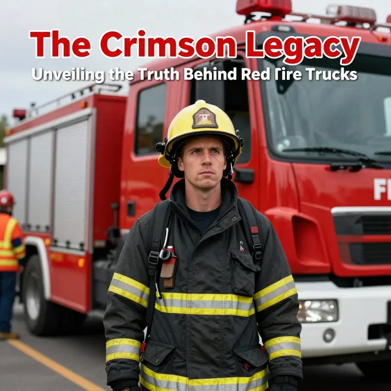
Color travels before reason, moving through the air with a history that outlives the canvas of any single paint swatch. The red of the fire truck is not merely a choice of hue; it is a convergence of past practices, practical constraints, and human perception. When a red fire apparatus rolls into a street, it carries a layered message: urgency, authority, and a cultural shorthand that communities understand instantly. Yet beneath that immediacy lies a more intricate story about how color becomes a language in its own right. The question “why are fire trucks red?” invites us to track not only a tradition but also the way people read color under stress. The explanation blends a trail of anecdotes and a bedrock of science, and it asks us to hold two truths at once. Red is symbolic and effective in ways that endure, even as new evidence points to alternatives that can sometimes outperform it in certain conditions. The lasting appeal of red rests on a set of interlocking forces—historic habit, economic practicality, and a psychological resonance that has become part of the fabric of public safety and civic memory.
The legend often told in classrooms and history halls links the color to a dramatic moment in early automotive history. Amid a sea of black cars that dominated the streets as the rapid rise of personal mobility reshaped urban life, fire departments reportedly chose red to stand out more clearly. The image of a red vehicle slicing through a monochrome landscape is vivid and compelling, a narrative that helps ordinary people attach meaning to a fire engine’s presence. Yet historians have pushed back against the idea that a single, deliberate strategy in a single era decided the color for all time. The story survives in part because it is easy to grasp: a bright red thing in a black world makes a striking mark. But the historical record shows a more nuanced set of influences. In the interwar period, the expansion of municipal fleets, the growth of standardized equipment, and the practicalities of paint production all shaped color choices. Red’s role as a recognizable, durable, and affordable coating fit well with the needs of large, budget-conscious departments faced with the task of maintaining reliable, long-lasting apparatus.
What then makes red endure beyond the ledger of costs and the rattle of historic anecdotes? The answer lies partly in the psychology of color and partly in the social contract between emergency services and the communities they serve. Red has, over a century, become a visual shorthand for danger and help in the public imagination. It cues attention before people can even process the specific nature of an emergency. The color’s immediacy is hard to dispute in moments of high tension: the sight of red can precipitate a cascade of responses—people pull over, drivers scan their mirrors, pedestrians pause, and crews gain precious seconds to navigate through traffic. This reflexive behavior is part of what practitioners in safety fields call contributing factors to situational awareness. Red’s impact on alertness and reaction time has been demonstrated across domains, from laboratory experiments to real-world observations of how drivers yield to emergency vehicles. The effect is not merely cultural; it taps into a physiological response that helps humans switch to a mode of heightened attention when a red object enters their field of view.
But the story is not a simple case of biology trumping aesthetics. The physics of visibility complicates the narrative. Red wavelengths are among the longest in the visible spectrum, and red light can travel with less scattering under certain conditions. This makes red a reliable beacon in rain, dust, and smoke, environments where visibility is compromised. Yet daylight itself can diminish the relative advantage of red as compared with other high-contrast colors. In bright sun, lime-yellow or fluorescent lime shades can offer higher conspicuity because they sit closer to the color that the human eye is most sensitive to at mid-day, around 555 nanometers. Research cited by safety professionals points out that lime-yellow fire vehicles can be spotted more quickly than red ones in a variety of conditions, particularly when light is limited or weather is poor. The tension here is revealing: the most scientifically efficient color in some circumstances is not the color that has become the emblem of firefighting. The enduring red is the product of a broader calculus—what a color communicates, what it signals, and what families and neighborhoods come to trust as a sign of help on the road.
From a design perspective, the choice of red has seeded a durable language of recognizability that extends beyond the vehicle’s paint. When a community sees a red fire truck in its streets, it recognizes not only the object but the role it embodies—the promise of rapid response, specialized expertise, and interwoven networks of dispatch, apparatus, and personnel. That recognition is crucial in emergencies, where seconds count and the surrounding crowd must respond with calm, predictable behavior. The moral economy of public safety is built on this shared understanding: the color becomes a cue for coordination. In a sense, red capitalism—the idea that red is a signal of urgency and priority—has become a social contract. The vehicle’s hue isn’t a mere aesthetic choice; it is a functional commitment to speed, attention, and trust. The psychological resonance deepens as the color is repeatedly associated with brave service and relief from danger. Communities curate a sense of safety by learning what a red emergency vehicle represents, a process reinforced through education campaigns, media depictions, and everyday encounters in the streets.
The persistence of red also reflects a practical, iterative logic. Paint technology evolved in ways that supported long service lives for heavy, high-use machinery. In the early 20th century, departments faced the cost calculus of upholstering, sealing, and repainting fleets. A durable paint with a color that could withstand fading and the abrasion of road salt, grime, and weather needed to be economical. Red emerged as a satisfying balance between visibility and cost, and as fleets rotated through maintenance cycles, the color became part of a standardized identity. Once a department settled on red, the cost and logistics of changing color across a fleet would be prohibitive. The inertia of a uniform color amplified the symbolic power of red, transforming it from a practical choice into a tradition. Traditions have their own resilience: once a color is embedded in the collective memory of a service and its community, it becomes less negotiable, even when other factors might suggest a brighter, more conspicuous option in modern contexts.
In this light, red’s appeal is not a failure to recognize the value of heightened perceptual cues. Rather, it is a case study in how real-world constraints—budget, maintenance, logistics, and the pull of shared history—shape decisions that become cultural cornerstones. The psychology of color cannot be divorced from these contingencies. A color that works well in one era may be complemented, or occasionally challenged, by new evidence about visibility. The conversation about red’s effectiveness continues to evolve as research expands, blending laboratory findings with field data from busy urban corridors and rural landscapes alike. The enduring question—whether red remains the best color for public safety vehicles—reflects a dynamic interplay of science and sociology. It invites a broader reflection on how we balance the desire for optimal performance with the need for recognizable, trusted symbols that communities rely on during moments of crisis.
If we widen the lens beyond color theory and into the broader practice of emergency readiness, the message deepens. The color of a fire truck is one element in a system designed to protect lives. The system includes training for drivers and bystanders, optimized traffic protocols, effective signaling through lights and sirens, and a culture of cooperation that governs behavior around incidents. In this ecosystem, the color red contributes to a composite effect: it helps to draw attention, it signals urgency, and it reinforces a tradition of service. Yet it also sits within a spectrum of options and trade-offs. The red we see on the streets is part of a narrative that honors history even as it invites ongoing refinement. That is, color is not a static attribute but a living component of public safety design, capable of absorbing new knowledge while maintaining continuity with communities’ sense of identity and trust.
The link between color and behavior is not purely instinctual; it is mediated by training and expectation. People learn to respond to the sight of red as part of an emergency sequence: the instinct to yield, the expectation of a rapid passage, the recognition of a vehicle carrying specialized personnel and equipment. This learning is reinforced by repeated exposure, by the cadence of dispatch announcements, and by the social rituals that accompany emergency response—the clear visual language of red on a truck, the synchronized flashing of lights, the sound of sirens that tell the brain to switch into mission mode. The result is a powerful, cumulative effect: red becomes a dependable prelude to action, a signal that the world must pause, listen, and adjust to give help a clear path forward.
In the modern context, there is room for nuance. While red remains a potent symbol and a reliable beacon in many scenarios, research and practice continually push for improvements in conspicuity. The science of visibility does not exist in a vacuum; it informs policy and design choices, including the palette used on emergency vehicles, the use of reflective materials, and the integration of color with illumination strategies. The best practice in many departments now involves a combination of color and contrast: red as a base hue supplemented by high-contrast markings, reflective decals, and smart lighting that adapts to conditions. This approach acknowledges what science has long indicated—that color adds meaning and urgency, but human perception thrives on a holistic package of cues. The conversation is not about discarding red; it is about enriching it with color science, situational awareness, and an ever-reading public that expects clarity and speed.
The broader lesson is clear. The question of why fire trucks are red is not a question of a single, unassailable reason. It is a window into how communities, technologies, and human perception co-create a public safety tool that matters in everyday life and in moments of crisis. Red endures because it works in meaningful, measurable ways, while the story around it continues to adapt as new data, new tactics, and new generations reimagine what it means to signal danger and to offer help. The color has become a grammar of rescue, a shorthand that can be decoded in an instant. And within that shorthand lies a readiness—a readiness that is not merely about a hue, but about a system that positions safety at the center of urban life. The public, responders, designers, and researchers all contribute to the ongoing refinement of this color’s role. In doing so, they preserve the sense that emergency response is both an act of bravery and a disciplined discipline—one communicated as clearly as possible through the simplest, oldest instrument in the language of danger: color.
As a final reflection, the red of fire trucks embodies a paradox common to public safety: the drive to be as perceptible as possible while acknowledging how perception can be enhanced or hindered by context. Red’s story is a reminder that progress in safety often travels along a path paved by tradition, practicality, and science, moving forward even as the past continues to color the present. It invites policymakers, designers, and the public to think not only about what color is on a vehicle, but what color communicates, how it shapes behavior, and how closely that communication aligns with the realities of perception in dynamic, real-world settings. In that alignment—the careful balance of symbol, psychology, and physics—lies the enduring rationale for red on fire trucks, and a reminder that public safety is as much about how people respond as it is about how the world responds to a fire.
For readers seeking a concise synthesis of the scientific nuance behind color and visibility, the field points to a broader literature that situates red within a spectrum of options, each with its own advantages and trade-offs. While bright lime-yellow or lime-green hues may offer advantages in certain daylight and foggy conditions, red remains a culturally resonant, economically viable, and psychologically potent choice that keeps its place at the center of emergency response rituals. The color’s staying power is not a monoculture of stubborn tradition; it is a testament to a safety philosophy that values recognizable signs, swift comprehension, and the ability to motivate action when seconds matter. In other words, red endures not because it is perfect in every context, but because it is deeply integrated into the social, logistical, and perceptual fabric that makes emergency response both efficient and trusted. The color thus functions as a bridge—linking historical necessity with contemporary science, and connecting the public to the urgent, life-saving work performed by the men and women who stand ready to answer the call when danger arrives.
Further reading and supporting perspectives can be found in a comprehensive overview of how color relates to emergency response and public perception; see the Scientific American article on the topic for a broader scientific context and historical exploration: https://www.scientificamerican.com/article/why-are-fire-trucks-red/. In addition, for readers curious about the modern practice of aligning psychological readiness with operations, a useful internal resource that examines how crews prepare mentally for high-stakes rescue work can be explored here: Mental readiness in fire service. This pairing of historical context, perceptual research, and practical application helps illuminate why a color as simple as red can carry such a complex and durable load in the world of emergency response.
Final thoughts
Understanding the reasons behind the vibrant red of fire trucks is more than just a matter of tradition; it encapsulates a rich history, economic factors, and a profound psychological connection to bravery and urgency. As we move forward, it’s essential to recognize the significance of this color, not just as a symbol of firefighting, but as a beacon of hope and safety for communities worldwide. Fire truck enthusiasts, aspiring firefighters, and emergency service professionals alike can appreciate how this iconic hue resonates through time, inviting us all to reflect on the legacy and importance of those who bravely respond to emergencies.