
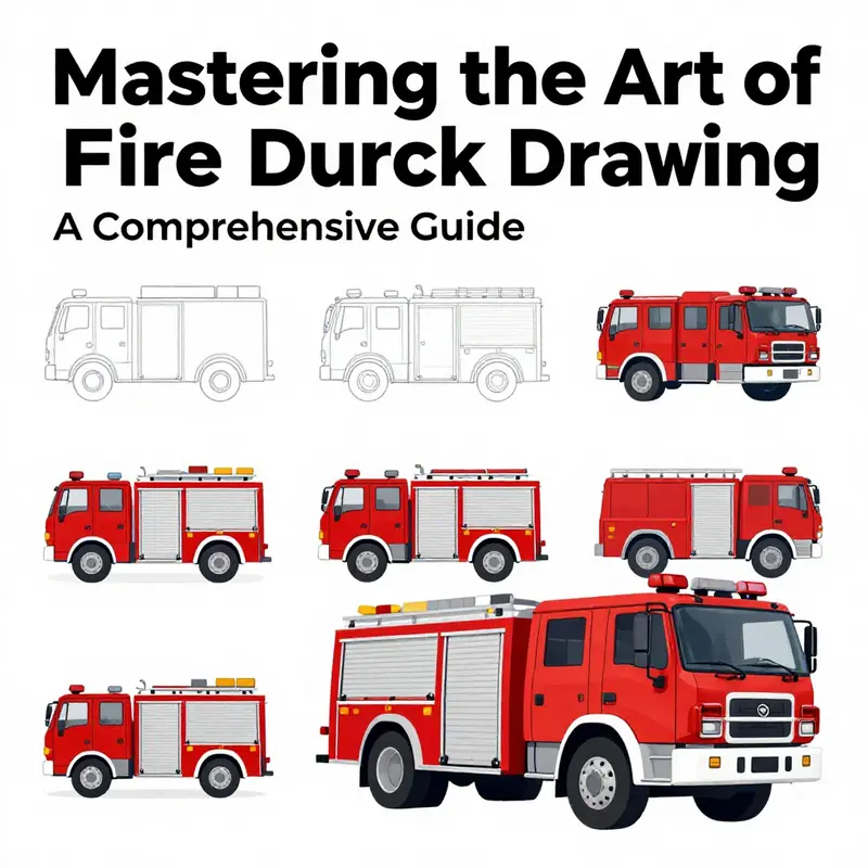
Drawing a fire truck is not just an exciting challenge; it’s a gateway into the vibrant world of firefighting and emergency services. For fire truck enthusiasts, aspiring young firefighters, and professionals in the field, understanding how to capture the essence of this vital vehicle can be immensely satisfying. In this guide, we will explore step-by-step instructions on how to draw a fire truck, detail key elements to include, highlight common mistakes to avoid, and provide effective coloring techniques for your masterpiece. Each chapter is designed to build your skills and knowledge, ensuring you create a fire truck drawing that truly stands out.
null
null
Bringing a Fire Truck to Life: Essential Elements for a Convincing Drawing
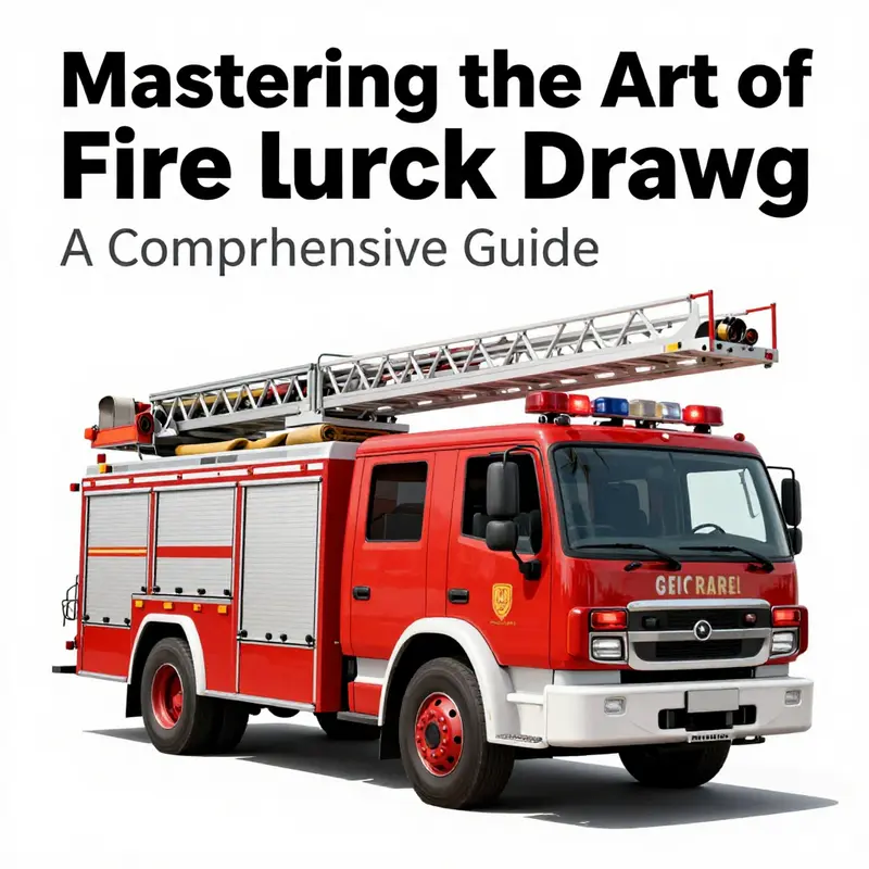
Drawing a fire truck is about more than color and shape. It is a small narrative of purpose, craft, and the way communities rely on equipment built to work under pressure. When you start, focus on a few core features that ground the image in reality: the cab, the body, the ladder or aerial, the hoses and racks, the lights and sirens, and the wheels. These elements give the silhouette clarity and space for your own style.
Begin with the cab and body as one flowing form. The cab sits at the front with generous windows that suggest visibility for the driver. Keep the edges slightly rounded to imply mass and resilience. The body behind the cab should look substantial, housing a water tank, pumps, and compartments. Think in blocks: a c shaped silhouette for the cab, a long rectangular body, then the ladder or platform rising above. Use line weight to separate operator space from the work area; let a thin line act as a hinge that grounds the vehicle on the page.
The ladder is a defining feature. Draw it as a long, segmented line with clear joints. If you include a hydraulic platform, hint at the arms and platform edge without clutter. Keep the ladder slightly lighter than the main body so it recedes in the composition.
Hoses and racks are the quiet specialists. Sketch curved hoses along racks with a few well placed coils. Represent tool bays with simple rectangles, ensuring the arrangement reads as organized and ready. Use shading along the edges to suggest depth and metal textures.
Sirens and lights crown the roof. Use a small cluster of lines to suggest a rotating beacon, and highlight with a bright spot or a white reflection. A restrained palette or monochrome shading helps the lights read as energy in motion.
Wheels and stance anchor the drawing in three dimensional space. Show the wheel wells with gentle curves, emphasize tread marks with bold circles, and keep the near wheel slightly larger for perspective. The balance of mass and length should feel credible.
Branding and insignia add personality. Place logos, numbers, or shields on side panels at a scale that is legible but not overpowering. A tiny crew silhouette in the cab can hint at life inside without distracting from the vehicle’s form.
Proportion and practice. Treat the truck as a sequence of blocks: cab, body, ladder. Draft with light construction lines first, then reinforce with bolder outlines. Color helps separate parts: red for the body, lighter shades for chrome and hose reels, and clear highlights on metal. If you work in black and white, rely on contrast and edge shading to convey reflectivity and texture.
If you want a scene, place the truck on a street with a horizon line, curb hints, or a distant skyline. A touch of smoke or water spray can add drama, but keep the composition clear so the truck remains the focus.
Finally, study real references to understand proportion and silhouette, but let your own style show. Look at multiple angles to practice drawing from side views to three-quarter poses, and let the essential features guide your eye even when you stylize.
Proportions and Practice: Avoiding Common Mistakes When Drawing a Fire Truck
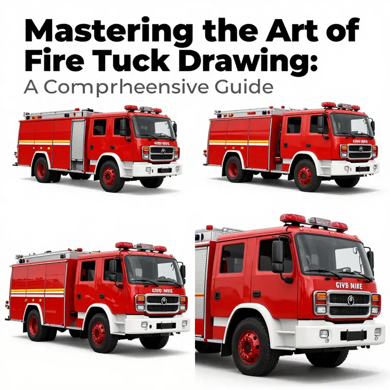
Drawing a fire truck is a study in proportions. The most common mistakes come from making the cab too small, the body too long, or the wheels too perfect without mass. Start with a simple rectangular chassis and place a smaller cab where it belongs, ensuring the cab sits toward the front and the body behind it carries equipment without overpowering the silhouette. The ladder should relate to the chassis and body, extending from a secure base rather than floating above the roof; imagine its joints and segments aligning with the vehicle’s proportions. Wheels are more than circles; give them an inner hub, a tire edge, and subtle shading to imply depth and contact with the ground. Use a restrained color plan and clear edges so the silhouette remains legible at a glance. Reflective markings and lights should support the design without overwhelming it, keeping emphasis on proportion and structure. Practice with small thumbnails to test relative sizes, then refine a strong version with measured lines and deliberate corrections. Consider context as well; a hint of street or building helps judge scale and perspective, making the drawing feel situated rather than flat. With patience and repeated, mindful practice, your fire truck drawing can evolve from a simple outline into a convincing, believable machine that communicates readiness and reliability.
Hue, Glow, and Heroism: Color Techniques that Bring a Fire Truck to Life
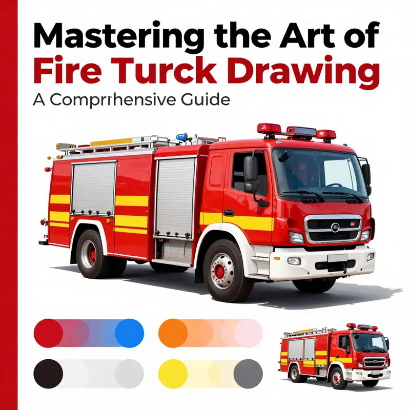
Color is the bridge between line and story. A fire truck drawing, when colored with intention, stops being a simple shape on paper and becomes a living scene that carries energy, urgency, and a touch of heroism. The color choices you make set the mood and guide the viewer’s eye along the length of the vehicle, across its ladders and hoses, and toward the little details that tell a story—the glint on a chrome grille, the glow of emergency lights, the way light plays across a curved cab. This chapter explores coloring as a way to expand the realism of a basic fire truck drawing while also inviting playful experimentation. It is about translating the iconic silhouette into a vibrant, believable, or whimsically bold image, depending on the moment you want to capture on the page. For more approachable coloring ideas, see the Fire Truck Blog. (Internal link) And if you’re looking for additional inspiration beyond your own sketchbook, you can also explore printable templates and coloring pages from external resources that offer structured outlines to practice these techniques. External resource: https://www.coloringtop.com/free-fire-truck-coloring-pages/.
The starting point is still the same: a clean, confident red forms the backbone of the drawing. Red is not merely a color choice; it is a cue to the viewer that this is a fire truck, a symbol of readiness and response. Real fire engines often rely on variations of red to convey different degrees of gloss and wear, but on the page you have the freedom to exaggerate or simplify. A vibrant, saturated red communicates immediacy and visibility, the kind of presence a department vehicle has when it stands at a scene or trundles down a city street. Yet the power of color lies not only in the base hue but in how you apply it—how you layer, blend, and contrast the red with other tones to create depth and shine. It is helpful to imagine a single light source coming from above and slightly to one side; this makes the shading more intuitive and the final image more convincing. The body, then, becomes a canvas where color governs mood as much as contour governs shape.
As you begin to fill in the primary body of the truck, think about the spectrum of red you can use. Start with a core red that feels bright and clean. Then introduce slightly darker reds along the lower edges and near recesses where the body panels meet or where the truck would cast a shadow. A subtle gradient from dark to light red as you move upward or toward the center of a curved surface creates a roundness that mimics metal catching the light. If you’re using pencils, a gentle layering approach works well: lay down the base, add a second layer with a slightly cooler red to deepen the shadows, then return to the original hue for midtones. Markers can deliver a bolder effect, but you’ll want to watch for harsh edges. When you blend with a lighter red or even a touch of white, you can soften these transitions and preserve a sense of gleam on the curved surface.
Contrast is essential for readability and interest. The ladder, the equipment, the tires, and the lights should not dissolve into the red of the body. For these areas, adopt darker tones—think near-black or deep gray—so they stand out against the bright red. The ladder rungs, the outlines of the cab, and the wheel wells gain definition from these dark accents, while still feeling integrated into the overall composition. Use black or dark gray strategically: on the edges where panels meet or where metal fixtures catch the shade. This contrast not only clarifies form but adds a crisp, graphic quality that makes the drawing feel intentional and polished.
Highlights play a complementary role to shadows. A white or pale gray stroke along the front grille, the window frames, and the chrome trim can simulate light reflecting off polished metal and glass. Even a thin white line along the top edge of a door panel or a narrow arc at the crown of the cab can suggest a glossy surface catching a gleam. In some scenes, a touch of lighter red along the upper curves can mimic a secondary bloom of light, producing a soft glow that enriches the image without overpowering the main color. Highlights should feel purposeful, not random; they guide the eye toward the most important features—the driver’s window, the badge on the door, the lines that define the truck’s silhouette.
A scene’s personality often comes from auxiliary colors. The detailing on the equipment—ladders, hoses, nozzles—benefits from black or dark gray to stay legible against the red. The wheels typically read best in black with lighter gray or white shows for hubcaps or reflective rims. The lights themselves deserve something more than a single red or yellow squiggle; you can introduce small facets of white or pale blue to convey glass and glassy reflections, which makes the emergency lighting feel live rather than decorative. When you place these elements, let the eye move across the scene with intention; the strong red body will anchor the composition, while the darks and highlights frame the crucial features.
Color can also tell a more specific story through the depiction of figures associated with the vehicle. If your drawing includes a firefighter figure by the cab, color the turnout gear with care. The coat is often represented in bright, high-visibility tones such as yellow or orange in many educational illustrations because these hues communicate safety and teamwork to younger viewers. Pants and boots typically appear in darker shades—black or navy—to ground the figure and to maintain legibility against the red backdrop of the truck. The skin tone and facial features, if included, can be kept simple to preserve readability for a growing artist. This approach to color helps young artists grasp the idea that the figures on a fire scene are not mere accessories; they are essential players in the story the drawing is telling.
Shading techniques deepen the sense of volume and space. Two classic methods—hatching and cross-hatching—are especially effective on the curved surfaces of a fire truck. With fine lines drawn in parallel or at angles, you simulate the way light settles into the contours. When you cross hatch, you layer lines in two or more directions, increasing the sense of texture and mass, particularly on the cab and the wheels where the rounded form begs for a tactile impression. If you’re working with markers, you can replicate this effect with a series of slightly varied red tones, carefully layering from dark at the edges of panels to lighter in the centers. The presence of hatch marks or cross-hatching can transform a flat color field into a narrative texture, suggesting metallic sheen, dents, or wear without introducing a lot of extraneous detail.
Another powerful tool is the gradient approach. By creating a subtle shift from a deeper, almost burgundy shade at the lower portions to a brighter, almost cherry red toward the tops of the panels, you add a dimensional lift that makes the vehicle feel more tangible. A gentle value change can imply a curved surface catching light from a slightly higher angle. Depending on the medium, you can blend these transitions with a soft stroke of a lighter red, a touch of white, or a blending stump to smooth the transition and avoid harsh boundaries. The gradient is a quiet hero in the color toolkit: it adds depth without demanding extra lines or clutter, which keeps the focus on the overall form and the story the truck carries.
For a kid-friendly rendering, a more playful color philosophy can be applied. Bold, unorthodox combinations invite imagination and celebrate creativity. A scene with the red truck reflecting a purple sunset, or its ladder painted a bright sky-blue for contrast, can spark curiosity and make coloring more engaging. In such cases, the goal is not strict realism but a compelling visual rhythm that reads well at a distance and delights close inspection. The emphasis shifts from precise lighting to bold relationships among color blocks, allowing young artists to experiment with balance, proportion, and personal expression while still retaining the recognizable silhouette of the fire truck.
Texture is another layer of storytelling. Metal surfaces, rubber tires, and glass panes each respond to color and shading in distinct ways. You can simulate metal by using crisp edges, high-contrast highlights, and careful use of white along the most illuminated lines. Tires benefit from darker values and more uniform shading to convey their mass and texture, with a subtle highlight along the tire sidewalls to suggest curvature. Glass for the windows can be treated with cooler grays and a bright highlight to imitate glare, while the chrome details can be given a metallic gleam with a bright white spot and a thin, sharp edge of gray to mimic reflectivity. When you combine texture cues with the core red, the drawing emerges with a tangible feel—one that can be realistic, stylized, or somewhere in between depending on the artist’s intention.
The composition of a fire truck drawing benefits from a mindful approach to the background as well. A simple street scene or a suggestion of smoke can frame the vehicle without stealing attention from the main subject. Light, airy backgrounds help the red body pop, while darker or more saturated backdrops can create a dramatic stage for a scene that implies action or urgency. If you choose to place the truck on a street, consider light reflections on the pavement in subdued tones that echo the vehicle’s color palette. This consistency of color across foreground and environment creates cohesion and makes the scene feel deliberate rather than pasted together.
In this chapter’s explorations, the technical and the expressive converge. The color choices—red as the loud protagonist, darks for structure, lights and whites for sparkle—work in concert with shading and texture to deliver not just a visually pleasing image but a communicative one. The viewer should be able to sense the truck’s mass, the curvature of its body, and the sheen of its fixtures, all while feeling the mood the artist wants to convey. That mood can be a confident, true-to-life portrayal of a rescue vehicle, or a more fantastical, child-friendly rendition where color carries the story forward with whimsy and energy. Either way, color is the language that translates lines into life.
If you are looking for additional guidance or examples to reinforce these ideas, reflect on how color supports the narrative you want to tell. Practice on a few small sketches, layering colors gradually, testing different lighting directions, and letting your curiosity drive experimentation. The process is as important as the result because it teaches you how paint, pencil, or marker interacts with paper, how light behaves, and how to balance attention between large shapes and tiny details. It is a practice that grows with you as an artist, and it sits at the heart of how to draw a fire truck in a way that feels both true and alive. For more approachable coloring techniques and ideas, the Fire Truck Blog offers ongoing insights and examples that can complement your drawing practice. (Internal link) And when you want additional templates or step outlines to support your coloring journey, you can consult external resources that provide printable outlines to guide your approach—these tools can be especially helpful for beginners who benefit from a ready-made structure as a launchpad for creativity. External resource: https://www.coloringtop.com/free-fire-truck-coloring-pages/.
Final thoughts
Creating a stunning fire truck drawing is an enriching experience that melds creativity with an appreciation for essential services. Whether you’re a budding artist or a fire truck enthusiast, following the steps and tips outlined in this guide will enhance your skills and confidence. Remember to focus on the details that bring your drawing to life and avoid common pitfalls that can detract from your work. With practice and passion, your fire truck drawings will become masterpieces that reflect the bravery and dedication found in firefighting.