
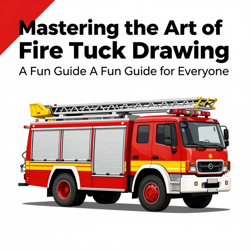
Drawing a fire truck can be an exhilarating journey, full of excitement and creativity. Whether you’re a young aspiring firefighter eager to express your passion, a collector intrigued by the details of fire trucks, or a professional in the field looking to engage with the next generation, this guide is tailored for you! Each chapter walks you through a simple process that covers every essential aspect: from the main body to vibrant finishing touches, every step is designed to ensure you can create a striking representation of this heroic vehicle. Get ready to unleash your creativity as we dive into the colorful world of fire trucks!
From Silhouette to Structure: Mastering the Main Body of an Easy Fire Truck
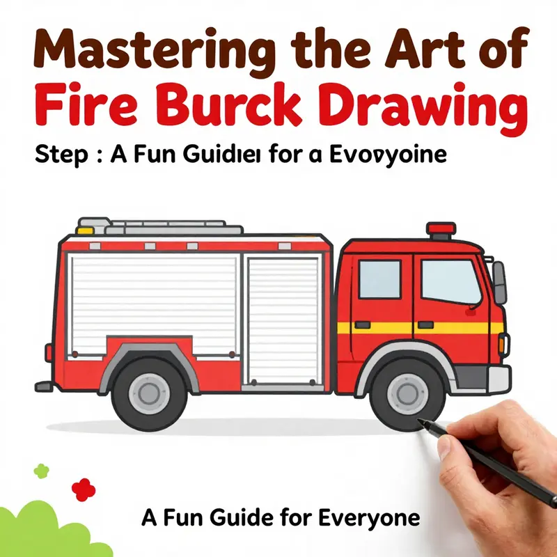
The main body of a fire truck is more than a shell; it is the backbone of the drawing, the sturdy frame that gives the whole image its confidence and rhythm. When you begin with the main body, you set a foundation that makes every subsequent detail feel believable and cohesive. This chapter invites you to see the vehicle as a collection of clean, geometric forms—a tall cab, a solid chassis, and a compact, dependable upper section that hints at the ladder and equipment stored above. By treating the body as the central silhouette, you cultivate a drawing practice that is both forgiving for beginners and satisfying in its clarity.
Begin with the cab, the driver’s space, as the anchor of the composition. Picture a large rectangle that stands tall and upright, slightly separated from the rest of the length you will give to the fire truck. Keep the lines decisive but not overly heavy at first; this stage is about establishing proportion rather than final texture. The cab should suggest volume without becoming complicated. A tall rectangle gives the sense that the truck’s cabin is perched above the street, a familiar pose for the vehicle. This initial shape acts as a signal to the eye: here is where the driver sits, here the story of the truck begins.
Below the cab, sketch a second rectangle that will become the chassis—the base that holds the wheels and connects the front to the rear. This rectangle should feel sturdy and slightly smaller in height than the cab to maintain a balance between the upper structure and the lower body. The idea is to create a visual relationship where the cab and chassis sit in a quiet, horizontal dialogue with each other. It helps to draw the chassis at about the same length as the cab, but you can adjust as you go to keep the silhouette harmonious. The key is to avoid floating shapes; connect the sections with clean, straight lines so the transition from cab to base reads as a single, unified form.
Once the two main blocks—the cab and the chassis—are in place, you connect them with straight lines that suggest the frame of the truck. These lines should be confident and precise, as if you are outlining the skeleton that will support all other details. The connections matter, because they anchor the figure in a way that makes later elements feel grounded rather than sketched on haphazardly. A solid connection line between the cab and chassis communicates to the viewer that the truck is built to endure, which is exactly the impression a drawing for beginners should convey: strength through simple geometry.
With the backbone laid, add the upper section on top of the cab. This is the space where you hint at the ladder storage and the equipment that sits above the driver’s head. Draw a simple rectangular box that sits atop the cab, smaller in width than the cab but proportional to the overall body. The goal here is not to overcomplicate the geometry but to suggest a compact, functional roof. Adjust the size so that it feels in scale with the cab and chassis, keeping the proportions readable at a glance. If the upper section appears too bulky or too slim, tweak the dimensions a little, always returning to the image as a whole and asking whether the silhouette communicates a practical, easy-to-draw form.
As you refine the shape, focus on the lines themselves. Cleanliness of line helps the drawing read as a sturdy, approachable object rather than a loose doodle. Use light pencil strokes to sketch, then reinforce the final lines with a firmer touch once you are satisfied with the proportions. This approach keeps you from committing to a flawed silhouette and makes it easier to adjust things like the height of the cab or the length of the chassis without starting over. The mathematics of the silhouette—how the rectangles meet and how the upper box sits atop the cab—are the heart of this step. Getting them right gives you a reliable platform for every other feature you will add, from wheels to doors to the siren that glows above.
Proportion is your steady guide. A correctly proportioned main body communicates a sense of reliability and simplicity that is ideal for beginners and kids alike. If the cab feels too tall, the truck can look toppy or cartoonish in a way that jars the eye. If the chassis is too long or too short, the overall balance shifts and the truck loses its recognizable shape. A practical way to check is to imagine the vehicle in a snapshot: the cab should lead the eye, the chassis should ground it, and the upper section should feel like a natural extension rather than an add-on. When in doubt, compare your drawing to a simple, known ratio: the cab is a vertical emphasis, the chassis anchors the length, and the upper section sits as a compact crown above the cab. Small adjustments here can make a big difference in readability.
Texture and detail come after the silhouette, and the silhouette itself is a teacher. The shapes you chose—the two main rectangles and the top box—provide a scaffold for the rest of the drawing. The ladder, the wheels, the grille, and the doors will all trace their placement against this backbone. By thinking in terms of these basic blocks, you create a map that reduces hesitation later. Even when you introduce color or more complex features, you will notice that your lines carry the language of the truck’s form. In that sense, your main body becomes not just a shape on a page but a framework that carries the storytelling of the vehicle: durability, accessibility, and readiness.
As you continue, consider how to integrate small, constructive details without breaking the clean geometry. You can add a slight curvature to the lower edge of the chassis to imply a wheel well, or you can tuck in a subtle bevel along the corners of the cab to soften the look just enough to feel friendly for younger artists. Remember that simplicity is a strength here. The objective is to create a recognizable, approachable fire truck with minimal complexity. If your lines start to look cramped or cluttered, pause and reassess the function of each element. It is better to have a crisp silhouette with fewer features than a crowded page where the main shape competes with every tiny mark.
In the bigger picture of your drawing journey, this main-body work is the touchstone for all following chapters. The cab, the chassis, and the upper box are not just the first steps; they are the anchor that keeps every addition—from windows to wheels to the ladder—consistent and coherent. If you want to see how a broader approach to vehicle drawing unfolds, you can explore deeper into the overall practice on the Fire Truck Blog as a companion resource: firetruck.space/blog/.
For those who crave a visual reference beyond words, a guided, beginner-friendly video tutorial can illuminate how to translate these geometric ideas into a cartoonish yet accurate silhouette. The emphasis remains on the simple geometry of rectangles and boxes, but seeing a quick demonstration can reinforce the habit of building from a strong backbone. As you watch or sketch, keep returning to the principle that the main body is the skeleton; everything else would be softer tissue layered upon a solid frame. A well-drawn main body makes the rest of the drawing feel natural, almost inevitable, and it invites you to complete the rest with confidence.
In closing, the practice of constructing a Fire Truck begins with this core frame. The cab rises like a beacon of the vehicle’s human element, the chassis grounds the model in reality, and the upper section offers a hint of the equipment that defines the fire service. When these pieces align in clean, geometric harmony, the drawing becomes teachable, repeatable, and, most importantly, enjoyable. You have a solid template that can be adapted as you expand your skills—whether you are guiding a pencil in a classroom, helping a child discover line, shape, and proportion, or simply enjoying a satisfying, methodical approach to art.
External resource: How to Draw a Fire Truck – Easy Drawing Tutorial. https://www.youtube.com/watch?v=Q9Z0w3X7V6c
Carving the Cab: Defining the Fire Truck’s Driver’s Space with Simple, Flexible Lines
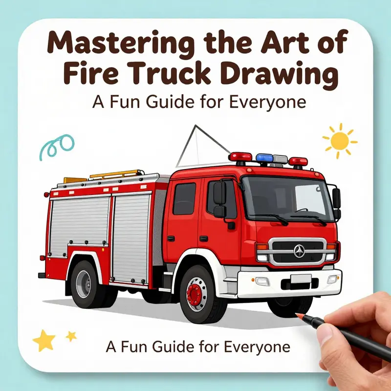
With the sturdy rectangle you drew in Step 1 as the backbone, Step 2 invites you to give the fire truck its character by shaping the cab. The cab is more than a place for a driver to sit; it anchors the whole vehicle in perspective, sets the silhouette’s rhythm, and hints at the truck’s purpose with every line. The approach is not about precision alone, but about balance, flow, and the feel of a compact yet capable machine ready to roll into action. As you begin, keep in mind that this stage should be light and exploratory. The cab will eventually house the windshield, the roofline, and the driver’s window, all of which work together to create a believable, friendly, child-scale version of a real fire truck. Let the process unfold gradually, adjusting as needed, and you’ll find that the cab begins to take on life without ever losing its simple, approachable charm.
Start by redefining the front of the truck with a windshield that reads as a window to the vehicle’s mission. Draw a slightly curved or angled rectangle for the windshield area. The key is to let the shape slope gently forward, which gives the cab a dynamic, forward-leaning presence that mirrors the speed and urgency of a real fire truck. You don’t need perfect angles or perfect symmetry at this stage; what matters is the sense that the driver can see clearly ahead and that the cab sits crisply atop the body. If your line feels stiff, soften the curve a touch and allow the rectangle to taper slightly toward the edges. This subtle adjustment can transform a flat box into something that looks more alive and ready for action.
Next, sketch the roofline of the cab. The roofline should connect naturally to the back edge of the windshield, forming a cohesive silhouette that reads as a single unit rather than two separate shapes. The roofline can be a straight line or a gentle slope, depending on the character you’re aiming for. A straight roofline keeps the look traditional and friendly, while a slight tilt can suggest motion or a modern touch. At this stage, use loose, light lines so you can tweak the angle without fear of damaging a final contour. The habit of keeping the lines light is one of the greatest advantages for beginners, because it preserves options for adjusting proportions without heavy erasure work.
As you set the cab, keep proportion at the forefront. A practical rule of thumb is that the cab should appear proportionate to the rest of the vehicle, with its height roughly one-third to one-half of the total height of the truck. If your body is tall and rectangular, the cab should not dwarf it, and it should not vanish into the truck’s mass. A quick check is to compare the cab’s height to the overall height and adjust until the two read as a single, cohesive vehicle. This balance matters because it affects how the ladder, wheels, and other features line up later. When you’re visually unsure, a simple trick is to place invisible horizontal guides that span the width of the body. These guides help you visualize where the top and bottom edges of the cab should sit in relation to the rest of the truck.
Symmetry is another essential consideration here. The left and right sides of the cab should feel evenly weighted, which contributes to a convincing, friendly drawing. To achieve this, you can lightly mark a vertical center line along the cab area and measure equal distances from it for any windows or side details you plan to add. If you find that one side looks larger or pushed forward, revise the line placements to bring them back into harmony. Symmetry isn’t about perfection; it’s about an intuitive sense of balance that makes the figure look stable and ready to move.
Now, begin outlining the driver’s side window. A light, shallow shape just below the windshield helps anchor the cab’s interior without committing you to a complex interior. You can imagine a driver’s seat behind a small, rectangular window that echoes the windshield’s angle. The extra line serves a practical purpose: it gives you a reference for the cab’s interior space and adds a level of detail that makes the truck feel more complete for young artists who are learning to see through the shape of a vehicle. If you prefer a slightly more detailed look, you can sketch a thin vertical line within the windshield area to imply a frame or a corner of the door nearby. The goal is not to overcomplicate the drawing but to hint at real-world features in a simple, kid-friendly style.
As these shapes emerge, it’s natural to think ahead about what comes next. Step 3 will bring the windows more fully into view and will begin to define the cab’s personality with small details like the mirrors and grill elements. The ladder area will begin to appear on top of the body in Step 5, and the cab’s roofline will subtly influence the placement of those features. Keeping the cab proportionate and balanced now ensures that each subsequent detail lands in the right place and reads clearly to a viewer who is quickly skimming a simple, cheerful drawing. Remember, this is a drawing meant for beginners and kids. The lines should feel friendly rather than technical, and mistakes can become opportunities. If a line ends up too sharp or skewed, you can always soften it with a gentle curve or erase lightly and redraw. The flexibility of the pencil is your ally here, not a hurdle.
To reinforce what you’re aiming for, imagine the cab as a small box perched on a larger, sturdy base—the body of the truck. The windows are like windows on a real vehicle, but drawn with minimal details to keep the image approachable. A couple of rounded corners can help soften the look and keep the vehicle from appearing too rigid. The cab’s silhouette should reflect a practical, working craft: robust enough to convey strength, compact enough to remain friendly to a young artist’s perspective. If you want to test your cab’s feel, you can softly sketch light horizontal guidelines at about the height where the driver’s eye line would be. These lines are not final; they’re scaffolding that helps you maintain alignment as you add more components during later steps.
In the broader context of your drawing process, Step 2 is where your fire truck begins to tell its story. The cab is the heart of the vehicle’s character; from here, the eyes of the viewer—our windshield and side window—establish a connection with the audience. The balance you strike now will echo through the rest of the drawing, whether you’re adding chrome detailing, a bold stripe along the side, or a raised ladder rack on top. Take your time with these early decisions, and you’ll enjoy the smoother transitions into subsequent stages, where the ladder, wheels, and siren lights will join the cab to complete the image.
If you’d like to explore more visual guidance as you work, you can visit the Fire Truck Blog for related tutorials and tips. It can be a helpful companion as you refine technique and approach, keeping you grounded in the same friendly, approachable style that makes drawing easy for beginners. Fire Truck Blog.
As you close Step 2, step back and look at the overall silhouette. The cab’s shape should feel cohesive with the rectangular body, and its lines should invite the eye to travel from the cab to the back where a ladder might sit or where a small door detail could appear later. If you notice any awkward gaps or misalignments, that’s a cue to revisit the windshield angle or the roofline slightly. Small tweaks now save larger corrections later—and they keep the drawing fun rather than frustrating. The cab, with its curved windshield and simple roof, should radiate a sense of readiness: a compact, dependable vehicle, ready to slide onto the page with the same dependable ease you’re cultivating as your drawing skill grows.
Finally, remember that this chapter’s goal isn’t to achieve a technical blueprint but to create an inviting, easy-to-recognize fire truck that a child can relate to. The steps here offer a flexible framework: keep lines light, adjust proportion in small increments, maintain symmetry, and let the cab’s shape guide the rest of the drawing. With the wind in your pencil and the cab shaping up in your sketchbook, you’ll be prepared to move into the next phases—adding the windows, the ladder, the wheels, and the finishing colors—while preserving the simple charm that makes this exercise truly enjoyable. For more visual references and inspiration on drawing techniques and kid-friendly tutorials, you can also explore a concise, engaging video guide that demonstrates these ideas in motion, helping you see how the shapes come together in real time. And when you’re ready for a broader look at fire truck design and related topics, the Fire Truck Blog remains a reliable starting point for ongoing practice and ideas.
Windows That Speak: Drawing Easy Fire Truck Windows with Confidence
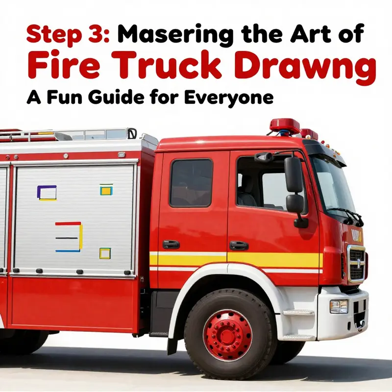
Windows are more than glass on a fire truck; they are the windows to the vehicle’s face, the place where the story of safety, speed, and teamwork begins for the young artist. In a simple drawing, the windows can carry a surprising amount of personality, giving the truck character without complicating the image. The goal is not a technical blueprint but a clean, friendly silhouette that a child can recognize and a beginner can reproduce with a handful of gentle steps. When you approach the cab area with the right eye for proportion and a steady hand for lines, the windows become landmarks that guide the rest of the truck’s body. The cab, after all, is the head of the machine; its windows are its eyes, and the spacing between them sets the rhythm of the whole drawing.
To begin, imagine the fire truck as a sturdy, elongated block moving along the page. The cab sits at the front, a slightly taller projection that houses the driver and the passenger. The first mark on the cab is not a window but the general shape: a rectangle or a slightly angled trapezoid that leans forward a touch, echoing the forward motion of a vehicle in motion. Within that space, plan two to three windows. The simplest and most kid friendly arrangement uses a pair of main windshield panels at the top and one or two smaller windows beneath them. The exact count can be adjusted to fit the artist’s comfort, but the idea remains the same: windows of different sizes create visual interest while preserving clarity and proportion.
Position matters as much as size. Place the top window or windows near the upper third of the cab, close enough to suggest a real windshield but not so close that you crowd the outline. The bottom windows should be aligned below, evenly spaced, and sized a touch smaller to convey depth and perspective. In a straightforward, beginner friendly look, the top window or windows can be larger, serving as the main windshield, while the lower panes act as side windows, enabling the viewer to sense that the driver has a clear view of the road and the team waiting behind the truck. If there is a single central window in the middle, it can connect the upper and lower windows visually, acting as a bridge between the two levels of glass. This simple arrangement keeps the cab readable and friendly, which is exactly what a child’s artwork needs.
When you draw each window, consider a light grid to suggest panes without turning the drawing into a complex photograph. A straightforward approach is to draw one vertical line down the middle of each window and one horizontal line across, dividing the rectangle into four equal parts. It is a small touch, but it adds visual structure and helps the eye travel naturally from the windshield to the side windows and back again. For younger artists, keeping the grid light and evenly spaced is crucial. The lines should be faint and easily erasable, so they can be refined or erased as confidence grows. If the lines feel bold, a quick pass with a softer pencil or a blend of light shading can soften them, making the glass appear more like a reflection and less like a grid drawn in stone.
Glass effects, though subtle, can elevate a simple drawing. A child friendly way to convey glass is to add a gentle sheen or a few curved lines near the edges of each window to imply reflection. Light shading with a cool color can simulate the translucent nature of glass without over complicating the scene. A pale blue or soft gray pencil can hint at the window’s transparency, while leaving most of the interior visible enough to suggest the driver’s area. This approach keeps the windows approachable and keeps the overall composition airy, which is ideal for a project intended to be completed in a short session and enjoyed long after the paper has dried.
Symmetry and balance remain key. The windows should mirror each other across the cab’s central axis, creating a sense of stability. If you place two windows side by side on the front of the cab, they should be of equal height and width, with the vertical grid lines aligned. The lower windows, if used, should be proportionally smaller and perfectly aligned with the top panes. When the lines are tidy and the spacing consistent, the cab reads clearly as a real, navigable space rather than a collection of shapes. A gentle reminder to young artists is to keep erasing as a normal part of the process. Lightly erase any stray guide marks after the windows have set into the drawing; this step helps the glass shine without being overwhelmed by stray pencil marks.
The overall look should feel friendly and approachable. Fire trucks in children’s art are often drawn with rounded edges and bright, bold colors. The windows can echo that tone by keeping the outlines simple and avoiding excessive internal detailing. The goal is to achieve a clear silhouette that scales well from a small sketch to a larger page. In a longer tube of a drawing, the windows act as a mental cue that anchors attention in the cab, leaving the rest of the truck to tell the story of ladders, hoses, and emergency readiness. With the windows settled, the eye naturally moves along the body to the ladder on top, the side details, and the wheels, creating a cohesive whole that feels both accurate and playful.
A practical mindset helps a lot here: start with light lines and build up gradually. If you are working with a pencil, use a 2H or 3H for the initial outline and switch to a 2B or 4B for shading gentle reflections on the glass. If you are coloring, choose a vivid red for the body, and use lighter shades or white to highlight the window reflections, letting the glass itself remain clean and bright. The ladder on the truck, often perched along the top, benefits from straightforward treatment as well: a simple rectangle with evenly spaced rungs is enough to communicate its presence without stealing focus from the cab. The same logic applies to the mirrors, which can be tiny, unobtrusive details that contribute to the overall realism without complicating the scene.
As you work, keep an eye on the cab’s relationship to the front grille and wheels. The windows sit above the grille, and the distance to the wheels should feel proportional; a common misstep is to draw a cab that sits too high or too low relative to the body, which can disrupt the sense of balance. If you imagine a line running along the base of the cab toward the back, you’ll keep the windows in proper alignment with the lower edge of the truck’s body, reinforcing the linear rhythm of the design. A good habit is to pause after placing the windows and compare them to the rest of the truck. Does the cab read as the vehicle’s front, or does it look like a separate box strapped onto the body? If the latter, adjust the angles slightly, reducing the tilt or widening the cab’s base until the two parts feel integrated.
Creative shortcuts are perfectly acceptable for beginners. If you want to keep the focus on windows but still deliver a complete drawing, you can simplify by using a single, prominent windshield with two small side windows beneath. The effect remains instantly recognizable and dramatically easier to reproduce. The same approach can be mirrored on other parts of the vehicle later, once confidence with the windows is established. In this way, the drawing becomes a stepping-stone, not a single giant leap. You don’t have to master every possible configuration in one sitting; you only need to master a clear, friendly window layout that communicates the truck’s purpose with clarity and charm.
For those looking to expand their practice beyond a basic sketch, a gentle invitation to explore more on the craft can be found in the broader drawing community. If you would like to see how others approach the overall look of emergency vehicles, a quick visit to the blog that covers a wide range of drawing ideas provides a steady stream of tips and examples. It serves as a practical reference if you want to experiment with different window arrangements or color schemes. External reference: firetruck.space blog. This resource keeps the focus on accessible techniques and encourages experimentation while maintaining a beginner friendly mindset. As you develop, you will notice how small adjustments to window size, spacing, or shading can dramatically alter the feel of the entire vehicle, making it easier to tailor your own version of the easy fire truck to your style.
This chapter remains focused on guiding you through a calm, confident process. The windows, though a small detail in size, carry a big responsibility for the truck’s personality and legibility. As you finish, step back and admire how the lines work together the cab’s windows, the door seams, the curvature of the fenders, and the ladder’s silhouette all forming a single, coherent machine ready to surge into life on the page. The act of drawing is more than copying shapes; it is about translating a familiar, heroic vehicle into a line-based memory that children and beginners can revisit with pride. The windows become a trustworthy anchor, a quiet invitation to keep practicing, because once you have tamed them, the rest of the fire truck falls into place with greater ease.
External reference: https://www.drawingforall.net/fire-truck-drawing-for-kids/
Wheels on the Move: Crafting Easy, Realistic Wheels for a Fire Truck
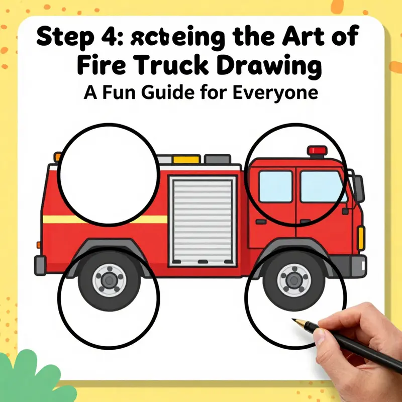
The wheels are more than just round shapes under a truck; they ground the drawing and give it balance, energy, and a sense of story. When you’re building a simple fire truck from a few basic shapes, the wheels offer a ready-made anchor that can boost the whole composition. If the wheels look off, the vehicle can feel wobbly or toy-like, even if every other line is bold and accurate. The good news is that with a few careful choices, you can make wheels that read as sturdy, practical, and ready for action without getting lost in complexity. This chapter guides you through drawing two large, clean tires that align with the body, then adds the little details—hubcaps, centers, and spokes—that turn plain circles into convincing wheels.
The process begins with a steady hand and a light touch. Start by envisioning the fire truck as resting on a flat surface. The baseline line on your paper is your friend here. It helps you keep the wheels on the same level and ensures the body travels straight above them. Place the two main circles so they sit beneath the rectangle you’ve already sketched for the truck’s body. The front wheel should be roughly beneath the front half of the cab, while the rear wheel nestles under the back portion of the body. The distance between the centers matters: too close, and the truck looks cramped; too far apart, and it might feel unstable. A simple rule of thumb is to space them as far apart as the body is tall, with enough room for the wheel wells to breathe. If you’re unsure, you can lightly mark the centers with tiny dots first, then connect the lines of the wheel arches. Remember to keep your pencil lines gentle in this stage; you’ll erase and refine later, so don’t press hard enough to leave stubborn marks that bleed through to the final drawing. Keeping lines light at this stage makes corrections inexpensive and quick, a handy trick for beginners who want to preserve options.
When you draw the two circles, aim for symmetry. They don’t have to be perfect, but they should feel identical in size. A good trick is to hold your pencil as you would in a game of connect-the-dots and compare the two circles against one another. If one circle sits a hair higher than the other, adjust by lightly nudging it until both share the same baseline. This attention to alignment has a surprising impact. A pair of wheels that sit evenly not only looks more professional, it also creates a visual rhythm that guides the viewer’s eye along the truck, from front to back, reinforcing the silhouette of a real vehicle.
Once the main tire shapes are in place, it’s time to think about depth and detail. Inside each tire, draw a second, smaller circle to indicate the hubcap or wheel center. This inner circle helps ground the tire to the wheel’s actual axle, and it adds a sense of weight. If you prefer a more mechanical look, you can leave the center clean with a solid circle. For a more detailed or playful approach, you can add a few evenly spaced tiny lines radiating from the center to suggest spokes. The choice between spokes and a solid center is a matter of style and intent: spokes read as more mechanical and intricate, while a solid center keeps the design simple and kid-friendly. Either option works well for an easy fire truck, and you can switch between them in future practice drawings to discover what reads best to you.
After the hubcaps, consider the tire tread and surface texture. In a basic drawing, you can mimic tread with a few short, curved lines along the circumference or with a light zigzag at the edge. Since the aim is simplicity, avoid overworking the tire surface. A couple of well-placed lines can convey rugged rubber without turning the wheel into a maze of details. If you’re drawing with color, the tires typically read as black or dark gray, so you don’t need to add shading to every edge to imply darkness. Instead, rely on a gentle variation of tone—lighter edges where the light hits and slightly darker inner rims—to suggest roundness and volume. The key is restraint; a few thoughtful marks go farther than a dozen small scribbles.
Then comes the transition from circle to wheel well. The wheel wells or arches shape the bottom edge of the body and reveal how the truck sits on its tires. Lightly draw an arc that cuts into the tire just above the bottom edge of the wheel circle, tracing the inner contour of the fender. This connection between tire and body is crucial: it grounds the wheel in the vehicle’s frame and helps the viewer understand that the wheel is tucked into a protective opening. If you’re keeping the design simple, a single curved line to imply the wheel well is enough. If you want to add more character, you can shade the inner portion of the wheel well or add a faint outline of a fender flare, which gives the drawing a more finished, three-dimensional feel.
The final polish on the wheels comes with careful, light shading and a few decisive lines that suggest structure without clutter. Consider adding a faint circular ring around the hubcap to emphasize its edge, and if you’re including a metallic highlight, reserve a small white area along the wheel’s outer rim where light would bounce most strongly. A touch of shading under the tires can imply weight and gravity, suggesting the truck is firmly planted on the road rather than hovering above it. The trick here is to balance simplicity with realism: you want the wheels to feel solid and functional, not flat and cartoonish. A small amount of shading in the right places can make a big difference in how the wheels read in projection.
While you’re working on the wheels, keep a steady pace and return to the rest of the truck only when you’re satisfied with their baseline shapes. The body’s straight lines and the cab’s angular shapes will interact with the curved contours of the wheels, so checking alignment frequently is a good habit. If a line from the wheel’s center to the body’s edge seems off, a tiny correction will save you from reworking a larger section later. This patient, iterative approach mirrors the way real drawing grows from rough sketches into a confident finished piece. It’s also a healthy practice for beginners: it teaches you to see proportion as a whole and to adjust one element without tearing apart everything you’ve done so far.
For more structured practice, you can explore broader drawing tips on the Fire Truck Blog, which offers insights that translate across steps like wheel placement, perspective, and line quality. Fire Truck Blog is a good resource to reinforce the ideas you’ve encountered here and to provide additional exercises that target wheels, cabs, and the essential components of a simple fire truck drawing.
As you continue, imagine the wheels not as isolated circles but as the door to the truck’s story. The way you shape and shade them can imply speed or steadiness, which helps you convey the role of the vehicle in a narrative image—whether it will be chasing a flame or parked in a quiet street, awaiting its next emergency. The integration of wheels with the body matters because it anchors the whole scene. If the wheels sit right, the rest of the truck follows more confidently. If they’re slightly off, you’ll notice the mismatch even before you finish the color and details. The good news is that making steady, incremental adjustments is easier than it seems. With a patient line, you can draw and redraw the wheel circles, adjusting position a touch here, a touch there, until the two circles rest comfortably beneath the body.
In practice, you might find it helpful to sketch the tires on scrap paper first as a warm-up before you commit to the final sheet. Use that opportunity to test proportions and see how the hubcaps read when you adjust the inner circle’s size. Once you feel more confident with the wheel geometry, transfer the technique to the main drawing. You’ll often notice that the look of the truck becomes more credible once the wheels feel rooted in the ground, and that sense of grounded realism has a powerful effect on the rest of the composition.
If you want to extend the practice beyond a single drawing, consider drawing several versions of the same wheel arrangement at slightly different scales. This helps you understand how size affects balance and how the same wheel design can pair with various body lengths. It’s a useful exercise for beginners who want to internalize proportion without getting overwhelmed by extra details. And if you’d like to see how professionals simplify complex vehicles while keeping accuracy, browsing through additional tutorials can be inspiring, even if you don’t replicate everything exactly. Keep the lines light and the mind curious, and you’ll find that your ability to render wheels—and by extension the entire fire truck—improves steadily with each attempt.
External resources can offer different perspectives on wheel construction and shading, which can complement this guide. For instance, a quick look at a 10-minute drawing tutorial on a popular visual platform can provide a concise, beginner-friendly demonstration of wheel construction that aligns with the simple approach outlined here. External resource: https://www.pinterest.com/pin/524697388433275747/
To keep building on these ideas, remember to return to the basics: keep the wheel centers aligned, maintain even spacing, circle with light lines, and use hubcaps and spokes to add character without clutter. If you want a steadier pace in your practice, repeat the process with the other wheel and then compare how the two interact with the truck’s length and overall silhouette. You’ll often discover that the simplest changes—slight adjustments to circle size, the height of the wheel well, or the inner hubcap—have a surprising impact on how solid the final image feels. And as you refine your one, two, or three tries, you’ll begin to sense the wheel’s role not just as a drawing exercise, but as a foundational piece of visual storytelling that gives a fire truck its unmistakable, dependable presence on the page.
null
null
Final thoughts
Congratulations on completing your fire truck drawing adventure! You’ve transformed simple shapes into a striking representation of a beloved icon. Whether you’re a budding artist or a fire truck enthusiast, this creative exercise not only enhances your artistic skills but celebrates the bravery and excitement associated with firefighting. Keep practicing your drawing skills and remember, each masterpiece is a testament to your imagination and passion!