
Have you ever dreamed of sketching an awe-inspiring fire truck that captures its vibrant spirit and heroic nature? Whether you’re a young aspiring firefighter, a collector passionate about fire trucks, or a professional immersed in emergency services, learning how to draw these iconic vehicles can be both fun and fulfilling. This guide embarks on a journey through the fascinating world of fire truck artistry, starting with basic drawing steps. As we delve deeper, we’ll explore advanced techniques for a realistic rendition, add intricate details, and finally, discover the pulsating energy of color to bring your drawing to life. Gear up as we unlock the secrets to capturing the essence of fire trucks on paper!
From Simple Shapes to a Striking Fire Truck: A Complete Guide to Drawing for Beginners
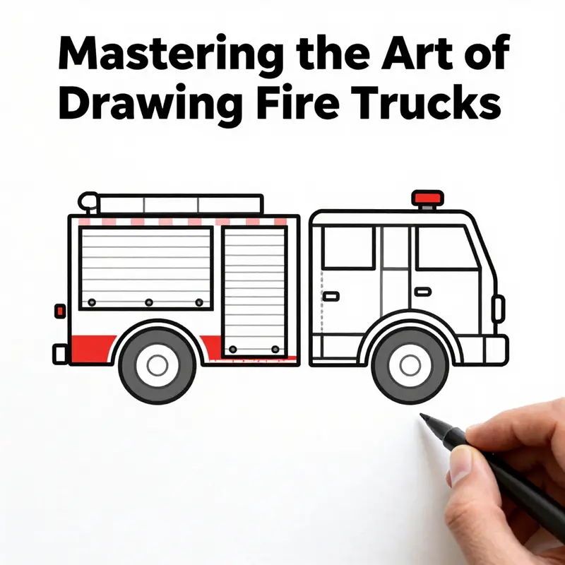
A fire truck sits at the intersection of practicality and drama. Its silhouette is built from bold, readable shapes that communicate speed, safety, and service. For beginners, the best way to approach drawing one is to treat the vehicle as a carefully assembled composition of simple forms. Start with the big picture in mind, then layer on the details, and the result will feel both accurate and alive. This chapter treats drawing a fire truck as a journey through proportion, perspective, and purposeful color, a journey that grows from confident basics into a more expressive, real-world look without losing the clarity that makes these vehicles so instantly recognizable.
Begin with the body. Picture the main portion of the truck as a large rectangle or a slightly elongated box. This is the chassis, the field where all the action will unfold. Keeping the shape simple at first helps your eye stay focused on overall balance. Place the rectangle so the longer side runs horizontally, giving the vehicle a stable, ground-hugging presence. The edges should feel sturdy, not delicate, because a fire truck is a workhorse. If you’re aiming for a slightly more dynamic stance, you can tilt the top edge ever so slightly to suggest a subtle perspective, but keep the bottom edge parallel to your drawing surface to preserve readability.
Next, introduce the cab—the driver’s area. At the front end of the rectangle, add a smaller, angled shape that roughly resembles a squared-off triangle or a shorter rectangle that tapers toward the nose. This front section is the fire truck’s signature “nose.” It anchors the composition and provides a clear focal point for the viewer’s eye. The cab is not just a structural element; it also helps convey the truck’s personality. A gently pointed, slightly elevated cab implies forward motion even when the vehicle is at rest.
Wheels are essential for grounding the vehicle in space. Draw two large circles near the bottom corners of the body for the front and two larger circles toward the rear. Make sure the wheels align with the body’s width and are evenly spaced to avoid a stilted look. Inside each tire, sketch a smaller circle for the hub and add a few lines to suggest rims or spokes. The wheels do more than hold the truck up; they provide rhythm and balance to the drawing. If you want to add a touch of realism, you can draw a thin line around each tire to suggest tread, and a small shadow where the tires meet the ground to suggest weight and contact with the surface.
Once the framework is set, add the cab details. Draw windows on the front cab area—two side windows and a larger windshield. A simple grille or bumper at the lower front edge helps anchor the face of the truck and invites the viewer to read the vehicle’s expression. Tiny details, like door outlines and handle lines, introduce depth without overwhelming the composition. The door lines on the cab are more than just decorative; they reinforce the truck’s functional identity and give you natural places to catch highlights and shadows as you color.
With the base and cab in place, consider the equipment that gives a fire truck its character: the hoses and ladders. On the side of the main body, draw a long, straight line to represent a hose. It’s a humble element, but it carries a lot of visual weight once you shade it and place it with a sense of length and purpose. If you’re feeling more ambitious, you can sketch a ladder extending from the back of the truck. The ladder adds vertical geometry and a sense of ascent, inviting the eye to move from the lower body up toward the top where emergency light domes and rescue equipment live.
Color and light are not mere afterthoughts but essential storytelling tools. A classic fire-truck palette helps viewers recognize the vehicle instantly. The body’s primary color is red, but not just any red—the color can express mood and visibility. In art discussions and practical guides, a bold, high-visibility red is often used for the main body, with bright yellow or white stripes along the sides to maximize contrast and readability from a distance. If you’re following more exacting color references, you might imagine Pantone 19-4052 as the core red and Pantone 13-0600 as a high-contrast stripe tone. The ladder, when present, can have a cooler treatment—think a blue-to-purple gradient—to convey metallic gleam and perspective as the ladder recedes toward the back of the truck. The lights are another focal point: a dome-shaped blue or red beacon on the cab roof, plus smaller indicators along the body, can be suggested with white or pale blue highlights to suggest reflective surfaces catching the light.
As you refine the drawing, bring proportion into sharper focus. For a more realistic look, imagine the body’s length to width ratio at about 2:3. This helps the truck feel substantial but not squat. When you introduce the water-tank area or the tank compartment behind the cab, tilt its top edge at a slight angle—roughly 45 degrees—as you would see in real apparatus. This tilt gives the vehicle a sense of volume and perspective. If you add the aerial ladder, think about the extension ratio: a practical guideline is about 1:1.5 relative to the body, which allows the ladder to read as an elongated, dynamic element without overpowering the rest of the composition. Perspective matters here; a calm, measured angle will keep the drawing legible while still conveying the height of a ladder perched above the truck.
To move beyond a flat illustration, layer in signs of motion and action. A simple way to do this is to imply activity with color and silhouette. Draw a few quick flames at the edge of a scene to suggest a dramatic rescue, then place a small firefighter silhouette in the distance or near the edge of the frame. A silhouette scaled at roughly 1:3 with respect to the truck can communicate scale and presence without stealing focus from the vehicle itself. The goal is to create a narrative without pulling your viewer away from the engine’s form. If you’re practicing, you might try a minimal flame made with bold red shapes outlined in black to read clearly against the red body, using shading to imply heat rather than rendering every flicker in detail.
The finishing touches come with line, shading, and texture. Outline the truck with a darker pencil to sharpen edges, then add subtle shading to suggest plane changes: the inside edge of the cab, the underside of the hoses, and the rear wheel wells. This is where the drawing begins to feel tactile. A gentle gradient along the body can imply curvature, especially near the cab and behind the water tank. For the stripes along the side, use a bright, reflective color and keep the edges crisp. The aim is contrast—bright stripes against a bold red field, white or yellow where the light hits and the side surfaces recede. Reflection can be hinted with a thin, pale wash along the upper edges of the body to mimic light catching the metal.
Coloring is where the image truly comes alive, but the approach should be deliberate. Start with a light base wash or pencil shading to map volume, then progressively layer the saturated color. If you’re using traditional media, you can begin with a base red wash, then apply the stripes and details with a high-contrast yellow or white. If you’re working digitally, you have the luxury of adjusting hue and saturation after you’ve established the shapes, which makes it easier to test color variations without redoing the entire drawing. Either way, the key is to keep the main silhouette clean and bold, leaving the more delicate details for later passes.
As you practice, you’ll notice how the same shapes recur in many drawings: a strong rectangular body, a compact cab, round wheels, and a few long lines for hoses or ladders. This repetition is not redundancy; it’s a language. Your eye reads these shapes quickly, recognizing the vehicle as a fire engine even before you notice the specific livery. That recognition is what makes the exercise valuable. It trains you to see structure first, story second, and color third. The benefit extends beyond art class. When you sketch a fire truck with proportion and perspective in mind, you’re training your eye to understand how real machines are built and how their lines communicate intent—safety, reach, and readiness.
If you want to explore more about real-world variations in equipment and design, you can visit resources that discuss fire-truck specifics and the broader context of rescue vehicles. For readers curious about where these machines live beyond the drawing board, one useful resource discusses real-world variations in fire apparatus and related topics at fire trucks for sale. This link provides additional context while you keep your focus on developing a confident drawing hand: fire trucks for sale.
Finally, if you learn best with a guided, visual walkthrough, a beginner-friendly YouTube tutorial offers step-by-step demonstrations that align with the steps described here. Watching a patient instructor construct the same shapes and proportions you’re practicing reinforces the rhythm of drawing and helps you translate the plan from mind to paper. The visual sequence can be especially helpful if you’re teaching a younger student or guiding a classroom through the basics of form, proportion, and color. For a quick, visual walkthrough, you can consult a well-regarded beginner video that demonstrates the same progression—from a simple body outline to the addition of cab, wheels, and equipment—with clear, approachable pacing. You’ll find it here: https://www.youtube.com/watch?v=Uu8qXgYd9vI
Realistic Fire Truck Rendering: Mastering Perspective, Texture, and Light
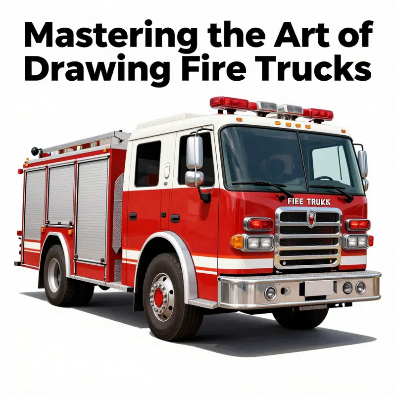
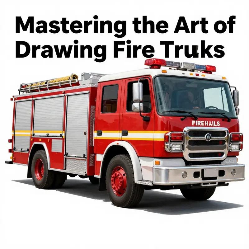
Realistic Fire Truck Rendering requires a patient workflow that balances accurate proportions, convincing perspective, and surface textures that respond to light. Start with careful observation of a range of references to capture the truck’s silhouette, the cab geometry, the ladder, and the water tank. Use a three-quarter view to reveal depth, while keeping reference points consistent as you lay in the main masses. Build in layers: the broad shapes first, then the doors, windows, and compartments, followed by rails, ladders, and hoses. Texture comes into play with metal panels showing a subtle grain and crisp reflections, chrome trim catching highlights, rubber tires with tread, and glass that reads as a reflective inner surface. When shading, identify a primary light source and plan the tonal range from highlight to midtones to deep shadows, avoiding flatness by preserving edge contrasts. Proportions must stay aligned across the cab, body, and chassis, with a light construction grid during planning to keep edges true. Real color should be modulated, with careful variation across sunlit and shadowed panels, and reflective surfaces treated with cooler highlights. If you add motion cues, keep them restrained to suggest activity without breaking the realism. Finally, compare your work with external references to refine technique without copying a model exactly.
null
null
Color on the Front Lines: Finishing a Fire Truck Drawing with Life, Light, and Realism
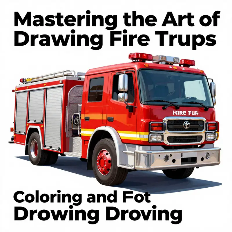
Color is where a line drawing finally breathes and becomes a scene you can step into. It is not merely about choosing red and filling shapes; it is about telling a quick story of purpose, motion, and safety. A fire truck, with its gleaming chrome, bold insignia, and bright markings, invites you to consider how light interacts with metal, glass, and painted surfaces. The finish you apply should honor the vehicle’s design while translating your own hand into the final image. The steps that come next are less about copying a reference and more about composing color like a musician composes a melody: with confidence, restraint, and attention to the way hues behave at different angles and in different moments of light.
The first and most obvious decision in coloring is the core palette. The iconic red that defines a fire engine isnt a single flat tone. It carries warmth, depth, and a hint of orange in the sun and a cooler undertone in shadow. When you begin, you lay down a base layer of red that covers the body with clean, even fills. From there you negotiate the tone by introducing subtle shifts: a touch of crimson at the shoulder curves where the sun kisses the metal, a deeper crimson along the wheel wells, and a warm highlight that runs along the roof line as if a lantern has brushed the surface. You do not want the red to feel cartoonish or flat; you want it to feel resilient, like the metal itself. A key to this is sampling and matching color against a reference—picking up a shade from a captured moment in your sketch or from an image you trust helps the color feel grounded rather than invented in isolation. Even in a simple illustration, color literacy matters: you know where the light comes from, you know which surfaces reflect, and you respect the truck’s geometry so the color sits in place rather than floating above it.
The color plan you choose should account for the different materials that make up the vehicle. The body, usually a bold red, is the dominant field. The windows are a cool, glassy space that should read as separate from the body but still part of the same scene. The ladder, panels, and doors carry their own character, so you might treat them with lighter or cooler tones to distinguish their forms while keeping the overall harmony. The tires anchor the composition with a deep, matte black that contrasts with the glossy surfaces; a thin white line around the tread can help them feel solid and mechanical rather than abstract. Light colors—white, pale yellow, or chrome accents—mark trim, decals, sirens, and lettering. They are not afterthoughts; they are the punctuation that clarifies structure.
To achieve clean, controlled color you work in layers. Separate layers for the body, the wheels, the windows, the ladder, and any signage or logos give you the freedom to adjust one part without disturbing the others. The fill tool and masking techniques become your friends here. You might start with broad fills on each layer and then tighten the edges with a small brush, letting the color meet the boundary lines with crisp, confident edges. This separation is not a GUI indulgence; it is a practical discipline that helps you preserve the integrity of the shapes you drew earlier and prevents color splashes from breaking the composition. It also makes subsequent shading and highlight work more precise. If you want to push realism, you can add a thin, pale wash along the top edge of the body to simulate light catching the surface, then darken the undersides with a cooler shadow tone. The palette remains small and intentional, but the perception of depth grows.
Shading and highlights are where the form becomes tangible. A soft brush allows you to blend red into darker reds, creating a velvet transition along curved surfaces such as the cab’s contour, the rounded fenders, and the corners where the body panels meet. The key is gradual change, not abrupt. Start with a midtone red and build a gradient by layering slightly darker reds into the shaded areas and lighter reds where the light hits most directly. Reflections should not be forced into place; they emerge from the geometry of the truck and the arrangement of light. Windows, for instance, should carry a cool tinge that suggests glass rather than painted metal. Chrome or metallic trim benefits from a light, almost icy highlight along its edges, with a subtle gradient that conveys rounded metal rather than a flat plate. When you reach the ladder and the equipment racks, consider a different approach: the ladder’s surface can show a cooler cast due to its metal composition. A blue-tint highlight along the ladder rungs can give the impression of a reflective, polished surface without overpowering the dominant red.
A realistic finish also means paying attention to details that might be overlooked in a quick sketch. Small features like license plates, door handles, and the siren’s outline are essential to sell the realism of the scene. Each element has its own color behavior. A plate may be a pale, neutral shade with dark numbers; door handles might pick up a warm highlight on one side while staying darker on the other. Logos and decals should read as integrated rather than pasted on. They benefit from a very fine linework and a careful edge where color meets surface, so they read as printed or painted marks rather than painted-on stickers. Add a touch of gloss or glare on reflective surfaces like the windows and chrome trim to suggest a healthy light specular and a credible finish. If you want to hint at action, you can hint at a small reflection of a firefighter silhouette or a hose pattern in the water-like sheen on the body, but keep it subtle so it does not overwhelm the rest of the composition.
Color balance is a broader tool that painters use to harmonize the entire piece. After you have established the base colors, use global adjustments to refine the mood and coherence across the drawing. A gentle brightness increase can lift the entire image, making the red read more brightly against the darker shadows. Saturation can be pushed slightly to enhance the vitality of the red, but too much can feel artificial. The trick is to preserve natural variations; your goal is to maintain a sense of life rather than a uniform, manufactured finish. If your workflow allows, you might work with a separate intensity layer that lets you tune the overall color without reworking each part individually. In a digital environment, it’s easy to return to earlier steps, adjust a hue or a value, and see how it affects the entire painting in real time. The result should feel cohesive, as if the truck truly exists in the world rather than being a flat illustration.
As you bring the drawing toward completion, the small details come into sharper focus. The windows gain a few highlights that mimic the light scattering on glass, the tires receive a thin edge highlight to emphasize their curvature, and the reflective surfaces pick up the ambient colors of the scene you imagine around the vehicle. These final touches are what separate a competent color job from a convincing one. They require patience and a willingness to zoom in on the craft and then step back to assess the overall impression. When you are satisfied with the balance of color and light, you can perform a final pass that tightens edges and reaffirms the relationships between parts. This is not about transforming the truck into a photo; it is about stacking visual promises so the viewer feels the weight and energy of a real vehicle on a moment of duty.
If you want ongoing guidance or examples as you color, you can explore the Fire Truck blog for reflections on technique and design philosophy, which aligns with the practical steps outlined here. The blog serves as a continuous resource that can inspire your choices about proportion, color, and finish as your skills grow. The link is provided here for convenience, but the best nourishment comes from watching how others approach the same task with their own eyes and hands. You may find that a simple difference—switching a shade slightly lighter on the cab, or widening the white trim on the front doors—shifts the entire feel of the truck and makes the scene more believable without sacrificing speed and clarity.
Alongside the practical steps in painting, your mental approach matters. When you paint a fire truck, you are solving a visual puzzle about how real machines look under different lighting and how color communicates safety, authority, and readiness. You want the viewer to sense that this is a vehicle designed to respond, to move quickly, to connect with the environment, and to serve communities under pressure. The color work—rich, deliberate, and integrated with the drawing’s lines and forms—becomes your language for telling that story. If you aim to share the image with others, consider including a brief note about your palette choices and the lighting concept so viewers appreciate the decision-making behind the colors rather than simply the final result. Your chapter of color is not a finale but a doorway into a broader conversation about how art reproduces the world with energy and intention.
For readers seeking a deeper technical workflow, a comprehensive resource on color and finishing techniques is available. The approach outlined here fits into larger digital workflows that emphasize layer management, precise selection, and controlled color application. If you want to examine a more rigorous technical guide, you can consult an external resource that details professional color workflows and how to apply them to complex subjects like emergency vehicles: https://helpx.adobe.com/photoshoplearnpanel/learntutorialszh_cn.html. This external guide complements the practical steps above, offering context for the tools you already use and new strategies to experiment with as you practice. Finally, keep your eye on the goal: a fire truck that looks ready for action, its color carrying the story of urgency, courage, and care that defines the subject you set out to draw. And as you refine your method, remember to revisit the idea that color, light, and finish are not decorations but the language through which your drawing communicates with the world.
Final thoughts
Drawing a fire truck is not just about replicating the vehicle’s image; it’s about capturing its spirit—both heroic and historic. Through mastering basic shapes, integrating advanced techniques, adding meticulous details, and employing vibrant colors, your sketches can evoke the thrilling essence of fire truck artistry. So, whether you’re sharing your artwork with other enthusiasts or keeping it as a personal masterpiece, remember that every line and color tells a story of bravery and community service. Embrace your passion and keep practicing, for every drawing is a step toward mastering your craft!