
Drawing a fire truck can be an exciting way to celebrate the bravery of firefighters while also honing your artistic skills. This guide caters to firetruck enthusiasts, young aspiring firefighters, and emergency services professionals alike. By breaking down the drawing process into four detailed chapters, we ensure artists of all levels can achieve a stunning representation of these heroic vehicles. With the foundation set in basic outlines in Chapter 1, you’ll then advance to adding intricate details in Chapter 2. Chapter 3 enhances your drawing with dynamic sirens and lights, while Chapter 4 culminates with final touches that bring your fire truck to life. Prepare your pencils, and let’s ignite your creativity!
Foundations in Fire: Crafting the Essential Outline for a Realistic Fire Truck
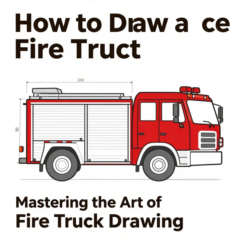
Drawing a fire truck begins not with the intricate details of hoses, ladders, or the glint of chrome, but with a steady, patient outline that captures the vehicle’s fundamental presence. The outline is the backbone of the illustration, the invisible frame that determines how every subsequent line will sit, how space will breathe within the drawing, and how perspective will ultimately convince the viewer that what they are looking at could exist in three dimensions. Before a single line sharpens into a doorway or a wheel, you are carving a skeleton from which all the features will emerge. This chapter follows that philosophy: start with simple, honest shapes; respect proportion and perspective; let the outline guide your later refinements; and never rush the process. In practice, this approach works for beginners and remains a reliable discipline for more experienced artists who want a dependable base before adding color, shading, or texture. As you move through the steps, observe how each choice—how long the chassis appears, where the cab sits relative to the body, how the roofline rises or remains flat—sows the seeds for a convincing, dynamic vehicle. If you crave a broader view on structured drawing methods, a dedicated resource explores foundational techniques and how to translate them into more complex subjects; for readers who want a concise jump start, the Fire Truck Drawing Blog offers a wealth of practical insights and examples that stay faithful to the idea of drawing first with clarity. Fire Truck Drawing Blog serves as a compass for the kind of disciplined practice that keeps a drawing from tipping into caricature or chaos.
The first moment of any fire truck sketch is the decision about scale and posture. Envision the vehicle as a compact rectangle that holds the main body, with a second, smaller rectangle pressed against the front to represent the cab where the driver and crew would sit. The cab’s placement matters: it is typically offset toward the front of the chassis, not perfectly centered, reflecting the practical layout of a real truck where the cab keeps the driver close to the leading edge and the rest of the apparatus stretches behind. This offset is not a rule carved in stone, but a commonly observed characteristic that strengthens the sense of realism when drawn with care. Use a light pencil to lay down these two basic forms, ensuring that the longer body rectangle aligns with your intended horizon line and that the cab’s rectangle sits slightly forward, establishing a balanced silhouette. The beauty of this step lies in its simplicity: you are setting the stage so that every subsequent feature can be measured against these two anchors.
From there, the undercarriage and the wheel placement begin to define the truck’s stance. Draw two or three generous circles along the length of the main rectangle, evenly spaced and aligned with a common baseline. The circles should not be perfectly round; in a three-quarter view, perspective will slightly flatten or broaden the circles depending on where your eye sits. The lower edges of the wheels should touch an implied ground line that you’ll later refine as you adjust the vehicle’s tilt and lean in space. This is where perspective begins to reveal its voice. If you imagine the viewer looking slightly up at the truck, the wheels nearer the foreground will appear somewhat larger than the ones toward the rear. If the viewing angle is more level, the wheel sizes will sit closer to equal, but the vanishing points will still pull the body toward a believable three-dimensional form. The subtle drama of perspective shapes how the ladder, the rear apparatus, and the upper lines of the cab will interact with the base shape.
The roofline should run straight and level along the length of the body, preserving a sense of solidity and mass. The front of the cab can carry a slight upward curve or angular slope, hinting at the dynamic geometry of the windshield and the forward contour of the vehicle. This is not about chasing exact curves right away but about anchoring the eye to a consistent rhythm. If the line you draw feels wobbly, pause and re-establish the baseline with a lighter set of guides before committing to a final line. A strong outline grows from repeated, careful passes rather than a single, forceful stroke. As you refine, you begin to notice how the silhouette informs proportions: the cab’s height relative to the body, the height of the wheel arches, and the way the hood slopes toward the grille. Each adjustment should feel deliberate, a balance between the truck’s robust utility and the graceful geometry that makes it readable at a glance.
With the basic mass in place, you can start refining the outline into something recognizably a fire truck without surrendering the room for expressive detail. Begin by tracing in a few key features that establish character without crowding the silhouette. On the rear of the vehicle, imagine a ladder mount and the box-like apparatus that carries the pieces needed for rescue and firefighting. The front grille and the windshield begin to take shape as you tighten the lines around the cab. It helps to think of these refinements as a process of subtraction and addition: subtract the unnecessary fuzziness in the outline while adding the defining elements that tell the viewer what they are seeing. The ladder mount becomes a raised platform that typically sits toward the back edge of the roof line, a rectangular bracket that reads clearly in the negative space created by the roof and the body. The grille is carved with a few vertical slats, suggesting ventilation and power without turning the truck into a mosaic of tiny slats that would overwhelm the larger geometry of the vehicle. The windshield can be sketched as a broad, gently curved pane that echoes the cab’s front edge, conveying the sense of glass and space inside the crew compartment. The goal is to preserve the clean, legible geometry while letting the more narrative details—lights, handrails, and—if you choose—small compartments and tool boxes—emerge as quiet landmarks along the sides of the truck.
Beyond these major lines, the outline invites you to consider the proportions and how the various components relate to one another. The wheel arches, for instance, should feel anchored and complete, not just circular holes punched into the body. They create a rhythm along the chassis, guiding how the eye travels from the cab to the rear and back again. The front bumper, the grille, and the headlights (even in line art) contribute to a sense of character. You may want to sketch the front bumper as a bold bar that sits just beneath the grille, followed by a row of lights that reflect a practical, no-nonsense aesthetic. These elements do not just decorate the outline; they articulate the truck’s function and identity. In a well-formed outline, every line serves a purpose, every corner reads cleanly, and the overall shape feels like something that could exist in a real world where towers of equipment and streams of siren light would be housed and deployed.
As you progress, keep your initial lines light and exploratory. The advantage of beginning with faint guides is that you can reassess proportions and angles without becoming trapped by the first impulse. If a line seems misaligned or the body appears too long, use your eraser to nudge the figure back to a more truthful stance. The outline should be a living document—something you adjust as you look at the whole picture with fresh eyes. It is common to redraw sections of the silhouette multiple times in the early stages, especially when working from reference images. This is not a sign of weakness but a sign that you are listening to the image rather than forcing it to fit a preconceived idea. When you finally commit to the core lines, your drawing will feel coherent and ready for the more expressive tasks that follow: adding the ladder, hoses, lights, and the subtle textural language of metal, glass, and rubber.
Color, shading, and detail follow a successful outline almost like a pledge to the observer that the picture will behave itself under light and perspective. The moment you declare the main shapes and refine the silhouette, your mind begins to anticipate how different surfaces will reflect or absorb light. The metal surfaces of a fire truck gleam with a hard, polished cadence, while rubber tires absorb sound and texture. Even in a drawing that remains purely line-based, you can suggest these material differences through deliberate line weight, edge sharpness, and the degree of curvature you allow along the body and the wheels. When the line work stays consistent and purposeful, color planning becomes a straightforward extension of the outline. You can imagine the primary color as a field that covers the main body and cab, while secondary colors highlight the ladder, compartments, and equipment. In a purely monochrome study, the outline’s strength will carry the image forward; in a colored version, the clean separation of the main body from the gears and details will return the viewer to the same sense of order you achieved with the initial skeleton.
If you want to deepen your understanding of how to observe and translate complex objects into structured outlines, you can consult a broader set of drawing resources that emphasize the relationship between simple shapes and more intricate forms. A well-regarded resource in the field offers a step-by-step approach to reducing complex subjects into basic shapes before gradually increasing their complexity. The value of that method echoes here: by anchoring your fire truck drawing in rectangles, squares, and circles, you prevent yourself from being overwhelmed by the ladder, hoses, and myriad small components that make the vehicle visually busy. This approach also makes it easier to translate your drawing into different sizes or media, whether you’re working with pencil, ink, or digital tools. A calm, deliberate pace is your ally, and the outline is the most reliable compass you have for navigating toward a finished piece that feels coherent, sturdy, and true to the subject.
In practice, the outline technique you adopt today becomes your everyday habit. It trains your eye to measure proportion and to hold a consistent scale across the entire vehicle. It teaches you to respect perspective and to acknowledge how the truck sits in space relative to the horizon line and the viewer’s vantage point. It also helps you develop a sense of timing: knowing when to refine and when to move forward. The journey from rough blocks to a confident, refined silhouette is the same path artists walk as they tackle other vehicles or machinery. The more you practice, the more the outline becomes second nature, and the more you can focus on the expressive aspects of the drawing—how the truck communicates purpose, reliability, and the quiet authority of a life-saving machine.
For readers seeking practical sources that pair well with this approach, a curated collection of drawing guides emphasizes employing architecture-like reasoning on vehicles and equipment. These guides remind us that shapes give birth to form, form gives rise to function, and function, when drawn with care, invites the viewer to linger and consider the story behind the lines. The same discipline you apply to the outline will serve you at every stage of color, texture, and detail, ensuring that your final image resonates with clarity and intentionality rather than mere ornament. If you wish to study more examples and keep a reference library handy, the Fire Truck Drawing Blog mentioned earlier can offer ongoing inspiration and targeted exercises that reinforce the essential habit of building from a strong outline. Fire Truck Drawing Blog
As you approach the end of this outlining phase, take a moment to compare the two main masses—the cab and the long body—and test the balance of the entire form. Tilt your head slightly to assess how the silhouette reads from different angles. If the ladder mount at the rear looks disproportionate, adjust the back edge of the body or the height of the ladder support until the proportions feel harmonious. If the cab seems too tall or too bulky, nudge the rectangle and the roof line down a notch or two. Remember that the outline must accommodate the features you will add in the next stage: the ladder, the tool compartments, the piping, the horns, and the emergency lights. The beauty of a robust outline is that it gives you the confidence to layer these features with precision.
As you transition from outline to detail, you may find it helpful to keep the outline visible for a while. You can sketch the body in a slightly darker tone or trace over the final lines with a gentle, confident stroke while keeping the lighter construction lines intact beneath. This approach lets you preserve the geometry while you explore the interplay of shadow and light, ensuring that the lines you add do not erase the essential proportions you established at the outset. It also helps you maintain a clean, readable drawing that will perform equally well in black-and-white studies or in richly colored renderings. The outline is not a static map; it is a living blueprint that guides every decision you make as you breathe life into the scene.
If you are ready to push further into the exercises suggested here, consider revisiting the source material that emphasizes step-by-step practice and the value of layering simple shapes into a more complex, accurate depiction. Real pathways to mastery emerge when you trust the process and let the outline carry you toward the final image. A clear, honest outline makes the rest of the journey smoother, faster, and more enjoyable. You will discover that a well-formed base does not limit imagination; it liberates it by giving you confidence and a solid platform from which to experiment with scale, detail, and color. In the end, the outline is not a cage but a compass that keeps you oriented toward the essential geometry of the machine you are drawing. A well-drawn outline invites viewers to admire the vehicle’s form and to imagine the stories it could tell in action.
External resource for extended guidance: for a practical, visual walkthrough that complements this outline-focused approach, you can watch a step-by-step video tutorial that breaks down the process into manageable stages and demonstrates how to translate a reference image into a clean, compositional outline. Watch the Tutorial
null
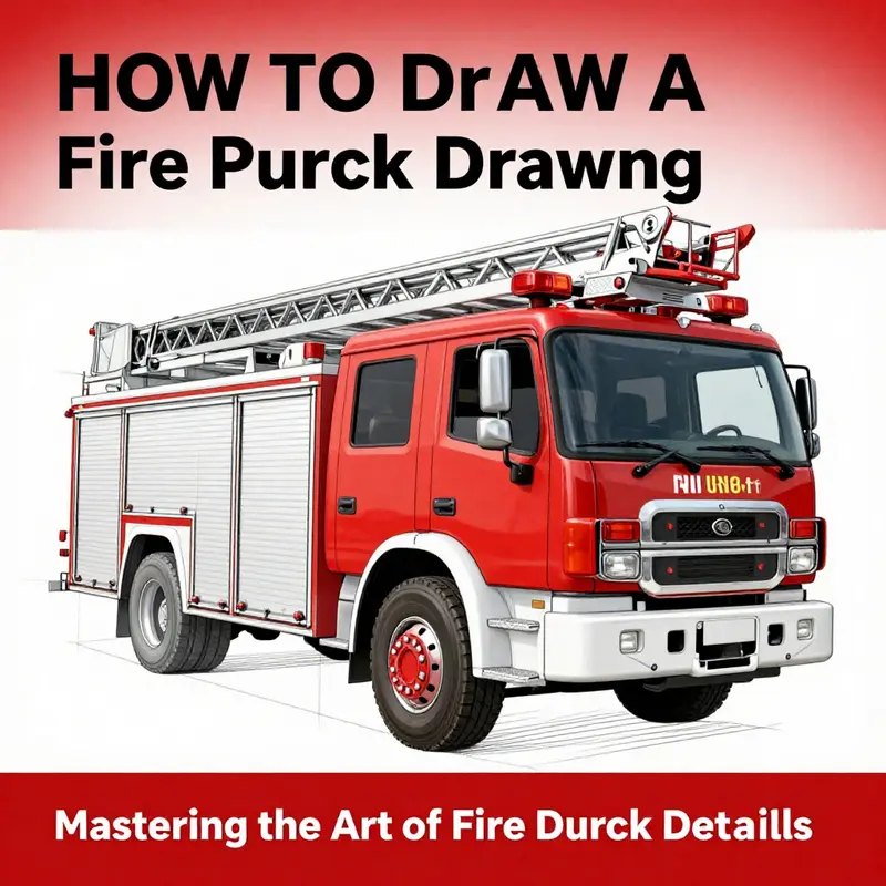
null
From Blocks to Blaze: Mastering the Fire Truck Illustration with Sirens and Lights
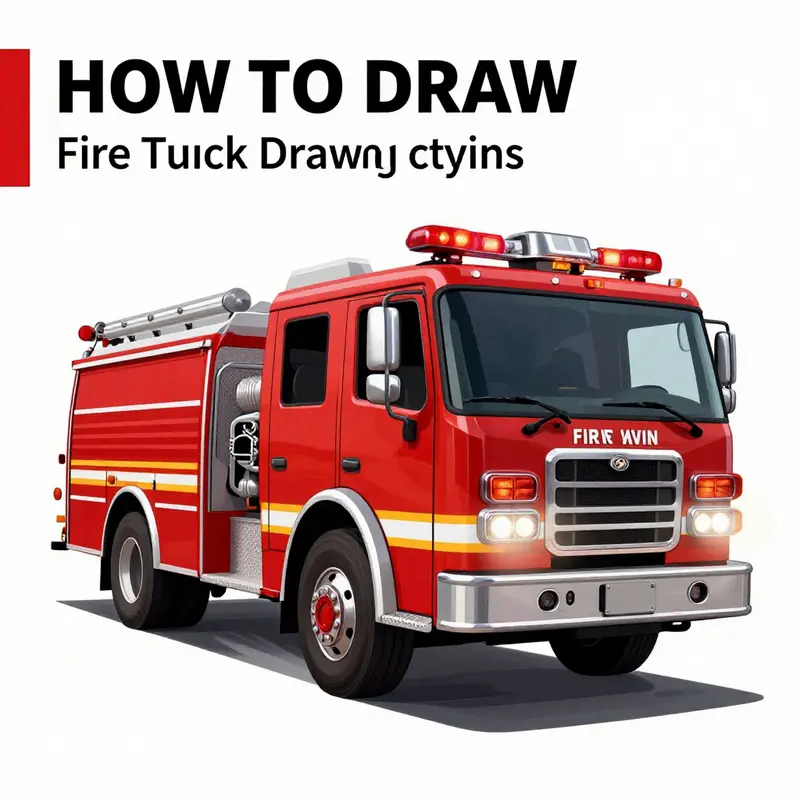
Drawing a fire truck is a study in balance, rhythm, and storytelling as much as it is a test of technique. The fire truck, with its clean lines and dynamic silhouette, invites you to translate a real-world machine into a confident two-dimensional form. The aim of this chapter is to guide you smoothly from a simple notebook sketch toward a finished illustration that feels sturdy, alive, and ready to roll. You’ll find that the process rests on a few reliable ideas: start with solid proportions, build complexity gradually, and let light and color do the work of turning a flat shape into a vehicle with presence. The approach here is deliberately linear, moving from broad structure to specific embellishments, while keeping the narrative seamless so you can reread it as a single, flowing practice session rather than a sequence of isolated tasks. If you want to revisit related ideas or find fresh practice prompts, a well-curated Fire Truck Blog provides ongoing inspiration and context. Fire Truck Blog. For a visual walkthrough that complements this prose, you can also explore a concise, step-by-step video guide linked in the detailed resources at the chapter’s end.
Begin with the baseline geometry. Visualize the truck as a sturdy rectangle that defines the main body, with two smaller rectangles tucked at the front for the cab where the driver sits. Keep the lines long and horizontal to convey the truck’s stability. The proportions matter: a typical fire truck reads as a elongated rectangle with a slightly elevated cab, allowing enough space for a hose bed and apparatus behind the cab. Don’t worry about perfection yet; your goal is to capture the weight and silhouette. Sketch lightly, using a graphite pencil, and keep your edges clean and parallel. If you’re unsure about length versus height, imagine the truck as a loaf of bread on wheels, where the loaf’s length dominates the composition while the height remains modest enough to preserve a low, ground-hugging stance. This mental model helps you avoid a top-heavy or squat appearance that would undermine the sense of power a fire truck conveys.
With the base established, move to the wheels. Place four generous circles beneath the main body, one near each corner. The wheels should ground the form and anchor the perspective. You can push the dynamics a bit by allowing one wheel to sit slightly off-center relative to the others. This asymmetry introduces a subtle sense of motion, even in a straight-on view, and it helps the vehicle read as a living machine rather than a static block. The tires themselves offer a second chance to add texture: draw a thin inner circle to suggest the rim, then shade the tire in with a slightly darker tone around the outer edge to imply thickness and roundness. A light highlight along a curved edge can mimic glossy rubber catching the ambient light. When you begin shading, remember that the wheel wells will create negative space that allows your vehicle to pop forward from the page; leave these gaps crisp to keep the form legible.
Next comes the ladder and the backline of equipment. The ladder is one of the most recognizable features on a fire engine, and its long, linear presence helps define the silhouette against the body. Start with a vertical line rising from the top center of the truck’s body. This central axis anchors the ladder, then add evenly spaced horizontal rungs. Even spacing is crucial here; parallel rungs with consistent gaps communicate precision and engineering rather than whimsy. If you’re aiming for a more dynamic composition, you can tilt the ladder slightly toward the viewer, which will introduce a touch of foreshortening. A ladder in perspective suggests depth and invites your eye to travel along the length of the vehicle, reinforcing the narrative of reach and capability that a fire truck embodies.
The cab deserves careful attention because it is the human interface of the vehicle. Within the front rectangle, sketch two small squares for the windshield, positioned to imply the driver’s line of sight. Add a simple, curved line for the windshield’s lower edge and two small circles for the headlights. A small trapezoid or rounded rectangle can suggest the door window if you want extra detail. These elements provide character without crowding the composition. Remember that the cab should feel slightly inset from the main body rather than flush; this separation helps convey the idea of space and protection for the crew inside. The cab’s contour lines can glow a touch brighter where light would naturally reflect off glass and metal, giving you a sense of material differentiation without piling on texture.
Now comes the heart of the scene: the sirens and lights. Sirens are not merely decoration; they signal intent and urgency. On the truck’s roof, place a large, circular siren or a compact dome, depending on your chosen reference. You can surround this siren with a halo of sound waves—tiny dots or curved lines radiating outward—to suggest the audible signal traveling through the air. Alternatively, you can opt for a vertical cylinder-type siren for a different stylistic approach. For the lights, think of color and pattern. Fire trucks typically feature bright red and blue lenses. Use large, rounded shapes on the sides and top of the cab to indicate beacons. To simulate a flashing effect, alternate solid color zones with dashed lines or tiny white highlights to imply the intermittent glow. A few smaller white lights near the front and rear will catch highlights and help guide the viewer’s eye along the vehicle’s length. If you want a more cinematic effect, you can suggest reflected light along the cab’s edge where chrome or polished metal would catch nearby flashes, giving the drawing a sense of environment and action. The goal is not to replicate a photograph but to convey energy, alertness, and readiness through strategic highlights and color blocks.
When you reach the final touches, think about how the hose and water cannons are integrated into the design. Draw a long, flexible line trailing from the back of the truck toward an imagined nozzle. This hose line should curve gently, breaking the rigid geometry of the body and adding life to the scene. The nozzle itself can be rendered as a small flare with a rounded mouth, suggesting a tool designed to control and direct water flow. For additional authenticity, you can sprinkle in details such as a water tank, compartments with panel lines along the truck’s sides, and small insignia or emblems that speak to the apparatus’s identity without overwhelming the composition. If your mood leans toward stylization, you can exaggerate the ladder, extend the hose, or add a flag fluttering from the truck’s antenna to plant a moment of narrative in the image. The aim is to balance realistic proportions with a touch of storytelling that makes the drawing feel alive rather than clinical.
Color, shading, and texture complete the picture. The body of the fire truck often reads as a robust red, but you can push tones toward crimson or cherry depending on your palette and the light in your imagined scene. White or chrome trim helps define edges and emphasizes durability. Shadows run along the lower edges of the body and inside wheel wells, with a slightly cooler value to imply shaded areas. Highlights along the chrome detailing, hubcaps, and the cab windows give the impression of a polished surface catching ambient light. Use subtle gradient shifts along the body to indicate curvature; flat color blocks can flatten the form, whereas gentle shading reveals the gentle convexity of panels, doors, and the fenders. The reflective surface of a fire truck is a great place to practice controlled light; you’re not painting a mirror, but you are painting the way light plays across metal and glass. A few quick lines or a narrow highlight along the top edge can imply a gloss surface without derailing the overall color cohesion.
Perspective and viewpoint play a crucial role in how dynamic your drawing feels. A slightly three-quarter view—where the front of the truck leans a little toward the viewer—often yields the most compelling composition. This angle lets you see both the length of the apparatus and the side details like ladders, compartments, and the hose. If you prefer a straighter side view, heighten the sense of depth by suggesting the front wheel slightly in front of the cab’s rear wheel and by adding a faint skyline or ground line to anchor the vehicle against the horizon. In any case, keep the lines clean and intentional. Real fire trucks have a modular precision; your drawing should echo that order through deliberate line work, confident edges, and balanced proportions.
Practice is where you transform a good sketch into a confident rendering. Start with a light, loose outline and refine gradually. Build in layers: first the broad shapes, then the ladder and cab, then the sirens and lights, and finally the hose and minor details. Don’t rush the shading; allow the form to reveal its geometry under gradual, selective darkening. If you’re working from reference photos or engine diagrams, compare the silhouette and the proportions; but don’t be afraid to adjust for your own artistic interpretation. A small shortcut to faster improvement is to do quick, repeated silhouettes of the vehicle in varying poses. This trains your eye to identify the most readable outline for a fire truck from any angle and trains your hand to reproduce it with consistency. You’ll notice that the more you practice the simpler the steps become; the ladder no longer looks like a rigid ladder, but as an architectural beacon that frames the truck’s architecture. The hose becomes a ribbon of function rather than a stray line, and the sirens act as punctuation—moments of visual energy that punctuate the narrative of movement and action.
As you near completion, consider the story your illustration tells beyond the lines on the page. A fire truck is not merely a machine; it is a symbol of teamwork, urgency, and rescue. You can add subtle details to enrich the scene without crowding it: a small emblem on the door, a tiny serrated edge on a panel caption, or a hint of a reflective stripe along the side that catches the light. Each element should support legibility and mood. If your goal is to teach someone else how to draw a fire truck, you might incorporate simple caption lines that describe proportions or shading decisions. But in a single narrative chapter like this, the emphasis remains on flow and cohesion. The drawing should progress as a natural extension of your thinking: you plan, you sketch, you refine, you shade, you finalize, and you observe how light interacts with metal and glass to reveal form. The result—whether you aim for a realistic render or a stylized, bold graphic—will owe much to your willingness to keep the linework decisive and the values clear.
If you’re seeking further inspiration or practice prompts, the Fire Truck Blog can be a helpful companion. It aggregates ideas and examples that complement the exercises in this chapter, offering readers additional angles on color, equipment placement, and dynamic presentation. Fire Truck Blog. In addition, for readers who want to see a concise, visual progression of the process, a dedicated video guide provides a step-by-step demonstration that aligns with the principles discussed here. The combination of prose, practice, and video can accelerate your competence from rough sketch to confident finish, ensuring your final drawing communicates both the mechanical seriousness of a fire truck and the human stories it enables.
To close the loop on this journey, imagine you have ready access to a real-world reference in your studio. The ladder glints under the lights, the cab windows reflect the surrounding environment, and the hose traces a lazy arc that promises action beyond the frame. Your job is to capture the essence of that scene—clarity of form, rhythm in the shape language, and a quiet sense of motion that invites the viewer to look closer. When you achieve a balanced composition with thoughtful shading and careful detailing, your drawing will honor the vehicle’s design while also inviting personal interpretation. It will stand as a practiced, thoughtful representation rather than a mere copy. And as you methodically revisit the steps—base outline, wheels, ladder, cab details, sirens and lights, final touches, color and shading—you’ll notice that the path from a simple rectangle to a convincing fire truck is not a series of isolated tasks but a single, continuous act of shaping a moving object on the page. This is the essence of confident illustration: see the form, respect the structure, and let light and color do the telling.
External resource: for an explicit, motion-focused demonstration of these techniques, consider a widely used step-by-step video guide: https://www.youtube.com/watch?v=8uXfRjBZ7qA
Breathing Life Into Steel: Final Touches and Dynamic Motion in Fire Truck Illustration
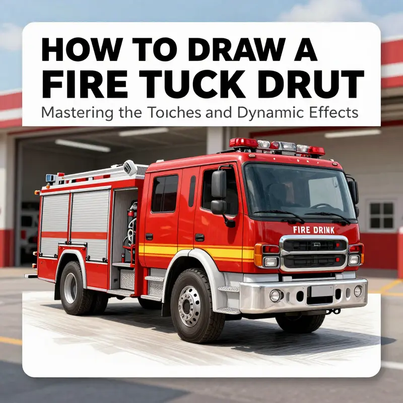
From the first sketch to the clean lines and bold shapes, a fire truck drawing becomes more than a static object on a page when you introduce light, movement, and texture. This chapter guides you through the last refinements that turn a respectable representation into a convincing, dynamic scene. The process rests on two pillars: careful shading and reflective highlights that model a three-dimensional form, and deliberate motion cues that hint at urgency and action. When you weave these elements together, your fire truck feels solid and alive, as if it might roll right off the page at any moment.
Consider the lighting that governs every shading decision. Before you lay another stroke, choose a light source. It could be the afternoon sun casting crisp, long shadows or the softer glow of street lamps when the scene is set at night. The toner of your shadows should fall on surfaces that would naturally receive less light. For the tires, the side facing away from the light source should appear deeper, while the near side reads with a touch of reflected ambient light. This is especially true for the tire treads, where the grooves catch darker tones, creating a sense of tread depth. Apply shading gradually; build up layers rather than pressing hard on the first pass. A light gray or a cool graphite can model the curvature of the wheel well, the rims, and the hubcaps without overpowering the line work that anchors the form. The body panels should reflect the general shape of the truck, with subtle gradations that suggest the rounded surfaces of the fenders and the sleek, elongated cab. The goal is not to caricature but to convey a believable volume that respects the truck’s geometry. If you’ve drawn the truck with a strong silhouette already, these shading steps will add the necessary dimensionality to push it beyond flat color and line.
Highlighting, too, plays a crucial role in delivering a polished finish. Chrome trim, the reflective windows, and the gleam of the sirens all respond to light in precise ways. Use a white or near-white pencil or a very light gray to pick out the brightest reflections along the edges of metal surfaces, especially along the chrome bumper, grille, and the metal ladder rungs on the sides. On glass windows, keep highlights narrow and crisp to communicate smooth, glassy surfaces. In contrast, the body panels can hold broader highlights that reveal the curvature and surface texture. If you’ve chosen a vivid red for the truck body, the highlights can read as a cool, almost pale red or pinkish-white where the light hits directly. Subtle color transitions—slightly warmer in the sun-warmed zones and cooler in the shaded areas—will help the vehicle feel tactile rather than flat.
Texture matters as much as form. The surface of a fire truck isn’t a single, uniform plane. It has rivets, panel seams, and occasional dent lines that catch light differently from the surrounding metal. Gentle, restrained line work can simulate these features without muddying the shading. For the engine hood and the cab’s roof, a few delicate cross-hatches or very fine stippling can evoke a metal sheen without overwhelming the surface. The tires deserve attention as well. You can add depth by shading the sidewalls more heavily and reserving a narrow highlight along the contact surface with the ground. This tiny contrast makes the tires appear truly rounded and in contact with the road, not simply flat cylinders.
Dynamic effects are where the scene breathes. If your drawing depicts the fire truck in motion, the viewer should almost hear the wheels gripping the pavement and the sirens slicing the air. Motion lines are a classic tool here. They don’t need to form perfect kerbs or equal curves; their irregularity can suggest the unpredictability of speed. Place the lines behind the truck, fanning outward in the direction you want the viewer’s eye to travel. They can be tapered, lighter at their tips, to imply rapid movement rather than stationary mass. If you want to push the sense of urgency, extend a few lines downward or diagonally from the exhaust pipe, using a lighter gray to mimic heat and rising air. Smoked contours add another layer of drama. A wispy swirl of exhaust can curl up behind the cabin or drift toward the upper corners of the frame. The key is to keep the smoke semi-transparent and softly feathered so it reads as movement rather than a solid shape that competes with the truck’s clarity.
Water, in particular, can be a powerful storytelling cue. A fire truck is an instrument of water, after all. A fine spray escaping from the hose, illustrated as a mist of tiny droplets or a jet with a slight arc, communicates action without overwhelming the composition. Water droplets on the grille can reflect the scene’s light and color, offering small, bright accents that catch the eye. If your scene includes a splash or spray, balance it with the surrounding shadows; this prevents the water from looking like a separate object and instead makes it feel like part of the ongoing action. The spray might also interact with the environment, catching in the air and catching light as tiny specular highlights that glint with each droplet.
The outline remains a trusted friend in the final stage. After you’ve layered shading, highlights, and motion, go over the main contours with a fine liner or pen. A disciplined outline strengthens the drawing by clarifying structure and enhancing readability. Use a slightly heavier line weight along the truck’s outer edge and around prominent features such as the cab’s window frame, the front grille, and the hose bed. Let the interior details—ladders, tool compartments, and the siren housings—receive lighter lines that read as recessed rather than bold. This variation in line weight helps preserve the sense of depth that shading introduced and keeps the piece from looking too flat or too graphic. If you’re fond of ink drawings, consider letting some of the line work breathe, allowing implied edges in shaded areas to remain soft. The final outline should feel confident, as if the truck could stand up on the page without wobbling—an anchor for all the layers that precede it.
Color choices, too, deserve a careful hand. Red remains the emblematic tone for fire trucks, but you can experiment with undertones that enrich the hue. A touch of orange in the sunlit areas can create warmth, while a cooler, blue-tinged gray in shadow regions reinforces the metallic feel. White for the trim should be kept crisp so it reads clean and reflective. If you’re illustrating classic equipment or a modern apparatus side by side, the color balance can shift to reflect character as well as time period. For instance, a vintage red that leans toward a maroon can hint at aged paint and a storied history, whereas a glossy, modern red can suggest the efficiency and speed of current engines. Remember to maintain harmony across the chassis, the water nozzles, and the ladder sections. The goal is not to create a patchwork of colors, but a cohesive surface where light travels predictably and helps guide the eye along the truck’s length.
To situate your finished vehicle in a believable environment, consider the surrounding scene. A fire truck rarely exists in isolation; a simple street setting with a hydrant, a curb, and perhaps a hint of smoke or steam can lend scale and narrative. Ground shadows anchor the wheels, while the reflections on the glossy body might echo elements of the environment—street lamps, the glow of emergency lighting, and the silhouettes of distant buildings. Subtle atmosphere can enhance mood without overshadowing the vehicle. If you choose to depict the truck at a turn or in a dynamic pose, angle the perspective to emphasize the vehicle’s length and mechanical precision. A slight three-quarter view often works well, giving you room to display both the front and side details while maintaining a sense of motion and purpose.
Incorporating a single, well-placed external link within a larger tutorial palette can offer readers a window into broader practice without derailing the narrative. For readers who want to explore related topics, you can direct them to a general hub of fire truck art and discussion. If you’re curious to see how other artists approach the craft, a visit to firetruck space’s main blog can provide additional context, tips, and inspiration. This repository of ideas complements the technique-focused guidance offered here and helps you map out a broader practice plan. For a concise, curated entry point, you might explore the blog at firetruck.space/blog/.
As you prepare to share your drawing, you may also find it helpful to compare your work to step-by-step demonstrations. Visual tutorials can illuminate the timing of your shading layers, the progression from rough to refined lines, and the calibration of highlights against shadows. A well-paced tutorial demonstrates how a final piece evolves from a simple silhouette into a richly detailed, dynamic scene. Watching these demonstrations can tune your eye to the subtle decisions that separate a competent rendering from a convincing, dramatic illustration. If you’d like to see a structured, camera-by-camera walkthrough, the linked video guide provides a practical template you can adapt to your own workflow. While you follow along, keep your own drawing flexible; allow space to adjust light, texture, and motion cues as your understanding of the scene deepens.
In this way, the final touches become more than cosmetic polish. They are the culmination of your observational acuity, your comfort with media, and your sense of motion. The truck’s reflectivity, its subtle color shifts, the way light glances off the chrome, and the energy of the trailing motion lines—these are the strands that weave a static image into a living moment. The brush, pencil, or pen in your hand becomes a translator of light and motion, translating the ideas you have in your head into a tangible feel on paper. Practice with a single, clear objective: to create a sense of presence. If the viewer can feel the weight of the truck on the page, the shift of light across its surface, and the momentum of the scene, you have achieved a successful capture of both engineering precision and human-scale drama.
To further deepen your practice beyond these refinements, you can explore broader topics related to practice, discipline, and craft in the field. For example, the path from a simple blueprint to a polished, story-driven image shares parallels with broader discussions about the craft of firefighting itself. Reading about the mental preparation involved in emergencies and the teamwork that underpins successful responses can enrich your understanding of the fire truck as a symbol of readiness and resilience. If you’d like to explore related themes that intersect with the craft of drawing and the real-world vocation these machines serve, you can visit the general hub of this topic at firetruck.space/blog/ and see how artists, hobbyists, and professionals alike approach the subject from different angles. This perspective can inform your portrayal, encouraging you to highlight the character and purpose of the vehicle while retaining the technical accuracy that makes the image credible.
For readers who want a hands-on, visual companion to these techniques, a well-structured, step-by-step video tutorial is available online. It showcases how a single composition can evolve from an arrangement of shapes into a dynamic, finished illustration. Watching a guided sequence helps you time your shading passes, the addition of highlights, and the layering of motion effects in a way that mirrors a working artist’s rhythm. The growth you experience through such demonstrations is incremental but cumulative, building confidence in your ability to render complex subjects with clarity and energy. As you complete your piece, you may find that the final touches not only sharpen the image but also sharpen your eye, training you to notice the smallest gleam on a chrome bumper or the precise angle at which a hose nozzle catches the light.
In sum, final touches and dynamic effects are not mere ornamentation; they are the language through which a drawing communicates its sense of instant, lived reality. With disciplined shading that models volume, strategic highlights that convey materiality, motion cues that imply speed and urgency, and careful outlining that preserves structure, your fire truck can stand as a convincing, compelling centerpiece on the page. The interplay among these elements—light, texture, motion, and narrative context—creates an image that invites viewers to linger, study the details, and feel the moment of action just as the scene unfolds in real life. When you combine this technical refinement with a thoughtful scene context and a spirit of experimentation, you ensure that your fire truck illustration remains not only technically sound but emotionally resonant as well.
External resource: For a visual, step-by-step demonstration that complements this guidance, see the following tutorial: How to Draw a Fire Truck – Step by Step Drawing Tutorial, available at https://www.youtube.com/watch?v=6Z1JwH2X7vQ.
Final thoughts
As you wrap up your journey through drawing a fire truck, remember that practice is key to mastering this art. Embracing each step—whether outlining basic shapes, detailing key features, adding effects like lights and sirens, or finishing with dynamic enhancements—will refine your skills and capture the essence of these remarkable machines. Whether for personal enjoyment or as a tribute to the brave individuals in emergency services, your completed fire truck drawing is a testament to your creativity and effort. Continue practicing and exploring new artistic techniques as you let your passion for fire trucks shine through your illustrations!