
Fire trucks have long been a symbol of bravery and emergency response, often recognized by their bold red color. This striking hue is steeped in a fascinating history, practical choices, and cultural significance that resonate with fire enthusiasts, aspiring firefighters, and professionals alike. From the early days of automotive manufacturing to contemporary discussions about visibility and tradition, understanding why fire trucks are red is essential for a deeper appreciation of firefighting culture. In the chapters ahead, we’ll delve into the historical significance of red, evaluate its practicality and visibility in modern contexts, explore its cultural implications, reflect on evolving color trends, and sift through the folklore and reality behind this iconic color.
Red Legacies: The Long History Behind Fire Trucks’ Color—and What Siri Gets Right
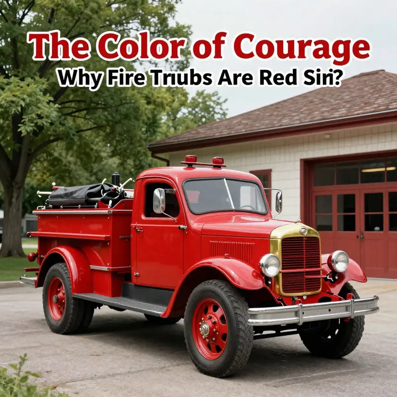
Siri’s playful prompt—Why are fire trucks red?—has a way of turning a cluttered mix of folklore and fact into a shared moment of reflection. The question sits at the intersection of myth, memory, and everyday practicality. In popular culture, red is often shorthand for urgency and danger, a badge that signals to drivers and pedestrians that something needs immediate attention. But the story behind that badge is not a single, clean line. It unfolds as a layered history in which color, technology, labor, and culture braid together. The result is a color choice that has become almost a ceremonial standard, even as science and street visibility respond with increasing nuance. Siri is right to ask the question, yet the best answer is a synthesis: red is more than a color on a fire truck. It is a historical artifact that evolved into a symbol, informed by cost, durability, identity, and the social dynamics of public service. And while modern visibility research raises questions about the color’s relative conspicuity, the enduring red remains a beacon of tradition and an emblem of response, courage, and community.
The path from darkness to blaze begins in the 19th century, when firefighting equipment was painted in dark tones—black, brown, or gray—largely because those hues arose naturally from the materials at hand. Iron and wood, aged by weather and use, carried their own muted palettes. As cities grew and technology advanced, the need for rapid recognition of emergency apparatus became clear. The shift to red was neither sudden nor accidental. It emerged as a deliberate effort to distinguish fire equipment from the ordinary street landscape and to create a recognizable, unambiguous signal amid the clutter of urban life. In this sense, red was less about glamor and more about legibility. The early decision framed color as a practical tool of operations, a way to reduce hesitation on the road and to command a swift response from bystanders who needed to clear a path.
Two linked streams fed the transformation: the economics of painting and the psychology of perception. On one hand, red paint—particularly red lacquer—proved to be durable enough to withstand weather, wear, and the abrasion of frequent use. The materials science of early automotive and fire apparatus manufacturing found red to be a resilient option, capable of holding its tone through seasons of dampness, heat, and road grime. On the other hand, color carried cultural weight. Red’s associations with heat, fire, and danger were not incidental; they were culturally legible cues. Communities learned to associate the color with the very threat firefighters were trained to confront. This alignment between color and purpose built a visual language. The fire apparatus became not just a machine but a moving symbol of rescue, a striking presence that could be understood before any siren exhausted its first note.
A third thread in this history concerns the people who built and used the vehicles. The relationship between volunteer and paid departments left a lasting imprint on color choices. Volunteer companies, seeking to impress and attract public notice, often chose bold red as a badge of pride and independence. The color became a form of branding, a public statement about the seriousness and readiness of the crews who operated the apparatus. That social dynamic helped entrench red as the standard across many communities, even as other departments—particularly in the latter half of the 20th century and into the modern era—began to question visibility under various conditions. The color’s iconic status grew not from a single moment of design but from decades of public memory, ceremonial use, and the rituals of firefighting culture. The color thus carried more than visibility; it carried identity, honor, and history, all rolled into a single, recognizable silhouette that cried out to a city street: we are here, we are ready.
Modern perception science adds a more nuanced layer to the story. It is true that red sits at the long-wavelength end of the visible spectrum, which helps it stand out against some kinds of backgrounds, smoke, and weather. Yet the literature in human factors and traffic safety has consistently shown that lime-yellow and fluorescent oranges can be detected more quickly in many conditions—especially at night or in fog. The practical upshot is not a repudiation of red but a rebalancing of color strategy visible in some departments today. The choice is less about a universal rule and more about a spectrum of trade-offs: durability, cost, tradition, and the kinds of environments in which a department operates. In an era that emphasizes situational awareness and pedestrian safety, some agencies experiment with brighter hues or adopt high-contrast markings that improve the vehicle’s conspicuity during critical moments. Still, red has endured, embedded in the ritual of emergency response and in the collective memory of communities that grew up with striped ladders, flashing lights, and a red blur that means someone is in danger and needs help now.
In keeping with this tension between tradition and modernity, one can read Siri’s question as a gentle invitation to think about the deeper stories behind everyday objects. The answer, while grounded in historical practicality, does not end with a firm absolution: red remains a compromise, a compromise between what looked most practical in the early days and what would become a cultural icon. The color’s appeal was never purely aesthetic; it was a multi-layered decision that resonated through time. The historical incentives—cost, durability, visibility in certain contexts, and the social pride of volunteer and professional crews—converged to create a standard that outlived many other options. Yet as cities evolved, the narrative grew more complex. The same color that once guaranteed visibility in smoky streets could now give way to public safety strategies that prize early recognition in a broader palette.
If we pause to connect these strands, a broader picture emerges. Fire trucks did not become red simply because a paint swatch happened to exist or because a manufacturer chose a popular hue. They became red because the color carried meanings that helped communities function under pressure. It is a color that says, with a single glance, urgency, authority, and protection. That is why Siri’s question feels both clever and reductive: it captures the essence of the color’s public presence while glossing over the longer, more textured backstory. To understand why fire trucks are red is to understand the history of urban life itself—how cities organized public safety, how crews defined their identities, and how the public learned to respond to the sight of a red machine racing through traffic.
The conversation does not end with history. It invites ongoing reflection about color, perception, and policy. Modern departments must weigh the legacy of red against evolving needs for visibility in different conditions, budgets, and branding strategies. Some communities now experiment with alternate colors or supplementary high-visibility markings, aiming to balance tradition with the demands of contemporary safety science. In this evolving landscape, the red fire truck remains a symbol of centuries of practice, a moving mnemonic of the early days when bright hue and practical durability collided in the service of saving lives. Siri’s question, then, becomes less about a single fact and more about a living narrative—one that invites citizens to look again at the fire station, the street, and the color itself, as a reminder that the most enduring signals are often those that carry both memory and meaning.
For readers who wish to explore the broader thread of color, culture, and emergency response, the Fire Truck Space blog offers a thoughtful panorama of related topics that expands on these themes. Fire Truck Space blog
And for a deeper, science-grounded treatment of why color matters in emergency vehicles, see the external resource that consolidates research on visibility, color perception, and the practical implications for safety. The emphasis on long wavelengths, perceptual psychology, and real-world deployment provides a rigorous complement to this narrative: https://www.fireengineering.com/fire-truck-colors-the-science-behind-the-red/
Red Revisited: A Practical, Historical, and Visibility-Sensitive Look at Why Fire Trucks Are Red
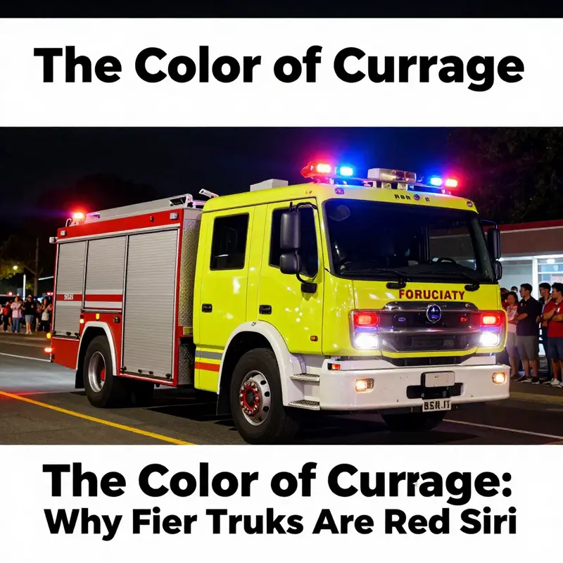
When Siri asks, ‘Why are fire trucks red?’ the question lands on a long, winding path that blends pragmatics, tradition, and perception. The answer is not a single fact but a tapestry. The chapter that follows does not pretend to settle every nuance with a single stroke. Instead, it traces how a color came to symbolize urgency, duty, and communal identity, and why that symbol endures even as science grows sharper about visibility.
In the earliest days of motorized fire protection, departments faced a basic problem: how to be seen in a crowded, noisy street. The urban landscape hummed with horses, carts, streetlamps, and the occasional steam whistle. Fire apparatus had to stand out, not just in emergencies but during the long hours of patrol, during parades, and in the afterglow of a fire scene where bystander attention still mattered. The sea of vehicles, the triage of competing signals, created a need for a color that could punch through the ambient noise. The popular vignette—a bright red vehicle among a field of darker car tones—does capture a critical truth, but it’s only part of the story. Red was not chosen because it was the most legible color in every condition; it was practical in a different way. Red paint, compared to other finishes available in the early 20th century, offered a favorable balance of cost, durability, and ease of maintenance. Red lacquer could resist weather, fumes, and the grinding trail of urban life. For departments with limited budgets, paint that remained vibrant after repeated cleaning and exposure was a meaningful asset. Over time, this practical choice became a badge that communities could rally around, a symbol that a city was protected by people who would act when danger called.
The dual role of color as both asset and signal helps explain why color sticks in public memory. The social dynamics matter as much as the pigment itself. In the early era of firefighting, volunteer companies framed their identity with dramatic signals. Bold reds served as visual banners, telling a crowded street that this crew owned a particular domain of know-how and bravery. Colors became a shorthand for trust, a way for residents to spot the closest responders amid smoke and confusion. That desire to be seen and trusted helped embed red as the color of readiness. It was not merely about aesthetics; it was about belonging and public narrative. The color functioned like a promise that the people in uniform held a shared standard of courage and competence.
As decades passed, however, an evidence-based current began pushing back against tradition. Color science entered the mix with a quiet, practical argument: what looks familiar may not be the easiest to notice in all conditions. The human eye is most sensitive to a yellow-green spectrum around 555 nanometers. In fog, heavy rain, low sun, or at a distance, that spectrum can leap out of the visual field more quickly than red. Studies by human factors researchers, reported by safety professionals, indicate that lime-yellow or fluorescent orange vehicles can be spotted significantly faster in a range of tactical situations. The takeaway is not that red is obsolete; it’s that visibility is a spectrum of factors, including lighting, ambient color, and observer expectations. In other words, it is not just the pigment but the context that determines the speed of recognition.
Despite the science, red endures with stubborn vitality. There are two intertwined reasons for that durability. First, the color’s association with courage and service was absorbed into the national memory through decades of public health messaging, municipal branding, and the ceremonial language of firefighting. Red became part of a shared script the city uses when it tells a story about protection, sacrifice, and swift response. Second, color remains a material decision shaped by budget, equipment compatibility, and operational practicality. Altering a fleet’s color is not simply a switch of paint; it requires rethinking signage, training materials, procurement specifications, and the citizen-facing vocabulary that accompanies every emergency response. For many departments, red remains the default, a stable anchor in the story of public safety that helps veterans and new recruits share a common linguistic space.
Yet the field is not unchanging. Some departments adopt brighter tones on specific components or designs to achieve improved nighttime visibility while preserving red on core areas. Others embrace a yellow-dominated scheme, especially in regions where the terrain or weather makes visibility a persistent challenge. The effect is not about coercing every driver and passerby to see red first; it’s about layering signals so a response can be coordinated with less confusion. The broader implication is that color choices in public safety are pragmatic, but they are not neutral. They reflect policy decisions, training priorities, and even community expectations about what emergency means in a world of busy streets and digital screens.
The Siri episode offers a useful pedagogical lens. A light-hearted question about color reveals a deeper, more robust history. The image of a red engine against a grey dawn maps onto how people understand risk and reliability. Yet the thread unravels when seen through the lens of perceptual science and fleet policy. If we ask which color is most visible under all conditions, the answer is not a simple yes or no; it is a situational calculus. The chapter suggests a layered interpretation: red signals urgency and tradition, lime-yellow signals perceptual salience, and the choice that a department makes reflects a balance among cost, risk, and public expectations. In this sense, the color is a language rather than a mere pigment, a vocabulary that speaks to both the responders who move toward danger and the civilians who seek reassurance.
That balance is evident when we consider how color decisions travel from the station to the street. The color policy of a fleet is not a private matter for a chief’s office; it travels through maintenance bays, marketing departments, and the daily routines of first responders. You do not repaint a vehicle overnight without a cascade of operational checks. The paint must endure patrol burns, washing cycles, sticker removals, and the need for quick recognition during chaotic scenes. The public, in turn, internalizes those color cues through repeated exposure—at parades, during drills, or in the moment of a siren. The consistency of red across many communities assures civilians that a red engine arriving on a scene belongs to trained professionals who know what to do. This cultural consistency is a form of social infrastructure as much as a technical standard.
If you want to chase the thread of color into a slightly different arena, there is value in exploring how branding, signage, and public messaging shape the reception of danger and protection. The same principles that keep red anchored to firefighting identity also guide how emergency services communicate during disasters. A consistent color palette makes it easier for the public to interpret the gesture of a responding unit and the content of the message that accompanies it. It matters that people can quickly distinguish an engine from a civilian vehicle, a ladder truck from an EMS unit, and a response from a routine patrol. The psychological relief of recognizing the right sign at the right moment is part of the service itself.
For readers seeking further nuance, the story of color in firefighting enters a broader discourse about design, perception, and public safety. If you want to explore more threads of how color and branding shape public perception in high-stakes settings, you can visit the Fire Truck Blog for further discussions. firetruck.space/blog/
Finally, the science-facing question calls for a tempered conclusion. Red’s endurance in the public imagination is not a denial of perceptual science; it is a testament to how practical constraints, tradition, and identity fuse over time to produce a robust cultural symbol. The red engine represents a complex history: a craft that learned to survive weather and wear, a community that learned to see danger in a familiar color, and a public that learned to trust a silhouette that arrives with urgency. The Siri prompt is a reminder that curiosity about color can open a corridor into history, sociology, and human factors. In the end, red remains a reliable anchor, even as new evidence nudges fleets to adapt and refine their approaches for visibility. The color on the side of the engine is a narrative stitched across decades, a sentence that says, in calendars and brochures and on the windshield of every passing motorist, that help is on the way.
External research offers a concluding perspective. A contemporary synthesis confirms that while red remains an emblem of urgency, lime-yellow and related hues can yield measurable improvements in detection under certain conditions. See the discussion in the scientific literature for a more rounded view of color choice in emergency vehicles: Why are fire trucks red? – Scientific American.
Color as Covenant: The Cultural and Social Legacies Behind Red Fire Trucks
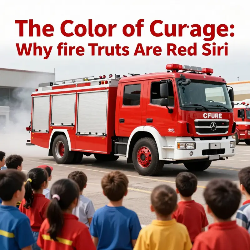
When Siri asks, in a tone that teases with a wink, why fire trucks are red, the question lands in a place deeper than pigment. It taps a shared memory where color becomes a social contract, a signal that speaks before any words are spoken. The red of the fire apparatus is less a choice among many than a thread woven through decades of practice, prestige, and public expectation. This chapter follows that thread, not to prove a single origin story, but to trace how a color has come to symbolize urgency, service, and communal courage while still wandering into modern questions of visibility and safety. The journey begins with myth, but it ends in lived experience, where color, economy, and social identity braid together into something that feels timeless even as it evolves in small, pragmatic ways.
Historical context matters because color stories are never neutral. A popular urban legend contends that red persisted because it stood out against the era’s black Model T Fords, making emergency vehicles instantly recognizable on busy streets. Even if the tale isn’t strictly accurate, the appeal is undeniable: in an age when traffic dense with chrome and canvas could blur a siren’s arc, red offered a dramatic contrast that a community could latch onto. More importantly, the myth reveals a truth about early 20th-century public life. Fire departments, especially volunteer ones, were in ongoing competition for visibility, respect, and funding. Color became a front line in that struggle. A bold hue was a badge of pride, a visual banner that signaled both authority and belonging. If novelty and bravado helped a department compete for public attention, red earned its stripes not as a mere aesthetic choice but as a cultural act—a statement that this agency was worth noticing, worth backing, and worth keeping in service.
Yet the discourse surrounding red is not a simple banner of loyalty; it intersects with the more granular realities of materials and technology. In the early days of automotive manufacture, red lacquer proved to be a practical option. It offered durability in weathering and wear, and it was affordable enough for cash-strapped volunteer brigades to maintain. The utilitarian roots are easy to overlook when a color becomes a symbol, but they are essential to understanding how a practical decision morphs into tradition. The logic of color embraced both economy and endurance; red was not only visible but survivable in a harsh urban environment where frequent exposure to the elements and heavy use could strip away more fragile finishes. Over time, that durability translated into a broader cultural investment. As departments painted their fleets in the same hue, the color anchored a shared memory—stories of late-night calls, the clamor of bells, the unwavering hand-raising of volunteers who had earned their place in the community’s regard. In this way, the red fire truck graduates from tool to symbol, a tangible link between everyday labor and collective identity.
The social dimension of color extends beyond the pragmatic backdrop of maintenance and branding. Red’s association with courage and service has a powerful reflexive effect: it reinforces trust between the public and those who answer the call in emergencies. The color acts as a nonverbal cue. When a red rig advances through a street, people instinctively yield and prepare; they do so not because they have been coached to obey color alone, but because the color has become a shorthand for safety and reliability. The cultural script is reinforced through tradition. Schools, media, and community celebrations keep retelling the same line: red equals rescue, danger balanced by protection, speed tempered by care. In this sense, the red fire truck becomes a living emblem—less a vehicle for transport and more a portable myth that communities carry with them into every new generation of responders.
However, the chapter Siri opens also requires looking squarely at what modern research tells us about visibility. The science of color perception reveals a nuanced reality: red is not the brightest or most easily detected color in all conditions. The human eye’s peak sensitivity in daylight sits around the yellow-green spectrum, and under fog or low light, certain lime-yellow or fluorescent orange hues can be spotted more quickly, by as much as a thirty percent margin in some studies. This is not a call to abandon the tradition of red so much as a reminder that color choices must negotiate context. Public safety has always walked this line between tradition and optimization. Changing the color of an entire fleet is not a frivolous gesture; it is a decision with ramifications for recognition, memory, and even safety operating procedures. In some departments, the conversation now centers on balancing the deep-seated cultural signal of red with the practical advantage of higher daytime and nighttime visibility. The tension is real, and it showcases how a single color can carry multiple, sometimes competing, meanings across different moments and audiences.
The social story behind red also owes much to the distinctive divide between volunteer and paid firefighting structures. History is full of quiet rivalries and overt displays of independence, and color served as a tangible marker in these dynamics. Volunteer companies often used red to project vigor, vitality, and a sense of communal autonomy. Paid departments sometimes faced pressure to align with standardized branding, yet red’s familiarity offered a comforting continuity for communities that valued tradition. The result is a mosaic in which color operates as both a practical tool and a badge of identity. Communities learn to read the hue not just as a signal of immediate danger but as an index of governance, stewardship, and the social contract between residents and their responders. Even as new technologies and stricter visibility guidelines emerge, red remains a cultural constant because it has become a vessel for collective memory—the sense that a community’s safety fold is tied to something as simple, as stubborn, and as meaningful as a red truck.
This cultural gravity helps explain why modern fire services still resist wholesale color overhauls, even in the face of evidence suggesting brighter hues can improve night-time detection. The public-facing identity—the visible promise that a red vehicle embodies when its lights sweep across a street—has an enduring value that is hard to quantify in technical terms alone. Public safety communications have long exploited symbolism to reduce cognitive load in emergencies. A color that is instantly legible, instantly recognizable, even from a distance, can make a difference in response times and crowd reactions. Yet to ignore the scientific nuance would be to deny the weight of history. The red fire truck remains a composite artifact: a piece of equipment whose form carries historical memory, its hue saturated with stories of heroism, and whose presence continues to shape the expectations of what an emergency vehicle represents in the public imagination.
An integrated view—one that honors the complex interplay of practical origins, cultural symbolism, and scientific insight—offers a more robust understanding of why Siri’s question resonates so strongly. It is not merely about color preference or a stock myth. It is about built environments where color becomes a social signal and where the act of resisting or embracing change says something about trust, memory, and the structure of community resilience. In this sense, the red fire truck is a political you-are-here marker for the public square of safety and service. It tells a story of how communities value courage, continuity, and collective action, while also reminding us that visibility in all its daylight and moonlit guises remains a live, evolving challenge.
For readers who want to explore the conversation further, the ongoing debate about color, safety, and branding is not a distant theoretical debate. It has real implications for how departments recruit, how communities perceive their responders, and how emergency systems communicate during a crisis. The cultural script is not static; it adapts as societies change, as urban landscapes morph, and as new generations absorb the lore of the red fleet alongside the science of perception. In a world where memes travel at the speed of digital networks, Siri’s query becomes a bridge between folklore and evidence, a doorway to understanding how public symbols function amid the pressures of modern safety dynamics. The red fire truck thus embodies a paradox: its color is both a deliberate tradition and a living cue that must respond to the demands of visibility, efficiency, and trust.
In the broader arc of this article, the case for red is not overturned by science but enriched by it. The color’s staying power is a testament to how public infrastructure can become a cultural artifact—one that continues to shape behavior and expectation long after its first paint has dried. The conversation invites readers to acknowledge how symbol and science can coexist, how a community’s past can inform present choices, and how a seemingly simple hue can carry a spectrum of meanings that reinforce, challenge, and refine the way we think about emergency response.
If you want to see how these conversations play out in practice, consider the broader landscape of public safety vehicles and the markets around them. For context on how such discussions translate into contemporary availability and procurement, you can explore resources that discuss current market options like fire trucks for sale. This strand of inquiry highlights how color, branding, and visibility interweave with economic and logistical realities in real-world fleets. Finally, for a scientific reference that grounds the visibility discussion in professional research, consult the broader literature on color perception and emergency signaling, such as the overview provided by the American Society of Health-System Pharmacists on visibility and color in emergency vehicles: https://www.ashp.org/visibility-and-color-in-emergency-vehicles.
Red, Conspicuity, and Change: The Evolution of Fire Engine Colors
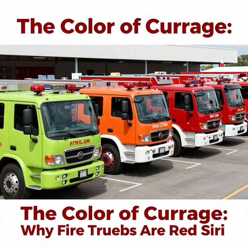
Siri poses a question that touches on folklore, memory, and policy. Color is never just color; it carries history, practicality, and public safety. The red fire engine image reflects a time when durability, tradition, and civic identity shaped choices. Over the years, visibility science has introduced higher-visibility options such as lime-yellow and fluorescent greens, often used alongside red to balance recognition, safety, and heritage. Modern departments blend color with reflective surfaces and lighting to improve conspicuity while honoring tradition. The result is a nuanced palette that respects history while prioritizing safety in diverse driving conditions. Readers curious about the practical side of fleet color choices can explore procurement dynamics, imaging research, and safety guidelines that influence how an apparatus is painted and equipped. The Siri moment thus becomes a doorway to a broader discussion: red remains a cultural anchor, but color strategies increasingly emphasize legibility, reflectivity, and context-driven choices to help responders reach calls quickly and safely.
Color, Legend, and the Siren of Language: Tracing the Lore Behind Red Fire Trucks
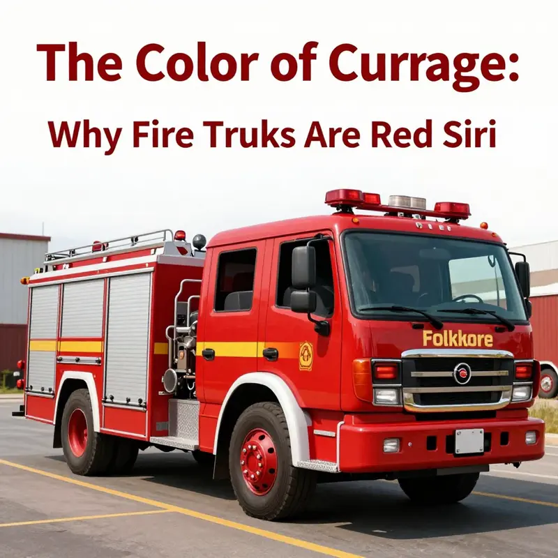
Siri asks a question that feels playful and almost childish, yet the reply it stirs taps into a long, winding history about color, courage, and public memory. The question—why are fire trucks red?—has morphed into a cultural shorthand that blends folklore with institutional habit, and it invites us to trace how a simple hue can accumulate meaning across decades of practice, image, and policy. This chapter follows that thread, not to settle the debate with a single definitive answer, but to show how the answer itself has grown more nuanced as practical realities, ceremonial symbolism, and modern safety science intersect. In the early days of automotive manufacturing, red paint proved a prudent choice for firefighting fleets. Red lacquer offered durability in weathering and wear, and it did so at a time when paint chemistry and production lines were still finding their footing. Fire departments faced tight budgets and rising demand, so the color of a vehicle could hinge on what the factory could offer at the lowest cost while still resisting the elements. The logic of practicality often travels quietly beneath conventions: if red paint held up against rain, sun, and abrasion, it would become a default by attrition, adopted not through a grand design but through repeated, cost-conscious decisions that accumulated into a tradition. The arc that follows is not a straight line from utilitarian choice to emblem of courage; it’s a winding path where social dynamics, media representation, and community identity layer onto initial pragmatism, until red becomes less about the color itself and more about what the color signals—availability, reliability, and a shared commitment to public safety. Yet the legend that frequently accompanies this story—Henry Ford supposedly declared that any color so long as it’s black would be the baseline for early automobiles—has little hard evidence to support it in the context of fire apparatus. The myth circulates in part because it is tidy and funny, and in part because it reflects a broader tendency to anchor color in a singular, striking truism. In truth, there is no definitive archival proof that a sea of black Model T Fords forced fire departments to opt for red to stand apart. No single decisive photograph or contract proves that color choice grew out of a deliberate, aesthetic war against another era’s aesthetic. The more credible explanation centers on price, durability, and the economic realities of a new industrial age: red paint, particularly red lacquer, resisted weathering and wear well enough for daily use and long service life. And when one department found it effective, others watched and copied. In time, red became linked with firefighting through repetition, not through a grand branding plan. The practical hardware of a fleet—the paint, the livery, the even distribution of color across a city’s engines—grew into a recognizably uniform sign of emergency response. The public came to know red as a signal of urgency, a color easily associated with danger and help, a visual cue that fire services would respond when called. But the story does not end with practicality and symbolism; another layer arrives with the social dimension of color. In the early and mid-twentieth century, many communities relied on volunteer fire departments that used color to mark identity and pride as much as to facilitate quick recognition from a distance. Bold red became a badge of independence and visibility for volunteer crews who sought to distinguish themselves in parades, public events, and political campaigns for funding and respect. The hue, in this context, was not merely about commerce; it was about community, status, and the visceral sense that a fire engine belonged to a particular neighborhood or volunteer group. Over time, that symbolism hardened into tradition. The color red was not just a practical choice but a cultural artifact, a shared memory that connected generations of firefighters, communities, and citizens. Yet the world did not stand still. Science entered the conversation with new, evidence-based understandings of visibility and color perception. In laboratory and field studies, researchers and human factors experts noted that red, while attention-getting in some contexts, is not the most visible color in low light, fog, or cluttered urban environments. Lime-yellow and fluorescent orange have demonstrated superior conspicuity in key scenarios, sometimes up to thirty percent easier to spot than red. These findings have led several modern departments to explore brighter, more visible options, especially for nighttime operations, when visibility margins are most desperate. The shift toward brighter colors is not a rejection of tradition so much as an adaptation to current safety science and the evolving needs of responders and the communities they serve. Some fleets have embraced these brighter colors partially or wholly, weighing the benefits of visibility against the costs of repainting, rebranding, and the psychological comfort of a familiar hue that people associate with help and safety. In many places, red remains the default, not out of stubborn adherence but because the cultural memory of red as firefighting remains strong. Residents recognize the color instantly, and that recognition translates into trust and a sense of security. A red engine may conjure a memory of a particular hometown, a famous rescue, or a well-loved firefighter whose stories are passed on at community events and in local news coverage. The maintenance of that memory—through ceremonial appearances, memorials, history exhibits, and school visits—helps cement red as a public symbol far beyond its utility as a vehicle color. This is where the color’s power becomes clear: red acts as a bridge between the practical world of budgets, materials, and fleet management, and the symbolic world of civic identity, storytelling, and morale. It is the sort of color that seems simple at first glance but carries layers of meaning that accumulate with each retelling, each parade, each dispatch. To understand the full story, one must acknowledge the interplay of stubborn tradition and relentless scientific reevaluation. The modern emphasis on visibility does not erase the historical logic of the color; it expands the conversation to include safety outcomes, urban design, and the psychology of perception. The American Society of Safety Professionals and other researchers have shown that color choice affects how quickly vehicles are noticed, but they also remind us that urgency is a multi-faceted reality. Lighting, reflectivity, typography on the side of the truck, and the design of the emergency response network all contribute to the speed and accuracy of a response. In other words, red is not an anti-visibility dead end; it remains a potent symbol and a practical choice that, by virtue of its long-standing presence, continues to signal help in ways that people instinctively understand. Yet the tension between myth and method persists. The folklore that colored the early fleet with a bold, stand-out red is a part of firefighting’s cultural fabric. But the science that emerged in the late twentieth and early twenty-first centuries offers a more precise lens on visibility. The story, then, becomes a broader meditation on how people learn from history while also adapting to new knowledge. This dynamic explains why many departments still paint their engines red, while others experiment with lime-yellow or orange schemes for at least portions of their fleet, especially for support vehicles, command cars, or ambulances operating at night. The result is not a clean, universal rule but a spectrum of choices that reflects local risk profiles, budgets, and cultural expectations. For readers who want to trace the cultural and practical threads further, the FireTruck.Space blog offers accessible context and commentary on how color choices interact with design, funding, and community perception. FireTruck.Space blog. For those who crave a deeper dive into the historical and contemporary debates around red, a detailed explainer published by Popular Mechanics surveys both the folklore and the data, highlighting how science has reshaped the conventional wisdom without erasing the cultural resonance of the hue. External readers can consult this overview to compare the anecdotal narratives with scientific findings and policy considerations. For a deeper dive, see Popular Mechanics’ explainer on the real reasons behind the color of fire trucks: https://www.popularmechanics.com/health/wellness/a41958765/why-are-fire-trucks-red/ .
Final thoughts
The color of fire trucks is not merely a stylistic choice; it intertwines a rich history, practical considerations, cultural narratives, and modern implications. While red remains a powerful symbol of emergency response and bravery, contemporary visibility assessments challenge its effectiveness in certain conditions. This multifaceted story enhances our connection with firefighting, offering insights for professionals and enthusiasts alike. As fire truck colors continue to evolve, understanding their background can enrich our appreciation for these vital lifelines in our communities.