
Fire trucks are synonymous with emergency response, but not all boast the traditional bold red. Some fire trucks, especially in regions prone to harsh weather and diverse urban landscapes, sport a striking yellow hue. This chapter will delve into the reasons behind this colorful trend, exploring critical insights into visibility and safety, the psychological impact of color, and the ongoing tension between tradition and modernity in fire service aesthetics. Each chapter will illuminate a unique aspect of this vibrant emergency service choice, providing a comprehensive understanding of why some fire trucks are yellow.
Bright Signals on the Line: The Science and Safety Behind Yellow Fire Trucks
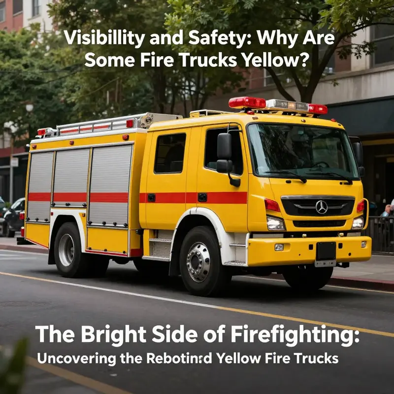
Why are some fire trucks yellow? The question invites more than a simple preference. It opens a window onto perception, design, and the flow of an emergency response. In this sense, color stops being merely cosmetic and becomes a tool that can shave precious seconds off reaction times, reduce the risk of collisions, and help those who are already stressed by danger to see what matters most. The shift toward yellow is, at its core, a practical response to real-world conditions. Fire apparatus must be noticed swiftly in a sea of motion—on busy streets, through rain and fog, or in the glare of bright sun reflecting off water and pavement. In each of these scenarios, yellow stands out in ways that red, blue, or black do not as reliably. It is not that yellow eliminates all risks, but it does change the odds in favor of quick recognition and safe clearance of a path for responders. This idea—color as a safety feature—is a throughline in emergency vehicle design, and yellow sits at a compelling intersection of vision science, environmental context, and operational necessity.
To understand why yellow can be so effective, it helps to start with how the eye processes color. Human vision is most efficient at detecting wavelengths around 555 nanometers, in the green-yellow part of the spectrum. In daylight, materials and surfaces that reflect yellow light often appear brighter to the eye than those that reflect red or blue. This heightened perceptual salience translates into faster detection by drivers, pedestrians, and other emergency responders who must integrate multiple cues in a stressful moment. In practical terms, a yellow fire truck can seem to ‘pop’ from a distance, turning into a beacon that the brain decodes quickly. The effect compounds in low-contrast environments, such as when a vehicle sits on dark asphalt or when the sun is low on the horizon, casting long shadows and reducing color fidelity. In such conditions, the bright, lime-tinged spectrum of yellow and yellow-green can be more conspicuous than the saturated warmth of red or the subdued tones of blue.
Environment matters, too. In places where rain, sea spray, and mist are common—Hawaii, coastal states, or regions with frequent downpours—the contrast between a vehicle and its surroundings shifts with weather. Yellow or yellow-green surfaces reflect more light in a broad range of angles, helping the vehicle to stand out against a backdrop of wet pavement, dark foliage, or bright sun’s glare off water. This is not merely an aesthetic preference; it is a tactical choice about perception under conditions where visibility can drop quickly. A yellow truck against a gray sky, a ribbon of white spray, and a windshield glare can be easier for a driver to notice than a red one that blends with brick, taillights, or rain-slick surfaces. In such settings, the bright, nearly fluorescent quality of certain yellows reduces the stimulus-to-response latency that underpins safe vehicle operation.
The case for yellow is reinforced by the way color interacts with urban and natural backgrounds. Red has a long association with fire with good visibility on many backdrops, which helps with branding and tradition. Yet urban environments are mosaics of dark asphalt, concrete, brick, signage, and greenery. Yellow’s high luminance and the broad catchment of the green-yellow spectrum enable it to cut through that mosaic more reliably. A yellow truck in a city street scene with heavy tree canopies or in a fog bank can be identified at greater distance or with less ambient light than a truck painted in deeper hues. The implication is not that yellow is universally superior, but that in certain critical operating environments, it offers a measurable advantage in conspicuity, the property most closely tied to safety margins for emergency vehicles.
These perceptual advantages are not merely theoretical. Visual ergonomics research—the kind that asks how humans detect, categorize, and react to rapidly changing stimuli—has consistently shown that high-visibility colors improve detection speed and can reduce the probability of conflicts with other road users. The broader safety literature points to fluorescent yellow-green and orange as particularly effective for warning and emergency signaling. In the United States, guidelines and standards bodies have embraced the principle that conspicuity can be engineered into vehicles. The Federal Highway Administration, for example, has recommended fluorescent yellow-green for school zones and pedestrian crossings precisely because it captures attention quickly and reliably in a variety of lighting conditions. The overarching takeaway is straightforward: when visibility is the goal, color choices matter in measurable ways.
Tradition, of course, remains a powerful force in the color story of fire apparatus. Red is the color with the longest historical lineage in firefighting. It’s a tie to early automotive days when red was a signal of status and boldness, easy to see on a chromatic palette that included more subdued backgrounds. Over time, the color red became a symbol of courage and urgency, a branding choice as much as a perceptual one. But safety is not static, and departments that face persistent visibility challenges may opt for yellow as a complement to, or even a replacement for, red in certain roles. The decision is rarely an absolute one. More often, it is a nuanced balance of visibility science, fleet maintenance realities, cost considerations, and the specific terrains a department serves. For areas prone to forested landscapes or where wildland firefighting is a regular duty, the argument for high-visibility yellows grows stronger, because the vehicles must be seen against foliage that can obscure or confuse. In those contexts, yellow or greenish-yellow hues are chosen to maximize conspicuity against natural backgrounds and to ensure that responders can be located quickly after they arrive on scene.
It is also worth noting how standards shape practice. In some regions, specific colors are codified for particular types of emergency vehicles. For instance, certain rescue and engineering vehicles operate under standards such as GB/T 3181, which calls for a Y07 medium yellow to maximize visibility during operations. This kind of standardization provides a practical framework for municipalities and departments weighing color choices against safety imperatives. It helps align procurement, maintenance, and field practices, so that the visual signal sent by the vehicle remains consistent across a region and across scenarios—from urban streets to rural fire lines. Such standards acknowledge that color is not merely a matter of taste but a functional attribute that interacts with design, lighting, weather, and the behavior of other drivers and pedestrians.
Beyond perception, the yellow decision interacts with the realities of emergency response logistics. Visibility is a force multiplier on the road: it influences how quickly other drivers yield, how quickly pedestrians notice an approaching unit, and how quickly commanders can position teams without adding risk. When seconds matter, a color that is quickly detected across a range of conditions can contribute to faster clearance of lanes, safer ingress into the scene, and more timely deployment of equipment. In forested or coastal environments where the backdrop is variable and the weather is capricious, yellow’s brightness helps a response crew maintain spatial awareness of their own vehicle in relation to the rest of the scene. This visibility advantage is not an abstract concept; it translates into real-world performance metrics that agencies care about when evaluating fleet configurations and training requirements.
An additional layer of nuance comes from how color interacts with visibility across senses and contexts. A yellow fire truck can be easier to spot not just in daylight but at dawn, dusk, or in smoky or foggy conditions, when human color discrimination becomes less precise. The eye’s sensitivity to brightness—its photopic and mesopic responses—means that a well-chosen yellow can preserve a signal’s legibility when lighting is far from ideal. For operators on the ground, that increased perceptual threshold can translate into more reliable situational awareness, reduced stress from ambiguous visuals, and improved coordination during critical phases of an incident. These factors collectively contribute to faster, safer operations and, ultimately, to better public safety outcomes.
The narrative of yellow in firefighting is as much about adaptability as it is about optics. Departments facing diverse geographies—urban cores, suburban sprawl, mountain passes, and island climates—often test both color and material choices to find the most effective balance. Some fleets may paint certain apparatus in yellow for high-visibility roles while retaining red for others, creating a dual-signaling system: one color for primary visibility on approaches and one for branding and recognition at the scene. The takeaway is not a universal prescription but a data-informed approach to design that recognizes color as a tool for perception, not merely as decoration. In this light, yellow fire trucks represent a modern approach to safety—an embodiment of how science, environment, and human behavior can converge to improve emergency outcomes without abandoning the heritage and symbolism that fire service culture has built around red.
For readers curious about how these ideas translate into practice, consider the broader ecosystem in which visibility research informs vehicle design. The conversation isn’t only about painting trucks yellow; it includes lighting placement, reflective materials, high-contrast markings, and the interaction of color with active warning signals like headlights, strobes, and directional indicators. Taken together, these elements form a layered signaling strategy that helps ensure that when a call goes out, the response begins not with hesitation but with precise, accurate perception and rapid action. The goal is a cohesive visual language that can be understood at a glance, in a crowded street or a smoke-filled hillside, by drivers, pedestrians, and first responders alike. That language is evolving, and yellow remains a strong, evidence-backed option within it.
If you want to explore how perception research shapes broader vehicle design—beyond color into form, lighting, and signaling—there is a focused resource that discusses these principles in a practical context. For a broader discussion on how visibility research informs vehicle design, see the Fire Truck Blog. Fire Truck Blog
External resource: the science and policy of visibility in emergency response are also summarized by national safety authorities. For a concise, authoritative overview of how visibility considerations influence emergency vehicle operations and public safety, refer to the National Highway Traffic Safety Administration’s overview on visibility and emergency response: https://www.nhtsa.gov/emergency-vehicles/visibility-and-emergency-response
Bright Signals on the Front Line: How Yellow Elevates Emergency Response and Public Safety
Color is more than a visual flourish on a vehicle. In the context of emergency response, it is a tool shaped by science and practiced by fleets that must act with speed, clarity, and calm under pressure. The choice of yellow for some fire trucks is not a marketing gimmick or a nod to tradition alone; it reflects a deliberate strategy to maximize conspicuity in the most challenging conditions and to optimize the response cycle from sighting to action. In environments where glare, rain, sea spray, or the long shadows of dawn and dusk can dull edges and blur outlines, yellow becomes a beacon. It signals presence, it commands attention, and it does so in a way that supports rapid, coordinated action across drivers, pedestrians, and bystanders. The broader story is not simply that yellow is bright, but that yellow speaks a precise cognitive language to the human brain—a language built from decades of perceptual science and applied safety research that translates into fewer seconds lost to uncertainty when seconds matter most.
To understand why yellow has earned a place among premier emergency signaling options, one must first peer into the physiology of sight. Human vision is most responsive to light in the green-yellow portion of the spectrum, with peak sensitivity near 555 nanometers. This means yellow hues sit right inside the sweet spot of luminance contrast. In practical terms, a yellow surface will often reflect more light to the eye under ordinary daylight than many other colors while also remaining highly legible against a wide array of backdrops. Moreover, fluorescent or high-visibility yellows are engineered to emit more light when illuminated, further enhancing detectability in low-light scenarios, rain, or misty air. In coastal or island environments where sudden downpours and sea spray are common—as noted in places like Hawaii—this luminance advantage translates into a practical edge: drivers notice a yellow emergency vehicle sooner, pedestrians react more quickly, and the window of time available to avert a near-miss or collision widens just enough to save lives.
The psychology of yellow goes beyond raw luminance. Environmental psychology research has repeatedly linked yellow to heightened alertness and rapid cognitive engagement. In experiments simulating driving with various warning cues, yellow signs prompted faster reaction times than red or white signs, with magnitudes that surprise lay readers but align with decades of cognitive load theory and perceptual ergonomics. A 2023 study in the Journal of Environmental Psychology reported that drivers exposed to yellow warning cues responded about 18% faster than those encountering red or white cues in driving simulations. While the exact numbers can depend on context and design specifics, the directional message is clear: yellow signals urgency without triggering the deep alarm of red, which can escalate stress responses. In the field, first responders wearing high-visibility yellow gear were perceived as more noticeable and trustworthy during drills, a subtle but meaningful boost to coordination and situational awareness. This perceptual calculus matters on the street where every glance, every micro-decision, and every sequence of movements contributes to the margin between getting to the scene quickly and being slowed by hesitation.
This is not to suggest that yellow operates in a vacuum. It is part of a signaling ecology that includes shape, size, reflectivity, motion, and audible cues. A yellow fire truck, especially when paired with high-contrast chevrons and reflective striping, becomes a composite signal: the color attracts attention, the figure-ground relationship improves recognition at a distance, and the painted surface can be enhanced with retroreflective elements that glow dramatically when illuminated by headlights or street lighting. In adverse weather—fog, rain, or sea-spray-laced air—the reflective properties of yellow surfaces work in tandem with lighting and markings to keep the vehicle conspicuous as it moves through traffic or stands at the edge of a scene. The conspicuity of yellow complements, rather than replaces, other safety features. It is a piece of a broader system that includes warning lights, siren patterns, vehicle geometry, and driving protocol. In this sense, yellow is a critical design choice within a holistic safety architecture.
Public safety research underscores why this color is particularly effective in emergency signaling without inflaming panic. Yellow carries an urgent undertone—it says, “pay attention now”—without the visceral dread that can accompany red cues. In healthcare settings as well as roadway contexts, yellow is used to mark hazards or critical equipment with the aim of guiding swift, composed action. The emotional resonance of color is subtle but real: it helps set the tempo of a response and calibrates bystander and driver behavior to a more predictable pattern. When a yellow fire truck appears in the field, it does not merely announce an emergency; it also communicates a request for space, caution, and efficiency. This alignment between color psychology and operational practice helps responders move from response to resolution with fewer disruptions and greater coordination across the incident command system.
The visibility advantages of yellow extend into practical, day-to-day fleet management. In regions where weather can blur contrast—think rain-lashed afternoons, shimmering glare along coastal roads, or the bright glare of sun on pavement—a yellow-painted unit remains more legible at the critical distance where drivers decide whether to yield or pass. This predictability reduces the likelihood of misjudgment: a driver sees a yellow vehicle, recognizes it as indicative of a response unit, and responds with an appropriate, timely action. This effect cascades through traffic dynamics, potentially reducing near-misses and optimizing the flow of movement around an active emergency scene. The upshot is a chain: color influences perception, perception shapes behavior, and behavior lowers risk in the theater of emergency response.
It is also worth acknowledging the historical dimension of color choices. Red has a storied place in fire service lore, rooted in early car colors and evolving through tradition and cost considerations. Yet the modern safety discourse increasingly treats yellow as a complementary, if not preferred, signaling option in certain contexts. The Hawaii example from the research overview offers a vivid reminder: in environments where sunlight meets sea spray and rain, the contrasts created by yellow can outperform traditional red in terms of conspicuity and speed of recognition. This does not erase the value of red, but it invites a more nuanced view of color as a safety asset that fleets deploy based on local climate, traffic patterns, and incident types. Yellow is not a universal replacement; it is a deliberate, evidence-informed choice that speaks to the specific sensory realities of a given operating environment.
For fleets considering color strategies, the internal logistics matter as much as the psychology. Paint durability, cost, maintenance cycles, and the availability of compatible reflectivity coatings all shape decision-making. In some departments, the choice to adopt yellow aligns with a broader commitment to safety-driven modernization: updating signaling materials, refreshing markings to meet current visibility standards, and investing in reflective compliance that ensures yellow vehicles remain conspicuously bright both day and night. The science supports these choices by showing that conspicuity is not a single-feature attribute but a multiplanar property that benefits from layering color with geometry, reflectivity, and lighting design. When these elements come together, yellow becomes more than color; it becomes a practical enabler of faster, safer emergency response.
In translating research into practice, emergency planners and fleet managers also weigh the human element. The perception of first responders as approachable and trustworthy can influence how communities respond to an incident. Yellow’s association with caution and readiness helps shape public expectations in a way that can calm a chaotic scene and reduce misguided reactions. The social psychology at work here suggests that color choices contribute to the perceived competence and reliability of responders, reinforcing public cooperation and adherence to direction at critical moments. This social dimension complements the cognitive and perceptual advantages of yellow, forming a triad of benefits that collectively enhance response effectiveness.
As readers consider the broader article topic—why some fire trucks are yellow—the takeaway is not simply a matter of fashion or novelty. It is a synthesis of perception science, safety engineering, and social dynamics applied to the real-world demands of emergency response. Yellow is a design lever that fleets pull when the goal is to shorten detection time, improve accuracy of driver behavior around emergency scenes, and maintain a sense of calm and order amid urgency. It sits alongside other high-visibility strategies: standardized markings, reflective exteriors, decision-support tools for operators, and coordinated response protocols that keep traffic from impeding critical movement. When planned and implemented well, yellow signals can become a reliable part of a fleet’s operational toolkit, helping responders reach those in need with greater speed and fewer friction points.
For readers who want to connect these ideas to tangible examples of how color choices intersect with market realities, exploring current fleet listings can be instructive. The vehicles you see on the sale floor reflect the same safety calculations that guide public agencies in the field. If you’re curious about how fleets translate visibility science into procurement decisions, you can explore listings that show yellow-painted units among available options and observe how color, form, and markings combine to create a conspicuity footprint that stands out even before lights and sirens engage. This practical lens demonstrates how research translates into the equipment that first responders rely on every shift. fire trucks for sale.
In sum, the psychology of yellow in emergency response is a compelling case study in applied perception. It shows how a color, chosen for its luminous properties and cognitive resonance, can influence both human behavior and system performance. The result is not merely increased speed or a brighter hue; it is a subtle, data-informed enhancement of safety, efficiency, and confidence on the front lines of public service. The ongoing conversation about fire truck color—how, when, and where yellow is used—helps illustrate a broader truth: color is a strategic asset in public safety, one that can be tuned to a community’s climate, traffic rhythms, and emergency needs. As technology, materials, and training continue to evolve, the color choices on emergency vehicles will likely become even more sophisticated, with yellow continuing to play a central role where visibility and calm urgency are paramount. The science behind this choice invites ongoing study and thoughtful application, ensuring that every hue on the road contributes to faster response, fewer mistakes, and safer outcomes for all.
Source for further reading on color in emergency signaling: https://www.sciencedirect.com/science/article/pii/S000169182300045X
In the City’s Light: Why Yellow Fire Trucks Boost Urban Visibility and Emergency Response
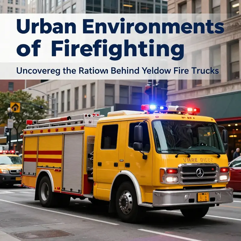
Cities present a moving mosaic of colors, shadows, and distractions. Neon signs, chrome, concrete, and glass compete for attention, while pedestrians weave through crosswalks and vehicles curl around congested blocks. In this urban theater, the color of a fire truck is not simply a stylistic choice; it is a deliberate design decision grounded in human perception, traffic dynamics, and the science of safety. The broader question of why some fire departments deploy yellow or lime-yellow fire apparatus is thus less about fashion and more about how color interacts with the complexity of city life. In these high-contrast environments, yellow stands out in ways that red, blue, or white often do not. It is not a universal rule that all yellow vehicles are safer, but a growing body of evidence from ergonomics and traffic safety research suggests that lime-yellow hues can enhance conspicuity, reduce reaction times, and, in turn, support faster, safer emergency responses. The urban context—and the eye that must navigate it—is the crucible where color becomes function.
The human visual system has a remarkable sensitivity curve. We are most responsive to light in the green-yellow region of the spectrum, roughly near 555 nanometers. That means under typical daylight, yellow and lime-green tones appear brighter to the eye than many other hues. In practical terms, a yellow fire truck can appear more salient against a cityscape of asphalt, brick, steel, and foliage, especially when the scene contains high visual clutter, glare from sun reflection off wet pavement, or shadows cast by tall buildings. This perceptual advantage is not just theoretical. Urban studies and driver-psychology research show that high-visibility colors facilitate quicker detection by drivers and pedestrians alike. When a large vehicle bearing bright color enters the peripheral vision, the brain can classify it with less cognitive load and react sooner. The result is a potential reduction in the likelihood of a collision, or at least a faster deceleration and yielding behavior from nearby road users during critical moments.
In practice, the urban environment introduces variables that can either mute or amplify the value of color. Rain-slicked streets, sea of headlights at night, and the shimmering glare from glass towers create a visual field where muted colors can disappear. Yellow’s brightness tends to cut through this clutter, especially when paired with reflective materials and bold markings that perform under shifting light. In densely populated districts, a yellow fire apparatus does not merely announce itself; it cues drivers to anticipate a large, moving object in proximity, which influences following distances, lane changes, and speed moderation. Pedestrians also benefit. The sightline from a sidewalk can reach the oncoming vehicle sooner when the color carries through the perceptual noise of an urban backdrop. The cumulative effect is a more predictable dynamic around emergency scenes, where every second counts and the margin for error narrows with distance and time.
The argument for yellow extends beyond human perception into the realm of behavioral safety. Traffic itself is a system of checks and responses: signals, signage, lane markings, and the implicit rules of yielding. A conspicuous color adds a parallel layer of safety by shaping expectations. When a yellow apparatus approaches with its lights flashing and its color blazing, other drivers can pre-emptively adjust—checking mirrors, signaling intentions, creating space. This anticipatory behavior reduces the likelihood of abrupt braking or sudden evasive maneuvers that could trigger secondary incidents. Even cyclists and bus riders are more likely to perceive the approaching apparatus in time to clear the path. In effect, color helps synchronize the micro-decisions of hundreds of road users into a safer, more orderly chorus around an emergency operation.
There is also a practical narrative about how color interacts with the operational realities of urban rigs. Yellow is easier to repaint and maintain under urban grime and road salt than some deeper reds or blues, which can fade unevenly with sun exposure and weather. The reflective tape and high-visibility markings that accompany yellow vehicles are designed to maximize the color’s conspicuity. When combined with illuminated warning devices—sirens and rooftop beacons—the overall visual signature becomes highly legible at varying distances and speeds. It is a design philosophy that recognizes color as a live facilitator of safety, not merely a badge. Yet the choice is not devoid of trade-offs. Red remains deeply entrenched in the tradition of fire service nomenclature and branding. Historically, red was selected for its visibility against blackened street cars of the early automotive era and for symbolic reasons tied to power and urgency. Repainting fleets or supplementing red with yellow elements involves costs, logistics, and a careful balance of identity versus function. Departments that adopt yellow often justify the shift with a calculus that weights incident detection, near-miss reductions, and the real-world experience of responders who operate in urban grids where visibility is frequently compromised by weather, street geometry, and dense traffic. The net effect is a color strategy that aligns with a modern emphasis on safety science and evidence-informed practice.
This line of reasoning resonates with broader safety standards and recommendations from traffic-safety authorities. The U.S. Federal Highway Administration, for instance, has highlighted fluorescent yellow-green as highly conspicuous for school zones and pedestrian crossings due to its superior detection properties. While that specific guidance targets a different context, the underlying principle—prioritizing conspicuity in high-risk environments—mirror-smashes into the rationale for yellow fire apparatus in city settings. The urban firefighter’s toolkit includes more than color: it combines lighting, signage, vehicle design, and incident command strategies to minimize risk and maximize speed to the scene. But color remains a simple, powerful, and cost-effective element that operators can deploy to influence behavior at scale. In that sense, yellow is not just a makeover; it is a statement about how fire departments are aligning themselves with evidence-based practices in a world where streets are busier and responses must be faster than ever.
The narrative of yellow in urban contexts is also a story of public perception and trust. Residents who regularly share sidewalks with emergency vehicles may interpret the color as a signal of readiness and safety. Schools and workplaces, when they see yellow apparatus at drills or during real emergencies, may experience a heightened sense of assurance that help is arriving with clarity and urgency. This psychological layer matters because trust in emergency services translates into cooperation: pedestrians stepping back, drivers yielding promptly, and bystanders offering space without hesitation. The color becomes part of the social contract between a city and its responders, a visible reminder that safety is a shared endeavor.
Of course, not every city or every department will adopt yellow for every scenario. The decision often rests on local weather patterns, road geometry, and historical accident data. In some places, yellow may perform exceptionally well in rain-heavy climates with reflective surfaces; in others, high-altitude or densely vegetated areas might benefit from combinations of color, lighting, and reflective sheeting tailored to the local visual ecology. What endures across contexts is a willingness to test, measure, and adapt. The best practice for any department is to consider color as one among many tools designed to improve conspicuity and reduce risk, and to monitor outcomes in the same rigorous way that it monitors equipment reliability or response times. In this sense, the urban color debate is a living experiment—a real-world laboratory where perception, behavior, and safety converge.
The chapter’s exploration of color would be incomplete without acknowledging the broader ecosystem that surrounds a fire apparatus in the city. Operational success depends not only on visibility but also on how crews coordinate with street traffic, pedestrians, and other responders. The color signals a readiness that should harmonize with dynamic warning lights, loud audible alerts, and the disciplined choreography of moving through traffic. The result is a citywide signal system where color, light, and sound combine to reduce reaction times and optimize the path to the incident. In recent years, some departments have integrated yellow with enhanced reflective materials, adaptive lighting, and digital signage to further sharpen conspicuity across day and night, sunlit avenues and shadowed alleyways. The science suggests a positive trend, but it remains essential to balance such changes with training, maintenance, and public communication so that the color choice is understood and trusted by the communities served.
For readers seeking a broader look at the conversation around vehicle color and visibility, additional insights can be found in the Fire Truck Blog, which surveys design considerations, case studies, and evolving best practices for emergency vehicles. Fire Truck Blog.
As urban designers, safety engineers, and responders continue to collaborate, yellow fire apparatus symbolize a pragmatic shift toward color-informed safety culture in cities. This shift is not about erasing tradition but about elevating safety through observable, measurable improvements in how quickly and safely a city can mobilize emergency response. It is about recognizing that perception is a form of infrastructure—one that can be designed, measured, and improved over time. When a yellow fire engine rounds a corner under the glare of mid-morning sun or after a sudden downpour that slicks the pavement, that color becomes a practical ally in the long arc of rescue, recovery, and community protection. That is the core idea behind the urban application of yellow: color as a living tool, integrated with training, technology, and policy, to help responders reach people faster and safer in the places where danger and life intersect.
For readers who want a concise summation of the empirical basis for these observations, the central takeaway is that conspicuity—the ease with which a vehicle stands out in complex environments—benefits from high-visibility hues like lime-yellow. The science behind this assertion is rooted in human factors research and vehicle visibility studies. While more city-specific data would continue to refine best practices, the current evidence aligns with a practical, proactive approach to safety in crowded urban landscapes. The chapter thus invites departments to weigh color as a concrete, evidence-informed option in their pursuit of faster response, fewer incidents, and safer streets for everyone.
External reference for further scientific context: https://www.nhtsa.gov/vehicle-color-and-visibility-research
Bright Beacons on the Front Lines: Why Some Fire Trucks Trade Red for Yellow
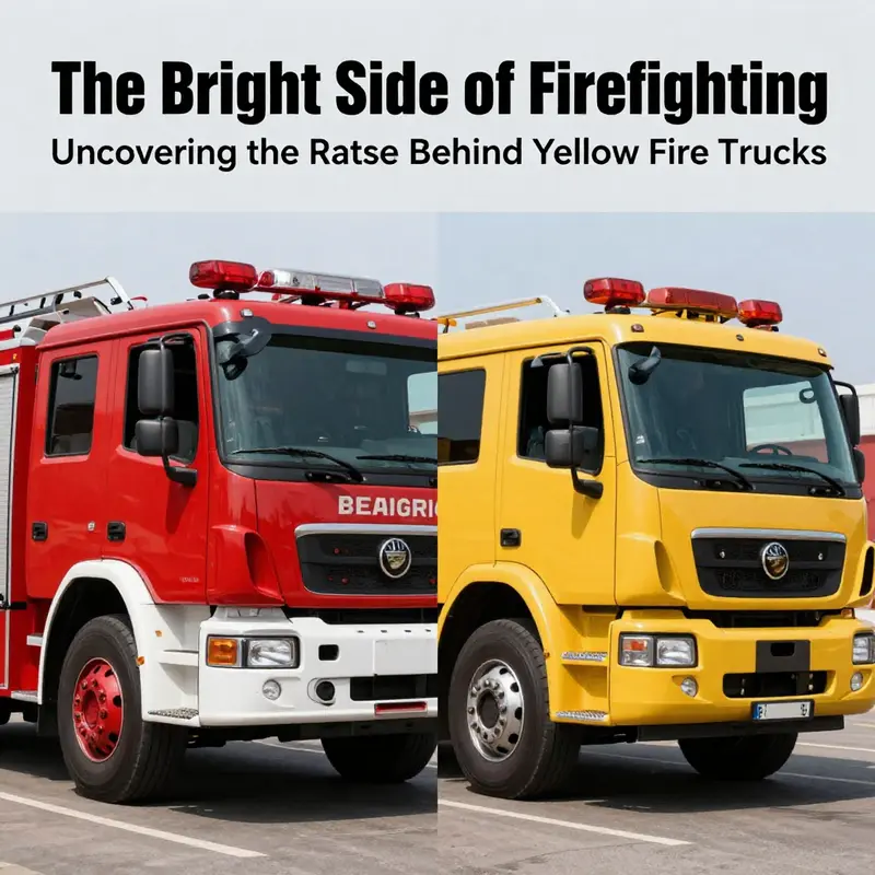
Color on the fire ground is more than a matter of tradition or taste. It is a practical tool that can influence how quickly a crew is noticed, how fast a driver responds, and how safely bystanders react to an approaching emergency. The shift from red to yellow on some departments’ fleets is not a casual rebranding; it is a carefully considered decision grounded in a long history of color psychology, human vision research, and real-world field data. In places where visibility is routinely challenged by weather, glare, and cluttered urban scenery, yellow is not merely bright. It is a scientifically informed signal designed to cut through noise and save precious seconds when every moment matters. This chapter follows that logic, tracing the arc from tradition to modernity, and showing how a color that once seemed merely ceremonial can become a critical component of public safety and emergency response effectiveness.
The story begins with a principle as old as firefighting itself: responders function best when they are seen. In the late 1980s, the Honolulu Fire Department undertook a deliberate review of how color affects visibility during rapid emergency maneuvers. They did not start from a canvas of nostalgia; they started from data. They combed collision statistics and peered into international practices where high-visibility colors—often lime-yellow or fluorescent yellow-green—had already become standard. The conclusion was not that red was wrong, but that yellow offered a meaningful advantage in the environments where Honolulu crews operate: coastal cities ringed with glare off water and pavement, often under sun-drenched skies and in humid, fogged, or rain-soaked conditions. The department recognized that color matters not just at a distance but at critical moments of entry into traffic, when pedestrians and other motorists must make split-second judgments about the safest path to safety and rescue.
A central piece of the evidence is rooted in human vision. The eye is most sensitive to light around 555 nanometers, a wavelength associated with the green-yellow portion of the spectrum. Under ordinary daylight, colors in this range tend to appear brighter to the average observer. The practical upshot is simple: a lime-yellow or fluorescent yellow-green vehicle can appear more conspicuous than a red one, especially against common urban backdrops like soot-streaked brick, grey concrete, black asphalt, and glassy storefronts. This is not a mystical claim but a reflection of how the optic system processes contrast, luminance, and motion. When an emergency vehicle is coming toward you or pulling onto a street, that enhanced conspicuity translates into faster detection by drivers and pedestrians, and faster reaction times that reduce the likelihood of near misses. The physics of color, paired with the psychology of attention, creates a chain of safety benefits that is especially valuable in high-traffic environments where a single collision can block an exit route or delay critical care.
These insights do not exist in a vacuum. In the broader field of visual ergonomics, fluorescent colors—particularly yellow-green and orange—are consistently associated with improved detection speed and reduced accident risk. Government and transportation agencies have cited high-visibility hues in contexts ranging from school zones to pedestrian crossings. The logic is straightforward: when visibility improves, the probability of a prompt, correct response rises. The Honolulu experience aligns with international practices observed in parts of Australia and Europe, where yellow or lime-green fire apparatus and service vehicles have become common in settings characterized by glare, moisture, and variable light conditions. The Hawaii decision thus mirrors a growing global shift toward evidence-based color choices that prioritize safety without sacrificing operational effectiveness.
Yet color choice is never only about optics. It intersects with cost, tradition, and public perception. Red remains deeply rooted in fire service lore. The color’s association with urgency is reinforced by historical narratives, symbolic meaning, and the visual strikingness of a red vehicle against a wide range of landscapes. In the early days of motorized firefighting, red also carried practical advantages: paint technology and availability were constrained, and agencies sought a color that would stand out against the earliest black or dark vehicles on the road. Over time, that pragmatic reality coalesced into a tradition that many departments upheld as part of their identity. In this sense, the tradition is not mere stubbornness; it is a memory of practical constraints and a signal of continuity that communities rely on in times of crisis.
But the modern question is not whether tradition should be dismissed outright. It is whether tradition can coexist with evidence, and whether new data deserve a seat at the design table when public safety is at stake. The Hawaii example provides a compelling case study of how a department prompted a broader discussion about color strategy that did not require abandoning the firefighting mission. The shift toward yellow was not a wholesale rejection of red; it was an assessment of situational visibility and risk reduction. If yellow offers measurable advantages in certain contexts, then the right decision is to adapt, while continuing to train, equip, and deploy resources with the same rigor that defines the profession. In other words, yellow became an instrument of safety rather than a symbol of novelty.
A deeper layer of the story concerns how color interacts with the urban fabric. Cities present a mosaic of textures and atmospheres: glassy high-rises reflecting the sun, weathered facades that absorb light, and seasonal variations that transform the perception of color. In such environments, yellow can yield higher contrast against a wide array of backdrops. A car with dark paint may disappear against a damp pavement in a fog, but a lime-yellow fire truck tends to remain a salient beacon. In coastal cities, where sea spray and humidity can soften contrasts, the lime-yellow hue maintains a detectable edge that can be crucial for both oncoming traffic and pedestrians who must make quick decisions about where to move. The same logic helps in rural or fog-prone regions where light diffusion can flatten color perception; yellow’s brightness helps it punch through murkiness and distance alike. This is not a universal rule that makes red obsolete, but a nuanced picture of where, when, and how color performs best.
From a design perspective, yellow also offers practical advantages in terms of reflectivity and daytime conspicuity. Many departments prefer paints and coatings that maximize visibility under diverse lighting: bright, high-luminance pigments that stay legible when glare is present, when smoke partially obscures vision, or when street lighting shifts the perceived brightness of surroundings. With yellow, the vehicle can maintain a visual prominence not just in direct sunlight but even in challenging light sources such as sodium vapor street lamps or LED arrays that sometimes distort color perception. The result is a platform that remains legible in the moments when the crew needs to be seen most clearly by drivers, bystanders, and other responders who rely on coordination and rapid communication.
Color decisions are never made in isolation from other visibility-enhancing strategies. Signage, lighting, retroreflective markings, and the distinctive shapes of emergency vehicles all contribute to overall conspicuity. In this integrated approach, yellow serves as a robust baseline, a primary signal that can be quickly interpreted at a distance, even before a driver assesses other cues. In practice, departments often pair the color shift with reflective striping and high-contrast lettering to ensure that a vehicle is unmistakable from a distance and legible up close. The result is a fleet that communicates intent with fewer ambiguities, which is particularly valuable during the high-pressure ferries of response, when every second counts.
The narrative also embraces the human factors of decision-making at the wheel. In the heat of an emergency, crews do not have the luxury of debating color theory. They rely on training, standard operating procedures, and the tacit calibration that comes from working together. A color that improves detection can shorten the time needed to interpret a scene, anticipate moves, and execute a safe, precise approach. In place after place, the observed outcomes align with the broader hypothesis: better visibility translates into faster, safer responses. The Hawaii case demonstrates how a tailored color decision, grounded in local conditions and international best practices, can yield measurable improvements in day-to-day operations and in the critical moments of an incident.
This is not a simple apologia for yellow as a universal cure. Some departments continue to favor red for historical, cultural, or logistical reasons. The key takeaway is that color strategy should be data-informed and context-aware. The debate between tradition and modernity is less about choosing one color over another and more about choosing the right color for the right conditions, while maintaining a coherent fleet identity and a robust safety framework. The Hawaiian example is particularly instructive because it shows a city with a dense urban edge and a complex climate embracing color science to enhance safety. It invites other departments to audit their own visibility strategies, examine collision and response data, and consider whether a shift in color could yield meaningful benefits for both firefighters and the public they serve.
For readers who want to explore the practical implications of color strategy beyond theory, there are tangible avenues to consider. Departments contemplating a change should review local traffic patterns, weather conditions, and incident types to identify which color signals will be most effective in their context. They should also weigh the cost and availability of high-visibility coatings, the maintenance implications of brighter pigments, and the potential need for updated signage and reflective materials to complement any color shift. A cohesive approach aligns vehicle color with training, communications, and field protocols, reinforcing a unified public-safety message rather than merely trading one hue for another.
In the end, yellow is not a rebellion against tradition but a measured adaptation grounded in evidence. It speaks to a broader evolution in public safety philosophy: when data point toward clearer visibility and fewer collisions, the profession should be willing to recalibrate its tools. The choice to paint some fire trucks yellow underscores a forward-looking mindset—one that values empirical results as much as historical identity. It is a reminder that the color of a vehicle can become, in its own quiet way, a life-saving instrument on the front lines of emergencies. And for communities watching this evolution, it is a signal that safety can grow through thoughtful change rather than rigid sameness.
As this chapter closes its examination of color, it invites readers to consider color not as an ornament but as a form of operational intelligence. The discussion is not about aesthetics; it is about how a color can shape perception, shorten reaction times, and contribute to safer outcomes for both firefighters and the public. The Hawaii experience adds weight to the argument that modern safety design, when guided by science, can preserve the core mission of the fire service while expanding its capacity to protect lives. For those curious about the practical aspects of fleet color strategy and to explore related options, see the catalog of current offerings at fire-trucks-for-sale.
External resources offer deeper context on the Hawaii case and the science behind conspicuity. For a detailed account of why Hawaii fire trucks are yellow and the history behind the decision, consult the Honolulu Fire Department’s official update and related coverage. This resource frames the discussion within a real-world policy decision and highlights the steps an urban department took to align color with performance data. It is a valuable companion to the research cited here and helps illustrate how theory translates into practice in a living city fleet.
External reference: https://www.honolulu.gov/hfd/press-releases/why-hawaii-fire-trucks-are-yellow.html
Final thoughts
In the world of firefighting, color plays a critical role in visibility and safety, particularly with the increasing adoption of yellow fire trucks. This bright color enhances recognition, reduces response times, and elevates overall safety standards in emergency situations. The psychological impact of yellow further underscores its effectiveness, creating heightened awareness and urgency during incidents. Amidst evolving urban landscapes and innovative approaches to emergency response, the discussion of tradition versus modernity in fire truck colors continues to inspire debate. Ultimately, the journey into the realm of yellow fire trucks reveals a commitment to adapting strategies that prioritize safety, visibility, and public trust.