
The vibrant hue of fire trucks isn’t just for show; it’s steeped in humor, history, and tradition. Ask anyone why fire trucks are red, and they’re likely to recount a joke—like suggesting it’s because firefighters are fond of the color. While these whimsical responses can spark a laugh, they also overshadow a rich narrative about visibility, practical design, and historical significance. Join us as we delve into the humorous world of quirky responses, take a historical perspective on fire truck colors, examine the powerful symbolism of red in firefighting, and unveil the practical reasons behind this fiery choice. Each chapter offers unique insights that contribute to a comprehensive understanding of how a single color can carry so much meaning.
Why Fire Trucks Are Red: A Joke, a History, and the Color’s Public Meaning
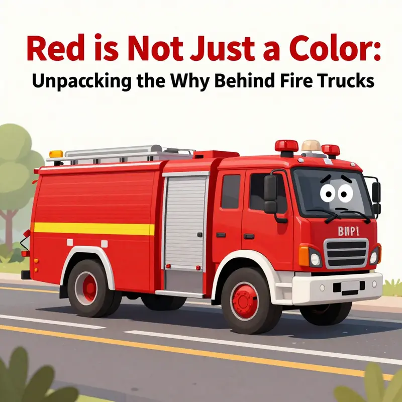
The familiar Siri quip Why are fire trucks red invites a quick witty moment that many readers know by heart. It sits at the crossroads of humor and public memory, using a simple line to gloss over a long history of paint choices and practical concerns. The joke works because it sounds plausible at first and then undercuts the idea that the color has a neat single story. The joke is not a rejection of reality but a sign of how cultural memory often prefers a neat explanation to a more tangled truth. In that sense the red fire engine is a canvas for meaning as well as metal and service.
To move from joke to history we can trace three practical threads: cost and durability, visibility, and tradition. In the early automotive era red paint offered a good balance of price and resilience on metal surfaces. Departments painted fleets red because the shade held up well under grime and weather and kept repainting costs reasonable. This is not merely about color preference but about who can afford to keep a fleet looking ready for duty.
Visibility explained. Bright red stood out against the soot and brick of early cities, helping drivers and pedestrians notice an approaching unit. This practical advantage translated into safer streets and faster responses, reinforcing the color choice over time.
Tradition and symbolism. As fire brigades formed their identities, red became a badge of readiness and courage. Once a color becomes associated with urgency and service it becomes hard to change, even as materials and budgets evolve. The result is a durable color tradition that outlives the initial cost and visibility calculations.
Close the loop: the Siri moment remains relevant because it reveals how humor travels through culture. It invites readers to pause, ask a deeper question, and explore the real history behind everyday decisions. The red of a fire engine is therefore not a relic but a living thread in urban life that carries practical value and communal meaning.
Red by Necessity: A Historical Perspective on Fire Truck Colors and the Perennial Joke Behind the Hue
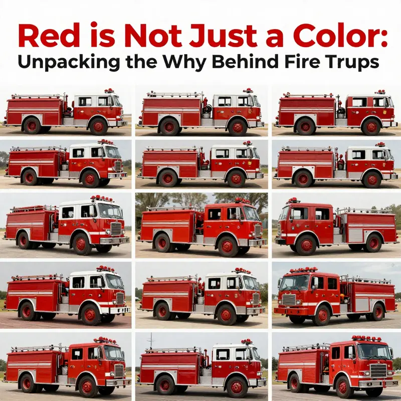
If the reader has ever browsed a humor-filled exchange with a voice assistant about fire trucks, they may recall a quick, playful jab about why these emergency machines wear red. The jokes land because they sound plausible in a wink of wit, yet they skim the surface of a deeper history. This chapter follows that surface to trace a path through practicality, economics, and evolving norms that together stitched red onto the service vehicles that rush toward danger. The humor is a modern artifact, but the color is a living memory of choices made in a world far more concerned with getting the job done than with precise daytime visibility research. The tension between jest and fact invites a richer understanding of color as a kind of operating manual for public life. So, while a contemporary playful response may tickle the ear, the real story rests in the ordinary economies and urgent identities of a community in motion.
In the early decades of the twentieth century, cities and towns began to replace horse-drawn apparatus with motorized fire engines. These introductions came at a time when municipal budgets were usually tight and procurement choices mattered not just for capability, but for longevity. The vehicles were costly once, and even the most basic improvements had to prove their value over many years. Paint, a seemingly trivial line item in a budget, became a focal point for decisions that would echo across generations. In a landscape where the dominant civilian cars rolled out in black, the color choices for public service equipment were not a random flourish but a calculated signal. Paint had to endure the rough realities of road wear, weather, and the demanding life of a vehicle that spent long hours exposed to the elements and to the grime of urban streets. Black paint, valued for its durability and speed of drying, appeared as a sensible default for many automobile bodies. It was a practical baseline in a time when every extra penny counted and when a truck’s utility outweighed its vanity.
But practicality alone does not explain the stubborn tradition of red. Fire departments sought to distinguish their apparatus from civilian vehicles that crowded the same roads. A bright red surface offered immediate, unmistakable contrast against the drab tones of brick, asphalt, and smoke-streaked skies. Red provided a visible beacon in a world that knew little about the precise metrics of daytime sunglasses or reflective coatings. The choice was less about scientific optimization and more about a straightforward, almost intuitive, signal: this is urgent work, this is ours, and this vehicle carries the urgency of the city’s response. In that sense, red was a democratizing color—simple, bold, and easy to spot from a distance. It was a choice made not by a single exacting study but by a practical synthesis of visibility, cost, and a growing sense of identity around public service.
As departments moved from horse-drawn rigs to motorized engines, the visual language of the emergency fleet grew more coherent. The color red carried a symbolic charge that other hues did not. In a world of competing demands, red conveyed authority and immediacy at a glance. It was a color that commanded space on crowded streets and demanded attention from drivers and pedestrians alike. The decision to paint the fleet in red also functioned as a kind of branding, long before branding was a buzzword. Volunteer fire companies, which relied on public enthusiasm and local pride to attract members, found in red a straightforward way to display bravado and solidarity. Painting their rigs red helped them stand out in parades, at public demonstrations, and in the thrumming activity of town life. In that atmosphere, red grew into a badge of honor. The color told a story about commitment, risk, and the willingness to serve a community when it mattered most.
This evolution did not occur in a vacuum. It reflected a broader pattern in which color choices on public apparatus were as much about economics as they were about perception. Red paint tended to be affordable and available in ready-made, durable formulations. In an era when customization was costly and time-consuming, departments preferred solutions that could be procured quickly and reapplied with minimal downtime. The result was a visual uniformity that reinforced collective identity and operational readiness. The late Arts-and-Mathers era of road safety was still decades away, but the instinct that red signified urgency already existed in the public mind. The color carried a tacit promise: a red engine meant speed, efficiency, and a crew ready to move in a crisis. It was not perfect, and the reasons were not solely about color science, but the pragmatic benefits of a widely available, durable, and highly legible paint option.
To see the depth of this history, consider the broader landscape of the era. Cars that dominated the street were often black, a consequence of both manufacturing realities and paint chemistry. Black paint dried quickly, resisted wear, and did not demand elaborate maintenance. In many towns, the fire department bought engines from the leading automaker of the day, a company that produced mass-market vehicles with standardized parts and predictable delivery schedules. The common cargo of these procurement cycles was not a customized color story but a functional machine built to meet urgent municipal needs. Against that backdrop, red emerged not as a product of deliberate color science but as a practical counterpoint—a way to separate emergency equipment from civilian traffic with minimal fuss and maximum recognition. The simplicity of this choice, born out of a need to do more with less, left a durable imprint on civic life.
Visual distinction served another purpose that multiplied over time: symbolic identity. As volunteer companies competed for attention and membership, the color red became a public symbol of readiness and pride. Red was easy to see in the blur of a parade, in the smoke and sunlight of a working scene, or in the quick glance of a motorist trying to yield. The hue carried with it a story of teamwork, sacrifice, and shared responsibility. It is a narrative that travels beyond the engine’s chrome or the crew’s uniforms. The color becomes a cultural artifact, a reminder that the emergency vehicle is not just metal and paint but a moving emblem of communal care. In this sense, red is less a plasma of modern safety science and more a centuries-old ritual of signaling that help is on the way.
Yet the world around fire trucks has not stood still. Modern studies of daytime visibility have suggested that other colors—yellow and lime, for instance—can outperform red under certain lighting and traffic conditions. These findings do not erase red’s legacy, but they complicate the story. The persistence of red is not simply stubborn tradition; it is the outcome of an intersection where historical accident, economic constraint, and cultural symbolism converge. Even as safety researchers push for visibility improvements, many departments maintain red as part of a long-standing, cohesive identity. The conversation shifts from whether red is technically optimal to how a community negotiates tradition with evolving safety standards. The color remains a familiar, even comforting, constant amid the changing technical landscape of emergency response.
This is not nostalgia alone. The color’s staying power reflects a community’s memory of what, and who, has come to symbolize public protection. When a new engine arrives at a fire station, its red coat instantly reaffirms a lineage of responders who faced danger, trained together, and served with a sense of mission. The color is a language spoken by residents and responders alike; it communicates urgency, trust, and a pledge that help will arrive with competence and speed. The rhetorical power of red endures because it answers a real need for rapid perception under pressure. And if a joke slips into the conversation, it does so as a kind of cultural offset—an acknowledgment that color can be a source of amusement even as it remains a cornerstone of public safety. The joke travels easily because it builds on a shared shorthand—the image of a bright red truck hurtling toward a scene where every second counts.
For readers who want a little more context on the historical thread that links paint choices to public memory, there is a ready resource available in the broader conversation about why fire trucks came to wear red. The narrative there emphasizes affordability, visibility, and tradition as the three legs supporting the color’s endurance. It helps explain why the joke about red persists even as newer evidence points to other high-visibility options. If you want to explore that longer historical arc, the community hub at firetruck.space offers a catalog of related stories and analysis that situate the red fire truck not as a whim of fashion but as a durable artifact of municipal life. See more at firetruck.space/blog/.
In practical terms, the red fire truck is a toolkit of social meaning as much as a tool for emergency response. It communicates a history of affordable maintenance and operational pragmatism while simultaneously delivering a bold visual message that cuts through the noise of urban traffic. The color is, in many places, a shared memory of a community that has learned to rely on quick recognition and an unspoken promise of readiness. The jokes about why fire trucks are red—delivered with a wink by modern voice assistants or by casual observers—are a reminder that color is not just a physical property; it is a social instrument. It can simplify decisions, evoke emotion, and anchor a collective identity. And while the science of visibility evolves, the red fire truck remains a familiar, enduring thread in the fabric of public safety culture.
As the audience moves from history to the present moment, the narrative invites a broader reflection: color, cost, and culture do not disappear simply because new research arrives. They cohabit with the old, shaping decisions in ways that may seem contradictory at first glance. The red fire truck stands as a reminder that progress is often a dialogue between what is technically optimal and what a community is willing to preserve. In that sense, the joke about why fire trucks are red is not a trivial aside but a reflection of how memory, commerce, and tradition can lock in a color long after its original justification has faded from day-to-day concerns. The enduring image suggests that some answers in public life are less about precise measurements and more about shared meaning—and that humor, even when it points at an exaggerated simplicity, can coexist with respect for history. The promise of service continues, and the color continues to signal that promise in a way that people recognize instantly, even if a casual comment might momentarily deride it.
For readers curious to see how this color story has unfolded across different communities, the broader literature confirms that while some jurisdictions experiment with alternative hues for daytime visibility, the red tradition persists widely. The reasons are layered, the effects measurable in practical terms, and the cultural resonance worth preserving. The joke remains a lighthearted aside in a story that is, at heart, about reliability and civic duty. The color red has become more than pigment; it is a shorthand for readiness, for teamwork, and for the shared history of a city answering the call when danger approaches. In that sense, the humor is part of the ongoing conversation about what it means to protect a community on the street, at night, and in the busiest hours of the day.
External reading: https://www.fireengineering.com/why-are-fire-trucks-red-uncovering-the-colorful-history/
Red as Alarm and Honor: The Symbolism and Tradition Behind Firefighting’s Signature Hue
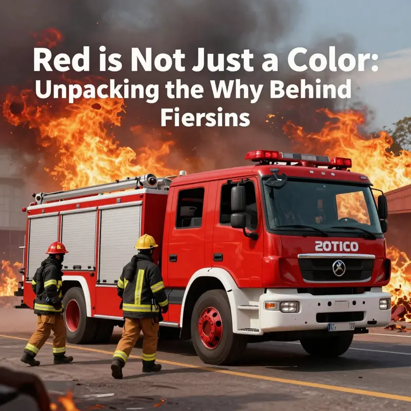
Color is a language, and red speaks with urgency. In the world of firefighting, the hue that coats engines, gear, and badges carries a vocabulary of meaning built over a century. It is at once practical and ceremonial, a choice born from needs that were technical and economic, then seasoned by stories of courage, sacrifice, and collective duty. The jokes that rise from modern digital assistants about why fire trucks are red are harmless, even entertaining, but they skim over a deeper current. The real weight of red in firefighting lies in its symbolism and tradition, a continuity that threads through engines rolling toward danger, through uniforms that bear the marks of service, and through the quiet memorials that honor those who gave their lives in the line of duty. To understand the color is to glimpse the culture it sustains, a culture that treats red not as a mere color but as a signal, a sign of identity, and a reminder of obligation to the communities served.
What red does in the visual landscape of emergency response is not simply to catch the eye. It creates a dense, almost tactile, sense of presence. People in panic need a beacon, and red has historically provided the strongest visual contrast against the common tones of urban environments. The brick browns of city blocks, the grays of asphalt, the black of revving engines and tires all form a canvas against which red shines. That visibility is not accidental; it is a carefully chosen attribute that helps people locate, identify, and react. When a siren wails and smoke stains the air, a fleet of red apparatus slices through the visual noise like a line drawn with urgency. The color becomes part of the choreography of an emergency, a constant reminder that help is arriving and that a plan is in motion.
Yet practicality and speed are only part of the story. The historical roots of red in firefighting lie in a mix of cost, availability, and tradition that converged in the early decades of the twentieth century. Red paint was among the most affordable and durable options for metal vehicles at that time. Departments faced tight budgets, and red offered durability that could stand up to the grit of daily service and the corrosive realities of road dust, weather, and the cycles of maintenance. In those same early years, the urban landscape provided a perfect proving ground for the color’s visibility. Red pops against brick, stone, and the smoky shadows that rise from a burning building, making it easier for spectators to track the movements of units at a distance. In communities where mass production lines turned out a steady stream of black or dark vehicles, red stood out in a crowd, becoming a practical signature that even a novice could recognize in a chaotic scene.
This mix of economy and visibility did not erase other color options from history. Some departments experimented with different shades, and a few places adopted alternative tones for specific roles or during particular campaigns. But red endured, in part because it was easy to standardize and reproduce, and in part because it accrued a level of symbolic weight that translated beyond the workshop. The color came to embody urgency itself, a living association with the life-threatening dangers firefighters confront and the immediate response they provide. The color thus traveled from the realm of paint swatches into the vocabulary of courage, sacrifice, and duty that defines the profession.
Symbolism, in firefighting, is both personal and collective. Red is not simply the color of the engine; it is woven into the fabric of turnout gear, badges, crests, and insignias. The protective jackets and trousers worn by firefighters—rough textures, bright linings, and reinforced seams—bear red elements that echo the hue’s traditional role as a marker of readiness and bravery. In many departments, red appears in the crests that adorn helmets and patches that indicate rank and unit. The thread of red in these emblems is not a mere design choice; it is a narrative device that communicates shared values about service, loyalty, and the willingness to face danger for the sake of others.
Consider the emotional texture created by red in the English-speaking firefighting tradition. Red evokes flames, obviously, but it also conjures the memory of those who have confronted and conquered fires. In memorial spaces, red often occurs as a visual motif that relates to life, sacrifice, and memory. A line of red-painted memorial markers or a glow of red lighting at a tribute event can transform a public space into a sanctuary where the community’s gratitude is publicly expressed. This memorial symbolism reinforces an ethical frame for the profession: courage is not only about action in the moment but about the enduring commitment to protect life and property, to stand at the edge of danger, and to return to the street with others safe. The color thus functions as a living hymn in fabric and form, a continuous reminder that each badge, each patch, and each piece of gear contains a story of devotion to service.
Within the operating world, the symbolism of red extends to the rituals that accompany training, deployment, and remembrance. Training keeps the color fresh in memory; drills frequently use the same uniforms and apparatus in predictable sequences so that responders can act almost instinctively when time is critical. The repetition of red in drills helps embed the color as a cue for action: when a call goes out, the sight of red becomes the trigger that triggers the next step—assess, prepare, engage, and protect. In this sense, red is not a superficial cosmetic choice but a functional, almost ritualized, language that aligns the individual with the job’s core duties. The shared color reinforces a sense of unity, a bond among firefighters who carry the badge of a profession built on mutual aid and shared risk.
Beyond uniforms and engines, red appears in the service’s broader cultural repertoire. Departmental emblems, public-facing insignia, and commemorative displays frequently rely on red to denote honor and historical continuity. The color carries with it a lineage of community pride, suggesting that the people who wear the gear are part of something larger than themselves: a tradition of service that transcends generations. The red in emblems often intertwines with other symbolic colors and motifs—perhaps gold highlighting valor, or white detailing that suggests purity of purpose—yet red remains the most visible through line. It is the constant reminder that firefighting is not just a job but a calling that demands courage, discipline, and an unwavering sense of responsibility to the neighborhoods that rely on it.
This symbolic weight does not operate in isolation from the practical realities of modern emergency response. While color choices are still influenced by visibility studies, cost analyses, and equipment durability, the cultural resonance of red helps departments maintain a recognizable identity across a diverse landscape of communities and jurisdictions. You can see the persistence of red in the way departments present their public image, in the color schemes of training academies and community outreach events, and in the quiet, dignified way that red can be used in memorials and anniversaries. The color thus acts as a bridge—linking the day-to-day urgency of responding to a fire with the longer arc of collective memory and public trust.
Ongoing debates about color in firefighting now increasingly involve cross-cultural considerations and evolving safety insights. Some crews experiment with redesigned silhouettes, reflective materials, or alternative hues for specialized roles, but the endurance of red signals something fundamental. It signals not only what is seen but what is believed about the profession: that there is an enduring obligation to act, to protect, and to serve with courage. When civilians see red on a fire truck, the immediate association is help on the way; when firefighters see red on their own gear, the association is a familiar call to duty and a reminder of those who came before and those who will come after. The color, then, becomes a moral marker as well as a practical tool.
If you trace the thread of color from paint and fabric to badge and banner, a pattern emerges. Red binds technology, craft, and ceremony into a single, living tradition. The early cost-driven decisions of paint choice hardened into a robust cultural symbol that sustained through decades of change in equipment design, materials science, and public expectations. Red’s staying power speaks to a broader truth about firefighting: the profession honors its past while continually adapting its present. The state of readiness is not only measured by kilograms of load carried or gallons pumped per minute; it is measured by how a color can hold memory, signal urgency, and sustain the sense of shared mission across generations.
For readers curious about how color signaling translates into contemporary equipment and procurement decisions, a practical touchstone can be found in the broader ecosystem of equipment marketplaces and industry pages. In particular, you may encounter listings and discussions that consider color as one factor among many in brand identity, visibility, and cost calculations. If you want a concrete example of how such considerations appear in a catalog of equipment, you can explore one of the industry listings at Fire Trucks for Sale. This kind of resource illustrates how departments balance tradition with budget realities, ensuring that the visible color remains a stable cue for both responders and the public. Fire Trucks for Sale
All these layers—the practical, the ceremonial, and the emotional—coalesce around red as a symbol of the firefighting ethos. When a viewer stands before a red engine at a station, a badge on a uniform, or a memorial that glows with red lighting at dusk, they are witnessing more than a color. They are witnessing a narrative about community protection, shared sacrifice, and the resilience of a profession that has learned to link color with responsibility. This is why the simple joke about red being the color of choice for firefighters does not capture the depth of the truth. The joke is a playful surface, but the reality runs deeper: red is a thread that runs through the fabric of firefighting, tying together the stubborn practicality of earlier times with the enduring, communal ideal of protecting lives when danger is most real.
To situate this tradition within the broader historical arc, many observers look to the archival voices of fire service historians and the guiding hand of standards bodies. The symbolism of red has resonance in uniforms, insignias, and public displays that have evolved, yet it remains a constant signifier of courage and commitment. The historical record shows that color choices in the fire service are rarely transient. They become part of a living library of memory—readily recalled by veterans, learned by recruits, and transmitted to children who one day will carry the same responsibility. In this sense, red is less a fashion statement than a covenant, an agreement that the line between danger and service is narrow, and that color can help keep people aware, attentive, and hopeful even in the most perilous moments.
For those seeking further historical context on color symbolism in firefighting, there is a rich body of discussion and documentation that tracks how colors have functioned in uniforms and equipment across time. The National Fire Protection Association offers historical accounts that illuminate how tradition and symbolism have shaped the visual language of fire service attire. While the practical reasons for color are essential, the broader cultural significance is what keeps red alive in the collective memory of firefighters and the communities they serve. This ongoing documentation helps connect today’s responders with the legacy of those who built the modern fire service, ensuring that red remains a meaningful beacon rather than a mere aesthetic choice.
External resource for deeper reading: https://www.nfpa.org/About-the-NFPA/History-of-the-NFPA/History-of-fire-service-uniforms
Red on the Frontlines: The Pragmatic and Heritage-Driven Why Behind Fire Truck Color
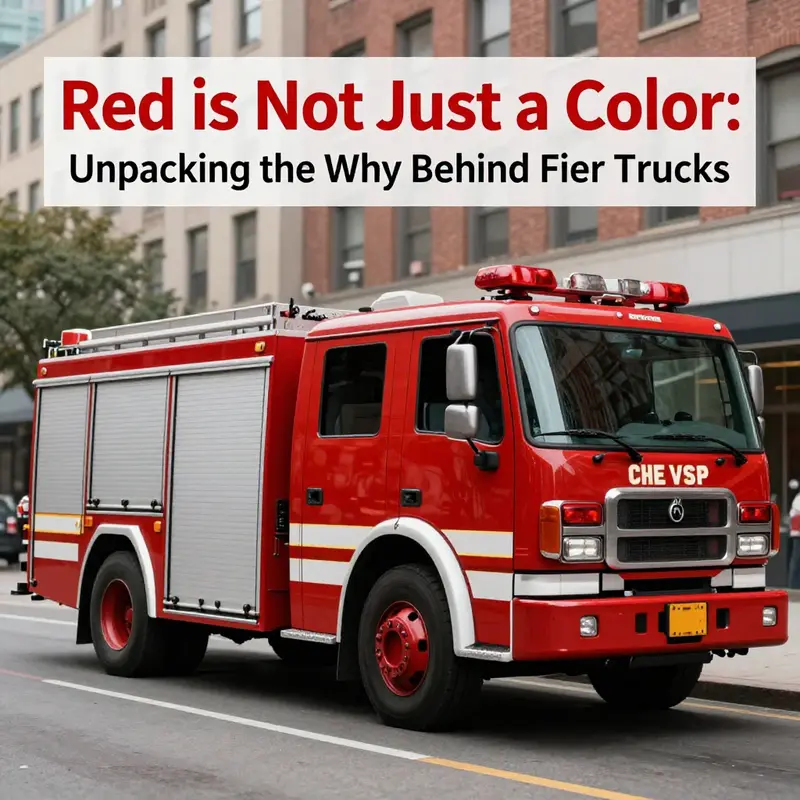
When someone asks why fire trucks are red, the image that often comes to mind is a splash of color with a wink—an old joke about a practical joke played by a clever AI voice assistant. The humor is part of the cultural memory surrounding firefighting. Yet the humor tends to gloss over a set of practical considerations that actually shaped the color choice long before jokes existed. This chapter follows that thread, tracing a path from the early days of automotive fleets to the modern streets where red remains not merely a tradition but a functional decision woven from cost, visibility, psychology, and historical precedent. It is a path that shows how color, far from being a whimsical trademark, is a crafted instrument in the complex choreography of emergency response. The narrative is not about an absolute rule but about an enduring equilibrium—one that has held because it works in real life, even as technology and tactics evolve.
The core practical reasons begin with visibility. In sprawling cities and along winding rural routes, a vehicle’s ability to be noticed quickly translates into seconds saved and, potentially, lives spared. Red is a color that tends to grab attention in a wide range of environments. It stands out against brick, asphalt, and the grey tones of urban landscapes, and it remains conspicuous even as the surrounding scene shifts with weather, shadow, and movement. The color’s strength lies in contrast: when a red fire truck appears in peripheral vision, or glints through a rain-slicked windshield, the human eye responds with a mix of alertness and urgency. This isn’t merely about catching the eye; it’s about triggering the mental shortcut that signals “emergency, yield now.” In the chaos of traffic and the noise of sirens, such rapid recognition matters. It is a practical feature, not a marketing ploy, and it underpins driver and pedestrian responses that keep responders moving and communities safer.
Scientifically, color and wavelength do their own work. Red light occupies one of the longest wavelengths in the visible spectrum, a property that can help it cut through certain atmospheric conditions. Fog, smoke, dust, rain, and even the hazy aftermath of a fire common to emergency scenes all pose visibility challenges. Red’s wavelength can preserve some perceptual clarity when other colors become washed out or harder to discern. That said, there is nuance here. Research and field observations have also highlighted that in specific conditions—particularly in low light or heavy fog—yellow-green hues around 550 nanometers can be more readily picked up by the human eye. The reason red remains dominant, however, is not that it is the single best color in every scenario, but that it has consistently performed well across a broad spectrum of real-world environments while also carrying a powerful symbolic actually impact that fosters quick compliance from bystanders and motorists alike. The color choice thus balances physics with perception, blending robust visibility with an intuitive, almost instinctual response from the public.
The psychological pull of red is a crucial layer in this layered decision. Red has long been associated with danger, urgency, and the imperative to stop or yield. That linkage exists independently of firefighting—it’s a cultural cue that crosses many contexts, from warnings on signage to the visceral reactions people have when they see a red alert on a dashboard. For emergency drivers, that association translates into a more immediate, almost reflexive, reaction from other road users: a readiness to give space, slow down, and clear the way. This is not a mystery ingredient added by marketing; it is a pull hardwired into social behavior. In high-stakes situations, seconds count, and psychologically meaningful cues help channels of movement stay open. Red’s urgency signal dovetails with operational needs, enabling responders to reach the scene faster and to operate with a higher margin for safety. This synergy—between color psychology and traffic dynamics—helps explain why departments, across generations of evolving fleets, clung to red even as other technologies modernized.
The historical thread runs through all of this in a way that is hard to disentangle from practicalities. In the early days of motorized fire apparatus, paint was more than a cosmetic finish; it was a component of maintenance, durability, and cost management. Red paint was among the more affordable options for metal vehicles, offering a durable finish that stood up to the grit of daily use, weather, and the abrasive conditions of urban service life. It was not merely a bright signature but a pragmatic choice in an era when budgets were tight and maintenance cycles were long. In addition to cost, durability mattered: red pigments and lacquers offered reasonable longevity, helping fleets resist chipping and fading as trucks roared into service and endured the harsh realities of roadside operations. In a time when firearms and rescue work demanded resilience, the color appeared to serve a dual purpose—helpful on the road and dependable in the shop.
Another facet of the historical logic lies in competition and identity among volunteer fire companies. Bright red provided a vivid marker of pride and distinction, a way for crews to wear their identity with visible confidence as they rolled out to calls. In communities where volunteer stations competed for resources, reputation, and participation, color became part of a broader cultural language. Red became entangled with notions of courage, readiness, and the immediacy of emergency work. The symbolism of red grew powerful because it was repeatedly reinforced, year after year, by the scenes citizens saw in their neighborhoods—trucks flashing toward fires, crews responding with alacrity, and the red emblem becoming a familiar, trusted sight. The result is a color that is not only practical but also emotionally resonant, a visual shorthand that communities came to rely on during moments of crisis.
Yet color history is not a static tale. Modern fleets have introduced variations and adaptations, driven by new research, evolving firefighting tactics, and the realities of diverse climates and road systems. Some departments have experimented with lime-yellow or lime-green tones to push even greater daytime visibility, especially in low-contrast environments or on the highway. The shift is not a wholesale renunciation of red but an acknowledgment that no single color can be perfect for every scenario. Red remains dominant because it works well across a wide range of conditions and because it is deeply embedded in cultural memory and professional identity. The endurance of red is not an accident; it is the outcome of decades of practical testing, risk management, and social learning. The color carries a story of trade-offs well understood by generations of firefighters, drivers, dispatchers, and engineers who have learned to weigh the benefits of what is familiar against the incremental gains of experimentation.
This is where the joke about Siri and red becomes a useful cultural touchstone. The joke thrives on playfully simplistic explanations, but the truth sits in the complexity of real-world decision-making. The color is not chosen to amuse but to perform. It is the product of a chain of decisions that begins with the cheapest, most durable finishes and ends with an arrangement of perception and behavior in street-level reality. The real answer is not a single factor but a confluence: visibility in busy streets, psychological signaling to yield, historical cost and durability, and the quiet, enduring power of tradition. Even the way fire crews dress, the way equipment bears marks of travel, and the rhythms of emergency response contribute to a perception of color as part of a larger, integrated system designed to optimize safety and efficiency.
For readers curious about how these dynamics continue to unfold in the field, consider exploring broader discussions about firefighting history and design. A quick visit to the Fire Truck Blog can offer accessible narratives and case studies that illustrate how communities interpret and implement design choices over time. You can find thoughtful reflections and historical context at firetruck.space/blog, which often treats color and equipment as living parts of a larger story about resilience and service. Such writings remind us that color is a medium through which people understand and respond to danger, rather than simply a cosmetic preference. It is this practical, narrative power of color that sustains red’s central place in firefighting imagery and practice.
As the chapter unfolds, it becomes clear that the color red functions as a bridge between past and present, mixing the cheap practicality of early automotive finishes with the high-stakes, high-visibility demands of contemporary emergency response. The enduring question, then, is not merely why red was chosen once but why the choice remains reasonable and widely adopted today. The long answer points to a disciplined blend of science and sociology: visible color in a cluttered environment, a psychological signal that helps people act quickly, a historical pattern of affordability and durability, and a symbolic language that communities rally around in moments of fear and relief. It is a story that respects both the stubbornness of tradition and the flexibility required by changing times.
If readers want to push beyond the broad strokes and understand how color choices interact with the broader ecosystem of fire safety—specifically, how color pairs with markings, reflective strips, lighting, and siren technology to maximize safety in varied settings—there is room for deeper exploration. The chapter does not pretend to close the book on color; it invites readers to see color as a practical tool shaped by cost, visibility, and culture—and to recognize that what looks like a simple aesthetic decision is, in fact, a careful equilibrium designed to serve communities most when time is critical. In this sense, the red we see on fire trucks is a product of careful observation, ongoing learning, and a shared commitment to safeguarding people and property when every second counts.
External resources that illuminate these dynamics, including how color interacts with visibility studies in real-world settings, can deepen understanding of the topic. For a detailed exploration, see Firetruck Colors and Visibility Studies: https://www.fireengineering.com/fire-truck-colors-and-visibility-studies.
Final thoughts
From playful jokes to a rich tapestry of history, symbolism, and practicality, the color red in fire trucks is far more than a mere aesthetic choice. It represents a blend of tradition, visibility in emergencies, and a community’s pride. As we treasure these iconic vehicles, understanding their vibrant hue deepens our appreciation for the brave individuals behind the wheel. Whether you’re a collector, an aspiring firefighter, or a professional in the field, this exploration not only clarifies the ‘why’ behind fire truck colors but also reinforces the unity and purpose they embody within the firefighting community.