
Fire trucks have long captured the fascination of enthusiasts, future firefighters, and professionals in emergency services. But have you ever wondered why these vital symbols of safety are painted red? This article delves deep into the vibrant history, practicality, and cultural significance of red fire trucks. In the first chapter, we will examine the historical insights that brought about the choice of red as the fire truck’s iconic color. Next, we will explore the practical implications surrounding visibility and functionality in emergency responses. Finally, we will reflect on the rich cultural significance that red holds in the public consciousness, portraying courage and urgency. Join us on this engaging journey to uncover the colorful truth about fire trucks.
Why Fire Trucks Are Red: A History of Practical Choices, Branding, and Public Perception
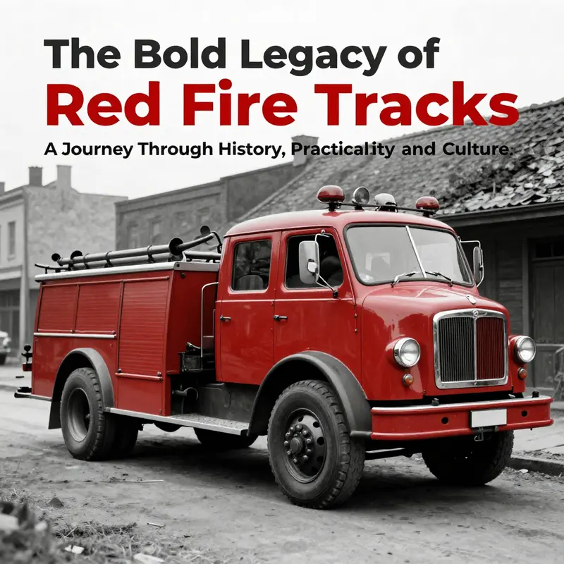
Red on fire engines is not just a color; it is a layered story of practicality, culture, and public trust.
Long before color became a badge of identity, fire apparatus were painted to reflect local norms and the needs of urban infrastructure. In the United States, Cincinnati’s mid-1800s push to professionalize its fire service helped establish red as a distinguishing hue to signal authority and readiness. In crowded, soot-filled streets, red provided a visual shorthand that helped a truck stand out as it approached a blaze. As other departments observed and imitated this choice, a broader national expectation formed that emergency vehicles should be distinct, strong, and recognizable.
Durability, cost, and ease of production also mattered. In the early 20th century, red offered a practical balance: it held up under harsh service, could be produced at scale, and was straightforward to touch up across fleets as departments expanded or upgraded from horse-drawn to motorized apparatus. Thus red became a reliable default, a common thread linking diverse municipalities.
Beyond fabrication and finance, color carried social and symbolic weight. Firefighting has long been wrapped in narratives of danger, sacrifice, and guardianship. Painting a truck red reinforced values of vigilance, reliability, and courage, and helped the public quickly recognize and trust responders. The color became a branding signal, a public ritual in which residents associated red with protection and swift action.
Red also served a practical role in the early era of volunteer brigades, offering an easy way to distinguish crews and assign responsibility. As cities and towns adopted similar practices, red spread as a shared color logic—one that communities could rely on as a sign of readiness and a visible commitment to safety.
Even as visibility science has evolved, red endures because it lives in the public imagination as the emblem of emergency response. Modern research notes that lime-yellow wavelengths can be detected faster in many conditions, but tradition, media representations, and the psychology of branding keep red in the foreground. The result is a color that is both historically rooted and culturally resonant, signaling urgency and protection across time.
Looking forward, fleets may explore innovations that balance symbolism with enhanced conspicuity—dynamic lighting, color-shifting coatings, or enhanced reflective features—yet red remains a cornerstone of identity for many departments. It is a living tradition that evolves with materials science, technology, and public expectations, not a static relic.
External resource: https://www.asse.org/standards-and-resources/emergency-vehicle-visibility-research/
Color, Courage, and Contrast: The Practical Implications Behind Why a Fire Truck is Red
Color is never merely a cosmetic choice in public safety. It functions as a first, tangible form of communication between a fire department and the communities it serves. In this sense, the color red on a fire apparatus operates on multiple levels at once: it signals urgency, it anchors a brand of readiness, and it carses a shared cultural memory that stretches back to the early days of motorized firefighting. The practical implications of choosing red, then, are not simply about how a vehicle looks in a showroom or on a street corner. They ripple through procurement decisions, day-to-day operations, cross-jurisdiction collaboration, and the subtle psychology of how people respond to danger. The story of why fire trucks are red is best understood as the synthesis of historical contingency, evolving safety science, and a deeply rooted public identity that persists even as newer evidence about visibility challenges convention. It is a narrative that invites us to look beyond color as a surface feature and to see color as a living component of a broader system dedicated to protecting life and property.
To begin with, the historical roots of red as the color of fire apparatus are not purely about the science of visibility, though that science is a recurring theme in any discussion about color. In the early 20th century, when fire departments worldwide were transitioning from horse-drawn to motorized apparatus, paint was a practical constraint as much as a stylistic one. Red was among the most durable and affordable colors available for metal bodies, standing up to the harsh realities of the urban environment with muck, soot, and the constant touch of engine heat. It was a pragmatic decision rooted in material reality: a color that could be mass-produced, that could be touched up without delicate shade matching, and that would endure the wear and tear of a city’s street life. This utilitarian rationality did not vanish as technology advanced. Instead, it embedded a tradition that would become a public symbol: red as the color of emergency response.
As these early trucks crisscrossed cities and towns, departments began to notice something else: red’s visual punch in crowded urban canyons. The brick, stone, and soot-streaked facades of older cities created a background that made a red vehicle pop. In a landscape of gray and black, red offered a high-contrast silhouette against everyday urban textures. That visual distinctiveness helped bystanders and motorists alike recognize the presence of an emergency unit and yield the right of way. The public’s attention was a crucial, unspoken currency. In practice, this meant faster clearance, quicker deployment, and a tighter feedback loop between the street and the firehouse: drivers learned to expect red, the public learned to respond to red, and a cultural habit formed around an unmistakable color code for crisis.
But the practicalities of color extend beyond mere visibility in a static sense. A key implication lies in the maintenance and logistics of a fleet. Red paint, at the time and for many decades thereafter, proved to be relatively forgiving for large fleets that faced repetitive repaint cycles and frequent scrapes from urban driving. In a fleet where efficiency is essential, choosing a color that minimizes maintenance headaches—color that hides minor dings and stands up to repeated washing—was not trivial. In many departments, this practical arithmetic reinforced red as a durable standard. The color thus came to symbolize reliability in a more tactile sense: you could count on a red fire truck to be ready after a quick repair, a quick wash, or a routine repaint. These operational conveniences reinforced the psychological and branding effects of red, creating a robust, self-reinforcing tradition that would be difficult to unwind later.
As time wore on, however, a different layer of consideration began to enter the conversation: human perception. The modern literature on color and visibility indicates that lime-yellow or fluorescent yellow-green vehicles tend to be detected more quickly than red in a variety of conditions, particularly in fog, rain, or dim light. Studies cited by safety professionals illustrate that these high-visibility yellows can improve detection rates by as much as about 30 percent in challenging conditions. The science here is not a rebellion against tradition so much as a recognition that perceptual physics matter. The sun has a maximum of color sensitivity, and in many natural and urban environments, lighting reduces the salience of red when it matters most: at dawn or dusk, or at the margins where a crew is integrating with traffic at the edge of the roadway. From this perspective, the color red is efficient symbolic branding but not the most efficient color for the instantaneous recognition that modern safety demands.
Yet the persistence of red is not merely stubborn nostalgia. The public’s association of red with danger and urgency has taken on the weight of cultural memory. People recognize a red fire truck not just as a vehicle, but as a signal of help, competence, and imminent action. This psychological branding—red as a beacon of emergency—builds trust. A long-standing color message reduces ambiguity; it creates a predictable, easily understood cue for residents, visitors, and workers in a city. In emergency communication theory, such predictability is invaluable. It means that in a critical moment, people do not have to interpret the color under extreme stress; they respond automatically to a familiar symbol. This automaticity is particularly meaningful in communities where emergency response is a shared social experience, where the color of a fire vehicle becomes part of the town’s visual folklore.
The interplay of tradition and science thus creates a delicate balance. On one hand, there is a robust case for experimenting with higher-visibility schemes. Departments across the world have begun to adopt lime-yellow or yellow-green as the dominant tone, sometimes retaining red accents or chevrons to maintain brand continuity while improving visibility. This fusion approach—high-visibility base color with red accents—illustrates a pragmatic compromise. It preserves the public’s recognition of emergency response while addressing the perceptual realities of modern driving and weather conditions. It also reveals a broader trend in public safety: color is not a static badge but a design element that can evolve in response to evidence and technology. The adoption of two-tone or multi-tone schemes allows fleet managers to maintain a traditional identity while incorporating contemporary safety best practices, such as reflective striping and high-contrast markings that boost nighttime visibility.
The procurement and policy implications of color choices cannot be ignored. Changing a fleet’s color scheme is not a cosmetic decision; it is a strategic investment that touches training, dispatch protocols, vehicle graphics, and public outreach. Any shift toward higher visibility requires careful coordination across departments, city budgets, and media outreach. The logistics of repainting or ordering new units involve not only paint costs but the costs of rebranding, updating decals, and retraining personnel to maintain consistent sightlines and expectations. Communities that make this change must consider the inertia of public perception: even when data suggests improved visibility, the public may continue to associate red with urgency simply because it has been the accepted standard for generations. This is where the public-facing dimension of color decisions becomes essential. A department must communicate clearly why a change is happening, what safety benefits are anticipated, and how the new color coordination aligns with other life-saving measures, such as reflective gear, lighting, and signage in the apparatus fleet.
There is also a broader social dimension to consider: color as a shared language across jurisdictions. Fire protection is often a transitive system—mutual aid agreements, cross-border drills, and regional dispatching networks require a common visual logic to avoid confusion in high-pressure moments. When every neighboring department uses a similar red hue, the public and responders instinctively read the scene with a common frame of reference. However, as more departments diverge toward high-visibility schemes, there is a potential for fragmentation. The public could encounter a patchwork of color codes that require extra attention, and mutual aid operations may need more explicit idiosyncratic cues to prevent misinterpretation, especially for out-of-towners. The tension between local tradition and regional harmony thus becomes a practical concern in how color choices are implemented at scale. It requires thoughtful standardization while preserving the flexibility to adapt to local climates, road conditions, and urban typologies.
In practice, many fire departments now adopt color strategies that respect the historical identity while embracing modern safety design. One common approach is to keep the red as a dominant, recognizable element—preserving the emotional and cultural resonance that the public associates with emergency response—while layering in high-visibility components. These may include lime-yellow or yellow-green base colors on newer vehicles, high-contrast grosgrain or reflective chevrons on the rear, and brighter lighting arrays. The result is a fleet whose appearance signals both tradition and a renewed commitment to safety science. This hybrid strategy is not a surrender to modern color theory but a deliberate, evidence-informed evolution that honors the past even as it builds toward a safer present. In communities where aging fleets are continually updated, the timing of color transitions can be planned to minimize disruption. Training programs can emphasize the contrast cues that accompany the new color schemes, ensuring that personnel and the public alike learn to read the new fleet with the same immediacy that red once conveyed.
The public’s trust, after all, is earned not by a single dramatic act but by consistency over time. Color is one of the most visible forms of that consistency. When a family watches a fire truck arrive at a home, the color helps anchor the sensory experience to memory. The certainty of a familiar hue provides a kind of emotional shorthand for safety: a signal that the people arriving are prepared, professional, and capable of managing danger. Yet the science of visibility reminds us that this trust must be earned anew with every generation of vehicles. If a department keeps red and harmonizes its other design elements with high-visibility considerations, it can maintain its branding while embracing a safety-first posture. Public education campaigns can reinforce the idea that high-visibility colors are about protecting both responders and residents, rather than about erasing tradition. The broader message is to value safety without sacrificing identity.
In this sense, the practical implications of why a fire truck is red are not a simple debate over color preferences. They are about balancing the emotional, cultural, and perceptual dimensions of emergency response. It is about understanding that color anchors public perception, informs recognition, and influences behavior under stress. It is about recognizing that visibility science does not neutralize history; it informs it. And it is about acknowledging that modern safety practice can honor a storied tradition while taking concrete steps to improve outcomes for the public and for the brave people who serve in the streets every day. The dialogue between tradition and science is ongoing, and the color of a fire truck remains one of the most tangible expressions of that dialogue in public life.
For readers who want to explore how this conversation evolves in practical terms, the ongoing discourse in the field—ranging from fleet procurement to nightly operations and community outreach—offers a rich lens. A concise entry point into the scientific side of vehicle coloration is available in broader safety literature, which outlines how perceptual systems respond to color in dynamic environments. This is not a nitpick about hue but a recognition that color choice is a design variable that can save lives when paired with the right maintenance, signaling, and training. As departments experiment with new palettes and as cities weigh the tradeoffs between tradition and safety, the question of color becomes a living case study in how public institutions translate evidence into practice while preserving the trust that a community places in its firefighters.
If you’re curious about a digestible exploration of the scientific angle behind the red question, a recent synthesis in a mainstream science and technology outlet offers a compact overview. It highlights how red has endured as an emblem of emergency response even as visibility science points toward more detectable color choices in certain conditions. The piece situates the discussion within the broader context of vehicle visibility and urban design, illustrating how color interacts with lighting, reflectivity, and human perception. This external reading provides a helpful anchor for readers who want to connect historical practice with modern safety research while keeping sight of the human stories behind every color decision. Why fire trucks are red.
In addition to the broader science and history, a practical thread runs through the discussion that touches every fire department’s daily operations. The choice of color is inseparable from the way a crew plans incidents, directs traffic, and communicates with other responders. When streets are crowded, and a siren slice cuts through noise, the color and the light emitted by the vehicle work in concert with sirens, exit lights, and crew movement. The cohesion between a vehicle’s color scheme and its signaling devices is a subtle choreography that reduces cognitive load for drivers, pedestrians, and motorists. This is especially important in high-stress incidents where seconds count and the environment is cluttered with competing signals. A well-designed color strategy therefore contributes to safer, more efficient responses by encoding expectations into the visual field. The result is not simply a matter of aesthetics; it is a practical feature of emergency readiness that survives changes in equipment and standards, and it remains a live conversation as new materials, coatings, and reflective technologies emerge.
The conversation about color will undoubtedly continue to evolve as new materials allow for brighter, longer-lasting finishes and as global urban design emphasizes shared spaces and multi-modal traffic. Yet the core insight remains persuasive: color choices embody a balance of history, perception, and practicality. They reflect a community’s values about readiness, protection, and service. In the end, red stands not only for a tradition of courage and response but for a concrete decision to coordinate visibility, reliability, and trust in a complex urban ecosystem. The practical implications of that decision show up in the fleet’s durability, the public’s recognition, the ease of cross-jurisdiction cooperation, and the ongoing commitment to safety that extends beyond the paint on a truck to every person who climbs into the cab, flips the switches, and drives toward danger with purpose.
To connect these ideas to the broader landscape of fire service communications and technology, consider how color integrates with training, equipment layout, and incident command. A department’s color strategy can influence how crews approach a scene, how they position vehicles for optimal coverage and safety, and how they convey urgency to bystanders who may not be in motion but who must decide how to move in response to an emergency. The color thus becomes a practical instrument in a larger toolkit designed to reduce risk, accelerate response, and maintain public confidence. It is a reminder that even seemingly simple choices—like the color of a vehicle—can cascade into complex practical effects that span hours of a shift, days of a week, and years of a department’s service to its community.
Ultimately, the story of why fire trucks are red is a reminder that tradition and progress are not opposing forces but complementary ones. The color system is a living artifact that encodes memory and identity while accommodating new insights about visibility and safety. The challenge for any department is to honor the past while embracing the future—maintaining a recognizable, trusted image for the public, and at the same time pursuing improvements that protect responders and the people they protect. In practice, this means thoughtful color policy integrated with reflectivity, labeling, and lighting; it means ongoing education for the community about what color designations mean; and it means a willingness to adapt when evidence and technology point toward safer, more effective solutions. The color red, in this sense, becomes a starting point for a broader discussion about how public safety communicates risk, reassures the public, and remains accountable to the communities it serves.
For those who want to investigate further how color choices intersect with evidence-based safety practices and design principles in emergency vehicles, the linked external resource provides a concise snapshot of the science behind public perception and color psychology in real-world contexts. It complements the historical and practical perspectives offered here and serves as a bridge to a deeper exploration of how color, design, and policy together shape the safety landscape in modern firefighting. Why fire trucks are red.
Crimson Calls: How the Color Red Shaped Firefighting’s Culture and Identity
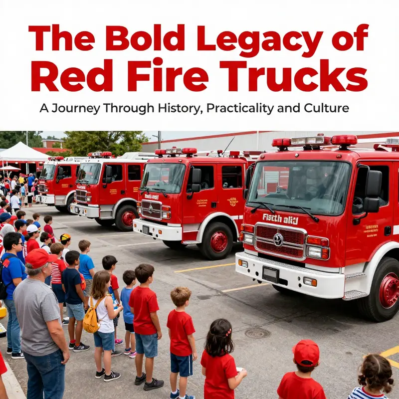
Color often carries more heft than utility, and nowhere is this more apparent than in the enduring image of a fire truck. In the public imagination, the red backbone of emergency service traffic is less a mere aesthetic choice than a cultural statement about readiness, community, and the shared nerve that binds a town to its firefighters. The color red, on the surface a simple pigment, has for more than a century become a signifier of alarm and action. It marks the moment when a siren might erupt, when a door might swing open to reveal a team rushing toward danger, and when neighbors pause to witness the spectacle of service in motion. To understand why a fire truck is red is to trace a tug-of-war between history and symbolism, between the practical needs of early mechanized fleets and the social psychology of collective duty. The chapter seeks to weave together those strands into a single, continuous arc—one that demonstrates how a practical painting choice grew into a cultural canon that still feels inevitable today.
The historical roots of the red fire engine lie in a period when cities were expanding, and municipal budgets were tight, but the stakes of public safety were high. In the early twentieth century, as fire departments transitioned from horse-drawn apparatus to motorized fleets, departments faced a palette of color options for metal vehicles. Red happened to be among the more durable and affordable choices. It could stand up to the grime of urban environments and weather the harsh realities of paint technology at the time better than some lighter hues that faded quickly or peeled in the damp, soot-filled air. Yet color is never only about weather and wear; it is a language. Red spoke in a loud, unequivocal voice. It said: this vehicle is part of the emergency fabric of the city, ready to intervene. The choice also intersected with a broader cultural moment shaped by industrial mass production. The automotive world was learning to present a distinctive silhouette in a crowd of metal forms, and red offered a dramatic contrast against the brick and stone of municipal architecture, especially in the sooty air that followed industrial nights. In this sense, red served as both a practical signal—visible from a distance—and a visual shorthand for authority and purpose.
Within this historical frame, a famous anecdote about color choices in the broader era begins to resonate. The notion that Henry Ford’s Model T would be available only in black, a dictum about efficiency and consistency, created a sort of countercurrent that highlighted color as a badge of difference. Fire departments, encountering a world of standardized production and tightening budgets, found red to be a way to stand out amid the monotone urban fabric of the time. It was a tactical choice with strategic payoff: if every vehicle was a shade of gray or black, a red fire truck would pop out, drawing attention, commanding the street, and signaling urgency with almost literal immediacy. The symbolism of red as a herald of action thus anchored itself in the everyday life of the city. It was not merely about catching the eye; it was about declaring that the space near a blaze was a space under institutional protection, that the community had deployed its most visible, most trusted resource to respond when danger arrived.
Practical considerations, too, helped cement red as a standard, and those considerations extend beyond color science into the social fabric of fire service. Paint chemistry in the early decades offered red as an affordable, durable option that could be applied to steel bodies without prohibitive cost. Departments, often wrestling with limited budgets, found red to be a sensible compromise between longevity and expense. It endured because it could resist the harsh elements of urban life and the wear of regular maintenance, a factor not to be dismissed when the life of a vehicle depends on dependable visibility and survivability. In addition, red became a unifying symbol across both volunteer and professional ranks. In many municipalities, volunteer fire companies competed for resources and prestige, and painting equipment in a striking color became part of an identity project—an outward sign that they were ready, willing, and able to respond at a moment’s notice. As neighboring towns observed this practice, the color gained momentum as a regional norm, eventually becoming the de facto standard across broad swathes of the country. What started as a practical response to material constraints and urban visibility grew into a shared tradition that helped knit together a disparate field of services under a common visual banner.
The cultural significance of red on fire trucks extends beyond visibility or cost. It has become a symbol that carries affective weight, a color that conjures memory and expectation in equal measure. Red evokes urgency in performance, but it also evokes trust. People learn early on that a red apparatus is a harbinger of assistance, a signal that the danger at hand will be confronted by trained professionals who know what they are doing. This cultural association thrives in the spaces where people watch fire crews in action—parades, open houses, retirement ceremonies, and moments of collective reflection after an emergency. In those spaces, red becomes a thread through community life, tying generations of residents to their local fire service. The color thus functions as a social technology: it encodes readiness, solidarity, and shared ritual into a single, memorable image that can be recognized instantly, often from a distance and under stress. Even as individuals grow older and new norms emerge, the red fire truck remains a cognitive shorthand—an anchor in a landscape where faces change but the color endures.
This enduring symbolism has a remarkable resilience, even as modern science paints a more nuanced picture of visibility. Contemporary human factors research suggests that lime-yellow, or fluorescent yellow-green, can offer faster detection in both daylight and low-light conditions, particularly in adverse weather. The practical argument is compelling: a vehicle painted in a highly visible hue can be detected more quickly, reducing reaction times and enhancing safety for both responders and the public. Yet the cultural gravity of red persists with almost stubborn force. Why? Because color is not only a signal to identify a vehicle; it is a signal of dependability, of a brand people can trust. Red has become a cultural badge, a signifier of professional identity that stretches beyond the confines of any single firehouse. It has become part of the visual language of emergency response, a language that speaks to bravery, sacrifice, and selflessness. The public knows what red means in this context; even when a different hue might technically offer a measurable improvement in visibility, the symbolic weight of red—built over generations—often outweighs the numerical advantage. This is not to deny the science but to acknowledge the social power of tradition. In many communities, the decision to maintain red is a deliberate, even ceremonial, choice: an affirmative stance that heritage matters as much as efficiency.
There is also a social psychology dimension to the color story. Red, with its associations of heat, danger, and action, seems to command attention in a way that is both primal and immediate. It is a color that triggers a certain level of arousal in observers, sharpening attention at the moment when a community most needs to respond. The front lines of emergency work—where the unknown unfolds and risk is constant—benefit from a color signal that is unambiguous, easily interpretable, and deeply perceived. The emotional resonance of red helps to anchor the public’s perception of the fire service as vigilant guardians, a perception that in turn engenders cooperation, trust, and willingness to comply with directions during crises. This is not only a matter of aesthetics; it is a form of social contract. The community agrees to give space, priority, and deference to those who move toward danger, and the red color becomes a visible codification of that agreement. In this sense, color is a governance tool as much as a design choice.
The cultural persistence of red also reveals a story about how communities imagine danger and the people who respond to it. The fire truck, as an institution, embodies both the immediacy of emergency and the long arc of public service. The color helps contain that duality by presenting a single, recognizable form that can be recalled in a hospital corridor, on a quiet street, or at a chaotic scene. It acts as a mnemonic cue that triggers recognition of rescue, aid, and protection. This is not to romanticize the challenges fire crews face but to illustrate how symbolic design can soften, or at least modulate, the emotional load of crisis for bystanders. A bright red vehicle rolling toward a blaze can calm nerves through familiarity even as it intensifies the perception of competence. It is a paradox, but it is one that helps explain why red endures in the public eye despite ongoing debates about visibility science.
The cultural conversation about color in firefighting also invites us to consider the role of tradition across time and geography. While the focus here has been predominantly the United States, the broader world offers variations in color conventions that reflect local histories, climates, and urban landscapes. Some regions emphasize different hues for their emergency fleets, often balancing visibility with cultural meaning or municipal identity. Yet even with such variations, the central idea remains: color is a medium through which communities project trust, order, and readiness. The red fire truck embodies a historical moment when technology began to unify disparate towns under a shared practice, and over time that practice became a public ritual. A color can become a tradition not because it is perfect in every measurable way but because it carries the weight of collective memory. When new recruits pledge their service, they often do so with an eye on the color that has preceded them—an inherited banner of responsibility that invites them to participate in something larger than themselves.
This is not to claim that the science of color is irrelevant or that modern departments should ignore evidence about visibility. It is an invitation to recognize that color choices operate on multiple planes at once: practical, symbolic, and social. The decision to stay with red is an acknowledgment that public perception matters—a recognition that, in urgent moments, people rely on a vehicle that is instantly familiar and emotionally legible. The rhetorical power of red helps to maintain a sense of continuity across generations of firefighters and citizens alike. It provides a shared vocabulary that transcends language, age, and background. When a city witnesses the same red silhouette crossing a street after decades of service, there is a sense of ongoing fidelity to a common purpose. The color, in that sense, becomes a moral marker as well as a mechanical choice.
As we reflect on why a fire truck is red, it is helpful to imagine the chapter as an unbroken conversation among material culture, public sentiment, and professional identity. The color does not merely decorate the vehicle; it narrates a story about how communities organize risk, value service, and honor those who stand between danger and home. The narrative is not static. It evolves with changes in paint technology, urban design, and social memory, yet it also resists such changes because the red hue has become part of the public psyche’s shorthand for protection and care. In this sense, color is less about what is seen and more about what is felt—the confidence that, when the call comes, a red engine will respond with speed, coordination, and courage. The enduring appeal of red, despite more scientifically optimized alternatives, speaks to the depth of cultural conditioning and the human craving for symbols that unify a community under pressure.
In the end, the color of a fire truck is a case study in how material decisions become social acts. The paint on a vehicle is a surface, but the meanings attached to it travel far beyond its thin layer of pigment. Red has become a procedural shorthand for readiness; it signals a shared standard that teams internalize and the public anticipates. It signals a city’s willingness to allocate resources and a department’s commitment to protective service. It signals bravery, yes, but also the quiet daily acts of maintenance, training, and mutual aid that allow a community to function under duress. The color helps to frame the public narrative of emergency response, shaping how people understand, remember, and engage with the risks that come with urban life. It is a testament to the power of design to encode values, to influence behavior, and to anchor communities in times of crisis.
As we move forward through the larger arc of this article, the story of red invites us to consider how other colors in public service landscapes might perform similarly as cultural signs. It also invites reflection on the delicate balance between tradition and improvement. The conversation about color in emergency services is not merely about optics; it is about what a city trusts when the clock ticks and a siren begins. It is about the shared vow to respond, to protect, and to stand in the open with neighbors who depend on those who answer the call. The red fire truck, in this light, is less a vehicle and more a ritual object—an embodiment of a community’s long memory of courage under pressure and its ongoing commitment to reenter danger to restore safety. For readers who want to link this cultural perspective with practical considerations in modern fleets, the narrative continues into the next sections, where design choices and policy considerations begin to intersect with evolving standards while still honoring the enduring symbolism of red. Thank you for following the thread of this long-standing tradition, a thread that helps explain not only why a fire truck is red, but why it remains red in the memory and imagination of communities across time. Thanking First Responders.
External resource for further reading: https://www.scientificamerican.com/article/why-are-firetrucks-red/
Final thoughts
In conclusion, the enduring choice of red for fire trucks is a captivating blend of history, practicality, and cultural symbolism. From its roots in the early 1900s as a visible and affordable color to its role in embodying bravery and readiness in our communities, red remains the emblem of courage and emergency response. Understanding this rich narrative enriches our appreciation for these vital vehicles, ensuring that as they race through our streets, they continue to symbolize more than just fire emergencies—they represent our collective safety and courage. Let’s celebrate this iconic color that has stood the test of time and continues to evoke a sense of urgency and community pride.