
The vibrant shift from traditional red to yellow fire trucks is not merely a trend driven by aesthetics; it’s a decision rooted in science and safety. While red has long been synonymous with urgency and alertness, research surrounding visibility reveals the superior advantages of lime-yellow and fluorescent greenish-yellow. This article will explore the scientific principles that enhance the visibility of these trucks, the historical context behind their adoption, and the significant implications for safety and response times. If you are a fire truck enthusiast, a young aspiring firefighter, or a professional in the emergency services field, this exploration into the colorful evolution of fire apparatus will enhance your understanding of the importance behind these bold new hues.
Seeing Safer in the Hue of Action: How Lime-Yellow Fire Trucks Translate Vision Science into Faster, Safer Responses

Color has always carried meaning in high-stakes work. Red signals urgency; amber signals caution; blue signals command. But color is not merely symbolic in the fire service. It is a tool that interacts with human perception, terrain, weather, and the fast, split-second decisions that define an emergency response. The choice to paint fire apparatus yellow, especially lime-yellow or fluorescent greenish-yellow, rests on a careful weighing of science against tradition. It is a decision rooted not in nostalgia but in an emerging body of evidence about how the human eye detects motion, contrast, and danger in challenging conditions. In the end, yellow becomes a practical design feature that, when combined with lights, markings, and trained habits, helps protect both the public and the responders who rush toward danger. This chapter traces the trajectory of that idea, from a specific departmental experiment in the 1980s to a broader understanding of human perception, and finally to the everyday implications for safety, policy, and the lived experience of those who serve.
The story begins with a problem that looks almost paradoxical from a distance: even when a vehicle is moving at high speed with its sirens and lights on, other drivers and pedestrians do not always react quickly enough. In the weather conditions most departments encounter—fog, rain, spray, glare from sunlight, or the white glare of urban lighting reflected off wet pavement—red can lose its edge. Red remains highly visible under bright daylight; it can stand out against green trees or blue skies. Yet in low-contrast environments, red’s effectiveness diminishes as peripheral vision narrows focus and the eye sifts through a noisy visual field. In Honolulu during the 1980s, a city that faces frequent squalls, sea mist, and intense sunshine reflecting off water, officials began to notice a troubling pattern: collisions and injuries during rapid responses were not rare events, but recurring risks. The Honolulu Fire Department undertook a data-driven investigation, looking not just at accident reports but at what drivers and pedestrians experienced as an emergency vehicle moved toward them. They paired local collision data with international practices, noting that some regions had already adopted yellow or lime-yellow vehicles as a standard safety measure. Their conclusion followed the logic of perceptual psychology: if a color is more easily detected, it is more likely to trigger a timely response, and that faster recognition can translate into fewer accidents and safer operations overall. The shift was gradual, cautious, and grounded in measurable outcomes rather than myth or prestige.
The transition toward yellow was never a rejection of red as a color that communicates danger or urgency. Red remains deeply embedded in the public imagination as a marker of emergency and authority. But perception science began to show a more nuanced picture. The eye does not perceive colors in a vacuum; it processes brightness, contrast, motion, and context. A bright lime-yellow hue sits at a different point on the human visual spectrum, a point where the eye’s sensitivity peaks. The wavelengths associated with yellow-green fall roughly in the 510 to 570 nanometer range, a band where the retina is especially responsive. When a vehicle carries color from this spectrum, it benefits from the eye’s natural proclivity to pick up motion and shape against a wide array of backgrounds. It is not merely color in isolation; it is color that interacts with luminance, glare, and the complex mosaic of urban and rural landscapes where emergency vehicles operate.
A body of studies, including widely cited work summarized by ScienceDaily and connected to research coming out of major universities, highlights this heightened detectability. In practical terms, lime-yellow and yellow-green vehicles tend to be seen earlier and more reliably than red ones under adverse conditions. In fog, rain, or mist, the color is reported to carve a more distinct presence in peripheral vision—the part of the eye most quickly engaged when a driver glances to the side or when a pedestrian scans the road while a siren blares in the distance. The science is not about triggering a particular emotion; it is about creating a more legible signal in a field of competing sensory inputs. High luminance compounds this effect. Bright yellows reflect more light, maintaining visibility even when other cues—shadows, reflections, and moving traffic—compete for attention. The result, repeatedly observed across different weather patterns and times of day, is a measurable improvement in reaction time and situational awareness.
Within this framework, color becomes part of a broader design philosophy aimed at safety. Yellow is not a standalone cure for risk; it functions in concert with reflective materials, conspicuous lighting, and clear, high-contrast markings that help people understand what they are seeing and what they should do. For example, emergency vehicles in yellow schools of design often pair the color with reflective striping and illuminated chevrons or other high-contrast identifiers that catch the eye even as ambient light shifts. This multi-layered approach—color first, then light, then shape—aligns with how the human perceptual system organizes information in urgent moments. The science explains why the initial color cue matters and why it makes a practical difference when seconds count.
Color is also inseparable from the broader cultural shift toward safety-oriented design. Even as departments across continents have experimented with yellow tones, the public’s recognition of an emergency vehicle still hinges on multiple cues: flashing lights, sirens, and typography that is legible at speed. The color is a first cue that primes drivers and pedestrians to pause and yield, but it does not replace the need for disciplined driving, well-lit scenes, and predictable positioning of apparatus. The yellow hue, therefore, becomes a first line of defense, a head start that improves the odds of a safe maneuver. Then, as responders approach, the interplay of bright headlights, high-contrast markings, and reflective elements confirms the vehicle’s identity and intent. In this sense, yellow is a force multiplier—auguring a quicker, safer lane to safety for everyone involved in the incident.
This perspective also resonates with other high-visibility design choices in public safety and transportation. School buses, long recognized in many countries for their attention-grabbing color, employ yellow for similar perceptual reasons. The logic extends beyond a single profession; it taps into a shared human response to color in complex environments. The same principle guides how cities design pedestrian crossing signals, how airport tarmacs contrast signage against the horizon, and how road crews mark cones and barriers in nighttime conditions. In fire service discourse, this transfer of knowledge matters. It creates a cross-pollination between disciplines and encourages departments to evaluate color not as a mere cosmetic preference but as a measurable factor in safety and efficiency.
The idea, then, is not to erase tradition but to enrich it with a science-based rationale. The public understands that yellow signals are connected to safety, not merely to novelty. The discipline of defense-in-depth—where color is one component among lights, reflectivity, and spatial orientation—helps mitigate the risk of misinterpretation or delayed reaction. Even when a department continues to honor historical associations with red, the incremental adoption of yellow vehicles across regions signals a shared commitment to reducing preventable injuries and fatalities during emergencies. This is not a wholesale shift away from a beloved symbol; it is an adaptive practice rooted in neuroscience and practical field experience.
From the standpoint of the responders, the color choice can influence risk exposure in subtle but meaningful ways. A yellow vehicle that pops against a variety of backgrounds can reduce the likelihood that a pedestrian or motorist fails to notice it when visibility is compromised. In the dynamic process of responding to a call, crews must account for the critical time window between detection and action. The longer it takes for bystanders to recognize and yield, the more potential hazards accumulate on scene, including moving traffic, obstructed pathways, and limited maneuver space. A color that supports faster detection translates into earlier deceleration, safer clearance spaces, and more controlled introductions of extinguishing or rescue operations. In turn, this supports the mental readiness and physical safety of the crew as they find their lines of retreat, deploy equipment, and work to bring the incident to a safe conclusion. The smaller the time gap between recognition and action, the more the mission can stay within safe margins rather than sliding into chaos.
As with any safety measure, practical implementation matters. Yellow is most effective when deployed alongside consistent lighting strategies and reflective markings. The hue must be calibrated for the local environment: urban canyons, coastal fog, inland deserts, or mountain shadows all shape how color is perceived at distance. Departments that have studied the science typically emphasize standardized color codes, precise manufacturing tolerances, and periodic recalibration of lighting systems to maintain visibility. In the field, this translates into a vehicle that not only looks different, but remains reliably detectable in conditions where other cues are distorted or hidden. The reliability of the signal—the certainty that a yellow fire apparatus will be noticed—depends on consistent application, quality materials, and ongoing training for both responders and the public they serve.
Readers who want to explore broader conversations about color, perception, and safety can turn to the Firetruck blog for discussions that weave practical field experience with perceptual science. Firetruck blog offers a space where researchers, manufacturers, and frontline crews reflect on how color choices intersect with training and everyday operations. The conversations are not about fashion; they are about evidence-based decisions that can improve outcomes in real emergencies. This kind of cross-disciplinary dialogue—between neuroscience, human factors engineering, and on-the-ground firefighting—helps ensure that design choices remain anchored to what saves lives on the worst days. The topic is not abstract; it is a living, evolving practice that keeps pace with new findings and the need to protect both civilians and responders.
The broader implications extend beyond the fire service. In the crowded ecosystems of cities and rural routes alike, color cues carry meaning in milliseconds. The shift toward yellow reflects a learning process: the acceptance that perception science can guide improvements in everyday public safety. It is worth noting that color alone will not erase all risk. It is part of a layered safety approach that includes driver training, synchronized signaling, maintained infrastructure, and clear procedural protocols for scene management. Yet when the color cue works as intended—standing out in fog, glare, rain, or low light—it creates a calmer, more predictable environment for those working to control a crisis. In a field where every second matters, even small gains in visibility can accumulate into meaningful reductions in exposure to harm.
In sum, the choice to adopt lime-yellow or yellow-green hues for emergency vehicles represents an application of neuroscience to public safety. It is a practical response to how human vision operates under stress, not a repudiation of tradition. It recognizes that the human eye is most sensitive to certain wavelengths of light and uses that insight to design safer, more reliable responses. The science behind yellow vehicles—supported by decades of field data and laboratory studies—has begun to influence policy, procurement, and training across regions. The aim is not to produce a perfect signal in every circumstance but to tilt the odds toward safer, faster, and more efficient emergency operations. As departments continue to refine their color palettes, the underlying principle remains clear: visibility is a life-saving tool, and the hues we choose matter precisely because they shape what people notice, how quickly they react, and how safely responders can do their work under pressure.
For those curious about the empirical foundations behind these ideas, the linked external resource offers a deeper dive into the physiological basis of color perception and its real-world implications for safety-critical design. External reference: https://www.sciencedaily.com/releases/2016/08/160824131915.htm
Lime-Visibility Shift: How Yellow Fire Trucks Became the Safer Standard
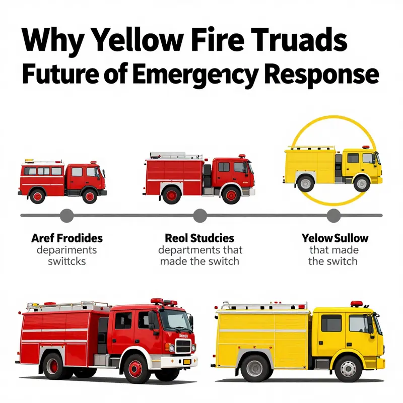
Color is rarely the main headline in emergency response, yet it is a quiet, relentless tool shaped by science and the tests of weather, traffic, and time. In the arc of fire-service design, red wore the default as a legacy of tradition, cost considerations, and early automotive aesthetics, standing out against urban streets and signaling urgency. Yet as fleets modernized and human factors research accumulated, color began to be treated as a variable in a safety equation. The lime-yellow shift did not arrive as a fad but as a reasoned answer to how well a color can be detected when every fraction of a second matters and conditions contend with visibility. The practical question became: how can responders be seen, understood, and trusted before a siren blares? The story of color, therefore, is a story of how the human eye, the traffic ecosystem, and the physics of light intersect in the heat of an emergency.
In the mid-to-late 20th century, the fire service began evaluating color through human performance. Observations from places like Honolulu highlighted how weather, sea spray, glare, and sun on pavement interact with vehicle visibility. Data on driver reaction times and pedestrian recognition accumulated, turning anecdote into evidence. The question evolved into whether a lime-yellow palette would be detected earlier across lighting and weather conditions, thereby reducing collision risk and response latency. The answer pointed toward lime-yellow for its relative perceptual advantage, while red retained its symbolic value. The shift thus represents a risk-management decision as much as a stylistic one.
The science behind lime-yellow rests on peak sensitivity in the yellow-green spectrum. In daylight and at dawn, lime-yellow tends to pop against asphalt, foliage, and gray skies, with strong in peripheral vision where hazards are noticed without direct focus. This perceptual edge translates into faster recognition by drivers, quicker crossing decisions by pedestrians, and earlier alerting of responders. Dr. John L. Smith, a human-factors specialist, has summarized that lime-yellow is among the most visible colors across diverse lighting, supporting peripheral detection when attention is divided. The evidence, while not erasing tradition, supports yellow as a safety feature under challenging weather and lighting.
Cities like Honolulu documented operational changes by layering visibility with reflective materials, lighting, and standardized signaling. The shift did not occur in isolation but alongside other safety enhancements, culminating in a broader safety ethos: color, lighting, and signaling are variables that can be tuned to maximize safety. Across North America, Europe, and beyond, the trend toward yellow reflects a practical, data-driven approach to protecting communities and responders while maintaining tradition. Critics ask about durability and branding, but most departments frame the choice as an investment in safety and consistency. The continuing story will incorporate advances in materials science, lighting technology, and data analytics to monitor visibility in dynamic environments. The core idea remains simple: when people see danger sooner, they act sooner, saving lives. The lime-yellow choice is a deliberate step in that life-saving chain, not a flashy trend, and it represents a growing alignment between perceptual science and emergency practice.
Seeing in the Spotlight: How Lime-Yellow Fire Trucks Elevate Safety and Speed
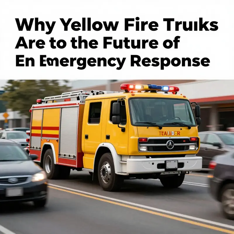
The question of color for emergency vehicles has shifted from a symbolic embrace of tradition to a calculation rooted in visibility, perception, and lifesaving speed. Yellow, particularly a bright lime-yellow often described in standards as a medium yellow, has become a central case study in modern safety design. This is not a whim driven by preference alone; it is the result of decades of human factors research, field observations, and standardized practices that converge on a single conclusion: color matters when seconds count and the public’s attention is pulled in many directions. Fire departments first adopted red out of cultural signals of urgency and authority, yet science began to tilt the compass toward yellow as a color that the human eye detects more readily under a broad range of conditions. The current momentum toward lime-yellow is a quiet revolution in how we think about emergency response, a shift that occurs not in laboratories alone but in the crowded, noisy, and fast-moving lanes of real streets where a truck must be seen, recognized, and allowed to proceed without delay.
Visibility is the core of the argument. The medium yellow hue used on emergency rescue vehicles is chosen because it leverages the eye’s peak sensitivity to light within the yellow-green spectrum. At the level of perception, the human visual system is tuned to respond more quickly to wavelengths around 555 nanometers, a sweet spot that makes yellow-green objects stand out with exceptional luminance. In daylight, this means a yellow fire apparatus can appear to glisten against a backdrop of green trees, gray roads, and the blues and whites of the sky in a way that is harder for drivers and pedestrians to miss. The advantage grows as lighting conditions deteriorate. Dusk and dawn, fog and drizzle, or rain-slicked pavements can sap contrast for many colors, while yellow maintains a stubborn clarity. The consequence is not merely a theoretical benefit but a practical one: earlier detection and faster, safer clearing of lanes for emergency responders. The difference between spotting a vehicle at a distance versus not seeing it until the last moment translates into fewer sudden stops, fewer near-misses, and more predictable behavior from other drivers who have learned to recognize yellow as a signal to yield.
In the real-world testing that informs policy, the Honolulu Fire Department’s early insight during the 1980s stands out as a watershed moment. Facing tough weather—heavy rain, sea mist, glare from sun on water and pavement—their data suggested that a more conspicuous color would reduce the chances of collisions during responses. They looked beyond tradition and drew on international practice from places where yellow emergency vehicles were already common. This kind of cross-border learning underscores a broader point: color choice in emergency services is a form of engineering, not ceremony. It is an attempt to harmonize human perception with vehicle design so that the public’s reactions align with the fastest possible safe passage for responders. Over the ensuing decades, numerous studies have corroborated the core claim: lime-yellow or fluorescent yellow-green fire trucks are more easily detected than red vehicles, particularly at greater distances and in our peripheral vision where many drivers catch glimpses of approaching apparatus without actively looking for them.
The science behind this is anchored in how the eye processes light. The cones in the retina that mediate color vision are most responsive to certain wavelengths, and the yellow-green portion of the spectrum is where visual acuity and luminance sensitivity peak under a wide array of conditions. This is not a narrow advantage limited to bright sun or bare pavement. It extends into the dimmest moments of emergency response, when silhouettes emerge from fog, weather-washed darkness, or transient glare from flashing lights themselves. The practical impact is that yellow rescue vehicles can be detected earlier, allowing those on the road to initiate safe maneuvers sooner. In turn, pedestrians can prepare to move aside, cyclists can reorient, and other motorists can yield with less abruptness. The early signal provided by color becomes an information channel that reduces cognitive load at a high-stakes moment. People see, interpret, and act faster because the color of the vehicle itself is doing part of the signaling work for them.
A further layer to the case for yellow is uniformity. National standards—such as the GB/T color guidelines that codify a specific yellow shade for emergency vehicles—create a shared vocabulary for what the vehicle represents. The standardization of a distinct yellow, a particular luminance level, and the designation of this hue as the standard color helps prevent confusion. When the public encounters a yellow vehicle, there is little doubt about its role, even if they cannot read the lettering on the side. This clarity is essential when seconds matter and multiple responders are converging on a scene. The standard color, combined with standardized side markings and distinctive lighting patterns, operates as a three-layer visual system. The color grabs attention; the side markings reinforce the message of purpose—often with terms like “Engineering Rescue” in a way that is legible from a distance; and the rotating or strobe lights add dynamic cues that align with human expectations during emergency driving. The combined effect is more than additive; it is multiplicative in terms of recognition speed and safe maneuvering by other road users.
To be sure, color is only one piece of a multi-faceted safety architecture. The palette is integrated with shape, signage, reflectivity, and lighting to create a robust signal that holds across daylight, night, and adverse weather. In systemic terms, the yellow color helps optimize the first impression of the vehicle, but it does not replace the need for clear markings, high-contrast lettering, and audible signals that together form a comprehensive communication package. This is why many departments’ adoption of yellow is described as a modern safety upgrade rather than a simple color swap. It reflects a holistic approach to emergency response design where perception, cognition, and behavior are treated as a continuum.
An additional dimension is the different environments in which emergency services operate. In the bustling and varied settings of urban corridors, rural roads, highways, and coastal areas, color must perform reliably. Yellow’s advantages persist across these conditions; it remains conspicuous when sun angles are low, when rain or sea spray reduces visibility, and when the urban landscape features a mosaic of colors and textures. The science supports what many responders experience in the field: a yellow truck enters the frame earlier in a driver’s decision-making process, giving the responder teams a critical margin to execute their approach, set up incident command, and begin life-saving work. The speed of these operations matters, because time saves lives not only for those directly involved in the incident but also for bystanders whose safety depends on prompt and well-coordinated action.
From a standards perspective, the move toward a standardized yellow color for rescue vehicles has become part of a broader push toward uniform identification. GB/T 3181 and related national standards anchor the hue in a shared system that reduces ambiguity. When a yellow vehicle appears, the expectation about its function is reinforced not just by the color itself but by the combination of markings, reflectivity, and warning signals. This uniformity helps the public, pedestrians, and other drivers quickly interpret the vehicle’s intent, which in turn eases the flow of traffic and minimizes the risk of collisions. In practice, this standardization helps a new responder unfamiliar with a particular region still recognize the vehicle instantly and respond accordingly, a point of importance as firefighting fleets become more interconnected across regional borders and mutual-a aid arrangements.
The multi-layered visual strategy does not stop at the paint and the markings. It extends into the lighting design, with rotating lights and high-intensity strobes calibrated to catch attention without overwhelming the driver of the approaching vehicle. The combination of color, markings, and lights is designed so that, even in peripheral vision, the object of the signal is unambiguous. This is a deliberate departure from past aesthetics where color might be part of a brand identity rather than a safety signal. The shift toward a standardized yellow and its accompanying visual system signals a prioritization of human perception in the design of emergency vehicles. It is a practical acknowledgment that when a vehicle is moving at speed toward a scene, every fraction of a second saved by the public’s ability to detect and interpret that signal translates into lives saved and injuries reduced.
Why does this matter for the future of emergency response? Because it reframes the question of how to optimize safety on the road. It invites agencies to think about color not as a matter of tradition but as a form of perceptual engineering. It encourages ongoing examination of color fidelity across manufacturing processes, the durability of the pigment under ultraviolet exposure, and the consistency of color under car headlights and city lighting at night. It also invites a broader dialogue with the public about what these colors signify. As more departments adopt the lime-yellow standard, the public learns to recognize the color as an immediate cue that a vehicle is in urgent need of right-of-way, just as people intuitively respond to flashing lights and sirens. This cumulative knowledge helps reduce hesitation and confusion, contributing to smoother, faster responses and safer scenes for everyone involved.
In terms of narrative and public communication, the color shift also shapes how incident scenes are perceived once responders arrive. A yellow vehicle, with its distinctive side markings and conspicuous lighting, conveys a message of competence and readiness. It signals to bystanders that trained professionals are en route and that lanes should be cleared with care. The psychological impact is subtle but significant: it reduces crowding near the incident site, lowers the likelihood of overcautious, obstructive behavior, and supports a more predictable flow for arriving units. As communities grow and road networks become more complex, the clarity provided by a standardized color helps maintain a shared frame of reference for what emergency responders are doing and why. It is a small but meaningful element in a broader system designed to protect property and preserve life in the most demanding moments.
The conversation around color, visibility, and safety is not purely theoretical. It unfolds in policy decisions, procurement practices, and training programs that emphasize perceptual factors as part of operational readiness. Departments may audit their fleet color choices in light of local weather patterns, traffic density, and the typical mix of day and night driving in their jurisdiction. They might also compare the performance of yellow against other hues in their own real-world data, ensuring that color remains aligned with measurable safety outcomes. The aim is not to bulldoze tradition but to refine it with empirical evidence so that the color of a fire truck becomes a dependable ally in the mission to save lives.
For readers who want to explore this topic in more depth and keep up with ongoing debates about color strategy in the field, the Fire Truck Blog offers a practical window into how practitioners weigh color choices in relation to real-world challenges. See the following resource for further discussion and case studies: Fire Truck Blog.
As this chapter moves toward its broader implications, it is worth acknowledging the broader debate that color alone cannot resolve every operational challenge. Visibility is essential, but it works in concert with other safety measures—driver training, vehicle lighting design, reflective markings, standardized signage, and rigorous incident command protocols. A lime-yellow truck is a powerful tool, but it is most effective when integrated into an ecosystem of best practices. The evidence gathered over years shows that this color choice can meaningfully reduce reaction times, lower the risk of collisions, and ultimately save lives and property. In the continuum of emergency vehicle design, yellow stands as a measurable, practical upgrade—one that respects tradition while embracing science.
For those who want to trace the lineage of this shift and understand how guidelines become common practice across regions, the national and international studies that underpin these standards are a reminder that safety is an evolving conversation. It is not only about what color looks best on a truck, but about how perceptual science translates into quicker, safer decisions on crowded roads and in the moments when every action counts. The yellow fire truck, in this light, is less a cosmetic choice than a calibrated instrument of public safety—an example of how careful attention to perception can yield tangible benefits for responders and communities alike. The story continues as more departments test, compare, and implement color strategies that reflect the best available science while adapting to local realities. In this sense, yellow is both a symbol and a tool—a symbol of science-led safety and a tool that helps responders reach people faster when it matters most.
External standards reference: GB/T 3181-2024 Paint Color Standards for Vehicles: https://std.samr.gov.cn/gb/search/gbDetailed?id=6B5D9F1E7C5A4F8EBB5B1F5A4D8F1E2D
Final thoughts
In conclusion, the shift to yellow fire trucks signifies a profound understanding of visibility science and its direct implications for safety. The adoption of these high-visibility colors is more than a stylistic choice; it is a commitment to enhancing response capabilities and protecting both firefighters and the communities they serve. As fire truck enthusiasts and professionals, recognizing this evolution allows us to appreciate the critical role of color in emergency vehicles. Understanding the reasons behind this change can foster greater awareness and support for our fire departments as they adapt to modern needs.