
For centuries, fire trucks have proudly showcased a striking red hue, standing as a symbol of bravery and emergency response. But why red? This question delves deeper than mere aesthetics. From historical practices that established red as a marker of authority to economic factors influencing paint choices, and groundbreaking visibility studies shaping modern standards, the narrative of fire truck colors is rich and evolving. Whether you’re a fire truck enthusiast, a young aspiring firefighter, or a seasoned emergency services professional, understanding the colorful legacy of red fire trucks not only enriches your appreciation but also informs how these vehicles adapt for better public safety.
Red by Tradition, Visible by Science: Tracing the History and Perception of Fire Truck Color
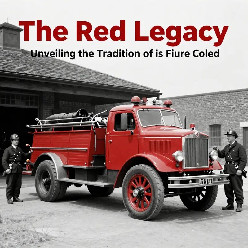
Color is a language of urgency and identity, a visual shorthand that travels faster than a siren. The red of a fire truck carries a long, winding memory that touches small-town pride, city branding, and the practical demands of keeping crews safe. It is not a single verdict spoken aloud by a committee, but a layered story stitched from early choices, economic realities, and the stubborn persistence of tradition. To understand why fire trucks look the way they do, one must walk through a corridor of history where color, commerce, and perception meet. What seems like a simple preference is, in fact, a mosaic of motives. When people ask why a fire truck is red, they are really asking how a symbol is formed and why it endures even as science points toward more visible hues. The answer sits at the intersection of tangible practice and collective memory, a blend that has traveled from horse-drawn apparatus to modern fleets with digital dashboards and high-visibility paints.
The earliest chapters of this color story are practical and local. In the United States, the Cincinnati Fire Department, among the nation’s first professional brigades, painted its equipment red around 1853. The choice was functional in a city where fire companies wanted to stand apart from other municipal services. Red conveyed authority and speed, a visual cue of urgency in a crowded urban landscape. This act of differentiation did more than label a squadron; it seeded a regional identity. Other departments watched and, intent on marking their own esteem and reliability, adopted the same hue. The effect was less a single scientific decision than a shared visual grammar that cities used to define themselves within a burgeoning urban culture. As more engines rolled out in red, a norm grew through imitation, prestige, and a practical sense that a uniform color could knit together a disparate fleet into a recognizable, almost heraldic, presence on the street.
From this point, popular lore begins to layer myth on top of the history. A widely circulated tale places the spark of red in the brisk economy of Henry Ford’s Model T era. The story goes that Ford’s car came only in black, so fire departments chose red so their trucks would pop against the sea of black automobiles. Historians, however, are divided on whether this is firm fact or enduring folklore. The absence of solid contemporaneous documentation makes the tale alluring, a tidy narrative that people can share around campfires and at station houses. Yet even if the Ford story isn’t literally true, it illustrates a deeper pattern: colors migrate from random preference to cultural emblem because communities want their emergency vehicles to be instantly legible and symbolically potent. Folklore often travels as a hint of truth, capturing a moment when a color becomes a badge of courage in the public imagination.
Practical considerations in the early 20th century further anchored red in the public safety canon. Paint technology and cost were decisive. Red pigments were relatively affordable and offered robust weather resistance compared with other shades. Fire departments, operating on tight budgets and frontline duties, gravitated toward the most economical choice that could weather sun, rain, and road grime without frequent repaints. The economics of the era thus reinforced a practical decision with a long tail. As fleets aged and new departments formed, the same logic echoed across municipalities. Red was not merely a color but a durable, cost-effective standard that made maintenance simpler and budgets easier to justify. The practicality of red solidified into habit; habit became identity; and identity, in turn, became tradition.
Another strand in this historical weave is the social and competitive texture of volunteer fire departments. In the 19th and early 20th centuries, departments vied for donors, crews, and civic prestige. Painting engines red was a way to signal seriousness, reliability, and readiness. A vivid hue could catch a donor’s eye, distinguish a department at a parade, and define a city’s public face in the eyes of its residents. In this sense, color became a marketing tool as much as a safety feature. The historical distribution of red across many cities reflects not only a shared aesthetic but also a network of local rivalries and intercity exchange. The color carried social capital; it helped departments recruit funds and volunteers by presenting a bold, unmistakable image of readiness.
Yet history is not only about what happened; it is also about what science later revealed. Modern research on visibility has challenged the long-held assumption that red is the most legible color for emergency vehicles. Studies conducted over recent decades show that lime-yellow, fluorescent orange, and white offer superior visibility in a variety of lighting conditions—daylight, dawn, dusk, fog, and rain. The eye’s peak sensitivity sits around the yellow-green wavelengths, roughly 555 nanometers, making these hues easier to spot than red under many real-world circumstances. The implication is not that red is a bad color, but that it is not the optimal choice for pure visibility in all contexts. For high-stress driving scenarios and the fast-paced tempo of emergency responses, the science suggests higher-contrast colors can reduce reaction times and improve safety margins, especially in mixed traffic and low-light environments. This body of evidence has sparked a gradual shift, with some departments adopting lime-yellow or other high-visibility schemes for new builds while others maintain red for cultural continuity and brand identity.
Despite these findings, the persistence of red as a standard is not surprising. Color does not exist in a vacuum; it travels through culture, memory, and ritual. The shade becomes a symbol of bravery, a visual mantra that steadies crews and reassures the public. When a citizen sees a red engine racing toward an alarm, the color aligns with decades of training, expectation, and communal trust. In busy urban corridors, red remains a legible beacon that, even if not mathematically optimal in every moment, carries meaning built over generations. The psychology of color—how people react emotionally to red as a sign of danger and urgency—continues to reinforce its place in the public psyche. In practice, many departments balance the old with the new: they honor heritage by keeping red where it matters emotionally while layering brighter accents or entirely new high-visibility schemes on new vehicles to improve day-to-day legibility and safety.
To see this balancing act clearly, consider how design and perception interact in the everyday choreography of an emergency response. A red engine is not simply seen; it is anticipated. Firefighters know their audience will interpret the color with speed and seriousness. Drivers, pedestrians, and bystanders respond with a trained reflex, slowing, yielding, and giving space. When a department adds lime-yellow panels or reflective trim, the vehicle remains instantly recognizable but gains a second layer of visibility under varied lighting. This compromise—honoring tradition while embracing scientific insight—reflects a mature approach to public safety design. It also demonstrates that color policy in emergency vehicles is not a static decree but a living negotiation among history, safety science, budget realities, and community expectations. If a city values both heritage and optimal visibility, its color strategy becomes a dialogue rather than a dogma, a way to honor what has come before while adapting to what science can offer today.
The contemporary picture, then, is not a single, universal rule but a spectrum. Some departments emphasize legacy and ceremonial aesthetics, keeping red as a central brand color across the fleet. Others pursue higher-visibility palettes, especially for new builds or specialized teams, recognizing that color can be tuned to context—urban traffic density, climate, and typical weather patterns. The evolution also mirrors broader trends in emergency services: a growing emphasis on measurable safety improvements, data-informed decision making, and public education about how to respond to emergencies. In this light, red remains a potent symbol, even as the science behind color choice continues to refine practices and push for designs that maximize early recognition and lane safety.
For readers who want to explore the conversation further, the evolving color debate sits alongside broader questions about how public safety branding intersects with engineering, psychology, and urban planning. The color of the fleet touches everything from the procurement process to the moment a crew slides down a pole and vaults into a truck, from the aesthetic of station façades to the way schools teach children to react when a fire truck approaches. It is a reminder that public safety is as much about perception as it is about equipment and tactics. If we listen closely, the color story offers a window into how cities balance heritage with evidence, how communities reward tradition, and how science can guide improvements without erasing the history that gives those vehicles their character. The tale of red thus remains relevant not because it is perfect by science, but because it is alive in the culture it serves.
Readers who wish to trace this thread further can explore broader narratives about public safety and the culture of emergency response on the Fire Truck Blog, which offers context, case studies, and reflections on how fleets are evolving while honoring their roots. Fire Truck Blog provides a useful gateway to related discussions about equipment design, visibility, and the way communities value their rescuers.
Ultimately, the question of why fire trucks are red is less a question with a single answer than a mosaic of explanations. The history of color in firefighting is a story of practical constraints, regional pride, and the human desire to make danger legible and trustworthy. The science of visibility adds a corrective voice, inviting departments to consider how color functions under different light and weather. The cultural pull of red ensures that many engines still carry the hue that has become a symbol of readiness and courage. The result is a fleet that speaks in two languages at once: the language of tradition etched in paint, and the language of science that seeks to make every response as fast and as safe as possible. It is a nuanced balance, and one that continues to evolve as new technologies, new materials, and new urban landscapes shape the way emergency vehicles are seen and understood by the people they serve.
External resource for further reading: https://www.ashs.org/insights/why-red-is-not-the-best-color-for-fire-trucks/
Red on a Budget: How Economics Forged the Fire Truck’s Legendary Hue
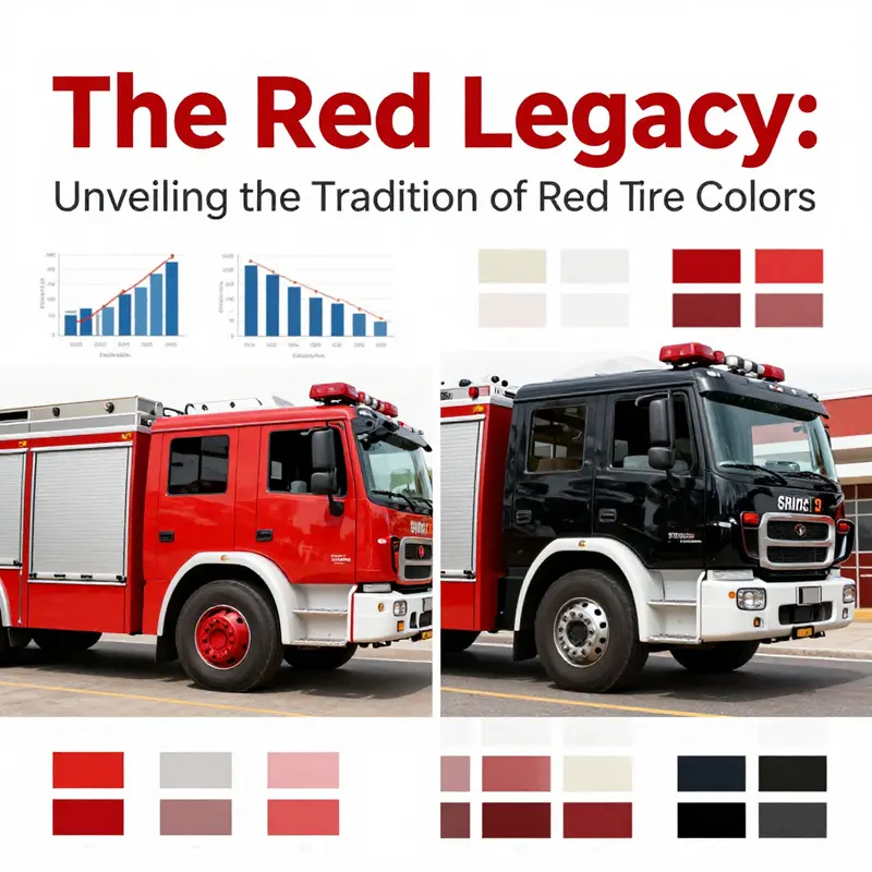
When people ask why fire trucks are red, they often expect a tale of bravado or myth. Yet a practical thread runs through the history of the color that blankets the fire service in local lore and national memory. The economic logic behind red is not a minor footnote; it is a foundational reason that helped fix the hue in fleets across cities and decades. This economic thread began in the 19th century, when fire departments operated under tight budgets and patchwork logistics. In those days, red paint offered a rare blend of low cost, broad availability, and robust appearance. The Cincinnati Fire Department, among the first professional brigades in the United States, painted its equipment red around 1853. The choice was not merely a statement of identity; it was a practical decision born from financial constraints and the realities of material supply. As other departments watched, the economic calculus in one city rippled outward, turning a functional choice into a widely adopted standard. The story is not that red is the most visible color in every light, but that it was the color most departments could afford to buy, apply, and maintain with the means at hand. Over time, this affordability became tradition, and tradition, in turn, reinforced economic behavior. The color became a predictable part of the procurement process and a recognizable symbol of urgency and authority. This is not to deny the later discoveries in color science, but to illuminate how money, not just optics, shaped the fire truck’s iconic look.
Pigments and paint technology of the era help explain the economics. In the 19th century, red pigments were widely manufactured and distributed, often more affordable than other hues. Iron oxide-based reds, among the most common pigments, were plentiful, durable, and relatively easy to produce in large quantities. A department could buy red paint in bulk and cover metal surfaces with fewer layers, reducing labor time and cost. Even when alternatives existed, the price difference for a practical, reliable color could be decisive for a fleet that needed to cover large urban areas with limited funds. The cost savings were not just in the initial coating. Maintenance followed the same logic: red pigments tended to weather well enough for routine exposure to weather, road grime, and the wear that comes with long shifts and frequent exposures to the elements. The bottom line was clear: red paint provided a combination of affordability and functional resilience that fit the budgets of volunteer companies and city departments alike.
The economic narrative extends beyond pigment chemistry into procurement culture. In many American cities, early fire apparatus were acquired by volunteer brigades or municipal bodies working from constrained line items. The emphasis was on maximizing the reach of every dollar, and a color that came with low cost and high visibility in rough conditions became a practical default. The visibility story, though not the sole driver, overlapped with cost considerations. Red, with its bright, commanding presence against urban façades and smoky horizons, offered more than symbolic authority. It functioned as a low-risk investment: a hue that didn’t demand exotic dyes, could be matched with common primers, and worked well with the metalwork of early steam and horse-drawn apparatus. In environments where budgets dictated everything from hoses to wheels, color was one more line item that needed to deliver value. And red did exactly that—deliverable value at predictable price points.
Once a color proves its cost-effectiveness, it gains momentum through institutional memory. Departments copied successful procurement practices from neighbors and distant peers, seizing the opportunity to standardize color across entire fleets. The practice of painting engines red did not require elaborate justification in every city; it was a straightforward, repeatable method. The shared standard lowered training and maintenance frictions. Mechanics and drivers learned the routines associated with red machines, from the way redundancy in parts to the painting schedule aligned with fleet turnover. That shared practice lowered risk and reduced the need for bespoke color decisions that could complicate budgets further down the line. In this way, the economic logic of one era—cheap pigments, broad availability, durable finishes—became a durable cultural habit. The color traveled with the apparatus through transition after transition, from horse-drawn rigs to steam-powered trucks and beyond, evolving in form but not in its economic rationale.
The historical tension between economics and safety remains a throughline in the chapter’s argument. While the economic case for red was compelling in the 19th and early 20th centuries, the modern era has introduced different pressures. Departments now weigh color choices against color science, visibility data, and evolving standards for safety and efficiency. The economics of pigment today, with their different supply chains and environmental considerations, still influence procurement, but not in the same way as in the era of inexpensive red oxide pigments. The shift toward lime-yellow, fluorescent orange, or white for daylight visibility embodies how internal cost-benefit analyses adapt to new knowledge. Yet even as this shift unfolds, the legacy of red endures in part because the initial economic decision created a robust identity that became deeply entrenched in regional memory and public expectation. The color is part history, part branding, and part economic artifact—an emblem of resourcefulness as much as urgency.
An external perspective helps ground this narrative in broader interpretation. Britannica’s concise exploration of the question Why Are Fire Trucks Red? echoes the same point: red’s popularity was born not purely from a desire to be seen, but from the practical realities of pigment availability and affordability in an era when fire service budgets had limited margins. The article situates the color choice within a wider historical landscape, where pragmatic decisions about materials often become enduring cultural symbols. That the color endured despite later debates about visibility underscores how economic constraints can shape cultural identity in the long term. The story, then, is a reminder that what looks like a simple aesthetic choice can carry the imprint of budgets, markets, and institutional memory across generations.
For readers curious about a broader narrative of how the color and its meaning have traveled through time, a quick foray into public-facing reflections on fire service history can be illuminating. The online landscape of fire service writing—including dedicated pieces on industry blogs—offers a sense of how communities connect with color as a badge of honor and service. In particular, a steady stream of historical notes, community anecdotes, and archival photographs helps illustrate how a color chosen for cost and practicality became a symbol that homeowners, volunteers, and professionals recognize in moments of crisis. If you’re following this thread further, consider exploring the Fire Truck Blog for accessible historical context and illustrative examples of how departments framed color in their own local stories. The blog’s content helps bridge the gap between archival history and living tradition, showing how a budget decision can become part of everyday meaning.
Turning from the past to the present, the economic logic of red remains relevant to how departments approach fleet management today. Even as some agencies evaluate newer colors for daylight visibility, the costs of repainting and rebranding fleets cannot be ignored. A fleet represents a substantial capital investment, and color changes are not simply cosmetic; they implicate maintenance schedules, supply contracts for paint and primers, and the logistics of training and documentation. In periods of tight budgets or shifting regulatory requirements, keeping a red fleet can feel like preserving the easier part of a complex system. The continuity of red, then, can be read as a pragmatic choice anchored in decades of fiscal practice. It reflects a balance between the desire to optimize visibility and the enduring reality that repainting a fleet is a high-stakes financial decision with long lead times and significant disruption to daily operations.
Even as the field advances, the economic narrative remains persuasive for many departments. The color’s historical role as a symbol of speed, authority, and urgency also reinforces procurement rationales. Red is not just a pigment; it is a familiar signal that reduces ambiguity for dispatchers, road users, and the public. This functional familiarity translates into a form of economic efficiency: when people instantly recognize a red fire truck, response chains are smoother, and the risk of misidentification during emergencies is reduced. In that sense, the economic argument is about more than the price of paint. It is about leveraging the social and operational advantages that come with a color that publics already associate with emergency response. The cost-benefit calculus thus becomes layered—pigment affordability, maintenance practicality, fleet uniformity, and social signaling—all reinforcing the same outcome: red as a stable, economical choice that has endured as the standard for a very long time.
The chapter’s core takeaway is thus not merely that red was cheap, but that cost-effectiveness is a powerful driver of normalization in public services. When a color is inexpensive to procure, easy to apply, and widely adopted, it creates a feedback loop that makes it harder for alternative hues to dislodge it. Each fleet that remained red contributed to a regional expectation that shaped future procurement decisions. As a result, the color became a recognizable, trusted feature of urban infrastructure. This is a reminder that the visual language of emergency services is as much a product of financial and logistical realities as it is a matter of design preferences. The economic origin story helps explain why the fire truck’s red has persisted even as scientific studies have pointed to different approaches in terms of daytime visibility, color science, and safety research. The legacy is not outdated; it remains a living echo of budgets past and the practical realities of keeping communities safe.
In sum, the economic rationale for red in fire service history is a story of available pigments, cost-effective application, and institutional memory. It is a narrative that shows how a choice made under financial constraints can become a durable cultural standard. The color’s endurance reflects more than symbolism; it reflects the layered ways budgets, supply chains, labor, and public expectation shape a city’s everyday tools of protection. The chapter serves as a reminder that the question, why is a fire truck red, invites not only aesthetic or safety considerations but a look at how money, materials, and momentum combine to define the vehicles that stand as the first line of defense in so many communities. The answer lies in a simple truth: red survived because it worked, economically and communally, at a time when every color choice carried real consequences for a city’s ability to respond to danger. And that history remains visible in every red-painted engine that still rolls toward the next alarm, echoing a decision made long ago in the language of budgets and practicality.
Clear as Daylight: Visibility Science, Tradition, and the Next Color Palette for Fire Trucks
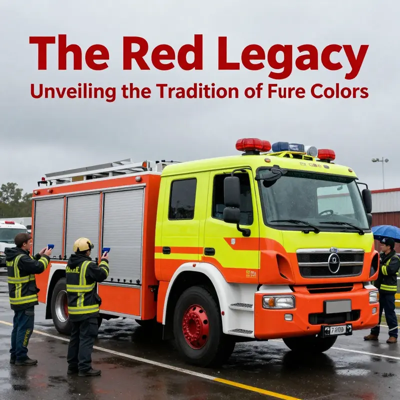
For more than a century, the color of a fire truck has stood as a public symbol as much as a practical cue. Red, carved into the public imagination by early departments and reinforced through decades of branding, has become a default of urgency, authority, and readiness. Yet the science of seeing—how human eyes detect movement, contrast, and color under shifting light and weather—presents a more nuanced truth. Red is not invisible, but it is not the most visible color in every time and place. The most compelling discoveries from visibility studies describe a spectrum of conditions in which bright yellows, lime greens, and even certain oranges can be detected more quickly and reliably than red. The question of color, then, sits at the intersection of history and optics, culture and safety, tradition and design. The future of fire trucks, in color terms, will likely reflect a synthesis: preserve recognizable branding while embracing high-visibility palettes that help responders reach scenes faster and bystanders recognize an emergency vehicle more quickly from a distance, in fog, at dawn, and through rain or glare. This is not merely a debate about aesthetics; it is a forward-looking question about public safety, response times, and the physics of perception. The chapter that follows threads through the historical reasons red became dominant, then moves to what visibility science has revealed, and finally considers how color choices might evolve in the service of faster recognition and swifter action, without discarding the cultural weight of tradition.
The story begins in a landscape where color was as much a badge of identity as a practical matter. In the 19th and early 20th centuries, fire departments often painted their apparatus in colors that helped them stand out on busy urban streets. Red emerged as a symbol of urgency in a period when cities were expanding, and public services were still in the process of professionalizing. In the United States, certain early adopters—city brigades with a desire to claim visibility and authority—painted their equipment red, setting a standard that others soon followed. Practical concerns also played a role: pigments, processing methods, and the relative durability of shell paint made red a reasonable choice in many places. The result was a cultural habit: red became the color we imagine when we think of a fire truck, a psychological cue linked to speed, danger, and response.
But as the century turned and science began to better explain how people see in the world, something about the red-choice narrative began to diverge from measurable reality. The human eye is most sensitive to wavelengths around 555 nanometers, a spectrum we perceive as yellow-green. In daylight and in conditions of poor visibility—fog, rain, or twilight—the eye’s peak sensitivity does not align perfectly with red. Color science has repeatedly demonstrated that certain high-visibility yellows and greens can be detected more quickly under many common emergency scenarios. This matters because response times hinge on the moment a bystander or a driver recognizes an approaching vehicle and yields or makes space. If a color pops more reliably under a wide range of lighting, the potential for faster recognition increases. It is not that red disappears from emergency design, but that it sits alongside a spectrum of safety-first color choices that science suggests may be more effective in many conditions.
Beyond the color alone, visibility is a function of contrast and reflectivity. A red vehicle can stand out against some backgrounds but blend in against others—think of a red car against a brick wall, a red sky at sunset, or a red vehicle reflected in wet asphalt. The modern design toolkit, therefore, does not treat color as a single lever. It combines color with reflective materials, high-contrast markings, and dynamic lighting. Retroflective chevrons and white or lime-yellow accents can dramatically increase detectability by drivers, pedestrians, and other responders. In this sense, the future of fire-truck design is less a single color decision and more a holistic approach to visibility. Color is one piece of a broader strategy that includes spacing, motion cues, and the way a vehicle presents itself from a distance as it moves toward an intersection or away from a scene.
What the science is telling us is nuanced but actionable. The lemon-yellow or lime-yellow family of high-visibility colors, sometimes combined with fluorescent elements, tends to trigger faster recognition at dawn, in fog, and during dusk. In controlled experiments that measure recognition speed and detection latency, these colors can prompt observers to identify an oncoming emergency vehicle up to thirty percent faster than red in certain conditions. That statistic translates into real-world impact: a few tenths of a second shaved off a driver’s reaction time, a pedestrian’s moment of awareness, or a motorist’s decision to yield. It is not that red lacks visibility; rather, it is that lime-yellow variants consistently outperform red in many day- and low-light scenarios. This is precisely why some departments are piloting high-visibility palettes that default to yellow-green tones for primary color fields, while maintaining red as an accent or secondary hue for branding and recognition in specific contexts.
The path from folklore to empiricism in this field has not been linear. A widely repeated anecdote—often cited in popular retellings—attributes the color choice to Henry Ford’s Model T era, suggesting fire departments painted red to outshine the nearly ubiquitous black cars of the day. Historians challenge this narrative as oversimplified folklore lacking robust documentation. Still, the practical and economic dynamics of early 20th-century procurement matter. Red paint, in many regions, was affordable, durable, and readily available from local suppliers. In an era when fire apparatus were built by smaller manufacturers who faced stock and cost pressures, red became a workable, repeatable standard. The result was not only a color but a brand signature that traveled with city identity and public memory. Over decades, as manufacturers scaled up, red hardened into a cultural expectation—an icon of emergency service that was both legible and legible in the public mind.
However, as the visibility science matured, departments began reexamining color choices within a broader safety framework. Some regions have started to adopt lime-yellow, light-reflective orange, or white as primary colors on new apparatus, especially in daylight and mixed-illumination environments. Others have integrated reactive or retroreflective materials that respond differently as headlights slide across their surfaces, increasing the perception of depth and motion. Importantly, these changes do not erase history; they re-contextualize it. Communities that once defined fire-rescue identity through a single hue can preserve that heritage while embracing practical enhancements that reduce response delays. The culture of fire service remains deeply rooted in tradition, courage, and service. The science does not demand a wholesale renunciation of red so much as a dynamic, context-aware approach to color that keeps the public safe and the responders visible.
Looking ahead, the future palette may become more nuanced and situational. The central question becomes how to balance recognizability with detectability across different environments and populations. In daylight, lime-yellow and neon-inflected yellows can outperform red in terms of quick detection, especially when the vehicle is moving toward an observer who is already scanning the road for hazards. In twilight, fog, rain, or urban canyons with backlit reflections, high-contrast whites and yellows with retroreflective patterns can improve discernibility. The design challenge is to harmonize these high-visibility elements with the need for a strong, enduring identity that the public associates with emergency response. It is not a matter of erasing tradition but of expanding it with informed choices that maximize safety without sacrificing the emotional and cultural cues that communities rely on during crisis moments.
This evolving landscape has practical implications for procurement, training, and fleet management. Agencies considering a color change must weigh the costs of repainting, the durability of new pigments, the availability of compatible markings, and the long-term visibility benefits under real-world conditions. They may pilot two-tone configurations or phased rollouts to gauge performance and community response before committing to a full transition. Training remains essential: drivers and bystanders must understand that color alone does not determine right-of-way or behavior at an incident scene. A visible vehicle still requires clear lighting, steady signaling, and predictable operations to minimize confusion and improve safety. In this sense, color is not a panacea but a powerful cognitive cue that works best when integrated with comprehensive visibility design, including lighting, signage, and reflective materials.
As we imagine the next generation of fire-truck colors, it is useful to think about color as a spectrum of options rather than a single endpoint. The question is not merely “Why red?” but “How can color work in concert with light, reflectivity, and human perception to reduce identification time and increase safety for everyone on the road?” In a world of diversified lighting, variable weather, and crowded urban spaces, the most effective designs acknowledge the limits of human perception while leveraging the strengths of modern materials and color science. If red remains a cultural anchor, the practical future might pair that anchor with a high-visibility core, one that can be seen quickly in the most challenging moments and still read with clarity at a distance or in glare. The result would be a more legible, more agile fleet without surrendering the heritage that communities entrust to their first responders.
For readers interested in procurement and market options, several departments have explored interim paths that blend tradition with safety. These pilots often emphasize two elements: the use of lime-yellow or similar high-visibility colors for the primary field, paired with red accents that preserve brand and cultural recognition. The success of any color transition hinges on community engagement, driver education, and consistent enforcement of right-of-way practices. It also depends on the integration of modern reflective technologies, such as chevrons and host vehicle markings, which amplify the color’s impact in low-light conditions. In the broader context of emergency response, color is one of many tools that help a vehicle announce its mission and reduce the friction between competing road users and responders. When combined with a thoughtful approach to illumination, signaling, and positioning, a new color strategy can help vehicles become more instantly recognizable, enabling responders to focus their attention on the tasks at hand rather than on deciphering a vehicle’s intent.
In summary, the historical association of fire trucks with red remains a powerful cultural motif. Yet visibility science invites a more nuanced view that recognizes color as a component of a larger visibility ecosystem. The future of fire-truck colors will likely be characterized by high-visibility cores, practical use of reflective materials, and careful consideration of how color interactions shift across time of day and weather. The goal is clear: more of the emergency’s first seconds, when every moment counts, spent on safe passage and rapid scene management rather than on deciphering a vehicle’s presence. It is a future where tradition remains, but it does not stand in opposition to safety; instead, it harmonizes with it, guiding the design choices that help communities better see, understand, and respond to the men and women who rush toward danger so others can be protected. And in that harmonized design, color matters not only as a badge but as a measurable contributor to speed, safety, and lifesaving outcomes. For those curious about how the market responds to such shifts, the procurement literature and dealer catalogs offer a window into how fleets adapt to evolving color standards while balancing cost and brand integrity.
External resource for further reading: https://www.assp.org/resources/fire-safety/why-are-firetrucks-red-the-real-answer/
Internal resource for procurement context (internal link): Fire trucks for sale.
Final thoughts
The color red has become synonymous with emergency response, rooted in historical significance, economic practicality, and cultural symbolism. As we shift towards brighter and more visible colors based on scientific research, the legacy of red will continue to influence the identity of fire trucks, even as new standards emerge. Understanding this colorful journey enriches our appreciation for these brave vehicles and underscores the ongoing commitment to safety in our communities.