
Color plays a vital role in the visibility and identity of fire trucks, especially in unique locales like Hawaii. Misconceptions abound regarding the color of these critical emergency vehicles, often leading to confusion among firetruck enthusiasts and future firefighters alike. This article delves into why fire trucks are perceived as yellow in Hawaii, examining the color standardization in emergency services, the importance of visibility and safety, and the impact of cultural and environmental influences. Furthermore, we will clarify common misconceptions about emergency vehicle colors, encouraging a deeper appreciation for the aesthetic and functional choices behind color variations. Join us on this colorful journey!
Sunlit Signals: How Hawaii’s Lime-Yellow Fire Trucks Became a Study in Visibility, Weather, and Rapid Response

When people imagine a fire truck, the color red often comes to mind first. It is a cultural shorthand that travels through history, symbolizing urgency and power. Yet in Hawaii, a different hue dominates the fire-stopping landscape: a bright lime-yellow, a fluorescent yellow-green that glows under a spectrum of sky, sea, and sun. This chapter follows that color from curiosity to practicality, weaving together insights from vision science, environmental conditions, and the evolving standards of emergency services. It is a narrative about how a single color choice can ripple through design, training, and the tempo of a life-saving response. What appears to be a simple aesthetic decision is, in fact, a carefully calibrated optimization for a landscape where visibility is constantly negotiated with weather, light, and terrain. The Hawaiian experience resonates with a broader shift in emergency vehicle safety, a move away from tradition toward color choices grounded in human perception and real-world performance. The thread that binds these ideas is the simple recognition that being seen quickly—and seen clearly—saves time, reduces risk, and can alter outcomes in moments that matter most.
Hawaii presents a living laboratory for understanding visibility because its weather and landscape are perpetually in motion. The islands are famed for bright sun, but those sunny moments are interspersed with sudden downpours, sea spray, mist off the Pacific, and the glare of water-minted reflections on asphalt. In such conditions, the wavelengths we tend to associate with classic red become less conspicuous against saturated backgrounds of red-hued sunsets, coppery rainfall, and the dusky shimmer that settles before a heavy afternoon shower. Vision science helps explain why lime-yellow emerges as a superior choice in this environment. Investigations into color perception in high-contrast, low-visibility conditions have consistently shown that colors in the yellow-green range, particularly around the 555-nanometer mark, are detected more quickly than red in several challenging lighting scenarios. The takeaway is not merely that yellow is bright; it is that yellow occupies a part of the perceptual spectrum that the human eye detects with heightened sensitivity when ambient conditions degrade contrast. In practical terms, a lime-yellow fire truck can be recognized sooner by drivers, pedestrians, and competing responders when movement and light are competing with rain, mist, or glare. The difference in reaction time, researchers have argued, can be measurable in fractions of a second—fractions that translate into precious minutes saved during emergency operations.
The rationale for color choices in emergency vehicles is as much about psychology as it is about pigment. Early fire service traditions embraced red for reasons that merged status, visibility against smoky backgrounds, and a cultural narrative of authority. Those choices, while historically influential, were seldom grounded in rigorous perceptual data. Over time, as safety science matured and data collection refined, departments began to reexamine color as a variable with tangible consequences for speed and safety. In this context, Hawaii’s adoption of lime-yellow is emblematic of a broader trend toward colors chosen for their demonstrable perceptual advantages rather than for ritual or convention alone. The Hawaiian approach aligns with a growing consensus among safety professionals that high-visibility colors can influence how quickly a vehicle is noticed and how quickly responders can engage. The shifting consensus is not about erasing tradition; it is about updating it to reflect current evidence about how humans see and react to dynamic scenes. This is a subtle but powerful distinction, one that places functional performance at the center of design decisions.
To appreciate why lime-yellow—often described as fluorescent yellow-green—fits so well with Hawaii’s weather, consider the way light travels across a misty morning or a sea-salted afternoon. The combination of high humidity and direct sun generates a spectrum where certain wavelengths can blend into backdrops that are otherwise challenging for the eye. The hue’s sensitivity to daylight and low-angle lighting makes it stand out as a beacon against a mosaic of blues, grays, and greens. It is not merely about brightness in a laboratory sense; it is about perceptual salience in the field, where maneuvering traffic, navigating through rain-slicked streets, and coordinating with other responders require speed and clarity. The color’s capacity to grab attention at a distance, even under rain’s blur, can shorten the time it takes for a driver to shift focus and for a crew to assume their tasks. This immediacy in perception becomes a safety asset when minutes and even seconds decide outcomes.
The science cited by safety researchers has repeatedly highlighted that the yellow-green end of the spectrum is detected faster than red in conditions characterized by glare, low light, or reduced contrast. The American Society of Safety Professionals and related human-factors research bodies have compiled findings showing that colors near 555 nanometers are recognized more quickly by the human visual system, a difference that accumulates across the sequence of a response. When a fire apparatus appears on a congested roadway, or when a blind corner is approached after a downpour, the lime-yellow hue can prompt an earlier mental acknowledgment from a driver who otherwise may have scanned for more familiar reds or blues. It is easy to imagine a chain reaction: a vehicle sees the lime-yellow, notes the approach of emergency lights, and yields more quickly, while the responding crew experiences reduced fumbles in the crucial moments before doors open and hoses deploy. This is not a myth of modern ad campaigns; it is a consequence of how sight, motion, and color interact in real-world driving contexts.
The practical implications of this color strategy extend beyond perception. Redemption of time in emergency response hinges on the quiet efficiency of recognition that occurs before a siren ever sounds. In Hawaii, the lime-yellow fleet enters a complex traffic ecosystem; it shares roads with tourists and residents who may be unfamiliar with local emergency patterns, and it must cut through a mosaic of coastal towns, mountain passes, and dense urban corridors. A color that is easy to spot in bright sun is disappointingly inadequate when rain or spray erodes contrast. Lime-yellow resists that erosion. It maintains a strong edge against a spectrum of backdrops—from the emerald canopies of Kaua‘i to the sun-glinted streets of coastal Honolulu. The color’s performance is not only about visible pigment; it also interacts with reflective surfaces on vehicles and the glow of emergency lighting. In combination, lime-yellow and forward-facing lighting create a visual signature that is difficult to ignore, even when drivers are momentarily distracted or when traffic is heavy and cluttered.
In discussions about color standards, the Hawaii experience is often cited as part of a broader narrative about safety-based standardization in emergency services. Rather than adhering to a historical reflex, departments increasingly adopt high-visibility palettes that are supported by a growing body of perceptual psychology research. The trend toward bright, lime-tinted yellows mirrors similar shifts in other jurisdictions that strive to balance tradition with the practical realities of day-to-day operations. The idea is simple: the more visible a vehicle is in the most challenging conditions, the faster it is seen, the quicker a driver can react, and the sooner responders can begin their critical work. Fire, after all, is a fast-moving adversary. The color of the apparatus is a single, tangible lever that can influence the speed and reliability of the entire response chain.
This perspective also dovetails with the notion that effective emergency response is a system property. Visibility is important, but it must work in concert with training, command visibility, and the predictability of response patterns. Color becomes a coded signal that can communicate, almost instantaneously, the role and urgency of a vehicle within a dynamic scene. In Hawaii, lime-yellow is not a standalone choice; it is integrated with procedures for lighting, positioning, and maneuvering that together create a highly responsive and safer operating environment. The result is a fleet that not only looks different from the traditional red but also behaves more predictably in the field. This predictability is a function of perception under stress, and it often translates to smoother traffic flow around emergency scenes, reduced risk for bystanders, and more efficient ingress and egress for arriving units.
The discussion about colors in emergency vehicles is not a matter of preference but of evidence-informed practice. While red remains deeply rooted in cultural associations and historic storytelling, Hawaii’s lime-yellow approach reflects a rigorous assessment of how humans detect, interpret, and act upon visual cues in the real world. It is a reminder that safety science is not about erasing the past, but about enhancing the future—one color at a time, tuned to the specific weather, light, and traffic realities of a region. In this sense, the color of a fire truck becomes a microcosm of a larger safety philosophy: that design choices should be guided by what the eye can see quickly, what the brain can interpret reliably, and what the road can accommodate without compromising the delicate balance between urgency and order on the path to a life-saving outcome.
As readers reflect on the Hawaiian model, it can be helpful to explore related discussions and case studies that gather practical insights from diverse contexts. For those who want to dig deeper into the broader discourse on visibility and emergency vehicle colors, the field offers a suite of resources, including research syntheses and white papers that bring together perception science, vehicle design, and field outcomes. For a more expansive read on the science behind high-visibility colors in emergency vehicles, see the external resource linked at the end of this chapter. In addition, curious readers can find related discourse and ongoing conversations in community and professional spaces across the web, including long-form discussions on the primary fire-truck platform and its related content hubs, which host a range of perspectives on apparatus color, safety, and adaptation to local conditions. If you would like to explore this topic further within a broader set of discussions about fire apparatus and safety culture, you can visit firetruck.space/blog/ for a collection of essays and contemporary viewpoints that frame the practical realities of color and safety in emergency service operations.
External resource for further reading: For a broader, evidence-based discussion of visibility and emergency vehicle colors, see the American Society of Safety Professionals’ white papers on the subject: https://www.assp.org/resources/white-papers/visibility-and-emergency-vehicle-colors
Bright as Dawn: How Lime-Yellow Fire Trucks Elevate Visibility and Safety on Hawaii’s Roads
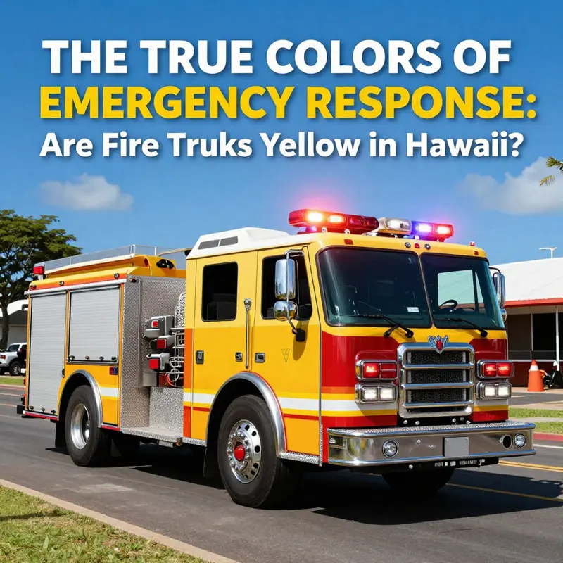
Hawaii presents a unique stage for emergency response, where the rhythms of rain, trade winds, and dense tropical foliage shape every decision a first responder makes. On the sunlit days when lava-breeze heat meets mist from the sea, a fire truck’s color is more than a banner on the side of a vehicle. It is a calculated tool, a moving beacon designed to cut through glare, haze, and the unpredictable dynamics of a coastal and mountainous terrain. In Hawaii, the choice of lime-yellow, a bright high-visibility shade, is not merely aesthetic. It is the product of deliberate science and grounded experience that ties color to the speed and safety of response, the rhythm of traffic in a busy island environment, and the need to protect both firefighters and the communities they serve. The story of why these trucks stand out as they do is a story about visibility itself—a story that begins with how human eyes perceive light and ends with how fleets are organized to minimize risk and maximize help in high-stakes moments.
To understand the core idea, consider the simple fact that human vision is most attuned to wavelengths in the yellow-green spectrum. The light that sits around 555 nanometers is where the eye’s rods and cones are most efficient at signaling contrast. When you stand in dawn light or fog, the sensory system doesn’t just register color; it evaluates contrast, brightness, and movement. Lime-yellow sits in a sweet spot for visibility: it remains bright even when backlit by the sun, it preserves contrast against greens of vegetation and blues of the sea, and it remains legible against the complex backgrounds that define Hawaii’s roads. Research conducted by human factors specialists, including those associated with the American Society of Safety Professionals, indicates that lime-yellow fire vehicles can be detected more quickly than traditional red ones under certain conditions, sometimes by as much as thirty percent in dawn, dusk, fog, or low-light scenarios. That is not a trivial margin. It translates into more time for a driver to orient to an emergency scene, more time for pedestrians and motorists to react, and, crucially, less distance traveled at high speed by an apparatus that must navigate winding coastal lanes and steep grades.
The practical implication of this science is straightforward: visibility saves lives. In Hawaii, where weather conditions can shift rapidly—from a bright, clear morning to a mist-laden afternoon, or from coastal fog to mountain haze—the ability for a fire vehicle to declare itself on the road quickly becomes a matter of seconds, not minutes. In real-world terms, lime-yellow reduces the likelihood that a driver already focused on a narrow lane and a clearing path for an oncoming engine will be caught off guard by an approaching apparatus. It is a color that communicates urgency without shouting, a signal that crosses cultural and linguistic boundaries through a shared, almost instinctive, recognition of danger and help. The island setting, with its mix of tourist traffic, residential neighborhoods, and rural byways, amplifies this benefit. A fire engine in Hawaii must cut through a cluttered field of visual information: the glare from the sun bouncing off a white-sand beach, the reflections from wet pavement after a rain shower, and the glare of oncoming headlights on a winding road that can resemble a river of light at night. Lime-yellow is, in a very tangible way, a design solution tuned to the island environment.
This tuning is not a trend, but a strategic decision rooted in safety philosophy. Across the United States, different departments approach color schemes based on local conditions, historical practice, and risk assessments. In some rural and high-visibility-challenge regions, lime-yellow or other high-visibility colors have gained traction precisely because they deliver measurable safety benefits in particular contexts. The Hawaii choice, however, sits at the intersection of robust field experience and a growing body of empirical support that links color choice to faster detection and quicker scene setup. It is a decision that recognizes that the effectiveness of a response hinges not only on the speed of the responders but on the moments between a driver first noticing an approaching vehicle and the crew arriving at the right location with the necessary tools and teams in place. The color becomes, in effect, a silent partner in every mission, an extra observer that helps a driver gauge distance, anticipate the path of traffic, and engage with the fragile balance of road safety in a busy landscape.
It is worth noting that the rationale for lime-yellow is often misunderstood as a cost-saving shift or a stylistic experiment. In reality, the move toward high-visibility colors is a reflection of a broader safety calculus. Designing an emergency vehicle involves more than choosing a hue. It requires harmonizing visibility with reflectivity, silhouette, and signal lighting. Lime-yellow, with its reflective components, works in concert with roof beacons, ground lighting, and the distinctive chevrons that many departments apply to the rear of their apparatus. The careful layering of color with reflective material ensures that the vehicle remains legible even when illuminated by headlights, streetlamps, or the beams of passing vehicles—across hours of dusk, night, or the peculiar twilight of Hawaii’s geography. In this sense, the choice of color is part of a larger system of visibility optimization, a canopy under which every other design feature operates more effectively.
The science of visibility has practical echoes in the training protocols and operational decisions of Hawaii’s fire services. When crews plan apparatus placement, they consider how color affects perception from multiple angles: a driver’s line of sight in a narrow highway corridor, a bystander’s recognition from a distance across a parking lot, even the way tourists in rental cars interpret a scene at the edge of a crowded beach access road. The lime-yellow color helps to anchor these perceptions. It creates a visual cue so potent that it can alter a driver’s expectations about a scene before they arrive at it. In a landscape where the coastline and the mountain spine meet, the ability to identify a responding unit quickly can reduce the risk of collisions with slowed traffic or pedestrians who are already reacting to an emergency.
This is not to suggest that color alone solves every hazard. Color is one piece of a complex safety mosaic. The most effective emergency vehicle design borrows strength from multiple elements: conspicuity, predictable behavior on the road, standardized lighting patterns, and a vehicle’s physical dimensions and handling, among others. A lime-yellow hue becomes meaningful when it sits alongside measurable lighting improvements, well-marked reflective patterns, and consistent fleet deployment practices. In Hawaii, as in other places with rugged topography and variable weather, these factors coalesce to form a safety ecosystem rather than a single feature. The color then becomes a reliable signal that crews and the public can depend on, a steady attribute that reduces cognitive load in high-stress moments and frees mental bandwidth for the real work of firefighting and rescue.
For readers who crave a closer look at how such color decisions are informed by research, the broader literature on emergency vehicle visibility offers a rigorous frame. The American Society of Safety Professionals, among others, has documented how human factors influence response times and safety outcomes in emergency scenarios. The evidence from these studies reinforces the Hawaii experience: when visibility is optimized by color, contrast, and reflectivity, response crews can move more efficiently and with greater situational awareness. It is a practical application of safety science that translates directly into the daily routines of fire crews and the lives they touch. This is why the lime-yellow choice has found resonance beyond Hawaii and across regions where glare, smoke, or sparse light conditions challenge traditional color norms.
A broader cultural and educational thread runs through this discussion, too. Color in public safety does not happen in a vacuum. Communities engage with these decisions through education, signage, and everyday exposure to emergency vehicles. Tourists and residents alike interpret the color cues in predictable ways, which helps to create a shared understanding of what to do when a fire truck approaches. That shared understanding can reduce confusion and increase the effectiveness of traffic clearance on busy roads or during evacuation scenarios. In Hawaii, the combination of color, lighting, and reflective design becomes part of a larger communal language about safety—a language that transcends language barriers and reaches people through a direct, visceral recognition of a bright, fast-moving symbol of help in need.
For those curious about how these design choices enter the marketplace of emergency vehicles, there is a practical reality worth noting. The acquisition and replacement of fleet vehicles often involve evaluating color schemes alongside cost, availability, and service compatibility. On platforms that discuss or showcase fire apparatus, you will encounter debates about color, materials, and configurations. The discussion is not merely about appearance; it is about ensuring that every new unit integrates seamlessly with existing training, road-use patterns, and regional weather conditions. If you want to explore how markets discuss such vehicles in a more general sense, you can visit the fire-trucks-for-sale page, which presents a catalog of options and configurations that departments weigh when updating their fleets. The page highlights how color feasibility interacts with practical considerations like chassis choices, equipment fit, and the ergonomic needs of crews. It is a useful snapshot of how color decisions travel from theory into the garage and onto the road.
In sum, Hawaii’s lime-yellow fire trucks embody a careful blend of science, practicality, and responsive design. The color is not a whim but a functional choice—one that aligns with human visual performance under the island’s distinctive light and weather patterns. It acts as a high-visibility beacon that helps drivers, pedestrians, and other travelers recognize danger and prompt action quickly. It supports a comprehensive safety strategy that extends beyond color to include reflective detailing, lighting, vehicle handling, and training that prepares responders to operate effectively across Hawaii’s varied terrain. The result is a fleet that communicates readiness and support through color as clearly as through siren and shifting lights. This is how visibility and safety in vehicle color choices translate into tangible improvements on the ground, keeping communities safer while preserving the swift, compassionate response that defines emergency service.
External resource: American Society of Safety Professionals – Human Factors Research on Emergency Vehicle Visibility. https://www.asse.org/resources/human-factors-research-emergency-vehicle-visibility/
If you’re curious to see how these design conversations circulate in broader industry discussions, a deeper dive into related resources can provide context on how color, safety protocols, and fleet management intersect in different regions. For broader reader exploration, you might look into the general discourse around emergency vehicle design and safety culture, which often touches on the same themes of conspicuity, recognition, and rapid response that Hawaii demonstrates in practice.
A Lime Signal in Paradise: Why Hawaii’s Fire Trucks Glow Yellow
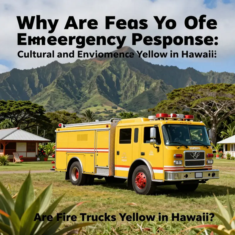
In Hawaii, the question of why fire trucks appear in a bright lime yellow is not a riddle about tradition alone. It is a practical answer rooted in how color interacts with perception, light, and landscape. The choice is a blend of science and environment, a deliberate adaptation to the island conditions that shape daily emergency response. The lime yellow most commonly seen on the islands is a fluorescent hue, a shade designed to punch through the kinds of visual clutter that tropical air and terrain often present. The same hue that stands out on a sunlit hillside also holds up under the grey veil of dawn, the silvery mist that sometimes rolls off the ocean, and the smoky edges of volcanic ash that occasionally drift across the islands. In short, it is color chosen because visibility matters when every second counts and the visual scene in which responders operate is constantly shifting.
To understand this choice, it helps to start with the core question—what makes a color effective for emergency vehicles in the first place? The answer lies at the intersection of human perception and environmental context. Red fire trucks have a storied history in many parts of the United States, tied to tradition and the long-standing association between red and urgency. Yet color science does not stop at tradition; it looks at how the eye detects contrast, how certain wavelengths hold attention, and how ambient conditions alter perception. In a tropical place like Hawaii, those conditions are unique. The island ecosystems present sweeping greens that can blend with red, especially under bright sunlight. The open shoreline, the blue of the Pacific, and the white foam of surf provide a tableau where a truck painted in a more neutral red can be less conspicuous at critical moments. The lime yellow, with its position in the yellow-green spectrum, sits closer to a wavelength that the human eye detects more readily in a variety of lighting, from the hazy pre-dawn to the glare of late afternoon. This is not merely a stylistic preference; it is a design choice grounded in detection thresholds and reaction times that matter on crowded roads and in mixed-use environments.
What makes Hawaii a compelling case study for this color strategy is how consistently the environment tests visibility. The islands present a mosaic of backdrops: the emerald of forests, the deep blue of the sea, the sulfurous whites of volcanic beaches, and the pale silver of persistent humidity. On a windy highway bordered by lush foliage, a red vehicle can disappear behind a tangle of leaves and shadows; a lime-yellow vehicle tends to register with greater immediacy even when the scene is busy or partially obscured by spray or haze. This advantage is not merely theoretical. Human factors research has shown that high-visibility colors, particularly fluorescent yellow-green tones, can outperform traditional reds in conditions where contrast is the critical variable. In Hawaii, where dawn becomes a global color wash with a mix of gold and green hues, where dusk can descend with a soft, almost pastel light, and where fog and mist are not rare, that contrast is crucial for quick location by drivers, pedestrians, and fellow responders alike. The eye is tuned to pick up signals that stand apart from the immediate surroundings, and the lime-yellow is calibrated to be such a signal in a tropical landscape.
The practical implications of this perception science ripple through daily operations. A fire engine that is easier to spot at a distance allows following vehicles to respond with more confidence and less hesitation. In the congested and often multi-lane roadways of tourist corridors, residential streets near coastlines, and the sometimes narrow lanes that thread through older neighborhoods, every fraction of a second saved by faster recognition translates into more rapid deployment of pumps, lights, and personnel. Visibility contributes to safer lane positioning and reduces the chance that an approaching driver will misjudge the distance to an oncoming unit. For pedestrians looking up from a sidewalk or a beach access path, the luminous lime-yellow can be more discernible against the greens of vegetation and the blues of the water than a darker red under ocean mist. These are not abstract notions but the kinds of improvements that emergency services teams weigh when they review fleet colors, signage, and lighting integration.
Cultural and environmental influences also shape the color narrative in subtler ways. Hawaii’s approach to safety messaging has long emphasized clarity, accessibility, and swift action. The colors used for public safety equipment are components of a broader communication strategy that seeks to minimize confusion in crisis moments. The bright yellow-green hue has acquired a regional identity through repeated exposure in training exercises, drills, and real-life responses. It has become a recognizable cue for emergency presence, a beacon that signals urgency without relying solely on flashing lights. That recognition feeds into a feedback loop: drivers become primed to notice yellow-green emergency vehicles quickly, pedestrians learn to yield to their approach, and the overall traffic dynamic becomes more predictable during incidents. The color thus serves as both a practical tool and a cultural signpost—a local language in which safety is spoken through visibility.
The environmental conditions that define Hawaii also push equipment designers and fleet managers to favor materials and finishes that perform under humid heat and salty air. The lime-yellow finish is often paired with high-reflectivity coatings and durable, corrosion-resistant materials that maintain brightness over time. In a climate where coastal salt spray and strong sun can accelerate fading or surface wear, the reliability of a high-visibility color becomes a long-term operational asset. This is not a cosmetic trend; it is a strategic choice that takes into account the lifecycle of equipment, maintenance schedules, and the realities of island weather. The result is a fleet that not only looks distinct but stays legible through the arcs of weather, patrols, and mission calls.
A deeper layer in this narrative concerns the interplay between uniformity and local adaptation. Fire departments across the United States historically draw on a palette that reflects national practice, yet many places, including Hawaii, find value in tailoring appearance to local conditions. The shift toward lime-yellow in Hawaii did not arise solely from external mandates; it emerged from a conversation among responders, safety officers, fleet managers, and the communities they serve. The conversation centers on effectiveness and trust—will people recognize an approaching engine as a vehicle that must yield? Will drivers know at a glance that this is an emergency unit, not a routine passerby? The answers hinge on perception research and on lived experience within the islands’ roads and neighborhoods. In practice, this means a color that harmonizes with the daily rhythms of traffic and tourism, with the natural beauty that draws visitors and residents alike, and with a safety-first ethos that pervades public services in the state.
The narrative of color in Hawaii also intersects with broader conversations about emergency vehicle design. As fleets modernize, departments weigh not only color but the entire signaling package—flashing lights, reflective striping, and the arrangement of warning devices. A high-visibility color works in concert with these elements to create a composite signal that is unmistakable, even at a distance or when sightlines are compromised by obstacles. The Hawaii context suggests that the best outcomes come from a system that treats color as a first line of perception, a tool that reduces cognitive load at high-stakes moments. Once a color is established, it also supports training efficiency: new recruits learn to recognize a lime-yellow response unit quickly, which translates into faster scene assessment, better coordination, and, ultimately, improved patient or community outcomes.
As with any safety choice, there are voices that point to tradition and to the enduring familiarity of red on fire apparatus. The reality on the ground in Hawaii, however, reflects a forward-facing consideration: color is a variable, and in the open, sunlit or fogged, archipelagic theater of operations, the most legible color is not always the most traditional one. The decision to embrace lime-yellow is not an abandonment of heritage but an adaptation that honors safety science and the practical demands of the islands. It is a case study in how a local environment can shape a national practice without erasing the value of broader knowledge. The question ceases to be whether yellow is better than red in Hawaii. The question becomes how color, perception, and place collaborate to save time, reduce risk, and support the rapid mobilization of life-saving resources.
For readers seeking a concise, research-backed perspective on high-visibility colors in emergency vehicles, the National Highway Traffic Safety Administration offers a focused resource that encapsulates the science behind these design choices. This external reference underscores the core idea that perception, contrast, and situational awareness drive color decisions in the field. The Hawaii experience exemplifies how that science translates into concrete policy and fleet management decisions on a specific landscape. To explore the foundational concepts, see the external resource at the end of this chapter. [https://www.nhtsa.gov/vehicle-safety/emergency-vehicles-and-high-visibility-colors]
Within this chapter, a key takeaway is that color is not decorative in emergency services; it is a critical instrument of safety. In a place where nature provides both beauty and hazards, the lime-yellow fire truck becomes a deliberate, evidence-based choice. It is a symbol of an emergency response culture that values rapid recognition, clear signaling, and adaptive practice. The hue is a practical response to the island environment, a way of ensuring that each unit that rolls onto the pavement carries a stronger promise of visibility, speed, and safety for those on the scene and those who share the road with it. For departments contemplating color strategies in other contexts, Hawaii offers a reminder that perception is not universal. It is local, conditioned by light, landscape, and human attention. When those conditions are understood and respected, color can become a powerful ally in the mission to protect life and property in communities that are as varied as they are vibrant.
As always, continued observation, testing, and dialogue among responders, designers, and the public will refine these choices. Color may seem a small detail, but in emergency operations it is part of a larger system that speeds response and reduces risk. The bright lime-yellow of Hawaii’s fire trucks stands as a testament to how science, environment, and culture converge to shape the tools that keep people safe in paradise. And while other regions may maintain red as a familiar symbol of siren and urgency, Hawaii shows that when perception, climate, and terrain align, the color of a life-saving machine can become, in its own quiet way, a kind of local wisdom. The result is not merely a distinctive hue but a well-reasoned safeguard that embodies the islands’ commitment to safety for residents and visitors alike.
Internal link to related discussion: Fire Truck Space blog
External reference for further reading: https://www.nhtsa.gov/vehicle-safety/emergency-vehicles-and-high-visibility-colors
Bright on Arrival: How Hawaii’s Weather, Light, and Perception Shape Fire Truck Colors and the Science of Visibility
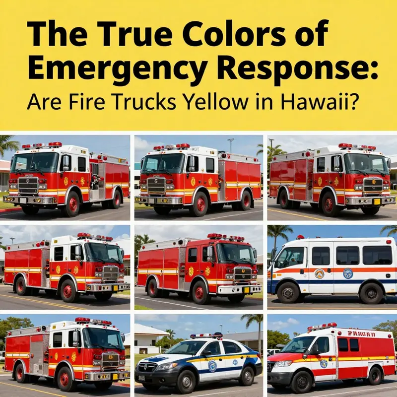
Per the Hawaii context, the color question is about visibility under tropical sun, spray, and varied weather. In practice, many departments use lime-yellow to enhance conspicuity. This is not about fashion but about how quickly drivers recognize an approaching unit in glare, rain, or mist. The reasoning combines human perception, vehicle lighting, and reflectivity with local maintenance realities. A bright yellow-green hue tends to retain brightness against blues, greens, and the white reflections from wet roads. In Hawaii, glare can wash out deeper reds, while lime-yellow stands out on coastal roads and through chlorophyll-rich foliage. Some fleets still use red where heritage or branding matters, and many departments mix colors with reflective striping for daytime and nighttime readability. Maintenance considerations–fading under tropical sun, salt air, and UV exposure–also influence color choices, favoring coatings that stay legible longer.
The broader point is that color is a safety tool, not a symbol alone. It works with retroreflective materials, lighting, and predictable vehicle behavior to reduce reaction times. National and regional guidance support high visibility colors in appropriate contexts, and Hawaii’s approach reflects local weather realities. For readers seeking more, the National Highway Traffic Safety Administration provides resources on emergency vehicle color and visibility: https://www.nhtsa.gov/vehicle-safety/emergency-vehicle-color-and-visibility.
In sum, Hawaii’s color decisions illustrate how environmental conditions shape fleet design for safer, faster responses while balancing tradition and maintenance. Lime-yellow stories are about practical visibility gains where sun, spray, and sea breeze frequently challenge legibility.
Final thoughts
Understanding the color dynamics of fire trucks in Hawaii reveals intriguing insights into safety, culture, and community identity. While the notion that fire trucks are primarily yellow in Hawaii may persist, it’s imperative to recognize that color choices vary based on visibility needs, cultural significance, and the universal standards set for emergency services. Through this exploration, firetruck enthusiasts, aspiring firefighters, and emergency service professionals can gain a deeper appreciation for the role color plays in their line of work. As we conclude, let’s celebrate the vibrant tapestry of colors that embody bravery and service across these beautiful islands.